

Parsons Branding shared a branding and visual identity for POP Furniture & Decor Paint. Launch a challenger chalk paint brand that appeals to a younger craftsperson, inspiring them to try DIY, add color to their life and transform more of their projects themselves.
The Process
Working with a long-standing client whose distribution business wed serviced for over a decade, we were able to fast-track when imagining what their own product would look like, creating a user-friendly brand that would reveal the creativity in everyone.
The Outcome
A bold, playful matte paint for makers looking to create. Not only does Pop unleash creativity, its simplicity allows creatives in South Africa to play in a safe and satisfying way.
Brand Identity
Seeking to uplift, Pops a reminder to always look on the bright side of life. The identity is fun, vibrant and practical, drawing the customer in with a smile and employing a light touch that enhances the brand experience. Its this memorable experience achieved through quirky humor, practical service and visual elegance that makes an impact.
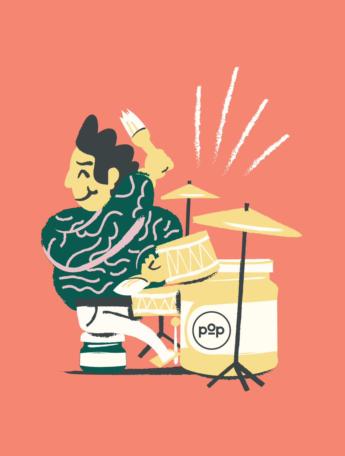
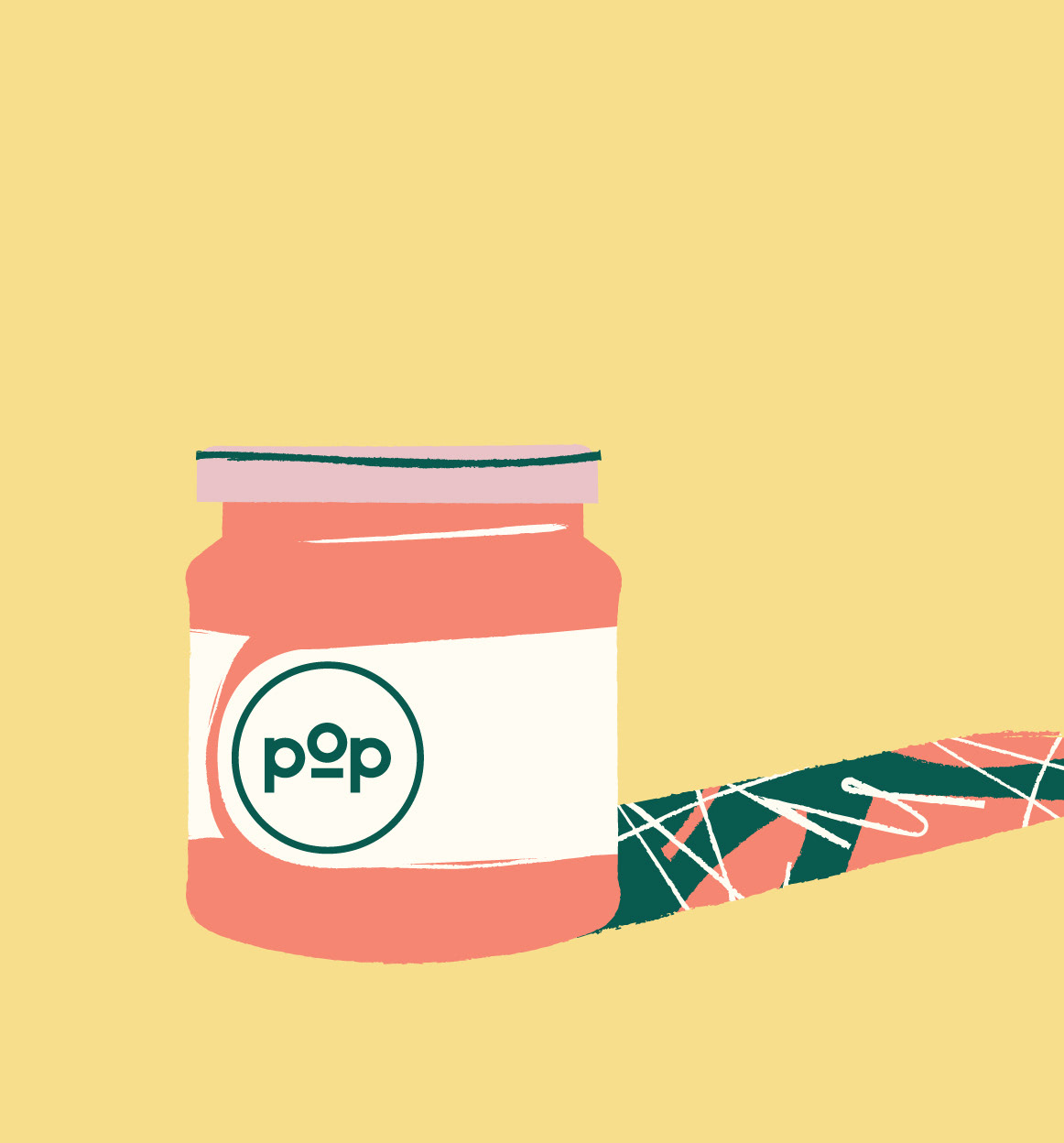
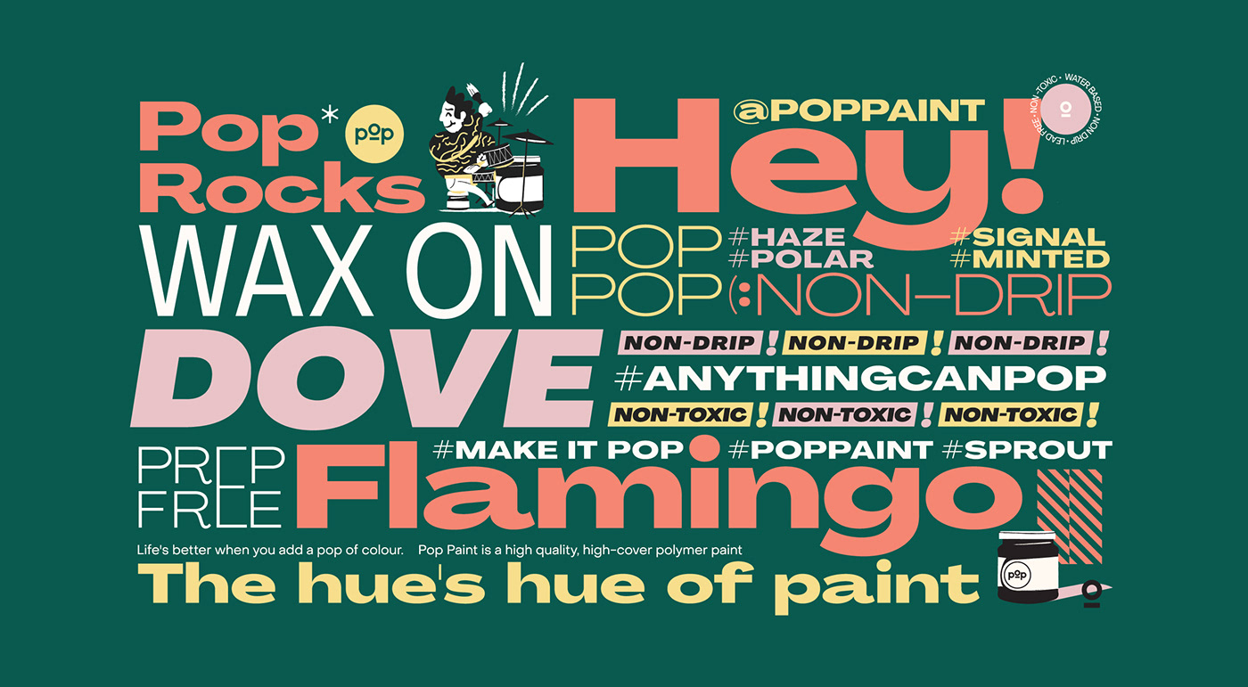
Illustration
To reiterate the crafty nature of the product, we employ detailed, hand-rendered illustration with texture that evokes paint strokes and multiple colors to show the diversity of the offering. Its this bespoke, eye-catching layer to the identity that seeks to stimulate the imagination and promote creativity.
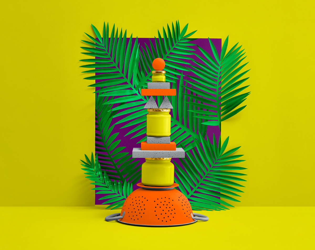
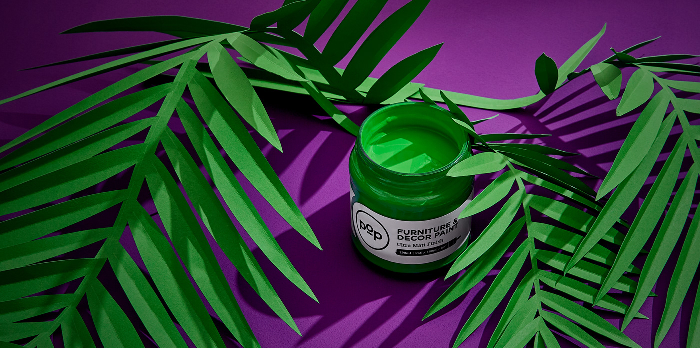
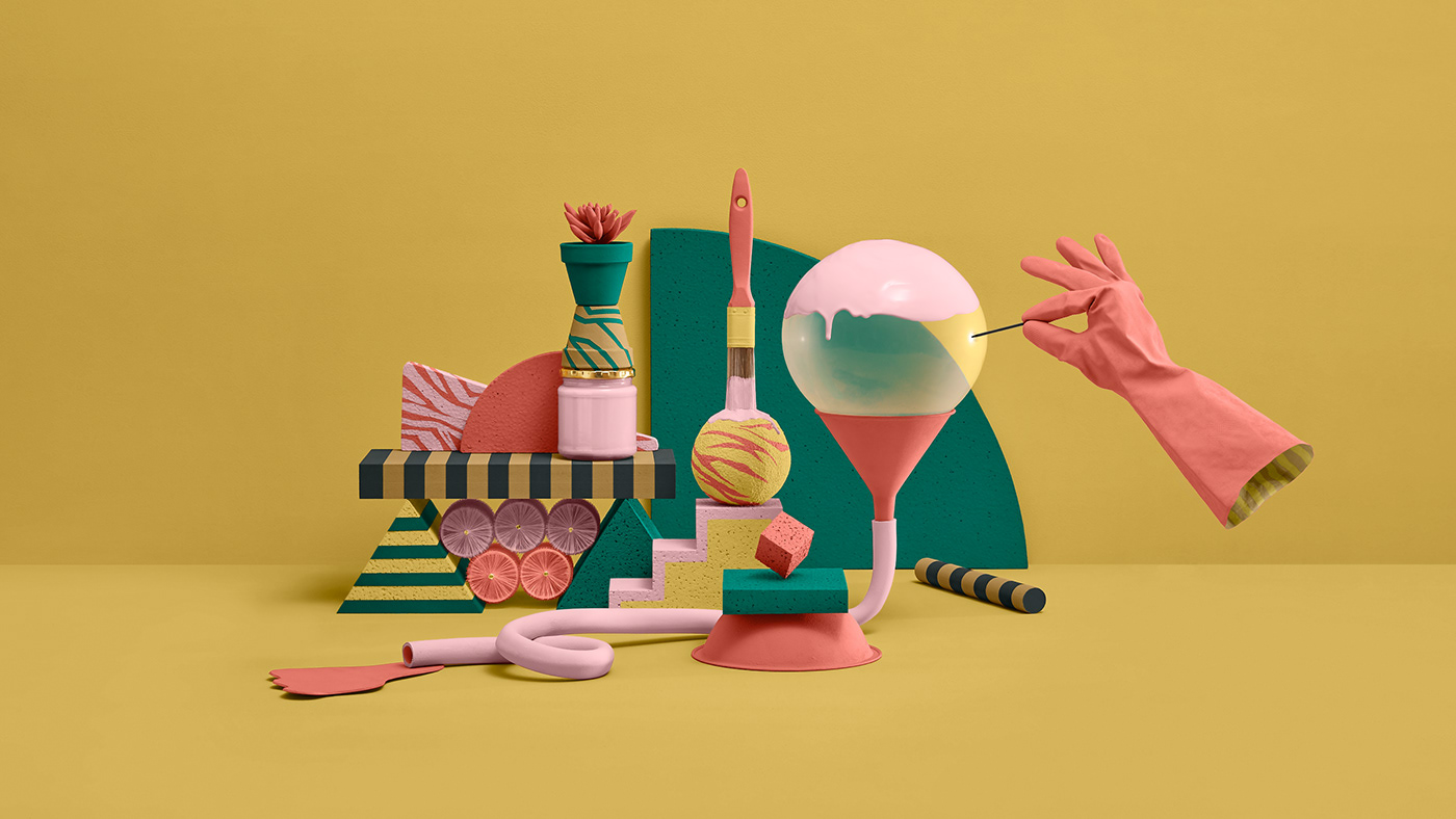
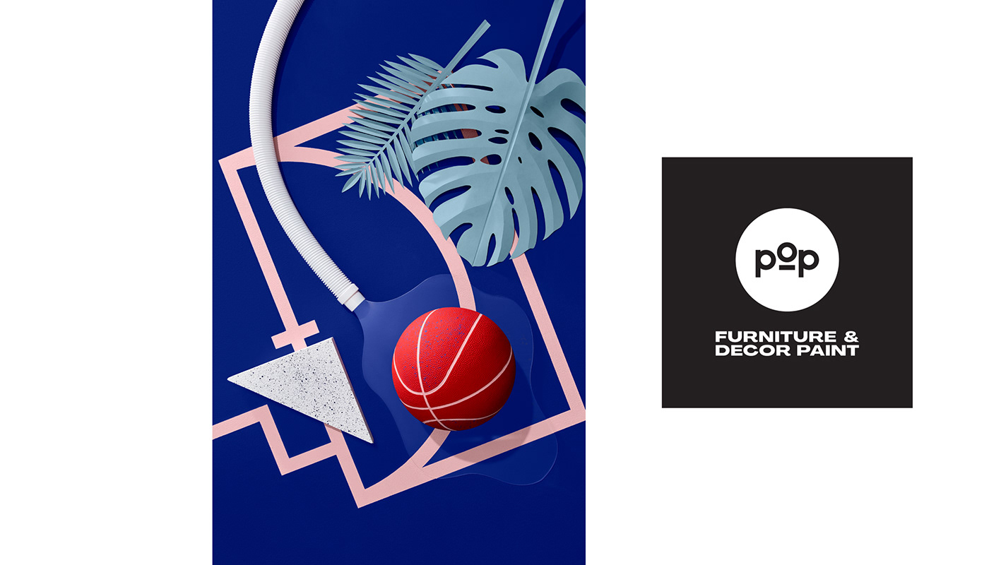
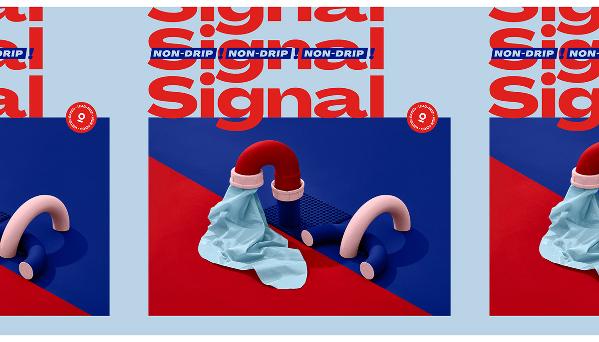
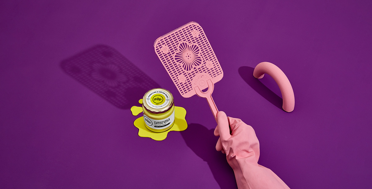
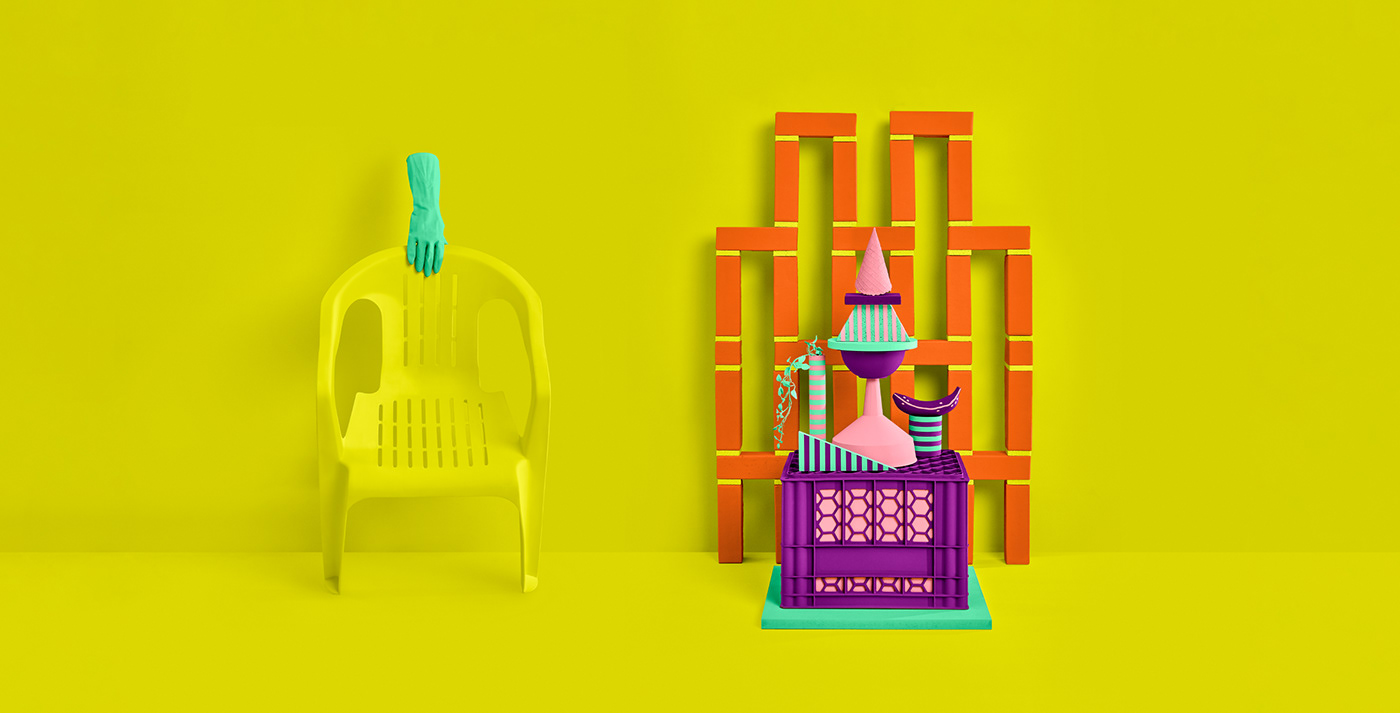
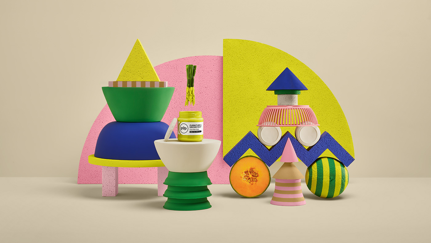
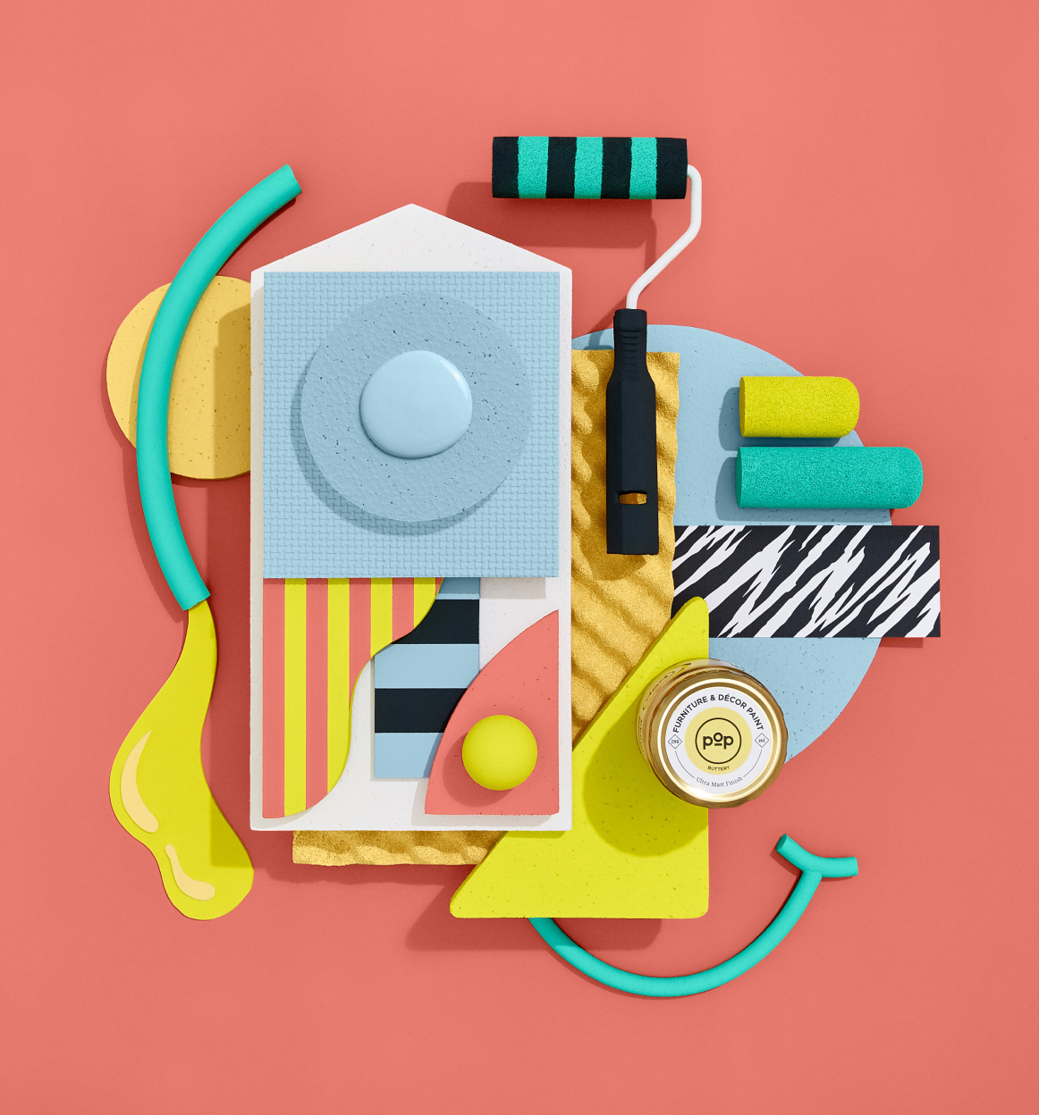
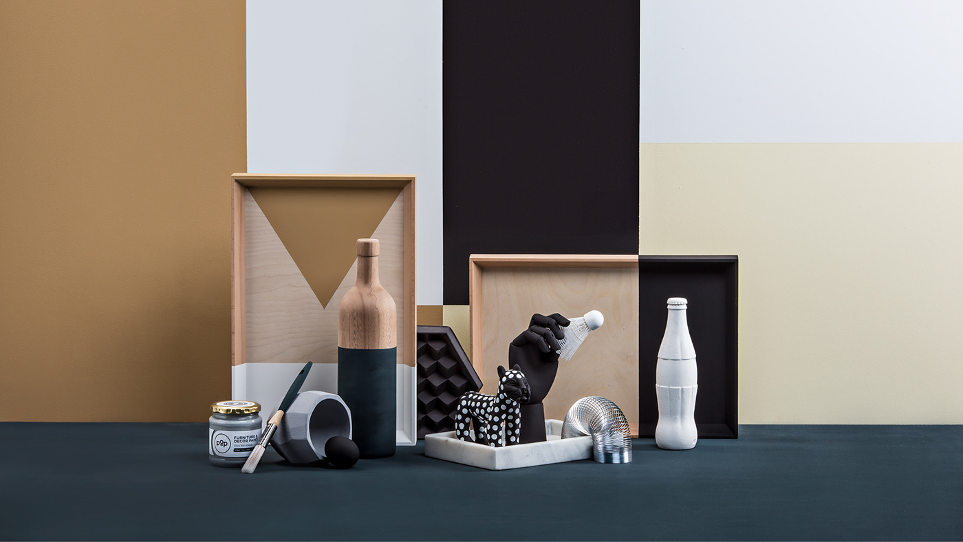
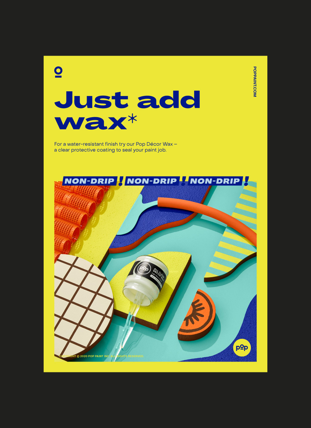
Photography
With either contrast dominating or tonal execution, close attention is paid to elevating the product colors through photography. The hyper-real subject matter adds to the impression of spontaneity, improvisation and bold creativity giving the work an authentic feel. These surrealistic motifs showcase the product offering through composed shoots that display Pops versatility and customizable attributes.
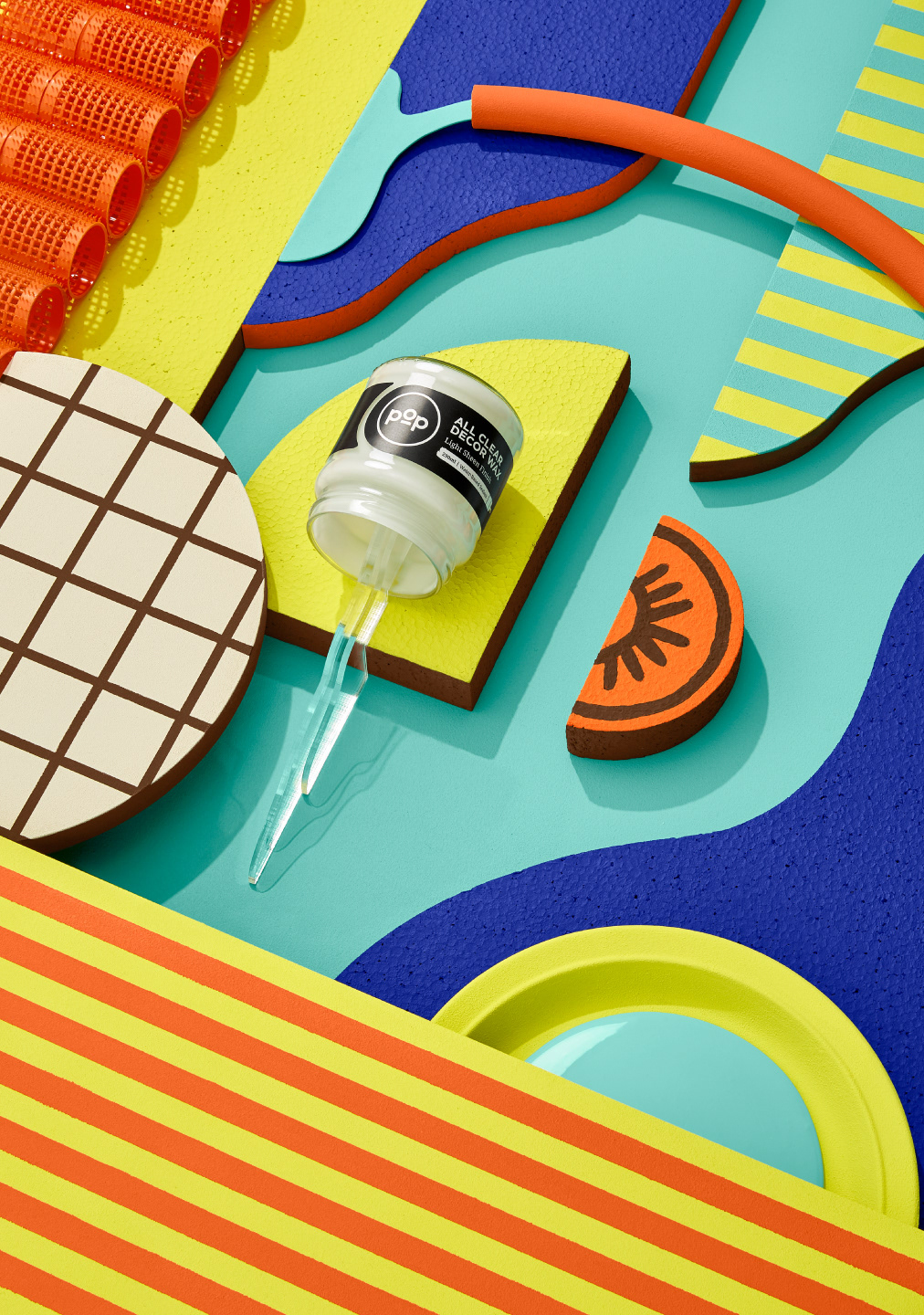
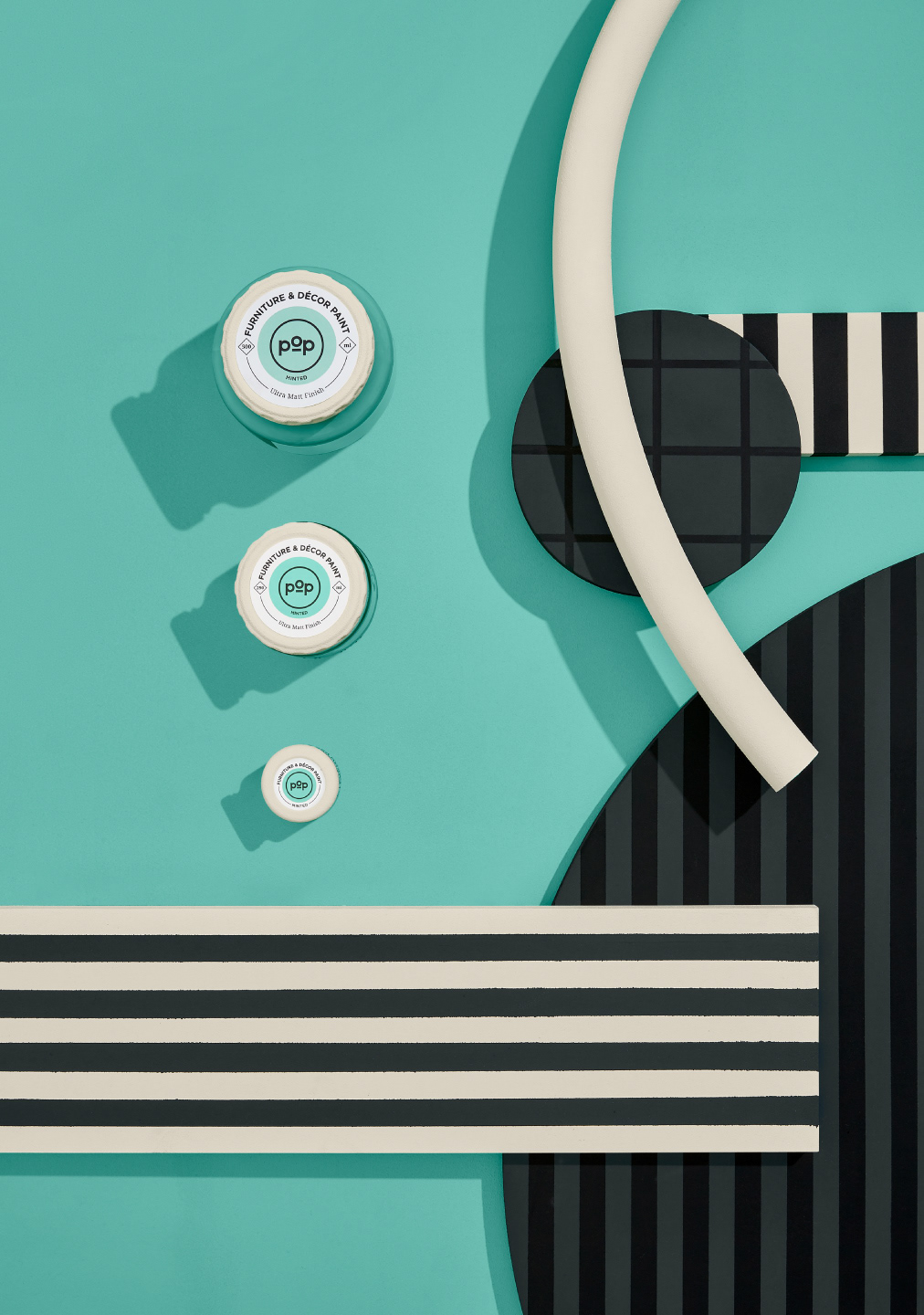
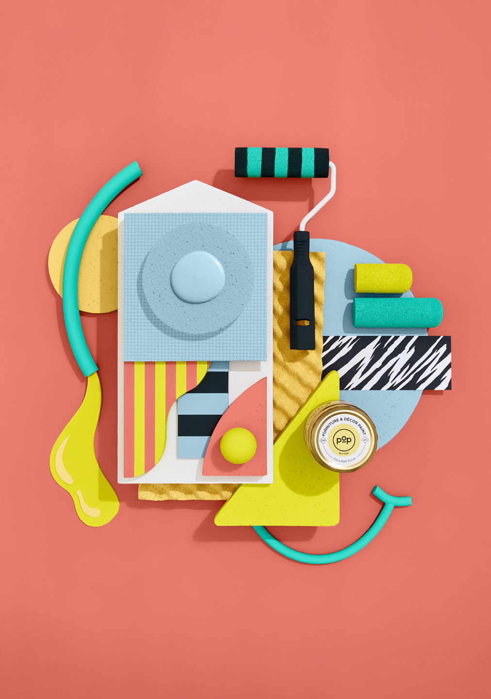
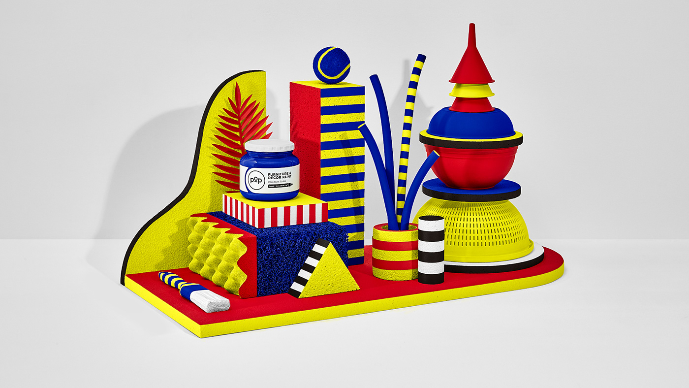
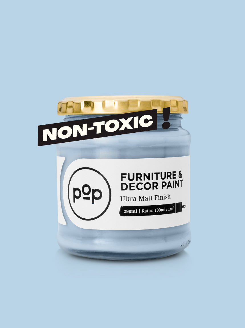
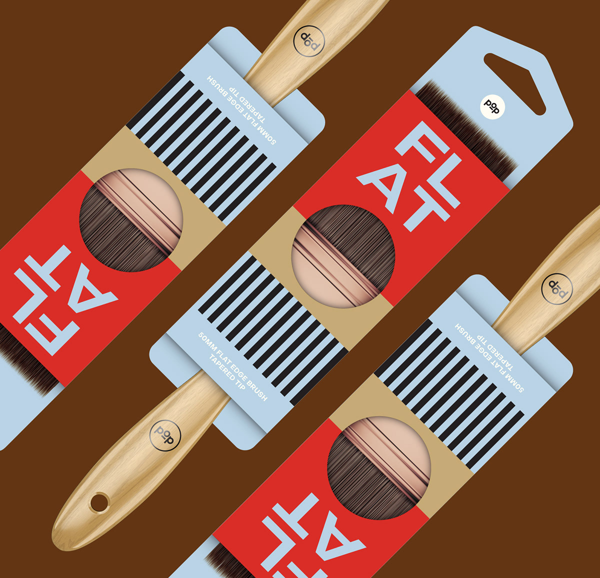
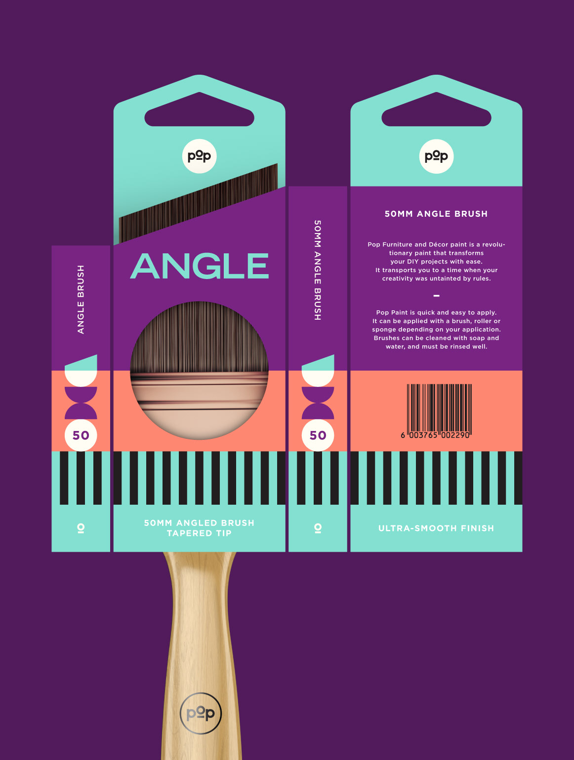
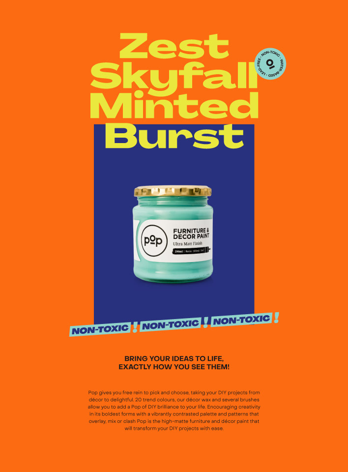
Packaging
Like everything else Pop, our packaging has been designed to make an impact using bold color with careful consideration paid to combining complementary hues. Accessories are similarly designed to stand out on shelf, eschewing the typical hardware store aesthetic for a much more designful approach. Because this is a DIY brand, packaging provides whatever information a customer may require to fulfil their DIY needs. Friendly and useful, thats Pop.

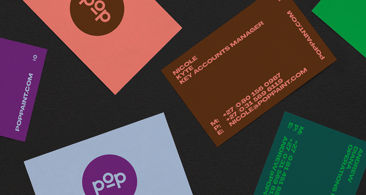
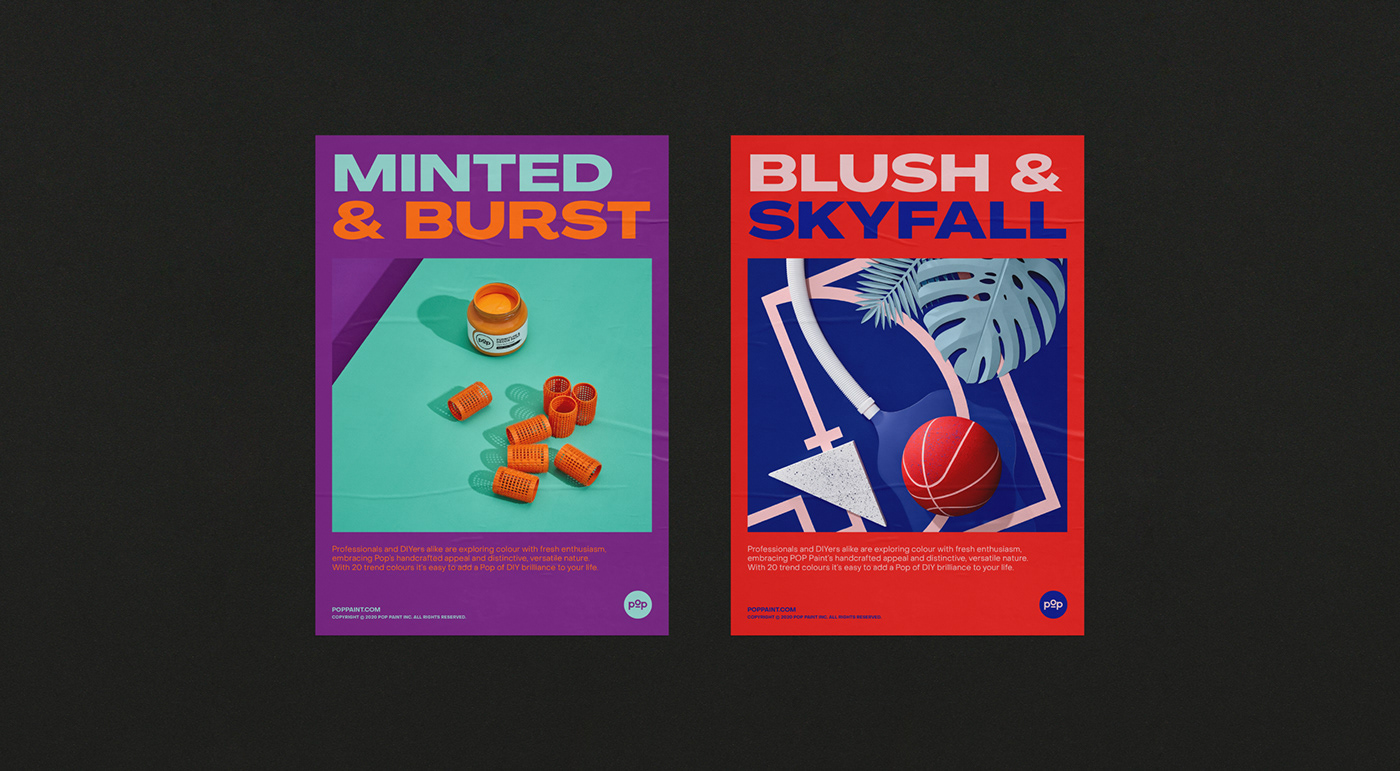
Print Collateral
Sharing the quirky, off-beat, non-conventional creativity inherent to Pop, stylistic quirks encourage exploration with upbeat, service-led content seeking to uplift and empower. Ultimately we are able to communicate in a way that entices the senses and evokes emotions through color and tactility encouraging creativity in its boldest forms.
For more information make sure to check out
 Abduzeedo is a collection of visual inspiration and useful tutorials