
An Interest In:
Web News this Week
- April 26, 2024
- April 25, 2024
- April 24, 2024
- April 23, 2024
- April 22, 2024
- April 21, 2024
- April 20, 2024
Some of Our Sources
- Simplebits
- The Logo Smith
- Fuel Your Creativity
- Inspiredology
- Fudge Graphics
- Wal You
- CSS Tricks
- Spyre Studios
- Daily Now
- TechPowerUp
Help Webnuz
Referal links:
Why a PWA app icon shouldn't have a purpose set to 'any maskable'
A Progressive Web App requires a web app manifest, a JSON file that contains the details of your app (things like the name and icons of your PWA).
An app manifest must have an array of icons. Each of these icons has a purpose set to either monochrome, any ormaskable or a combination of these three values.
Why is "any maskable" discouraged by Chrome?
Lately, I've noticed quite a few PWA app manifests displaying a warning that until mid-2021 didn't exist (those created with Progressier always work great though!):
Declaring an icon with purpose "any maskable" is discouraged. It is likely to look incorrect on some platforms due to too much or too little padding.
{ "icons": [ { "src": "icon1.png", "sizes": "196x196", "type": "image/png", "purpose": "any" }, { "src": "icon2.png", "sizes": "196x196", "type": "image/png", "purpose": "any maskable" // <-- triggers the warning }, ], }In this article, I'll show you exactly what Chrome means with that warning.
Where do my PWA icons show?
Here is a list of all places where the icons you set in your app manifest appear and which version of your icons each uses:
- Your Android home screen and Android Add-To-Home-Screen Prompt use the icon with the purpose
maskableif one exists in your manifest - The Android splash screen uses the icon with the purpose
anyif there is one in your manifest - All other platforms (Windows desktop icon, Mac OS desktop icon, Chrome OS installed app) use the icon with the purpose
anyif there is one in your manifest. - iOS/Safari requires an extra set of icons set with the
apple-touch-icon(home screen icon) andapple-touch-startup-imagemeta tags (splash screen)
Enter maskable icons
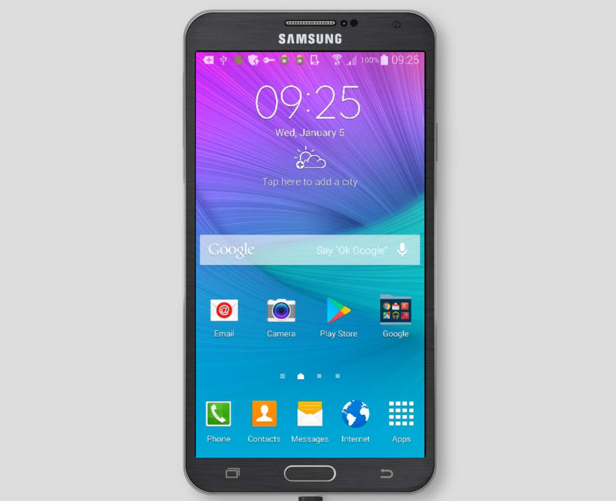
Until a few years ago, app icons on Android could have a transparent background and use any shape they wanted. And that frankly made your home screen quite messy. Look at that Samsung Galaxy Note 4 from 2014:
Since then, smartphones vendors probably in a effort to emulate iOS standardized app icons. On a given home screen, every app icon has the same size and shape.
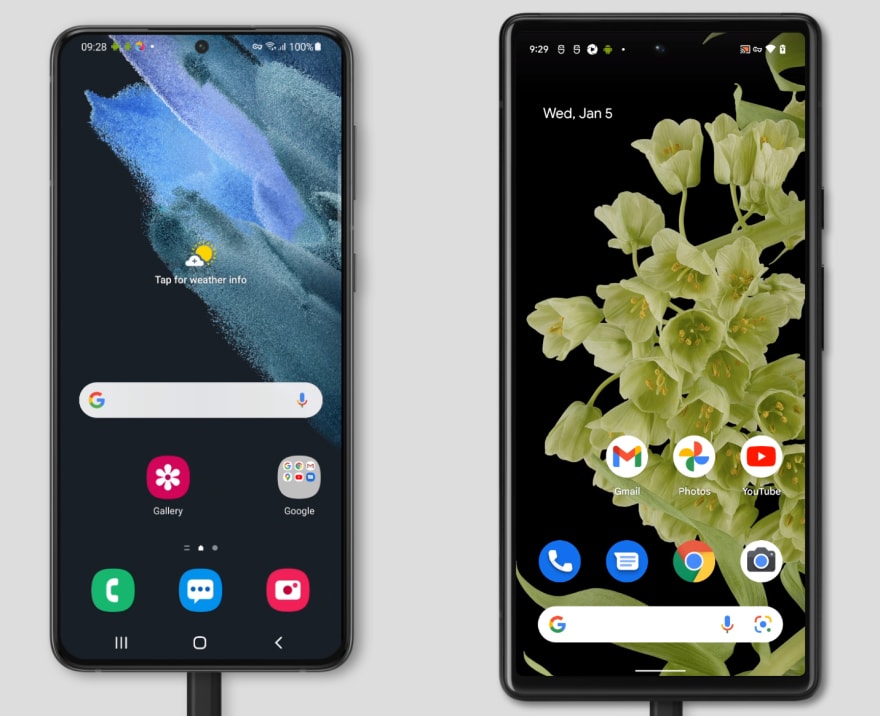
Samsung Galaxy Note S21+ (Square icons with rounded corners) vs Google Pixel 6 (circular icons)
Thankfully, the W3C folks came up with the maskable icon feature. A maskable icon is one that has a safe zone that is cropped so that the icon can be displayed within a variety of shapes and occupy the entire space available.
(I say "thankfully" because just imagine the mess it would have become if developers had to provide a different icon for each possible shape.)
Here is how a Android home screen renders the same PNG image with the purpose set to maskable (left) and set to any (right)
Now, let's make things interesting and see how different components of your PWA render an icon with a purpose set to a hybrid any maskable.
Bad Example 1: White icon on gradient background
{ "src": "white-icon-on-gradient-background.png", "sizes": "512x512", "type": "image/png", "purpose": "any maskable" }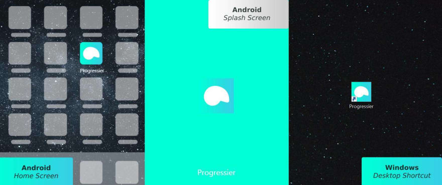
It works great on a Android home screen, but does not blend in properly on a splash screen. It's only okay-ish on desktop as Windows doesn't automatically add rounded corners to that icon.
If the background was a solid color instead of a gradient that matches the theme_color we set in the manifest, it would be acceptable if we're willing to be a bit forgiving with the desktop look.
Bad Example 2: White icon on transparent background
{ "src": "white-icon-on-transparent-background.png", "sizes": "512x512", "type": "image/png", "purpose": "any maskable" }
It works great on a splash screen as the theme_color from your manifest is used as background. It's acceptable on desktop, although it completely loses all traces of branding. But on mobile, the icon isn't visible at all. White on white never works great .
Bad Example 3: Solid icon on transparent background
{ "src": "solid-icon-on-transparent-background.png", "sizes": "512x512", "type": "image/png", "purpose": "any maskable" }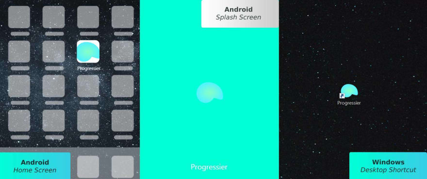
Now it looks good on desktop, but I'll have to change my theme_color to #ffffff if I want the splash screen to look decent.
Worse though, the Android home screen treats my icon as maskable and crops it awfully. If I added more padding around my icon, then I'll be able to make it look okay on my Android home screen. But then it would be really small on desktop/splash screens.
The solution
You get the idea: it's very hard to get one single image file to render optimally everywhere. So using any maskable is almost always a bad idea, hence the warning displayed by Chrome in your web app manifest.
The perfect solution, unfortunately, isn't that easy to implement. You need three sets of icons, and render the manifest dynamically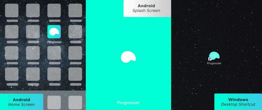
Desktop Manifest
{ "src": "solid-icon-on-transparent-background.png", "sizes": "512x512", "type": "image/png", "purpose": "any"},Android Manifest
{ "src": "white-icon-on-transparent-background.png", "sizes": "512x512", "type": "image/png", "purpose": "any" },{ "src": "white-icon-on-gradient-background.png", "sizes": "512x512", "type": "image/png", "purpose": "maskable" }That said, if you're okay with your app icon being overlaid on top of white background, you can probably get away with two sets of icons only. One icon with the purpose any and a transparent background. And another with the purpose maskable, a solid color as background and extra padding.
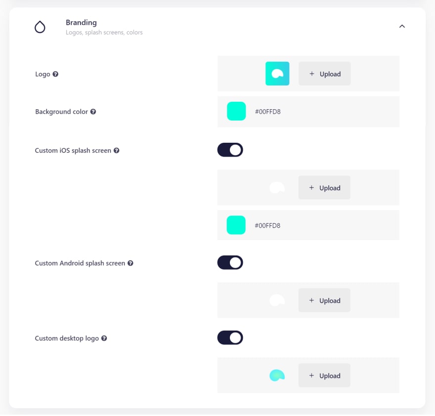
(Alternatively, use Progressier it's much easier ).
Original Link: https://dev.to/progressier/why-a-pwa-app-icon-shouldnt-have-a-purpose-set-to-any-maskable-4c78
Dev To
More About this Source Visit Dev To