
An Interest In:
Web News this Week
- April 27, 2024
- April 26, 2024
- April 25, 2024
- April 24, 2024
- April 23, 2024
- April 22, 2024
- April 21, 2024
Some of Our Sources
- Just Creative
- Six Revisions
- My Ink Blog
- Line 25
- Wal You
- Web Resource Source
- Codrops
- Willems Lab
- Daily Now
- Hashedout
Help Webnuz
Referal links:
Building a Tailwind CSS dropdown component
Tailwind CSS is a utility-first framework that I've been using for most of my projects this year and I can't find any good reason to go back to other frameworks such as Bootstrap or Foundation.
Despite that I did found a pretty big drawback because Tailwind CSS does not provide a base set of components that you can use to get build websites even faster.
That is why I started a tutorial series here on the DEV community on how to build the most commonly used web components using the utility classes from Tailwind CSS and Vanilla JavaScript.
Previously I showed you how to build Tailwind CSS card components and today I'll show something more advanced: how to build a Tailwind CSS dropdown element.
Let's get started.
Tailwind CSS dropdown
First things first, we need to build the HTML. Let's create a button and use the styles from this Tailwind CSS button from the Flowbite library.
<button class="text-white bg-blue-700 hover:bg-blue-800 focus:ring-4 focus:ring-blue-300 font-medium rounded-lg text-sm px-4 py-2.5 text-center inline-flex items-center" type="button">Dropdown button <svg class="w-4 h-4 ml-2" fill="none" stroke="currentColor" viewBox="0 0 24 24" xmlns="http://www.w3.org/2000/svg"><path stroke-linecap="round" stroke-linejoin="round" stroke-width="2" d="M19 9l-7 7-7-7"></path></svg></button>Now let's also set up the HTML of the menu itself.
<button class="text-white bg-blue-700 hover:bg-blue-800 focus:ring-4 focus:ring-blue-300 font-medium rounded-lg text-sm px-4 py-2.5 text-center inline-flex items-center" type="button" data-dropdown-toggle="dropdown">Dropdown button <svg class="w-4 h-4 ml-2" fill="none" stroke="currentColor" viewBox="0 0 24 24" xmlns="http://www.w3.org/2000/svg"><path stroke-linecap="round" stroke-linejoin="round" stroke-width="2" d="M19 9l-7 7-7-7"></path></svg></button><!-- Dropdown menu --><div class="hidden bg-white text-base z-50 list-none divide-y divide-gray-100 rounded shadow my-4"> <div class="px-4 py-3"> <span class="block text-sm">Bonnie Green</span> <span class="block text-sm font-medium text-gray-900 truncate">[email protected]</span> </div> <ul class="py-1" aria-labelledby="dropdown"> <li> <a href="#" class="text-sm hover:bg-gray-100 text-gray-700 block px-4 py-2">Dashboard</a> </li> <li> <a href="#" class="text-sm hover:bg-gray-100 text-gray-700 block px-4 py-2">Settings</a> </li> <li> <a href="#" class="text-sm hover:bg-gray-100 text-gray-700 block px-4 py-2">Earnings</a> </li> <li> <a href="#" class="text-sm hover:bg-gray-100 text-gray-700 block px-4 py-2">Sign out</a> </li> </ul></div>As you can see we've already applied the styles to the menu and we use the hidden class to hide it by default, since we only want it shown when we click on the button.
If we include the Flowbite library's JavaScript into our project via CDN or NPM, we'll be able to use data attributes to connect the button with the dropdown menu.
Include the following JavaScript before the closing of the <body> tag:
<script src="https://unpkg.com/@themesberg/flowbite@latest/dist/flowbite.bundle.js"></script>Great! Now let's add the data-dropdown-toggle="dropdown" attribute to the button, where dropdown is the id of the dropdown menu element's id.
We also have to add id="dropdown" to the dropdown menu element.
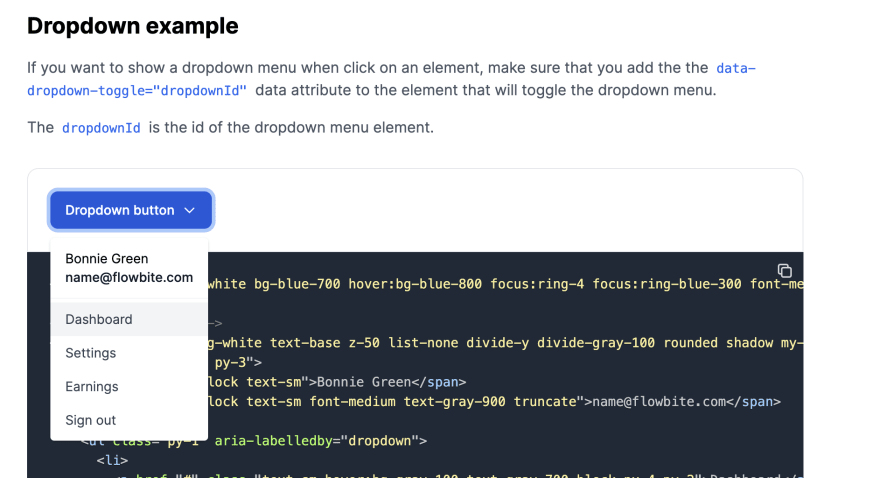
<button class="text-white bg-blue-700 hover:bg-blue-800 focus:ring-4 focus:ring-blue-300 font-medium rounded-lg text-sm px-4 py-2.5 text-center inline-flex items-center" type="button" data-dropdown-toggle="dropdown">Dropdown button <svg class="w-4 h-4 ml-2" fill="none" stroke="currentColor" viewBox="0 0 24 24" xmlns="http://www.w3.org/2000/svg"><path stroke-linecap="round" stroke-linejoin="round" stroke-width="2" d="M19 9l-7 7-7-7"></path></svg></button><!-- Dropdown menu --><div class="hidden bg-white text-base z-50 list-none divide-y divide-gray-100 rounded shadow my-4" id="dropdown"> <div class="px-4 py-3"> <span class="block text-sm">Bonnie Green</span> <span class="block text-sm font-medium text-gray-900 truncate">[email protected]</span> </div> <ul class="py-1" aria-labelledby="dropdown"> <li> <a href="#" class="text-sm hover:bg-gray-100 text-gray-700 block px-4 py-2">Dashboard</a> </li> <li> <a href="#" class="text-sm hover:bg-gray-100 text-gray-700 block px-4 py-2">Settings</a> </li> <li> <a href="#" class="text-sm hover:bg-gray-100 text-gray-700 block px-4 py-2">Earnings</a> </li> <li> <a href="#" class="text-sm hover:bg-gray-100 text-gray-700 block px-4 py-2">Sign out</a> </li> </ul></div>The final result should look like this:
Whenever you click on the button it will open the dropdown menu and when clicking outside it will close it. You can use this element anywhere on your website.
Flowbite - Tailwind CSS component library
This Tailwind CSS dropdown component is part of a larger and open-source component library called Flowbite.

Learn more about how you can get started with this Tailwind CSS component library by following the quickstart guide from the online documentation.
Original Link: https://dev.to/themesberg/building-a-tailwind-css-dropdown-component-ban
Dev To
 An online community for sharing and discovering great ideas, having debates, and making friends
More About this Source Visit Dev To