
An Interest In:
Web News this Week
- April 1, 2024
- March 31, 2024
- March 30, 2024
- March 29, 2024
- March 28, 2024
- March 27, 2024
- March 26, 2024
Some of Our Sources
View All SourcesHelp Webnuz
Referal links:
Introduction to styled-components (CSS-in-JS) in React
styled-components provides a way to write CSS-in-JS. It was created to enhance the way CSS is written when styling React components. This tutorial will provide an introduction to styled-components so you can decide if its an approach you would like to use in future or existing React applications.
For the purposes of this tutorial well create a simple component with some text and buttons like the following:
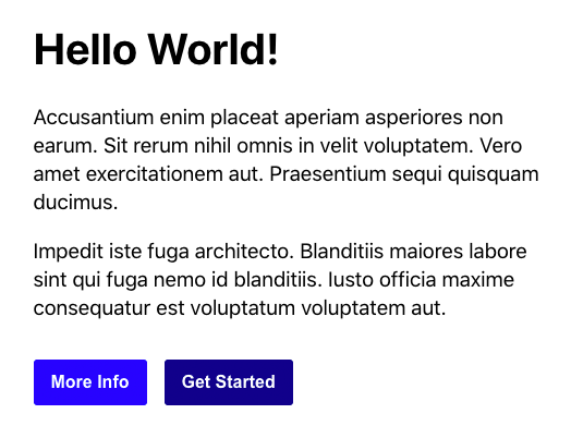
Heres how the markup for this component would be structured with traditional HTML:
<div class="welcome"> <h1>Hello World!</h1> <p> Accusantium enim placeat aperiam asperiores non earum. Sit rerum nihil omnis in velit voluptatem. Vero amet exercitationem aut. Praesentium sequi quisquam ducimus. </p> <p> Impedit iste fuga architecto. Blanditiis maiores labore sint qui fuga nemo id blanditiis. Iusto officia maxime consequatur est voluptatum voluptatem aut. </p> <button type="button" class="btn btn-light">More Info</button> <button type="button" class="btn btn-dark">Get Started</button></div>And the CSS would look something like this:
.welcome { margin: auto; max-width: 480px; }h1 { margin-top: 0; font-size: 2.5em; }p { line-height: 1.4em; font-size: 1.2em;}.btn { border: none; border-radius: 3px; color: white; font-size: 1em; font-weight: bold; margin: 1em 1em 0 0; padding: 0.75em 1em; }.btn-light { background-color: blue;}.btn-dark { background-color: darkblue;}Lets now go through the process of converting this HTML and CSS into a styled-component.
Installation
The styled-components framework can be installed using either NPM or Yarn:
npm install styled-componentsyarn add styled-componentsThen imported into React as follows:
import styled from "styled-components";Creating components
First thing we need to do is convert the HTML markup into component based markup:
<Welcome> <Heading>Hello World!</Heading> <Paragraph> Accusantium enim placeat aperiam asperiores non earum. Sit rerum nihil omnis in velit voluptatem. Vero amet exercitationem aut. Praesentium sequi quisquam ducimus. </Paragraph> <Paragraph> Impedit iste fuga architecto. Blanditiis maiores labore sint qui fuga nemo id blanditiis. Iusto officia maxime consequatur est voluptatum voluptatem aut. </Paragraph> <Button light>More Info</Button> <Button dark>Get Started</Button></Welcome>Styling components
styled-components utilises tagged template literals to style components. So in order to style our components we need to declare a variable that matches the component name and define what type of HTML element to render (div, h1, p, or button):
const Welcome = styled.div` margin: auto; max-width: 480px; `;const Heading = styled.h1` margin-top: 0; font-size: 2.5em;`;const Paragraph = styled.p` line-height: 1.4em; font-size: 1.2em;`;const Button = styled.button` border: none; border-radius: 3px; color: white; font-size: 1em; font-weight: bold; margin: 1em 1em 0 0; padding: 0.75em 1em; `;Adjusting styling using props
You may have noticed the buttons have a light & dark property attached to them. You can pass a function to a styled components template literal to modify the styling based on the property provided. Well change the background color to be light or dark:
const Button = styled.button` ... background-color: ${(props) => (props.light ? "blue" : "darkblue")};`;Conclusion
CSS-in-JS was one of those things I was reluctant to use at first but after spending some time working with styled-components its something Ive grown to enjoy. If youre interested in learning more about styled-components the full documentation can be found here.
Original Link: https://dev.to/michaelburrows/introduction-to-styled-components-css-in-js-in-react-2dd6
Dev To
 An online community for sharing and discovering great ideas, having debates, and making friends
More About this Source Visit Dev To