
Some of Our Sources
- TutsPlus - Code
- Smashing Magazine
- Web Designer Depot
- FanExtra - PSD
- Noupe
- My Ink Blog
- Stylized Web
- CSS Tricks
- Spyre Studios
- Design Modo
Help Webnuz
Referal links:
May 12, 2021 07:06 pm GMT
Original Link: https://dev.to/zubair12/css-penguin-design-3nk7
CSS Penguin Design
Hi friends here I have another complex design for you.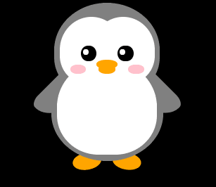
CSS Code:
.penguin { --penguin-skin: gray; position: relative; margin: auto; display: block; margin-top: 5%; width: 300px; height: 300px; } .penguin-top { top: 10%; left: 25%; /* Change code below this line */ background:var(--penguin-skin); /* Change code above this line */ width: 50%; height: 45%; border-radius: 70% 70% 60% 60%; } .penguin-bottom { top: 40%; left: 23.5%; /* Change code below this line */ background:var(--penguin-skin); /* Change code above this line */ width: 53%; height: 45%; border-radius: 70% 70% 100% 100%; } .right-hand { top: 0%; left: -5%; /* Change code below this line */ background:var(--penguin-skin); /* Change code above this line */ width: 30%; height: 60%; border-radius: 30% 30% 120% 30%; transform: rotate(45deg); z-index: -1; } .left-hand { top: 0%; left: 75%; /* Change code below this line */ background:var(--penguin-skin); /* Change code above this line */ width: 30%; height: 60%; border-radius: 30% 30% 30% 120%; transform: rotate(-45deg); z-index: -1; } .right-cheek { top: 15%; left: 35%; background: white; width: 60%; height: 70%; border-radius: 70% 70% 60% 60%; } .left-cheek { top: 15%; left: 5%; background: white; width: 60%; height: 70%; border-radius: 70% 70% 60% 60%; } .belly { top: 60%; left: 2.5%; background: white; width: 95%; height: 100%; border-radius: 120% 120% 100% 100%; } .right-feet { top: 85%; left: 60%; background: orange; width: 15%; height: 30%; border-radius: 50% 50% 50% 50%; transform: rotate(-80deg); z-index: -2222; } .left-feet { top: 85%; left: 25%; background: orange; width: 15%; height: 30%; border-radius: 50% 50% 50% 50%; transform: rotate(80deg); z-index: -2222; } .right-eye { top: 45%; left: 60%; background: black; width: 15%; height: 17%; border-radius: 50%; } .left-eye { top: 45%; left: 25%; background: black; width: 15%; height: 17%; border-radius: 50%; } .sparkle { top: 25%; left: 15%; background: white; width: 35%; height: 35%; border-radius: 50%; } .blush-right { top: 65%; left: 15%; background: pink; width: 15%; height: 10%; border-radius: 50%; } .blush-left { top: 65%; left: 70%; background: pink; width: 15%; height: 10%; border-radius: 50%; } .beak-top { top: 60%; left: 40%; background: orange; width: 20%; height: 10%; border-radius: 50%; } .beak-bottom { top: 65%; left: 42%; background: orange; width: 16%; height: 10%; border-radius: 50%; } body { background: black; } .penguin * { position: absolute; }</style>HTML Code:
<div class="penguin-bottom"> <div class="right-hand"></div> <div class="left-hand"></div> <div class="right-feet"></div> <div class="left-feet"></div> </div> <div class="penguin-top"> <div class="right-cheek"></div> <div class="left-cheek"></div> <div class="belly"></div> <div class="right-eye"> <div class="sparkle"></div> </div> <div class="left-eye"> <div class="sparkle"></div> </div> <div class="blush-right"></div> <div class="blush-left"></div> <div class="beak-top"></div> <div class="beak-bottom"></div> </div></div>Original Link: https://dev.to/zubair12/css-penguin-design-3nk7
Share this article:
Tweet

View Full Article
Dev To
 An online community for sharing and discovering great ideas, having debates, and making friends
More About this Source Visit Dev To