
An Interest In:
Web News this Week
- April 4, 2024
- April 3, 2024
- April 2, 2024
- April 1, 2024
- March 31, 2024
- March 30, 2024
- March 29, 2024
Some of Our Sources
- Team Treehouse
- Just Creative
- Joshua Blankenship
- Six Revisions
- TutsPlus - Design
- Noupe
- Fudge Graphics
- Web Design Ledger
- Hashedout
- The Verge
Help Webnuz
Referal links:
Get started with Flexbox.
What is Flexbox?
Flexbox is a layout in CSS3. Flexbox is used to make responsive layouts and components on a webpage. Using is a good choice to use in CSS so you can design the page responsively. Here is a basic guide to getting starting with flexbox.
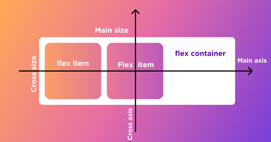
Consider the above image and try to understand a layout there is one container, and inside that two elements are placed. This is an important part to understand, then using flexbox will be easy. Now plot that container into an x-y axis coordinate, horizontal part in flexbox called the Main axis and vertical part is called the Cross axis.
Using Flexbox
Give property of display: flex; to element for using flexbox.
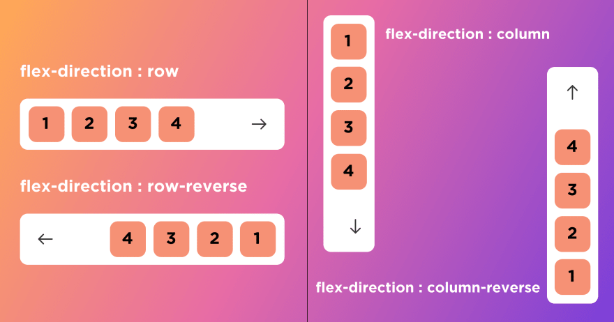
Flex-direction
Flex-direction property is used to give direction to element should be placed, four types of properties are defined.
flex-direction: row;place flex-items in row (horizontal).-
flex-direction: row-reverse;place flex-items in row but in reverse order. -
flex-direction: column;place flex-items in column (vertical). -
flex-direction: column-reverse;place flex-items in column but in reverse order.
You can see in the example below.
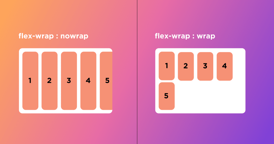
Flex-wrap
Flex-wrap property is used for wrapping flex-items inside the flex-container.
flex-wrap : nowrapwill not wrap flex-item in flex-container.flex-wrap : wrapwill wrap flex-item in flex-container if it not fit in container size.
You can see in the example below.
Justifying and aligning flex-item
Now, this is a very important property of flexbox and you will use it regularly.
Whenever we want to align flex-item to the Main axis (horizontally) use justify-content, and if you want to align flex-items to the Cross axis (vertically) use align-items. Now let's see in detail.
Justifying content along with the Main axis (Horizontally).
justify-content: flex-startwill place flex-item to the start of flex-container (refer the first image above)justify-content: flex-endwill place flex-item to the end of flex-containerjustify-content: centerto center flex-items.justify-content: space-around` space up around item.justify-content: space-betweenuses the whole frame and space item between.justify-content: space-evenlyspace all item evenly
Aligning content along with the Cross axis (vertically).
All properties are the same as justify-content .
align-items: flex-startwill place flex-item to the start of flex-container (refer the first image above)align-items: flex-endwill place flex-item to the end of flex-containersalign-items: centerto center flex-items.align-items: baselineplace flex-item to base item.
Tip: Flexbox is a good option for centering things in CSS. Make sure whatever element you want to center their parent element would have width and height defined and give parent element justify-content: center and align-items: center .
Thanks for reading.
Original Link: https://dev.to/virensuthar/get-started-with-flexbox-3in5
Dev To
 An online community for sharing and discovering great ideas, having debates, and making friends
More About this Source Visit Dev To