

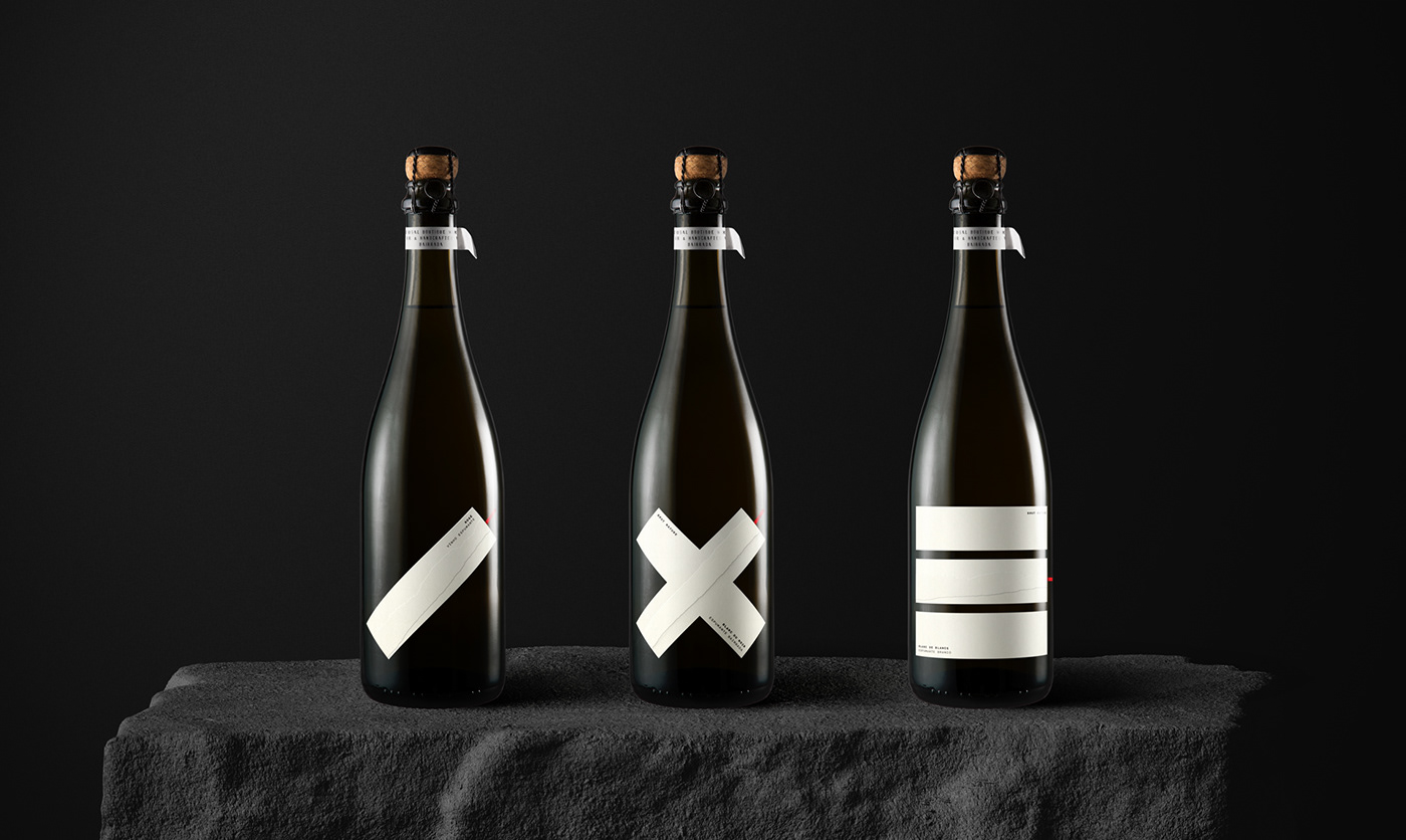
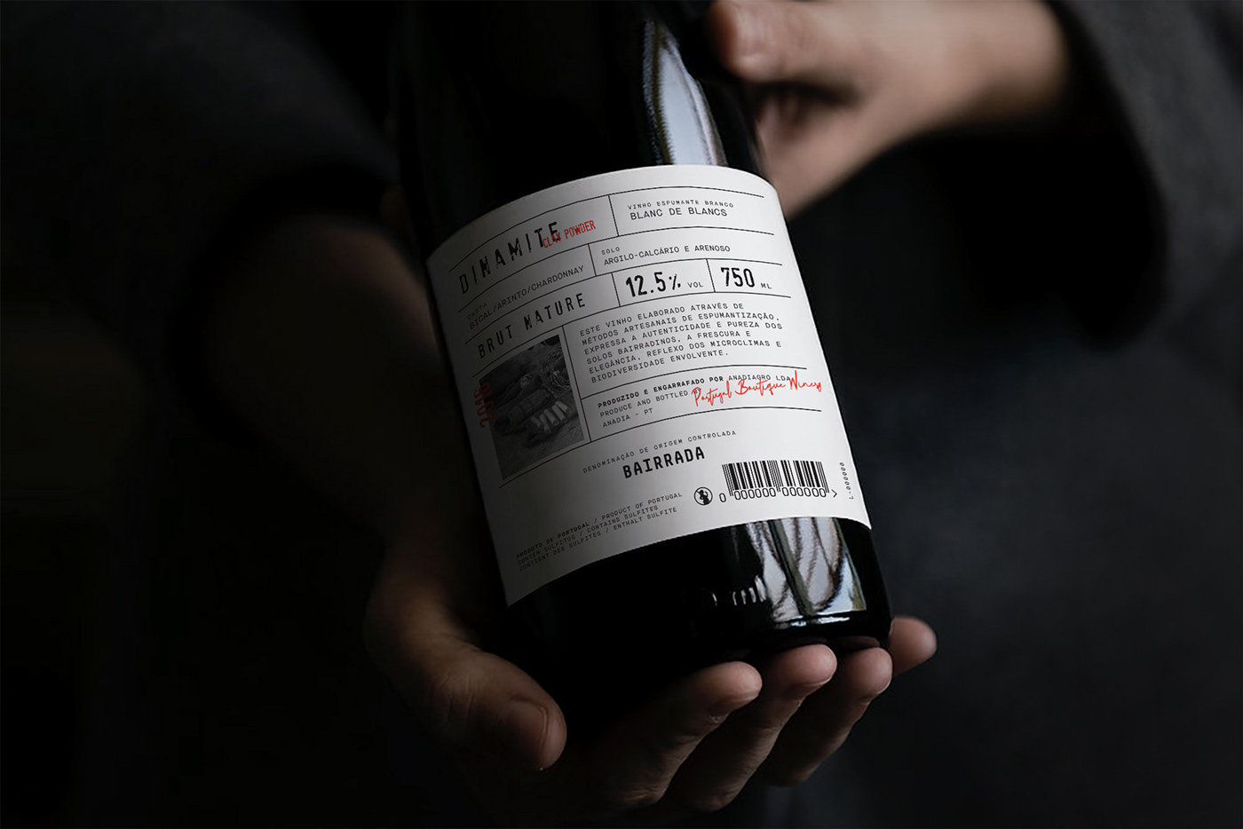
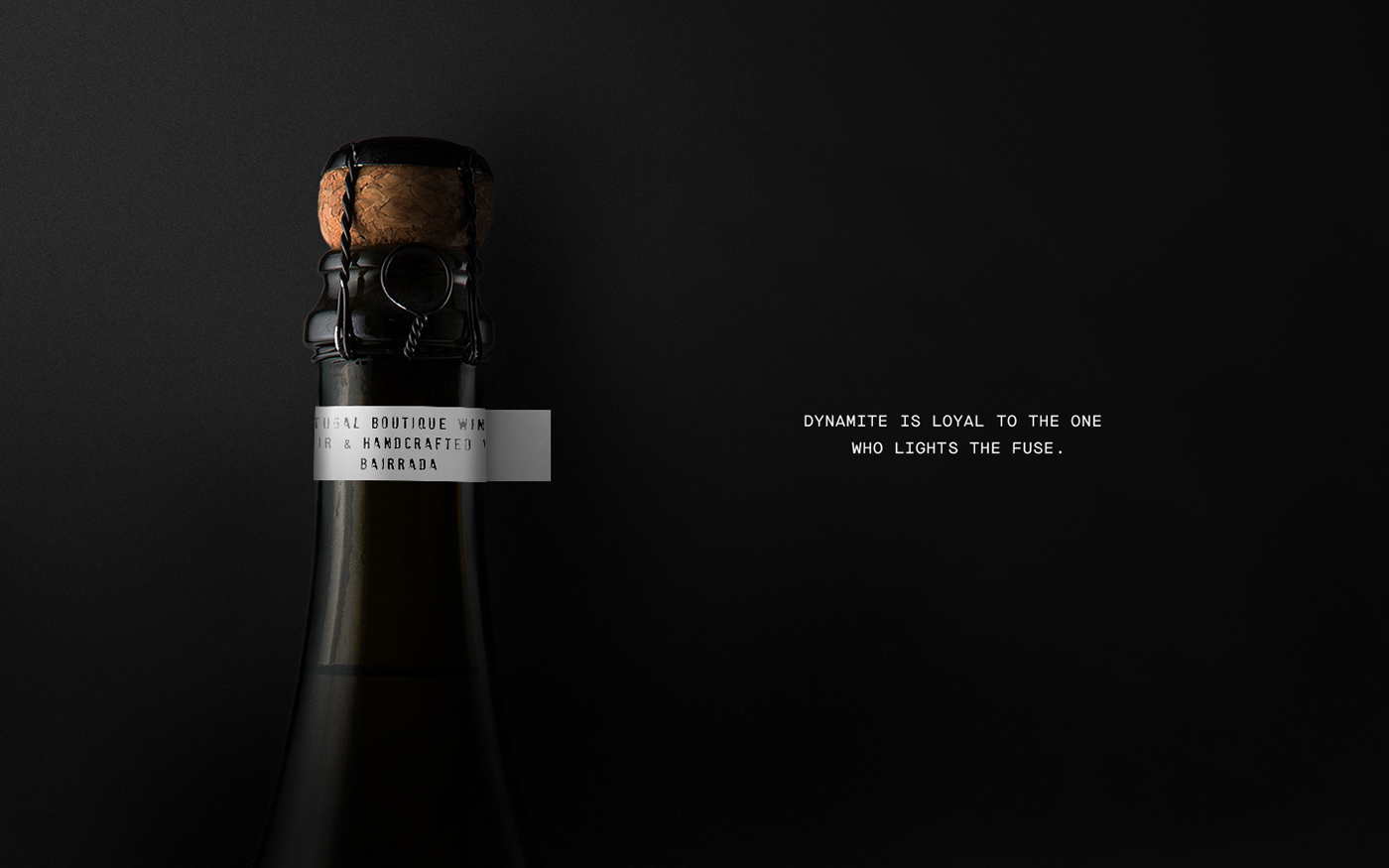
327 creative studio shared a very elegant branding and packaging design for a an unique sparkling wine collection, from the clay-limestone soils of Bairrada, Portugal. With a distinctive and bold identity, the concept of this 3 bottle edition, comes from its own name - Dinamite.
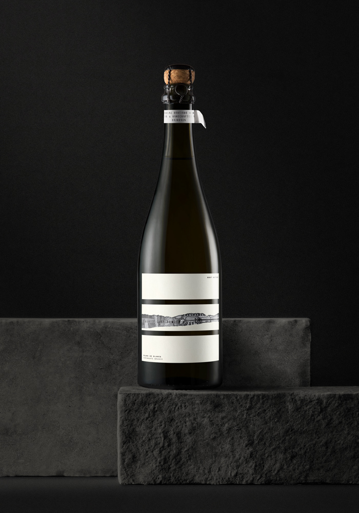
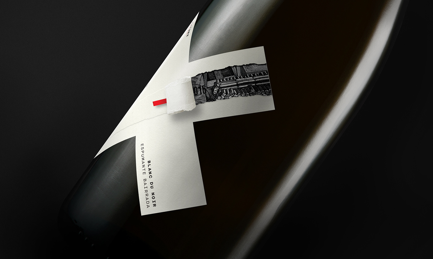
The identity developed for this project arose from the need to differentiate and number the three wines. Accordingly, we created 3 geometric sets - based on the dynamite silhouette - that became the face of this collection. With the intention of creating a label that would allow the consumer to interact with the product and express the metaphorical representation of "explosion", we used an overlay label with a "fuse" that you can pull and rip,revealing the name of the product.


 Abduzeedo is a collection of visual inspiration and useful tutorials