

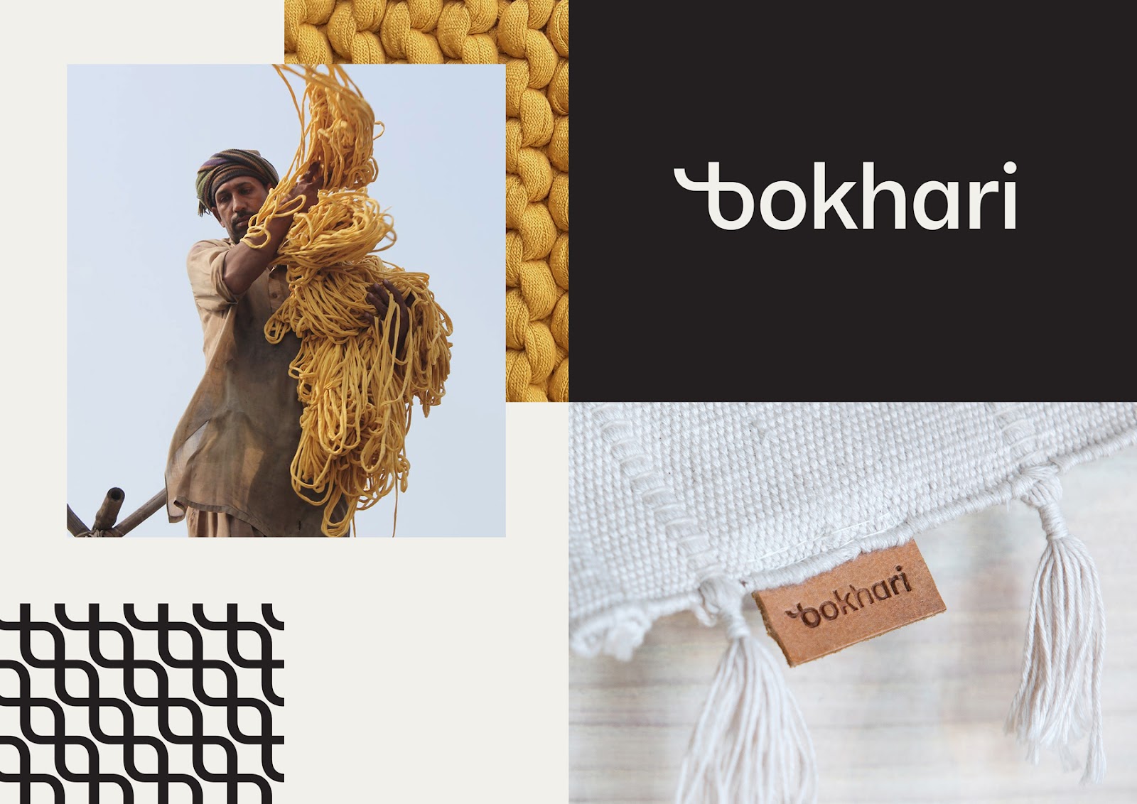
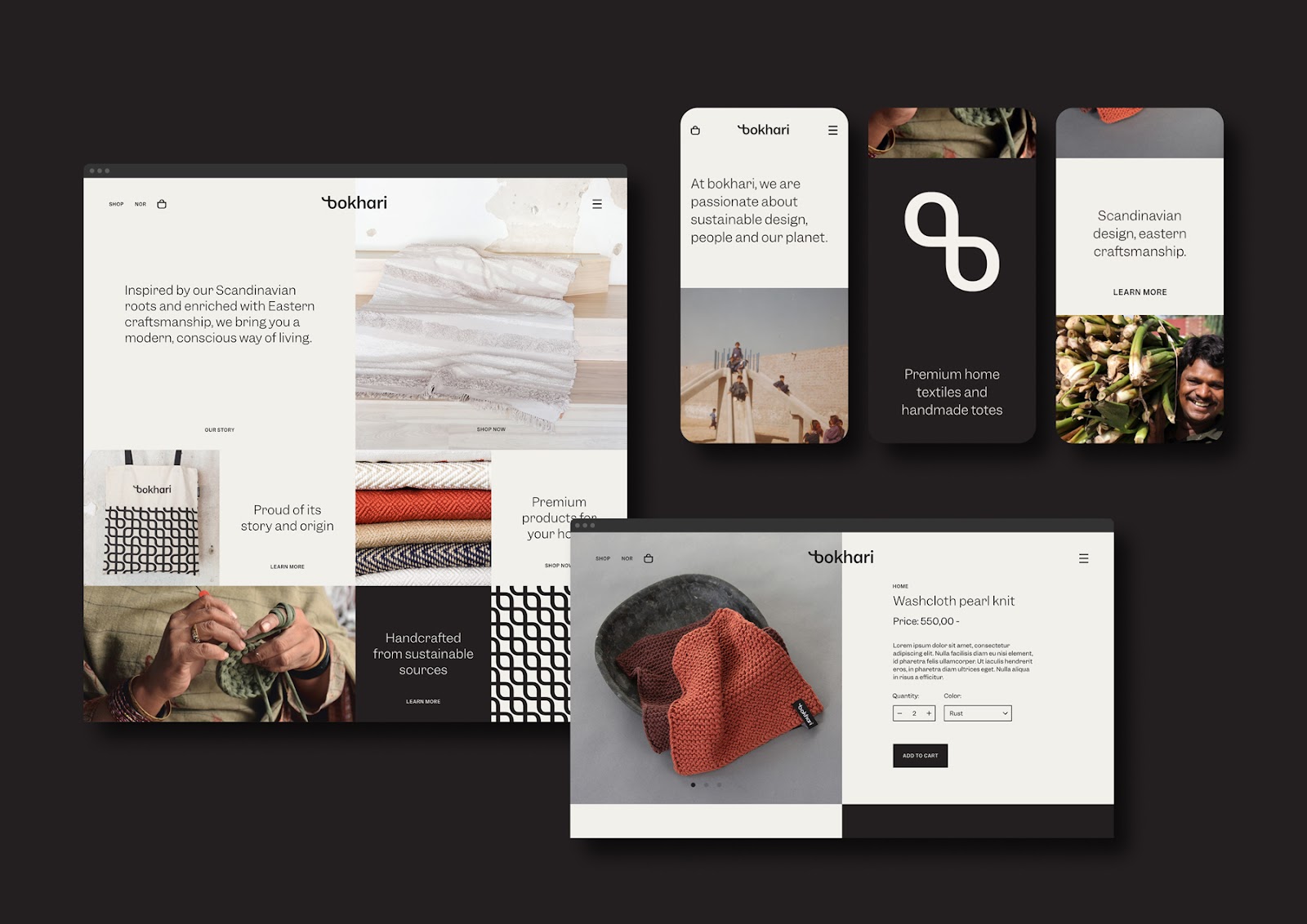
Tank Design was responsible for the branding and visual identity for Bokhari, a Norwegian brand that produces premium, hand-crafted interior textiles and bags. They combine Scandinavian design values with eastern tradition and craftsmanship. As a social enterprise, Bokhari improves the lives of its employees, funds the education of their children over 700 girls and boys, and supports the provision of clean drinking water in Sultan Town, Pakistan.
Sustainability, continuity and engagement with peoples lives are not only core values of the Bokhari brand but also notions that we found key to the craft of textile production itself. The designers at Tank created a visual identity that emphasizes this connection in a memorable way. design process began with visual research on the history of textile production, weaving techniques and their different forms.
This project is an example of successful collaboration between client and designers towards establishing a brand with a growing positive impact on society.
Design
Tankdesign process began with visual research on the history of textile production, weaving techniques and their different forms. Fascinated by the abundance of stories that the clients shared with us, together they formed a conceptual framework, where the textile fabric itself became a metaphor for a connected storyline. The rhythmic weaving patterns visually represented "paragraphs" with their repeating motifs, standing for the "words".
Furthermore, this project provided an opportunity for the whole Tank team, as graphic designers, to reflect on the nature of our own profession, which historically has its roots in the creation of textile patterns.
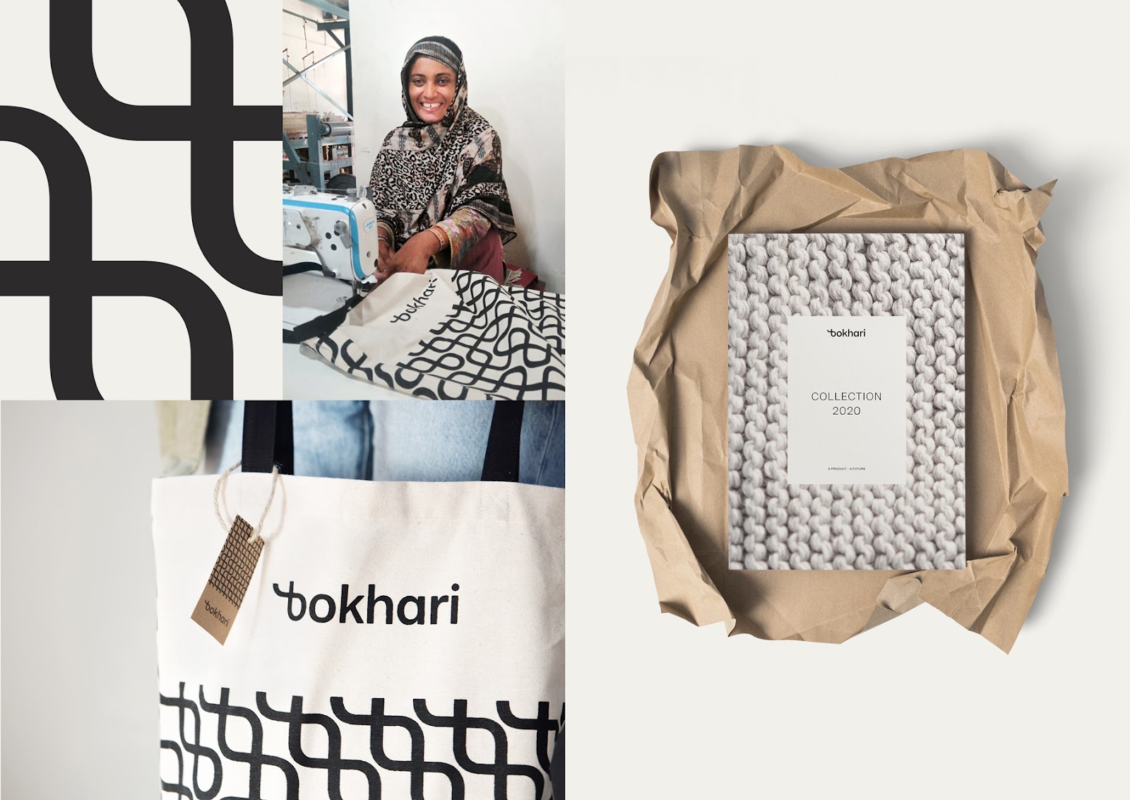
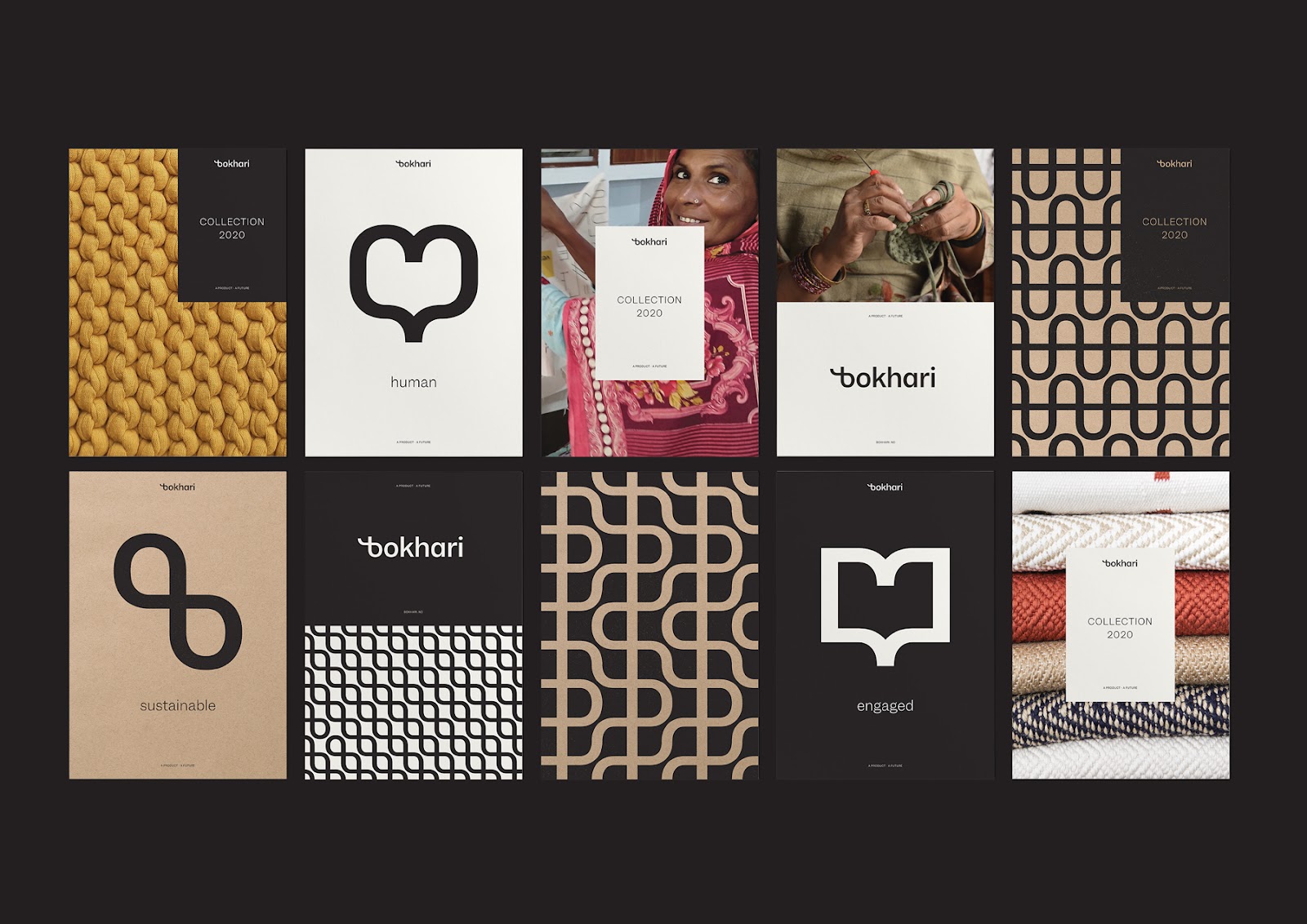
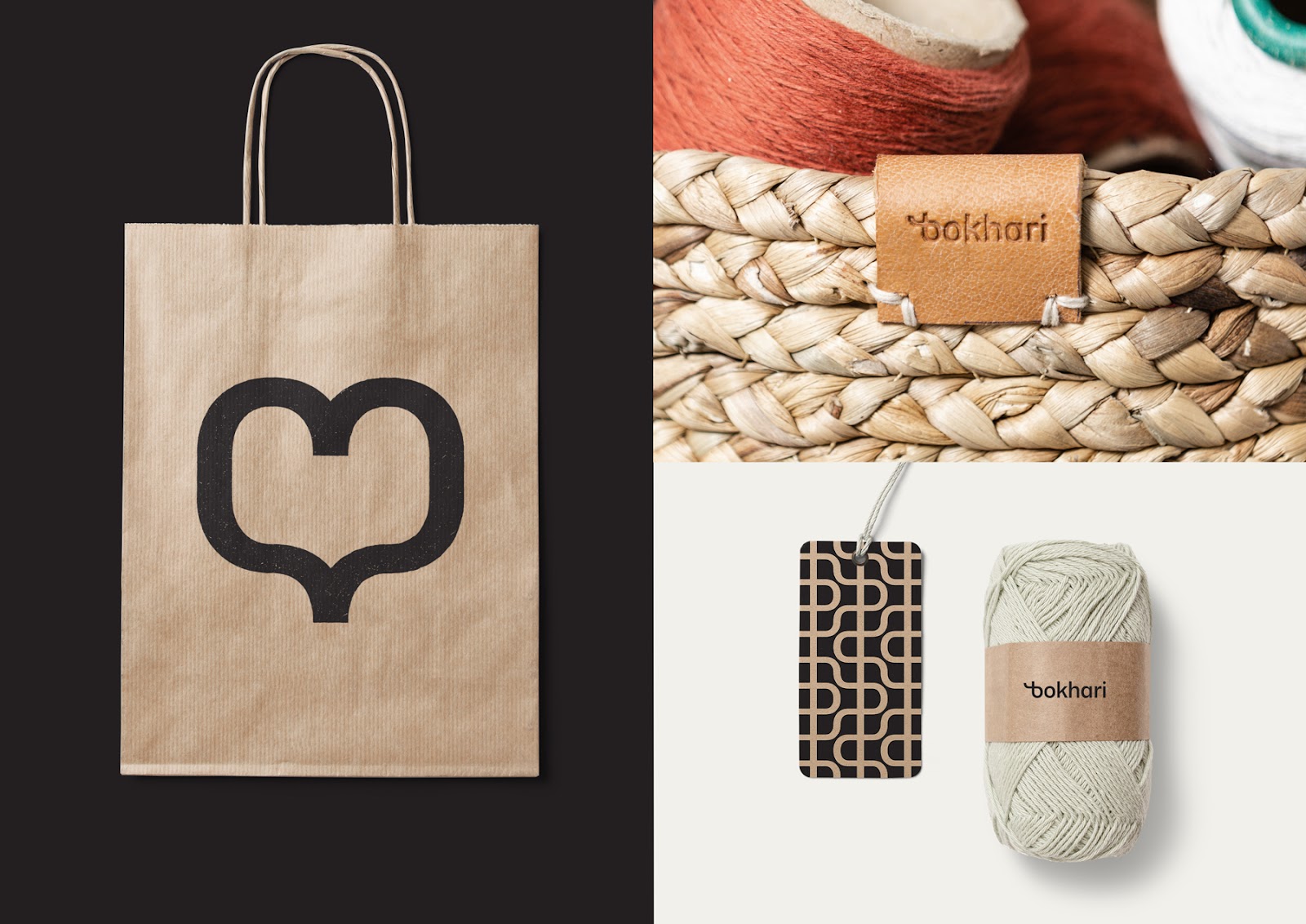
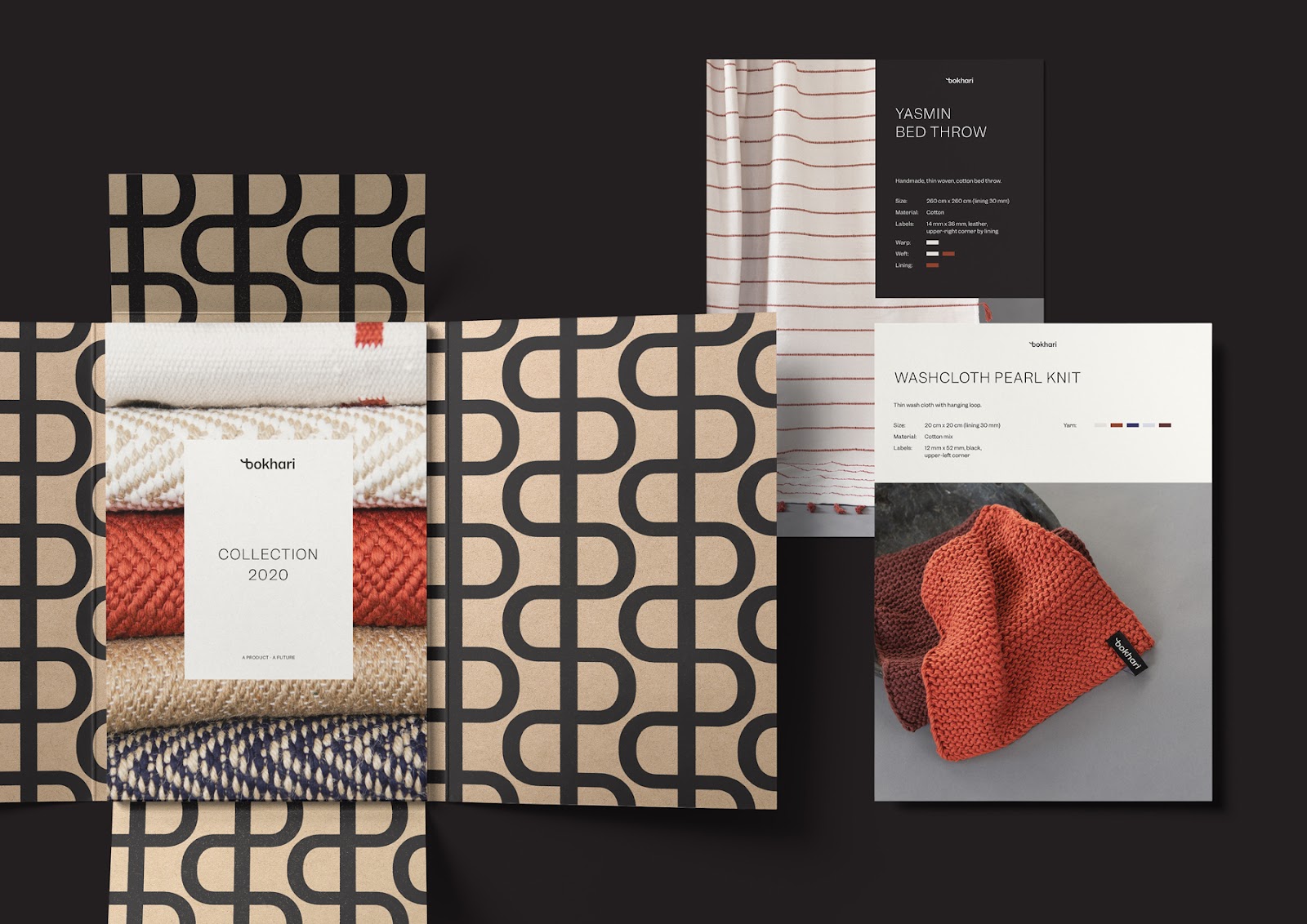
Following the fabric-story-type concept they created a custom letter b as a stylized weaving knot.
This initial motif provided us the seed to create a distinctive logotype along with a set of elaborate patterns, all revolving around a grid of inherited typographic proportions. Reused in multiple combinations, the visual elements become a playful "toolbox" which serves as a vehicle for Bokhari's brand.
Using solely black print on recycled paper, the resulting identity is monolithic in nature, yet flexible in use, striking a balance between abstract and concrete. The overall expression is a bridge between Scandinavian rationality and the sensitivity of the east, received equally positively by Bokharis customers, their own employees, as well as the children at the LAMS school in Pakistan.


 Abduzeedo is a collection of visual inspiration and useful tutorials