
An Interest In:
Web News this Week
- April 29, 2024
- April 28, 2024
- April 27, 2024
- April 26, 2024
- April 25, 2024
- April 24, 2024
- April 23, 2024
Some of Our Sources
- Techcrunch
- Six Revisions
- Abduzeedo
- TutsPlus - Design
- Creative Curio
- Web Designer Depot
- Noupe
- Web Design Ledger
- Wal You
- Dev To
Help Webnuz
Referal links:
10 Best Logo Colour Schemes & Combinations (With Examples)
Without a doubt, colour affects our emotions and behaviours and plays a critical role in designing a successful logo. Yet it’s one of the elements of logo design that small business owners who want to create their own logo feel the most uncertain about. So today, we’re going to help you understand a bit more about colour, how it affects our choices, and how to use it more effectively when creating your own logo.
Follow along with us over on our Envato Tuts+ YouTube channel:
Placeit’s Logo Maker
Before we begin, by the way, most of the examples of great logo design that we use here are taken from the Logo Maker at Placeit. The Logo Maker is a fun, hands-on, low-stress way for design novices to try out various logo ideas, get familiar with making design decisions, and understand how a logo is put together.

Best of all, it’s free and easy to use, though you'll pay a small fee to download your high-quality logo creations. Now on to the colour meaning in logo design.
What’s in a Logo Colour?
Colour psychology experts have studied how colour affects our emotions and behaviours for years. What they've found is that gender, personal preference, upbringing and culture can all diversify our responses to certain colours. Having said that, we share some commonality in how colour influences our choices, so if you want to know the best colours to use in your logo design then you first have to understand how and why people respond to colour and how using different colours will influence people’s perception of your brand.
Bear in mind, though, that the products or services you provide will and should influence the colours you use to represent your business. In his article, 'Color Psychology: How Colors Influence the Mind', writer Gregory Ciotti points out that, 'it’s the feeling, mood, and image that
your brand creates that play a role in persuasion ... colors only come into play when they can be used to match a
brand’s desired personality (i.e., the use of white to communicate
Apple’s love of clean, simple design).'
Colour Terms You Should Know
Before I get deep into the meaning associated with various colours, there are a few terms that are going to come up in this article, so let me define them for you before we get started.
Hue vs. Colour. Colour is an umbrella term used to describe hue, tint, tone, or shade, while hue refers to the dominant colour family of a specific colour on the colour wheel. e.g. Red is a hue, but pink is a tint (see below). Blue is a hue, but twilight is a shade (see below).
Tints. A tint is created when white is added to a hue, thus making the colour lighter, e.g. when white is added to red it creates pink.
Shades. A shade is created when black is added to a hue, thus making the colour darker, e.g. when black is added to blue, it creates twilight.
Tones. A tone is produced by mixing a hue with grey.
Primary Colours. There are three primary colours: red, blue, yellow.
Secondary Colours. Combining any two of those primary colours will give you a secondary colour. Red + Blue = Purple, Yellow + Blue = Green, Red + Yellow = Orange.
Tertiary Colours. A third set of colours called tertiary colours are created when equal amounts of a primary and a secondary colour that are adjacent to each other on the colour wheel are mixed, e.g. a mixture of 50% yellow and 50% green would result in the tertiary colour of yellow-green.

Warm colours. Red, yellow and orange evoke a warm feeling because they remind us of things like the sun or fire.
Cool colours. Blue, green and purple evoke cool feelings because they remind us of cool things like water or grass.
A Closer Look at Logo Colours
Now that we’ve gotten these terms out of the way, we can take a look at the emotional impact of colour:
Red
One of the primary colours, red is typically associated with strong or passionate emotions like love, confidence, excitement and passion and has been known to make people hungry. On the flip side, it's also associated with anger and danger.
Boxing Logo Maker for a Sports Club

Orange
Orange is a combination of the primary colours yellow and red. It's an energetic and refreshing colour that communicates enthusiasm, excitement, and warmth.
Cross Country Logo Creator for Kids

Yellow
A cheerful and warm colour, yellow is the most eye-catching of colours and is associated with optimism, self-esteem, extraversion, and friendliness. Yellow can conversely induce feelings of frustration and anger.
Real Estate Company Logo Maker

Blue
Blue brings to mind the sky and the ocean and is a calming and serene colour which promotes tranquillity and peace. It’s also associated with intelligence, trustworthiness, and stability.
Legal Aid Logo Maker

Green
Green brings to mind nature and abundance, so it's no wonder that it’s associated with money, fertility, good health, balance, and good luck. It's known to create soothing and calming feelings.
Mountain Bike Logo Creator

Purple
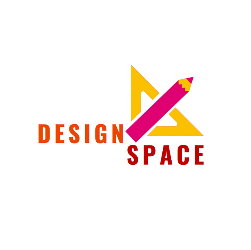
Purple is a spiritual or regal colour associated with luxury, royalty, imagination, quality, and truth.
Human Resources Agencies Logo Maker

Brown
Brown can be created by adding different colours together. It's associated with the earth and the natural world and communicates nature, earthiness, reliability, and warmth.
Tea Brand Logo Maker

Black
Scientifically, black isn’t considered a colour; it's the absence of light. In the world of art and design, however, it's a colour and is associated with sophistication, glamour, and substance. It can also be associated with heaviness, menace, coldness, and death.
Interior Designer Logo Design Template

White
White contains all the wavelengths of visible light and, like black, scientifically isn’t a colour. However, again in the world of art and design it's associated with simplicity, purity, innocence and cleanliness, but can also be considered cold, sterile, or bland.
Easy Interior Design Logo Template

When it comes to choosing logo colours, another point to keep in mind is that women and men tend to prefer different colour and women tend to gravitate to softer colours like tints, while men tend to prefer hues or shades of colours.
Pink
For example, pink is a tint of red and is often associated with femininity, kindness, softness, compassion, and love. It also evokes a certain calm.
Logo Maker for Children's Boutiques

Grey
Grey is a shade created by adding black to white. It's considered to be an emotionless and moody colour that can be used to communicate formality, conservativeness, and sophistication.
Builders Logo Maker

Best Colour Combinations for Business Logos
As you realise by now, selecting the best logo colours isn’t about choosing the colours you think are the prettiest or the logo colours you like. Rather, you need to take into consideration colour meaning in logo design, strategically assess the impact of the colours you choose on your target audience, and select company logo colours they'll respond to positively.
Obviously, there are an infinite number of colour combinations one can use in creating logos, but some are better than others. So to help you come up with the best logo colour combinations, we’ve put together a collection of the best colour combinations for business logos used by top global corporations and corresponding examples to show how you can borrow from them to create your own logo colour schemes:
1. Monochromatic Logo Colour Schemes
Monochromatic logo colour schemes use only one hue, but can use various shades, tones and tints of that hue to create the perfect logo. This approach to logo colours is among the most popular of colour schemes because it's the cleanest and simplest to use. Here are four approaches to monochromatic logo colour schemes.
PayPal is a good example of a company that uses monochromatic company logo colours successfully. Their text logo combines both a shade of blue and tint of blue to create logo colours meaning we’re stable and trustworthy. These colours can be transposed to a variety of businesses. Cycling Logo Maker template is a great example of how they look on another type of logo.

Now we move into some brands that are in the grey area of the monochromatic colour scheme. Nike, for example, could be considered to use a monochromatic colour scheme, as the company’s simple swoosh is usually black against white. However, it can also be white depending on the background it's shown against.
This is something that Apple also does. Though these two colours are opposites, both these companies have used them interchangeably as logo colours meaning sophistication and simplicity. If you’re interested in seeing how the simplicity and elegance both companies bring to their logos can translate in other logos, check out the Bar and Grill Logo Maker template.

Like Nike and Apple, Coca-Cola falls into a grey area of the monochromatic colour scheme. Most often their famous text logo is white against a red background, but sometimes the logo itself is red instead of white.
While the red colour symbolises passion and vitality and is meant to activate hunger, the white colour represents the elegance of the Coca-Cola brand. To see how this colour scheme translates into another logo, take a look at the Catering Logo Maker template.

Though the advice for a company looking to create a logo is to pick a logo and stick to it, one of the things that was interesting about many of the companies on this list is that the logo they started with is often starkly different from the logo they now use.
The logo for Starbucks is no exception. The Starbucks company logo colour has gone through four changes to arrive at the current minimalist and monochromatic colour scheme featuring a green circle stencil which, when placed on their white cups, shows their mermaid graphic. This Logo Maker for Salad Restaurants template takes its inspiration from the Starbucks logo.

2. Analogous Logo Colour Schemes
An analogous logo colour scheme uses colours that are next to each other on the colour wheel. These colour combinations are usually harmonious and pleasing to the eye.
One of the Big Four global professional services firms, PwC rebranded in 2010 with a logo which set them apart from the pack and is definitely one of the best logo colour combinations of any large corporation.
By eschewing blue, a favourite of large consulting, banking and financial firms, and choosing an eye-popping array of reds, pinks, yellows and oranges for its company logo colours, PwC established themselves as innovative and daring as well as energetic, friendly, approachable, and passionate.
This is a good lesson for any business: if you want to stand out, be different. If you’re interested in bringing the same qualities to your own logo, the Art and Design Online Logo Maker template is a good example of how you can apply the same colour combo principles to your logo.
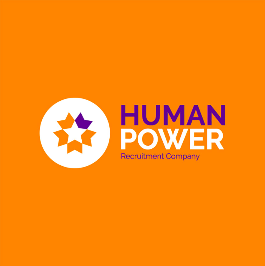
BP is another company that uses an analogous logo colour scheme. Its logo uses greens and yellow to create a sun and calls to mind nature, health, optimism, and balance. Logo Template for a Human Resources Agency template is a great example of how this colour scheme would work for many other businesses.

3. Complementary Logo Colour Schemes
Complementary colours are opposite each other on the colour wheel. The high contrast of complementary colours creates a vibrant look that can be a bit much, but there are quite a few companies that have used them and used them well.
Firefox is one of those companies. Who isn’t familiar with their combo of blue and orange, which are good logo colours meaning intelligence, trustworthiness and stability coupled with enthusiasm and excitement? If you think these complementary colours would be good logo colours for your own company, then check out the Crafting Logo Creator template to see how you could possibly use them.

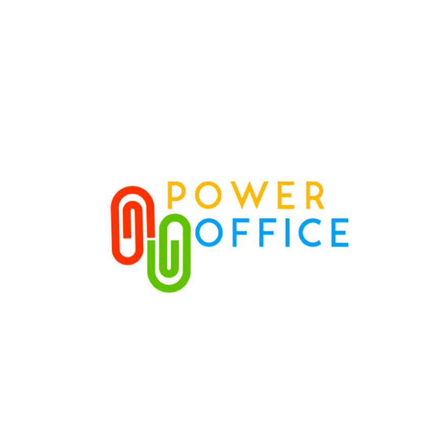
Whereas Firefox uses a straightforward complementary pairing, FedEx takes a slightly different approach, and by doing so created one of the best logo colour combinations and certainly one of the most popular. Instead of pairing orange with blue, they use a blue-purple tertiary which happily is close enough to blue to work very well. Create your own FedEx-inspired Recruitment Company Logo Maker template.
4. Tetradic Logo Colour Schemes
The tetradic colour scheme, also known as the double complementary scheme, is one of the richest of all colour schemes as it uses two pairs of complementary colours. The Microsoft logo is a great example of how to do this well, and if you want to create your own logo using double complementary colours, try the Stationery Shop Logo Maker template.
5. Triadic Logo Colour Schemes
Triadic logo colour schemes have three colours equally spaced around the colour wheel. The easiest way to identify them is by using a triangle of equal sides and placing the tip at your primary colour of choice on the colour wheel. The other two points will land on the corresponding colours of the triadic.
Burger King uses one of the best known triadic logo colour schemes, and if you’re looking for an equally vibrant combination, take a look at the Gaming Logo Maker template.

If you’re thoroughly inspired and want to create your own logo colour schemes with Placeit’s Logomaker, I’ll show you how.
How to Select the Best Logo Colour Schemes with Placeit
1. Navigate to Placeit's Logo Maker and Sign Up for FREE!
Enter the name of the business you’re creating the logo for and search for your industry by clicking the dropdown menu in the search bar that says All Industries.
Say you're creating a logo for a children’s clothing store called Sweet Tweets. Just type the name in the bar and select Clothing Brand from the drop-down menu. All the templates designed specifically for clothing brands will appear with the name Sweet Tweets on them.
Browse the templates and select the one that most appeals to you.
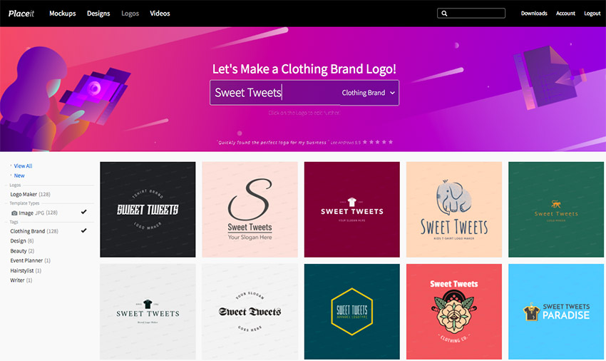
2. Open the Logo Maker
When you click on your chosen template, it'll open up in the Logo Maker. For my example, I chose the Children's Clothing Brand Logo Template shown here.

3. Customise Your Logo Template
You can now customise your logo template by choosing fonts, colours and graphics that reflect your company’s image.
Moving to the controls on the right and working from bottom to top, you can change the background colour, the graphics and their colours to ones that better reflect your goals for your logo. The background won’t play a part in my colour scheme as such, so I decided to make it transparent, but I'll make it white for our purposes here since the transparent option won’t allow the design to show up well enough for you to see.
Working upwards, I like the bottom graphics, so I’ll keep them as is. I also like the top graphics, so I’ll keep them as is. The colours, however, I want to change to reflect my choice of an analogous colour scheme of reds and oranges, logo colours meaning enthusiasm, excitement, and warmth.

Moving to the controls on the left and working from top to bottom, you can change your font style and the colour of your text. I chose the deepest red in my analogous colour scheme, which is more of a burgundy. I won’t change the text since it works well with my brand as a children’s clothing store.

4. Download Your Logo
Once you’ve completed your customisations and are satisfied with your design, hit the download button at the top of the screen and download your design for a small fee, or if you regularly need to create logos, flyers, posters, social media banners etc., then the monthly plan may be the best deal for you.

How to Select the Best Logo Colours With Envato Elements
Placeit’s Logo Maker isn’t the only option for the best colour combinations for business logos. Envato Elements offers over 5,000 logo designs to suit a wide variety of tastes and needs, and each template is completely customisable.

For example, this Branding / Letter B - Logo Template with an analogous colour scheme offers three colour variations which can all be changed to complementary, monochromatic, or any other colour scheme.

This is also the case for the Pro Drone template, which comes in both a vertical and horizontal layout and is fully editable so that you can apply whatever colour settings are most appropriate for your brand.

Select Your Best Logo Colour Combinations
Deciding on the best logo colours isn’t easy or straightforward. Experimentation is the key.
Follow the steps outlined here, check out the templates, and let us know in the comments below if you’ve found the perfect logo colour scheme for your company and which it is. We’d love to hear from you.
Also, use the tools at your disposal like the logo maker from Placeit and the ready-made templates at Envato Elements to help you find colours that work best for you. Between the two, they offer thousands of beautiful logo templates which will help you work out the best logo colours in no time.
Original Link: https://design.tutsplus.com/articles/best-logo-color-schemes--cms-32325
TutsPlus - Design
More About this Source Visit TutsPlus - Design