

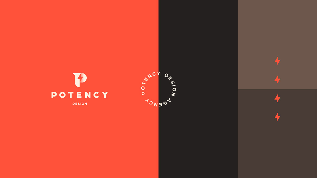
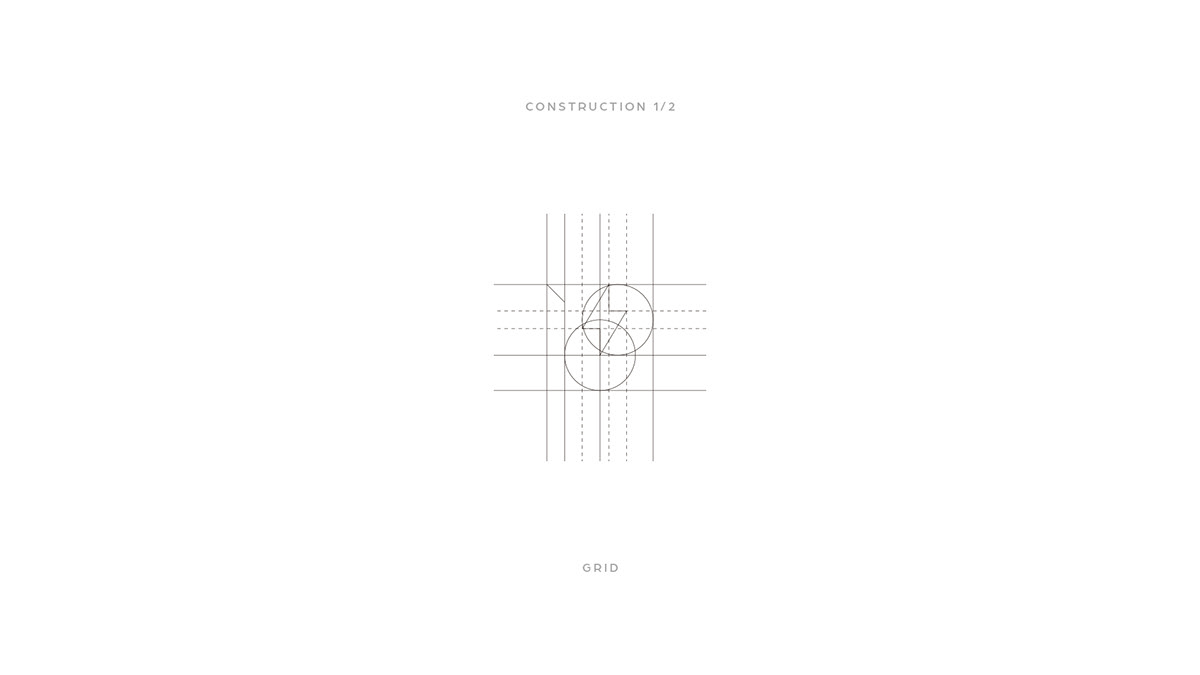
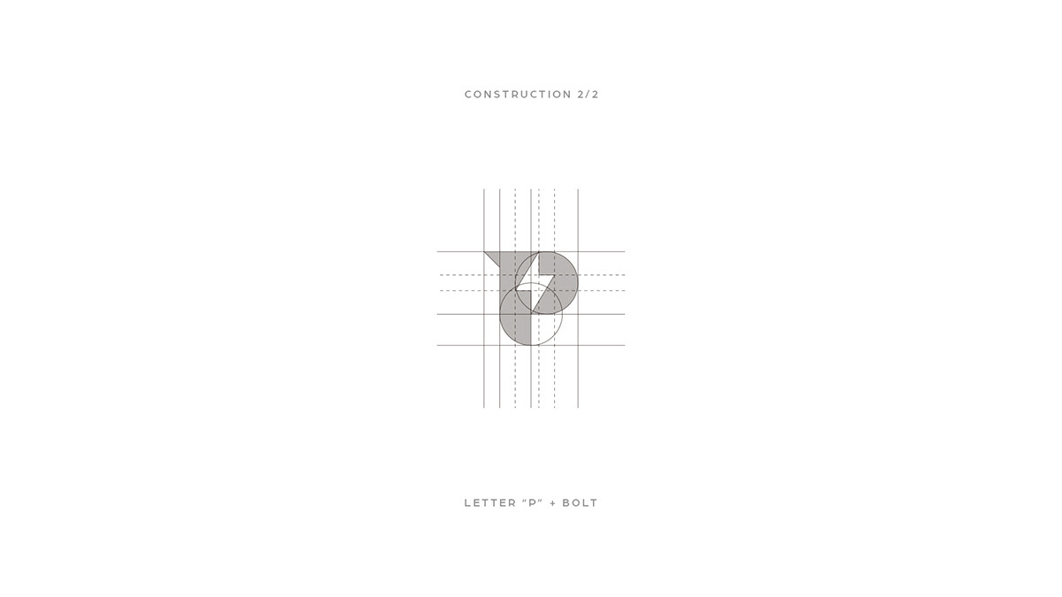
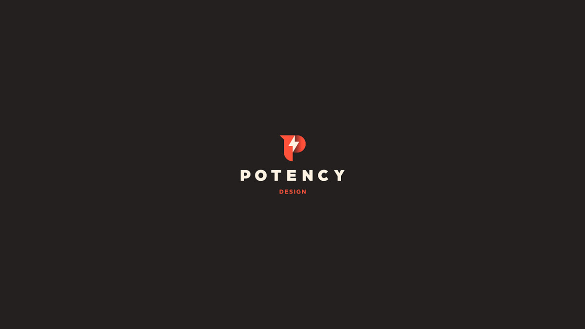
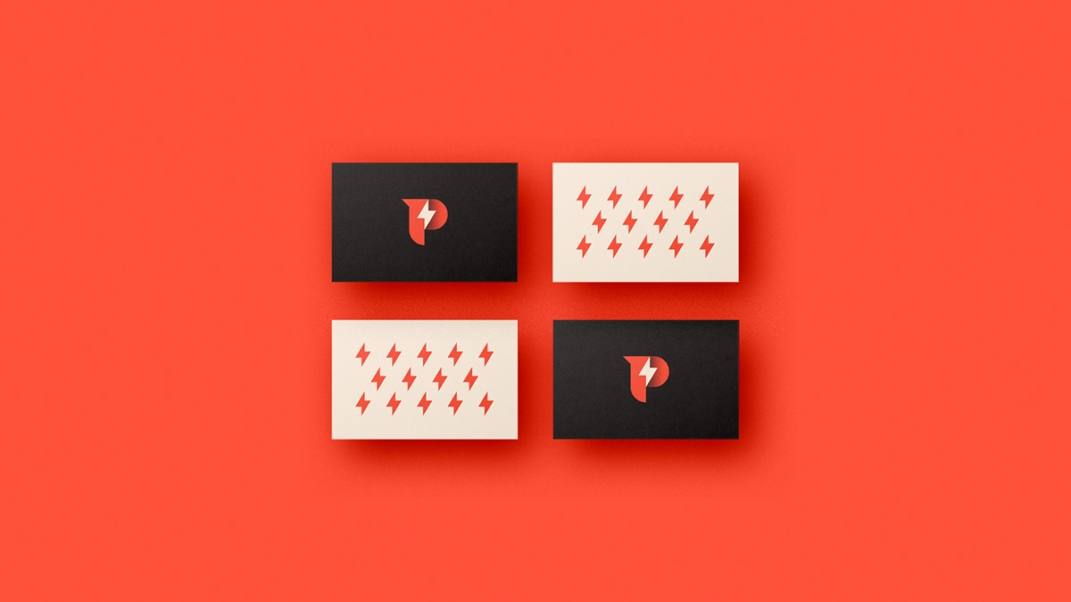
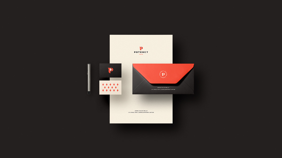
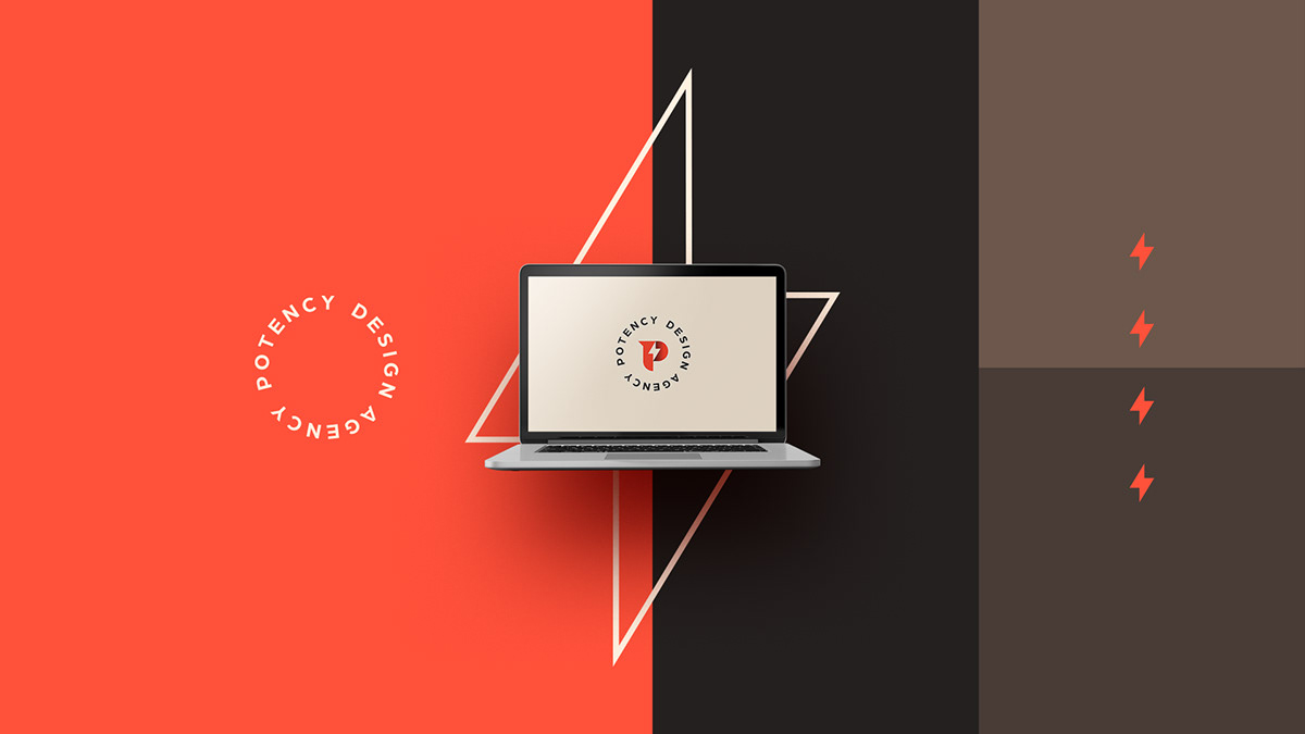
Guilherme Vissotto and Victor Berriel shared a branding and visual identity project for Potency Agency. The details about the project are quite scarce, they didnt add any description. Based on the work itself I assume its for a design studio/agency. The presentation is beautiful. The color palette is also very well selected. The logo plays with white space to mix the lightning and the P. They do an excellent job, however I am not really a fan of the shadow. It adds a good depth, but in some of the examples, the shadow feels too strong. Perhaps, just the pure symbol without any effect would suffice. What are your thoughts?
Branding and visual identity


 Abduzeedo is a collection of visual inspiration and useful tutorials