An Interest In:
Web News this Week
- May 1, 2024
- April 30, 2024
- April 29, 2024
- April 28, 2024
- April 27, 2024
- April 26, 2024
- April 25, 2024
Iconography of Security
Molly Wilson and Eileen Wagner battle the age old Christmas issues of right and wrong, good and evil, and how the messages we send through iconography design can impact the decisions users make around important issues of security. Are you icons wise men, or are they actually King Herod?
Congratulations, youre locked out! The paradox of security visuals
Designers of technology are fortunate to have an established visual language at our fingertips. We try to use colors and symbols in a way that is consistent with peoples existing expectations. When a non-designer asks a designer to make it intuitive, what theyre really asking is, please use elements people already know, even if the concept is new.
Lots of options for security icons
Were starting to see more consistency in the symbols that tech uses for privacy and security features, many of them built into robust, standardized icon sets and UI kits. To name a few: we collaborated with Adobe in 2018 to create the Vault UI Kit, which includes UI elements for security, like touch ID login and sending a secure copy of a file. Adobe has also released a UI kit for cookie banners.

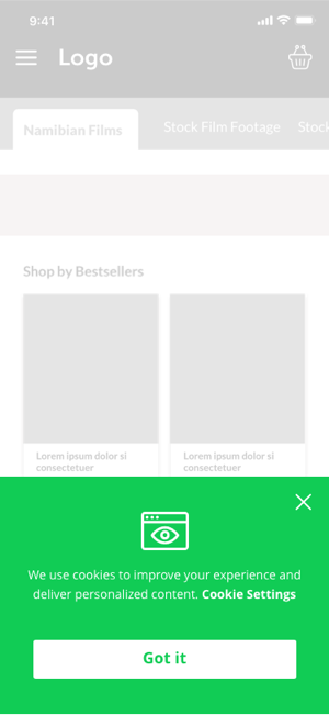
Even UI kits that arent specialized in security and privacy include icons that can be used to communicate security concepts, like InVisions Smart Home UI Kit. And, of course, nearly every icon set has security-related symbols, from Material Design to Iconic.


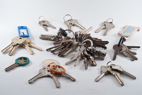
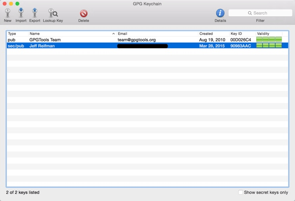
Many of these icons allude to physical analogies for the states and actions were trying to communicate. Locks and keys; shields for protection; warning signs and stop signs; happy faces and sad faces. Using these analogies helps build a bridge from the familiar, concrete world of door locks and keyrings to the unfamiliar, abstract realm of public- and private-key encryption.
When concepts dont match up
Many of the concepts were working with are pairs of opposites. Locked or unlocked. Private or public. Trusted or untrusted. Blocked or allowed. Encouraged or discouraged. Good or evil. When those concept pairs appear simultaneously, however, we quickly run into UX problems.
Take the following example. Security is good, right? When something is locked, that means youre being responsible and careful, and nobody else can access it. Its protected. Thats cause for celebration. Being locked and protected is a good state.
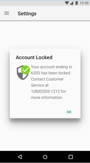
Whoops.
If the user didnt mean to lock something, or if the locked state is going to cause them any inconvenience, then extra security is definitely not good news.
Another case in point: Trust is good, right? Something trusted is welcome in peoples lives. Its allowed to enter, not blocked, and its there because people wanted it there. So trusting and allowing something is good.
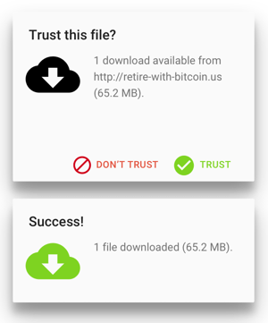
Nope. Doesnt work at all. What if we try the opposite colors and iconography?
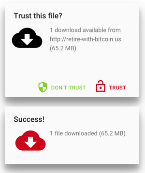
Thats even worse. Even though we, the designers, were trying both times to keep the user from downloading malware, the users actual behavior makes our design completely nonsensical.
Researchers from Google and UC Berkeley identified this problem in a 2016 USENIX paper analyzing connection security indicators. They pointed out that, when somebody clicks through a warning to an insecure website, the browser will show a neutral or positive indicator in the URL bar leading them to think that the website is now safe. Unlike our example above, this may not look like nonsense from the user point of view, but from a security standpoint, suddenly showing safe/good without any actual change in safety is a pretty dangerous move.
The deeper issue
Now, one could file these phenomena under mismatching iconography, but we think there is a deeper issue here that concerns security UI in particular. Security interface design pretty much always has at least a whiff of right vs. wrong. How did this moralizing creep into an ostensibly technical realm?
Well, we usually have a pretty good idea what wed like people to do with regards to security. Generally speaking, wed like them to be more cautious than they are (at least, so long as were not trying to sneak around behind their backs with confusing consent forms and extracurricular data use). Our well-intentioned educational enthusiasm leads us to use little design nudges that foster better security practices, and that makes us reach into the realm of social and psychological signals. But these nudges can easily backfire and turn into total nonsense.
Another example: NoScript
No UX designer would be dense enough to make these mistakes, you might be thinking.
Well, we recently did a redesign of the open-source content-blocking browser extension NoScript, and we can tell you from experience: finding the right visual language for pairs of opposites was a struggle.
NoScript is a browser extension that helps you block potential malware from the websites youre visiting. It needs to communicate a lot of states and actions to users. A single script can be blocked or allowed. A source of scripts can be trusted or untrusted. NoScript is a tool for the truly paranoid, so in general, wants to encourage blocking and not trusting. But:
An icon with a crossed-out item is usually BAD, and a sign without anything is usually GOOD. But of course, here blocking something is actually GOOD, while blocking nothing is actually BAD. So whichever indicators NoScript chooses, they should either aim to indicate system state [allow/block] or recommendation [good/bad], but not both. And in any case, NoScript should probably stay away from standard colors and icons.
So we ended up using hardly any of the many common security icons available. No shields, no alert! signs, no locked locks, no unlocked locks. And we completely avoided the red/green palette to keep from taking on unintended meaning.
Navigating the paradox
Security recommendations appear in most digital services are built nowadays. As we move into 2020, we expect to see a lot more conscious choice around colors, icons, and words related to security. For a start, Firefox already made a step in the right direction by streamlining indicators for SSL encryption as well as content blocking. (Spoilers: they avoided adding multiple dimensions of indicators, too!)
The most important thing to keep in mind, as youre choosing language around security and privacy features, is: dont conflate social and technical concepts. Trusting your partner is good. Trusting a website? Well, could be good, could be bad. Locking your bike? Good idea. Locking a file? That depends.
Think about the technical facts youre trying to communicate. Then, and only then, consider if theres also a behavioral nudge you want to send, and if you are, try to poke holes in your reasoning. Is there ever a case where your nudge could be dangerous? Colors, icons, and words give you a lot of control over how exactly people experience security and privacy features. Using them in a clear and consistent way will help people understand their choices and make more conscious decisions around security.
About the author
Molly Wilson is a designer by training and a teacher at heart: her passion is leveraging human-centered design to help make technology clear and understandable. She has been designing and leading programs in design thinking and innovation processes since 2010, first at the Stanford d.school in Palo Alto, CA and later at the Hasso-Plattner-Institut School of Design Thinking in Potsdam, Germany. Her work as an interaction designer has focused on complex products in finance, health, and education. Outside of work, talk to her about cross-cultural communication, feminism, DIY projects, and visual note-taking.
Molly holds a masters degree in Learning, Design, and Technology from Stanford University, and a bachelors degree magna cum laude in History of Science from Harvard University. See more about her work and projects at http://molly.is.
Eileen Wagner is Simply Secures in-house logician. She advises teams and organizations on UX design, supports research and user testing, and produces open resources for the community. Her focus is on information architecture, content strategy, and interaction design. Sometimes she puts on her admin hat and makes sure her team has the required infrastructure to excel.
She previously campaigned for open data and civic tech at the Open Knowledge Foundation Germany. There she helped establish the first public funding program for open source projects in Germany, the Prototype Fund. Her background is in analytic philosophy (BA Cambridge) and mathematical logic (MSc Amsterdam), and she wont stop talking about barbershop music.
More articles by Molly Wilson & Eileen
Original Link: http://feedproxy.google.com/~r/24ways/~3/Slaj4XXyXww/
24 Ways
 # 24 ways is an edgeofmyseat.com production. # Edited by Drew McLellan and Brian Suda. # Assisted by Anna Debenham and Owen Gregory.
More About this Source Visit 24 Ways

