

This typographic series started as exploration while playing with the settings and glass materials within the applications 'Arnold renderer and 'Cinema 4D'. The results are mesmerizing, the idea of 'dispersion' comes from the familiar example of a rainbow. I guess we are all familiar with that stripe of colors. The challenge to achieve such a natural look, takes time and commitment to do so. We are featuring the work of denfo, who took that ideology and decided to create a 'typography series titled: 'Alphabet Dispersion'. The alphabet being such a known starting point, this would be exactly the case for denfo.
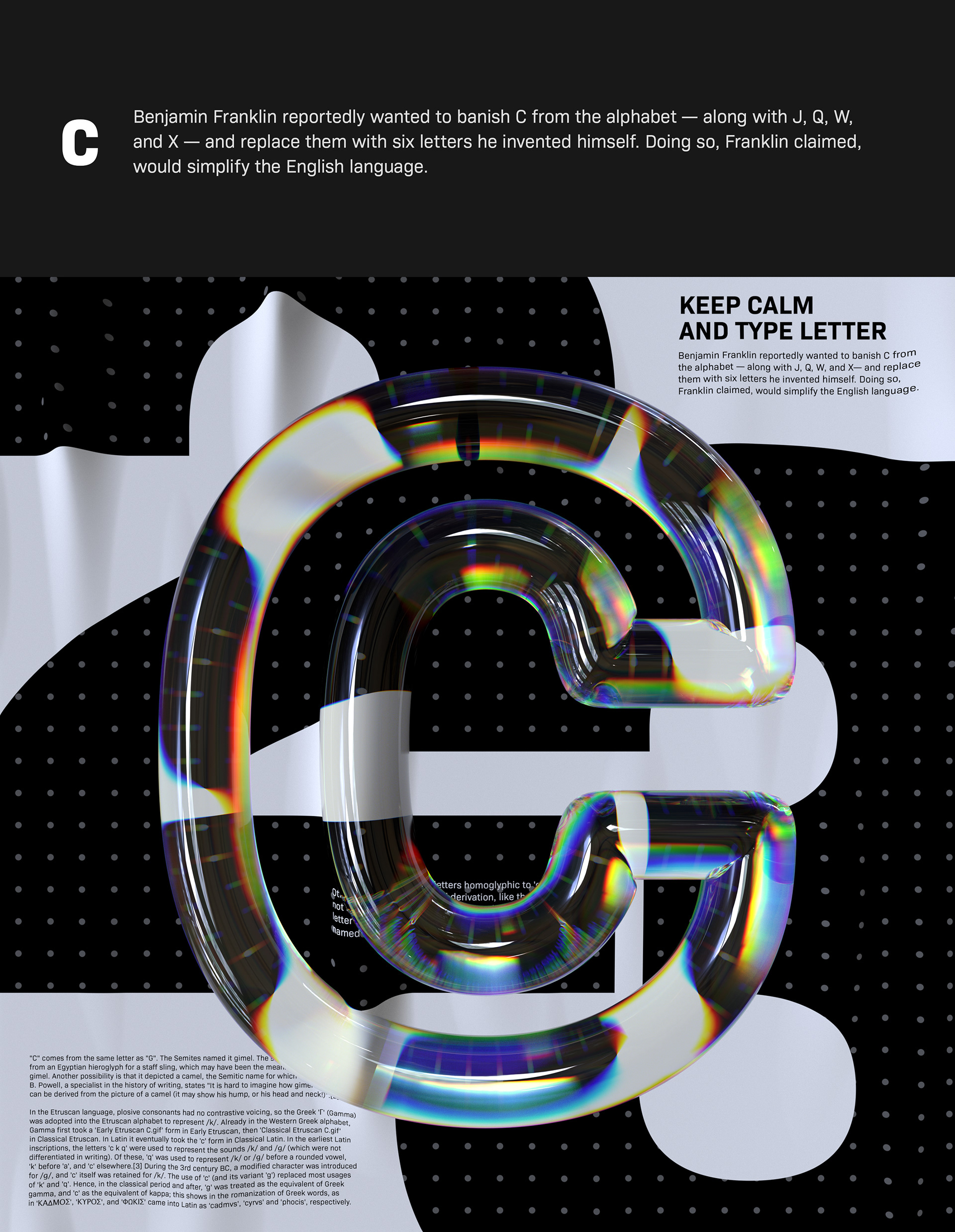
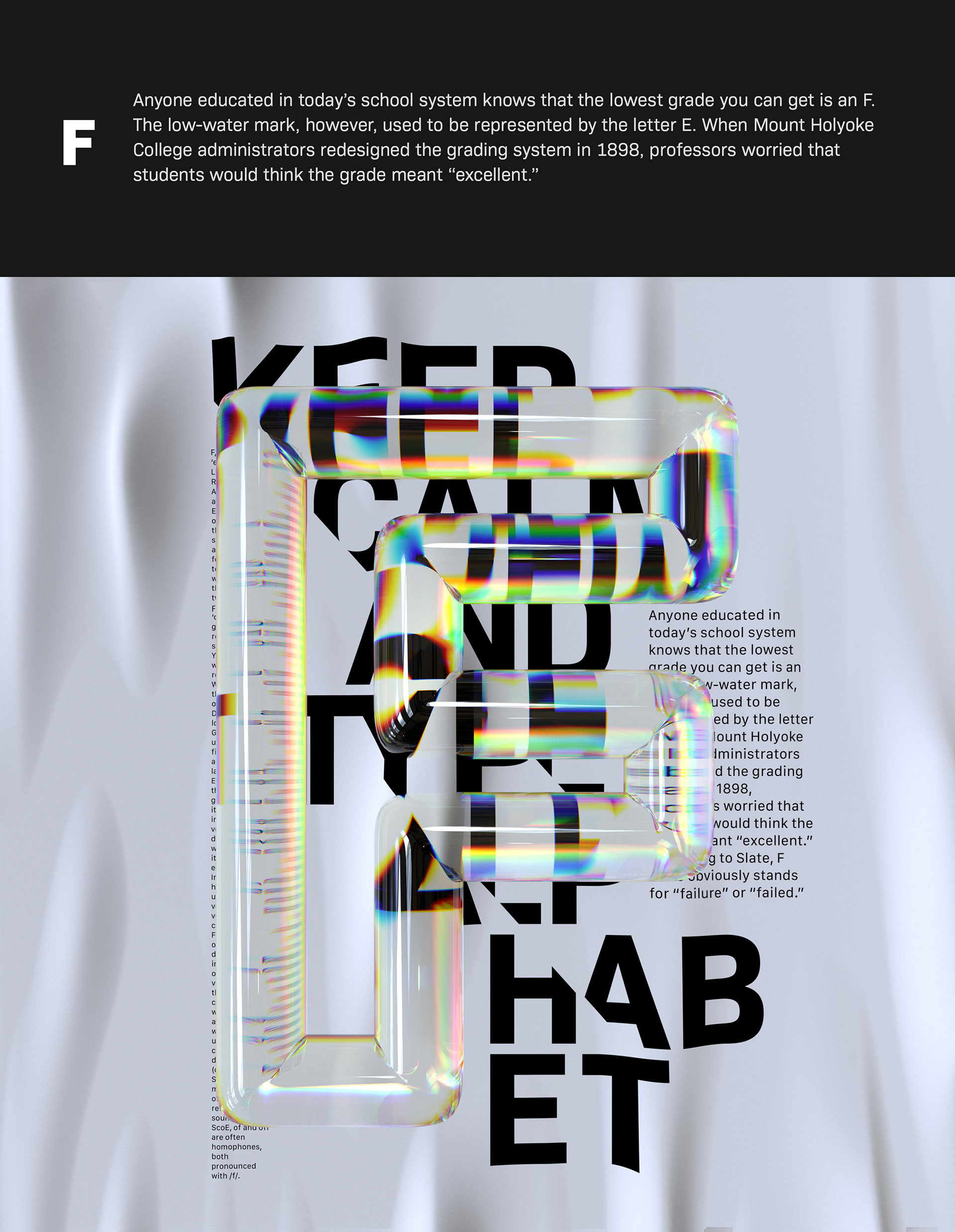
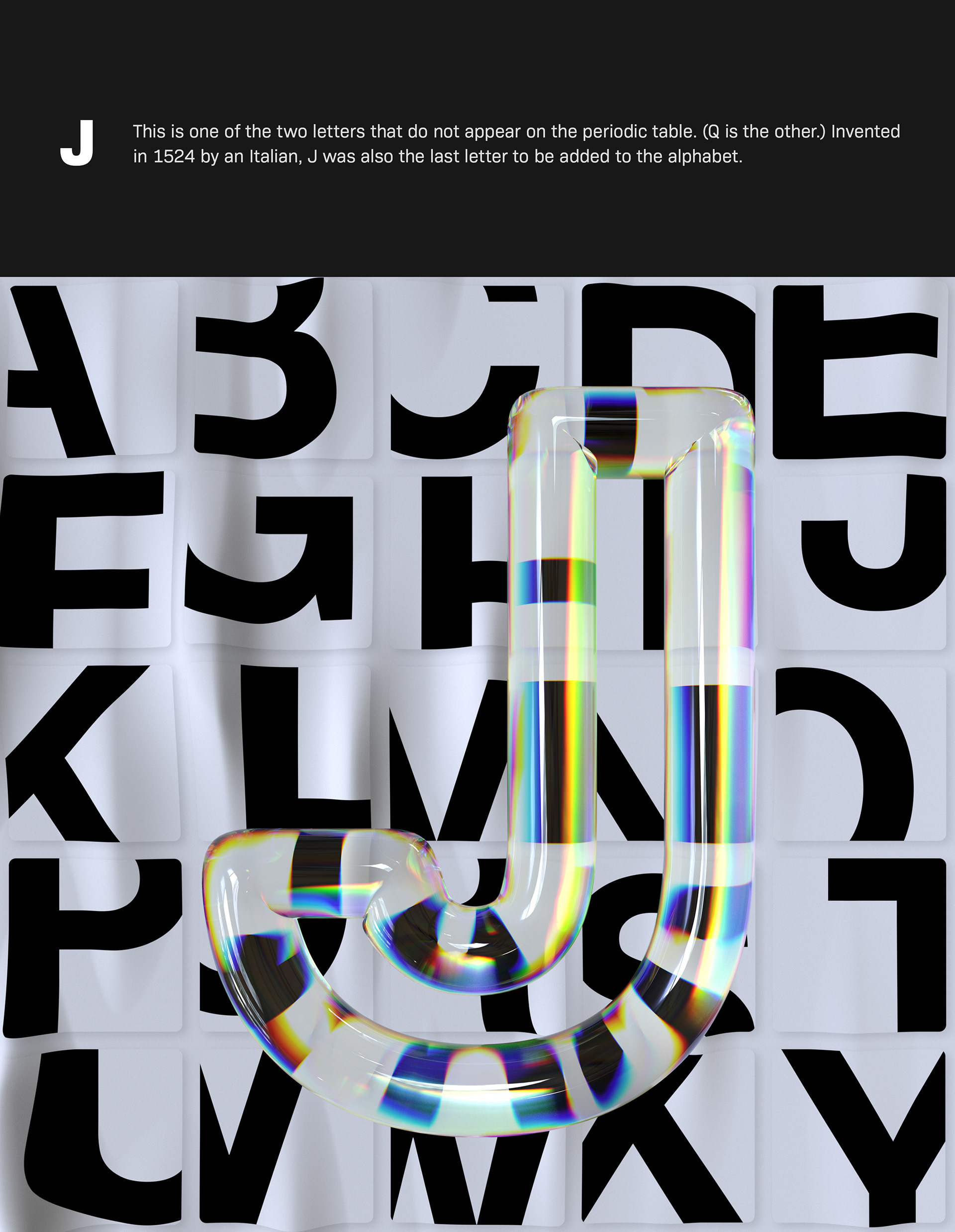
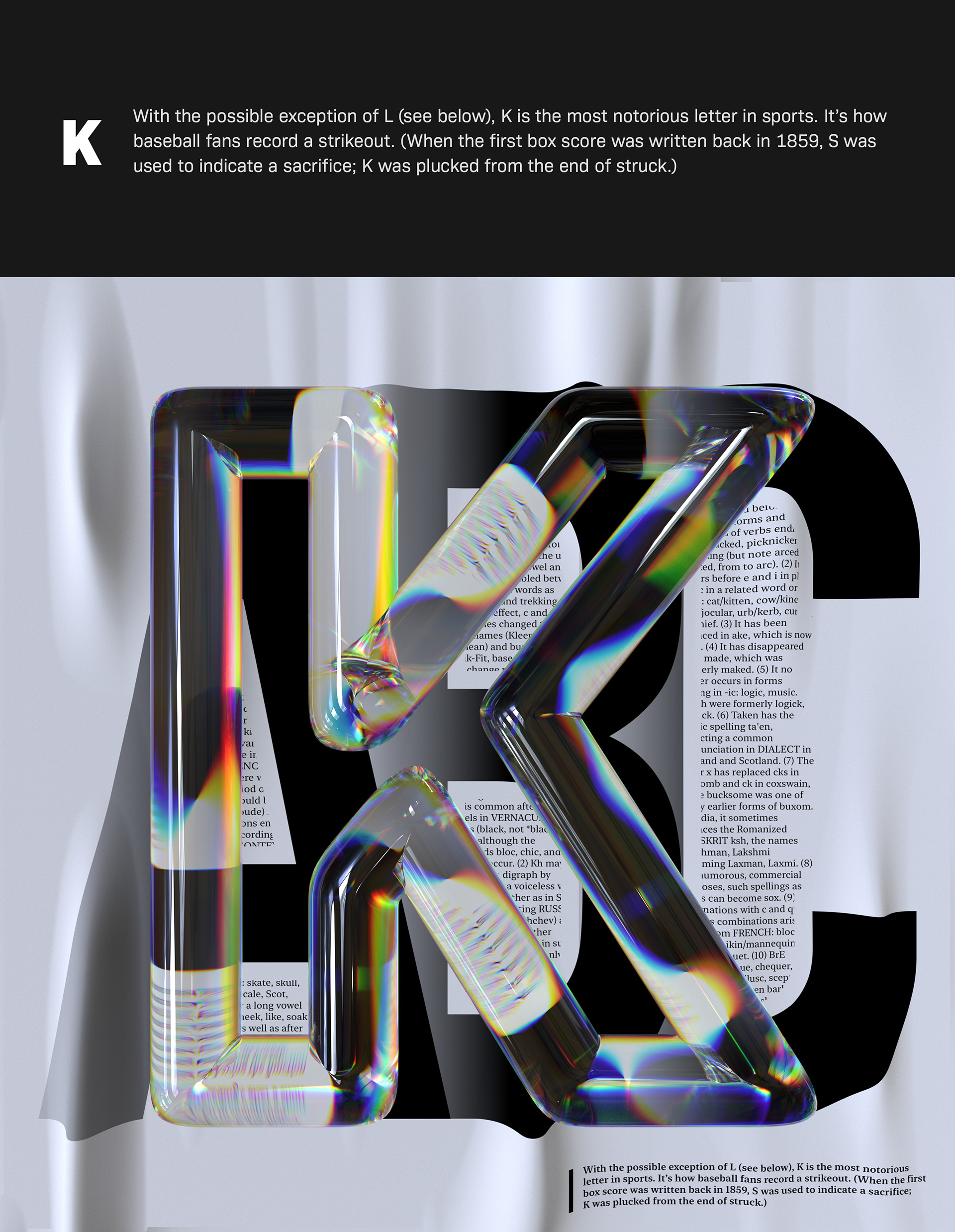
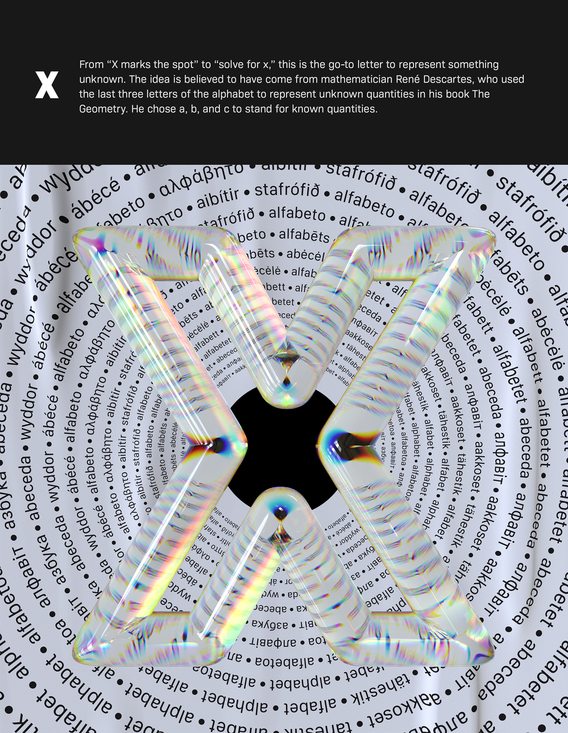
Alphabet Dispersion The most familiar example of dispersion is probably a rainbow, in which dispersion causes the spatial separation of white light into components of different wavelengths (different colors). I am mesmerized by the optical distortion of light.
Typography


 By
By About denfo
denfo is working as head of product design and based in Moscow, Russian Federation. His portfolio is pretty diverse, it could easily would go to 'illustrations', 'product design' pure '3d art' and more. Make sure to follow denfo's work through Behance.
 Abduzeedo is a collection of visual inspiration and useful tutorials