
Some of Our Sources
- Mashable
- TutsPlus - Code
- Web Designer Wall
- Spoon Graphics
- You The Designer
- Creative Curio
- Stylized Web
- Android Headlines
- Dev To
- TechPowerUp
Help Webnuz
Referal links:
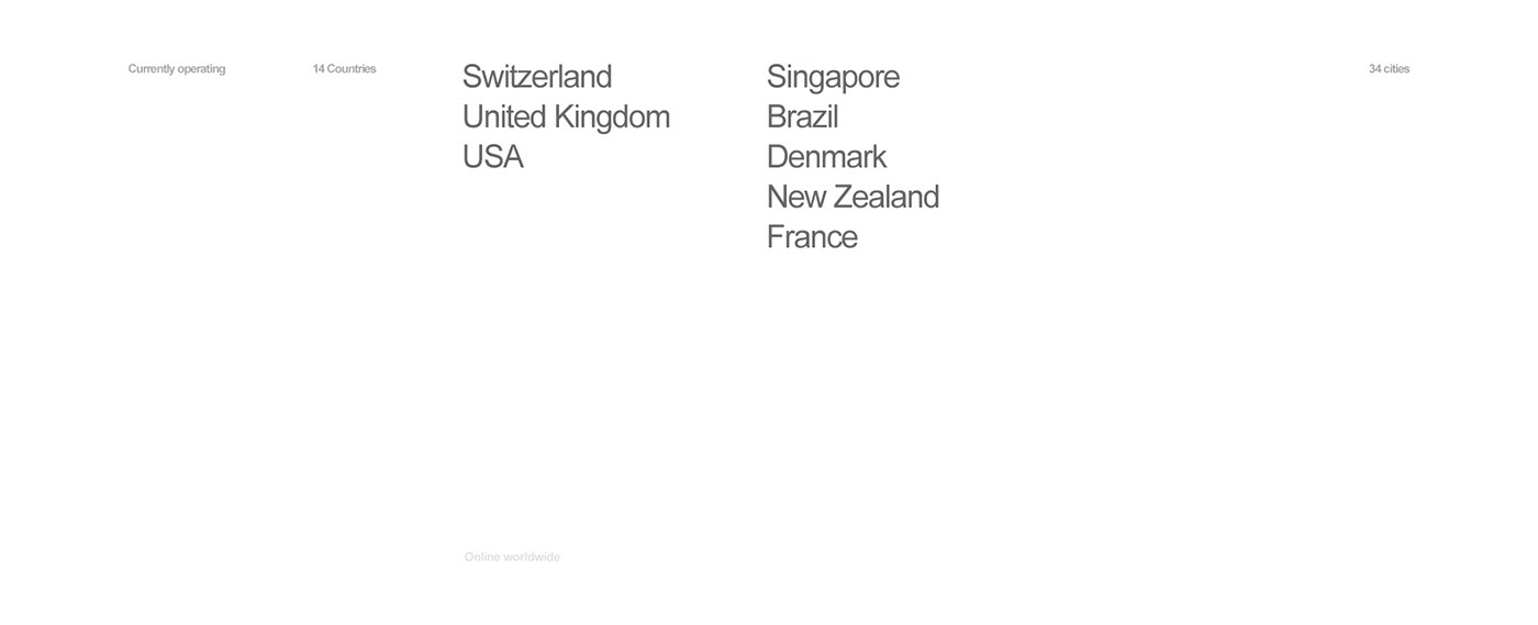
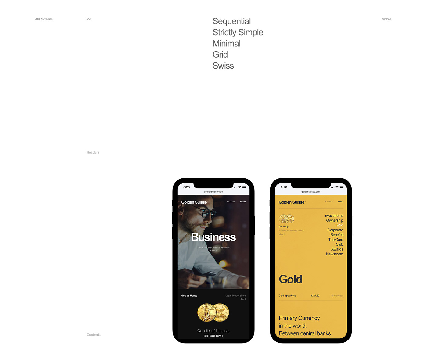
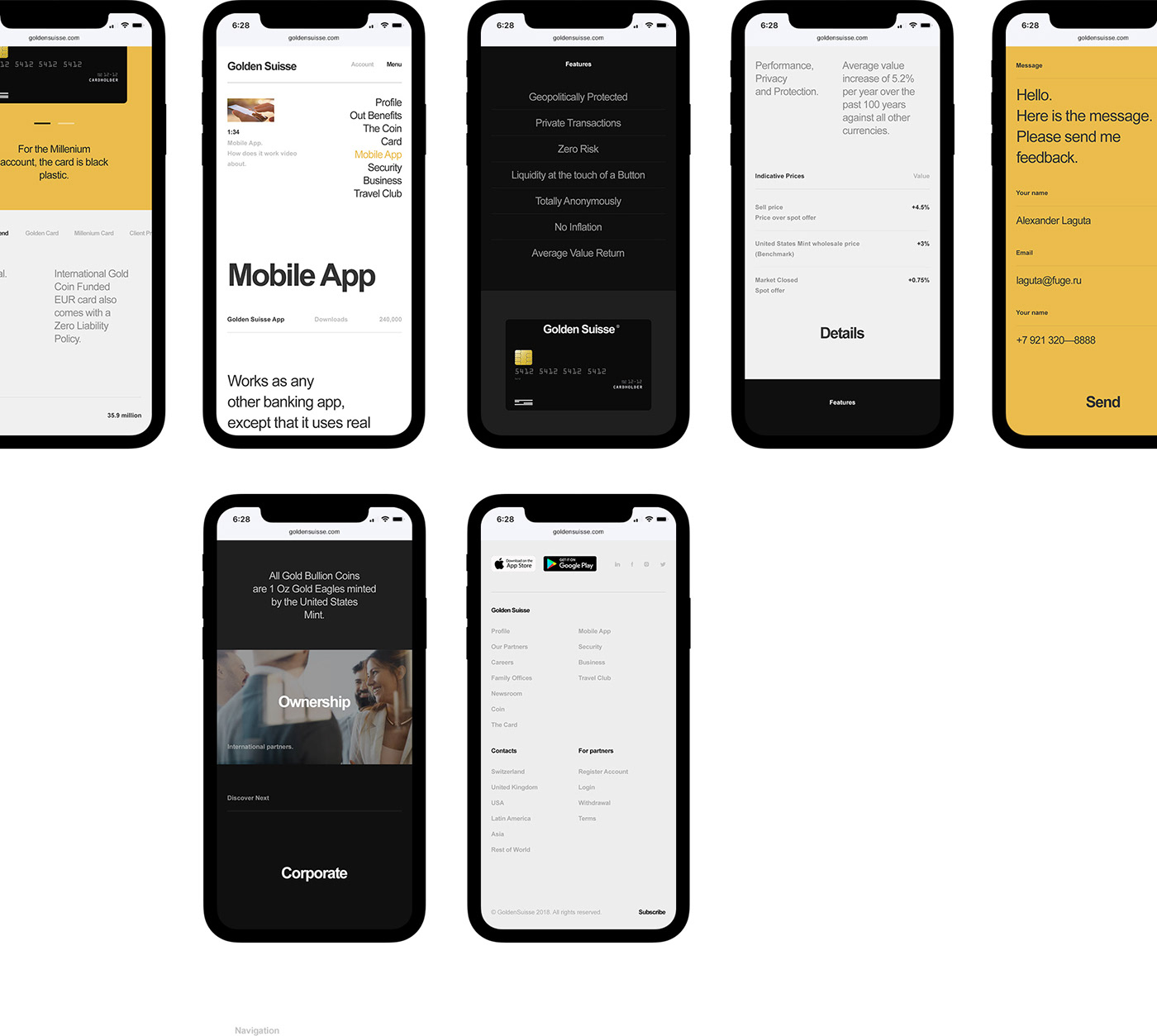
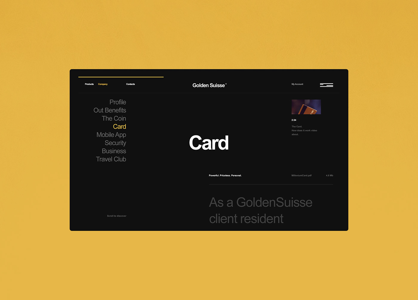
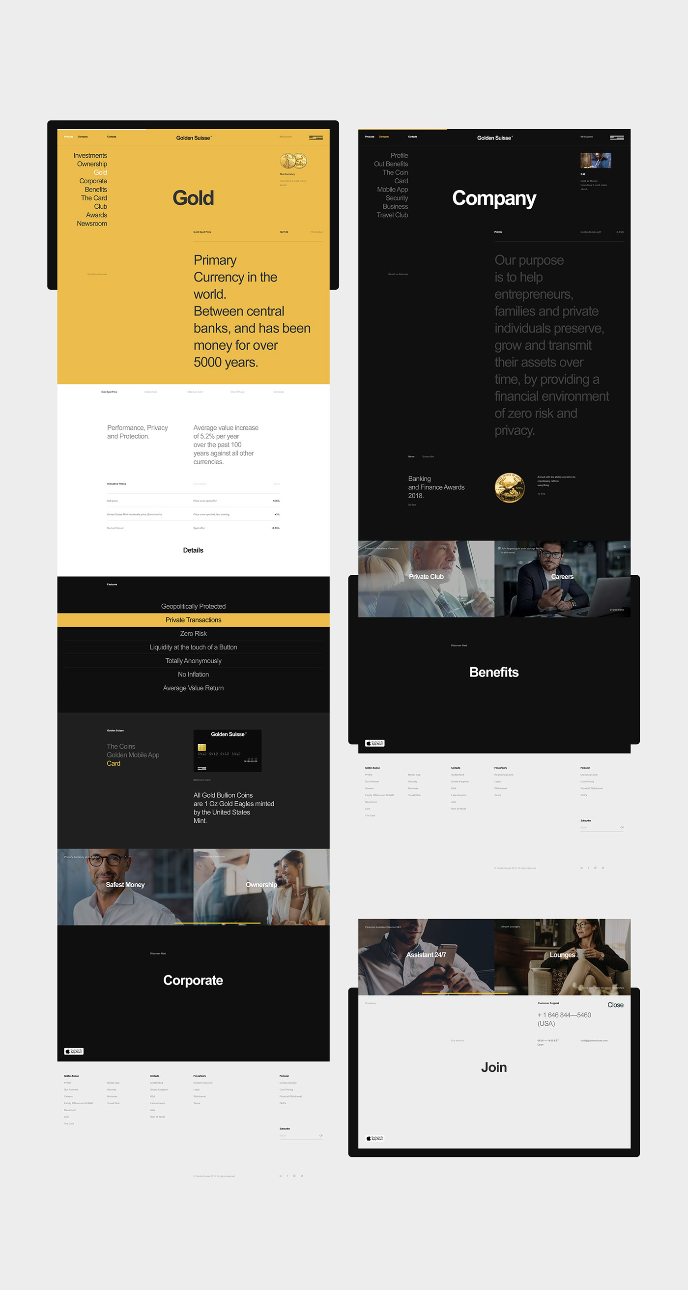
Branding & Interface Design for Golden Suisse
Branding & Interface Design for Golden Suisse
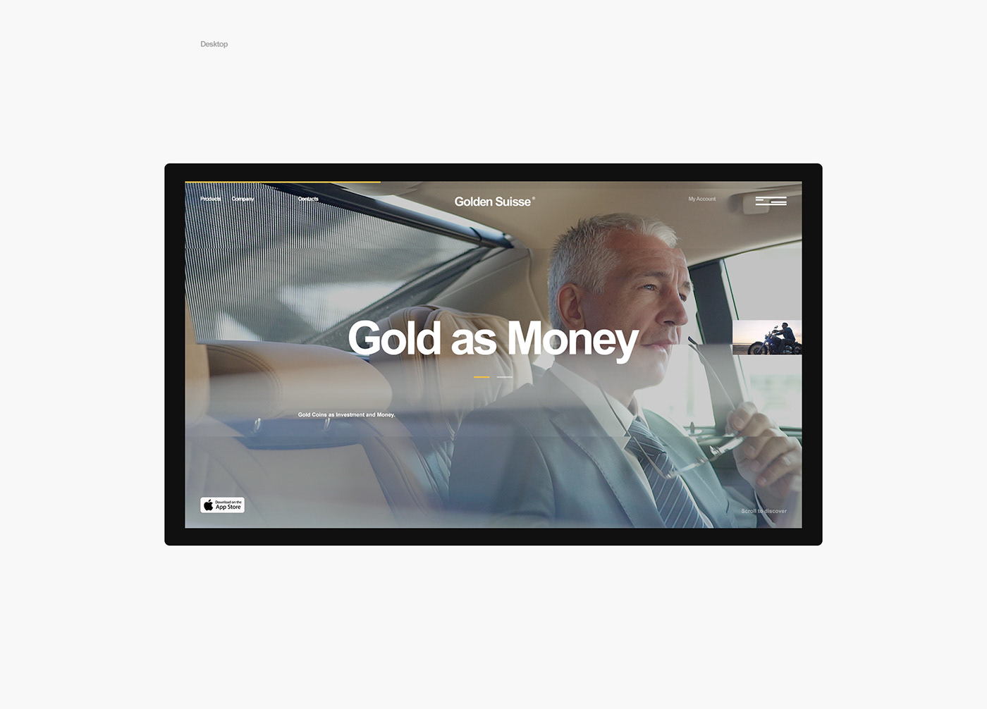
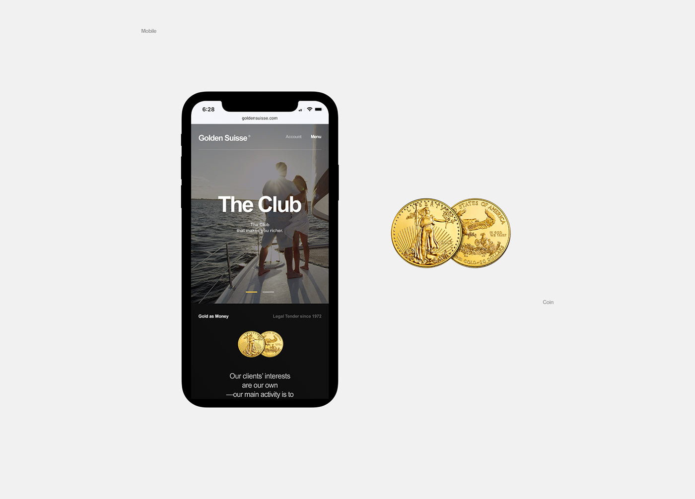
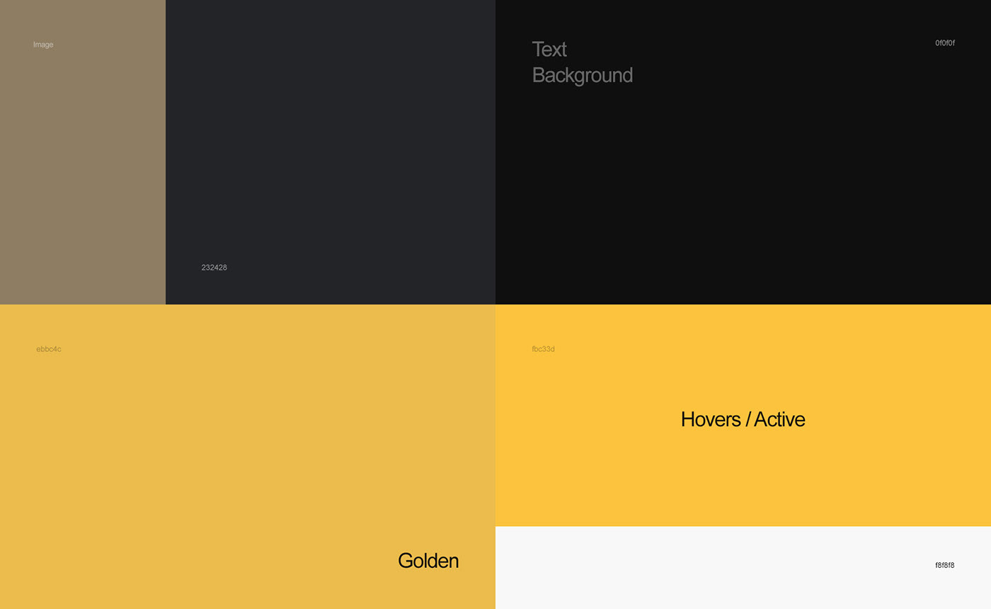
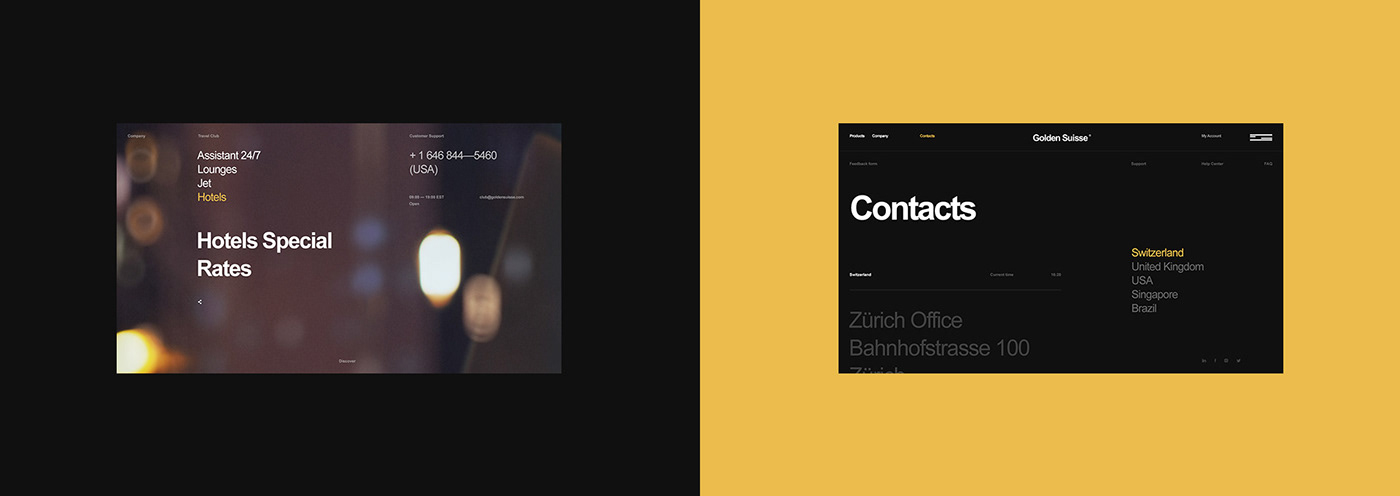
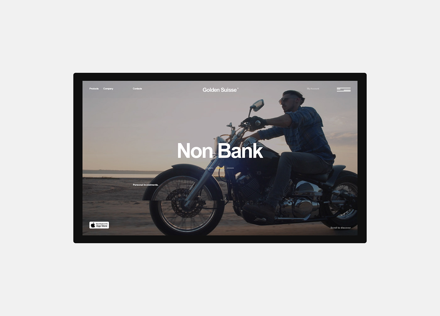
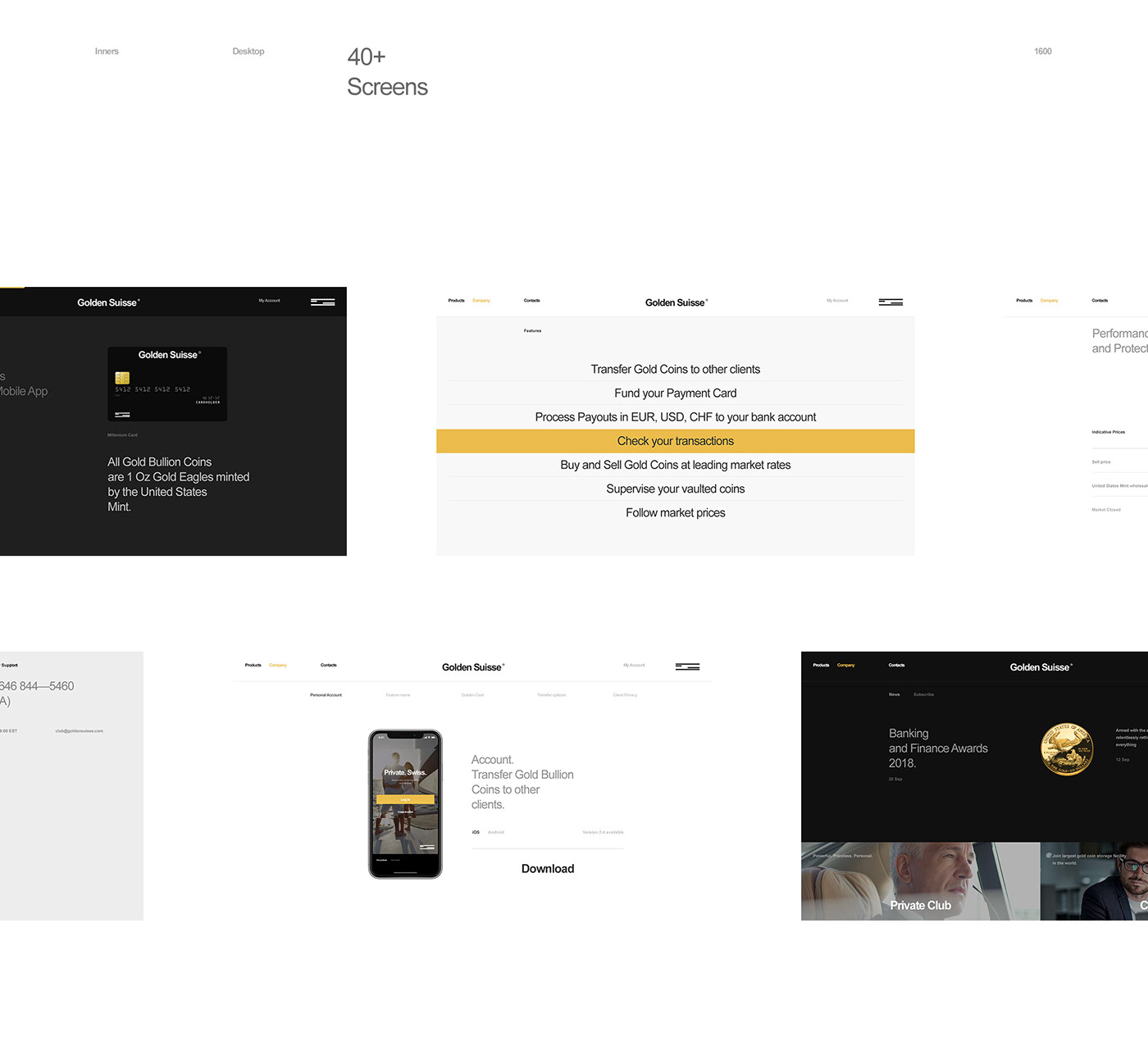
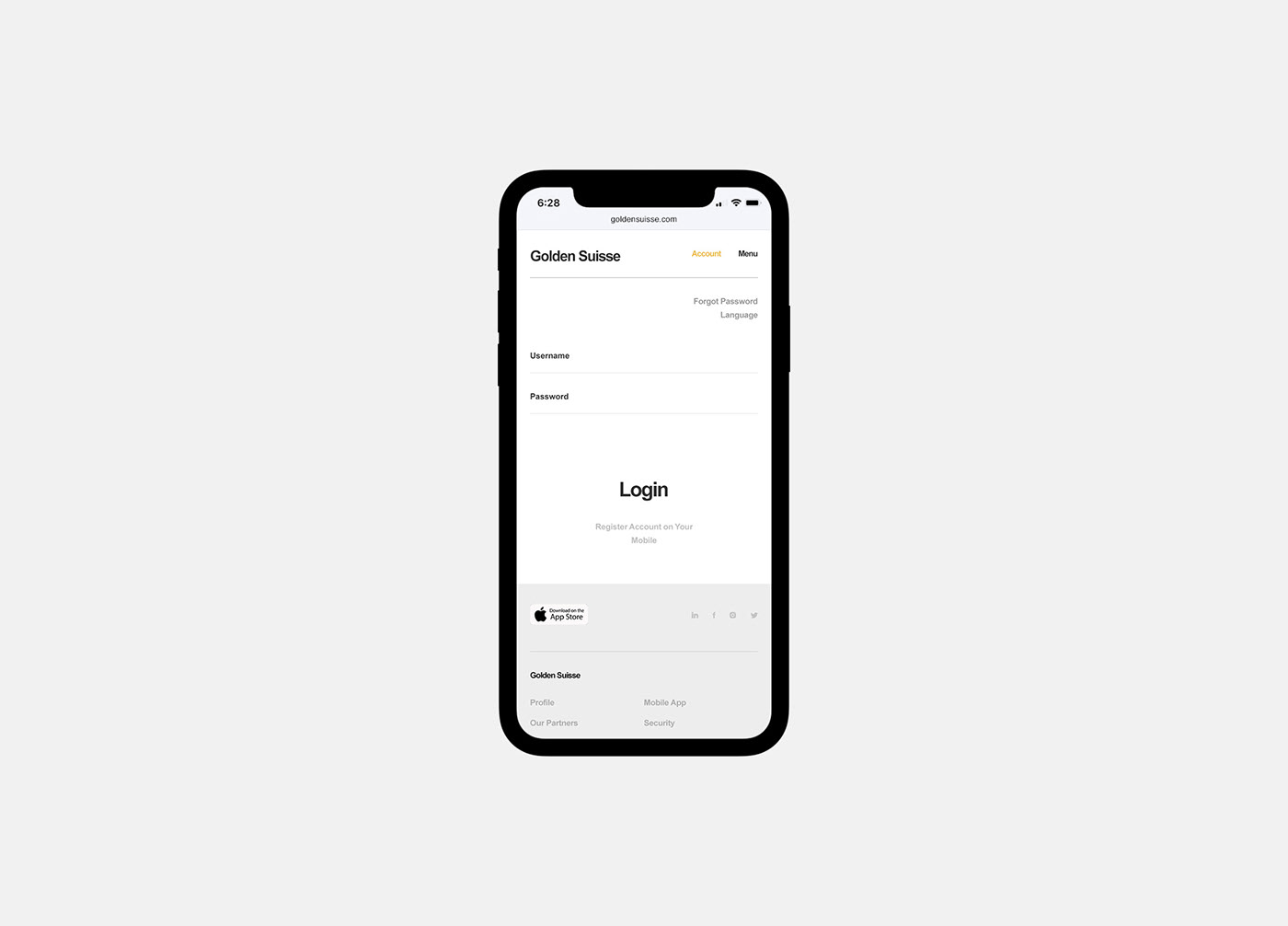
There are certain projects that really get my attention, especially when it comes to branding and web. They are always very simple and I am one hundred percent sure that, that is the reason for me to love them. Have you try to design something simple and minimal without feeling that there's something missing, or that the whole design is not complete. That's the biggest challenge, how to find the balance. In my opinion, the Golden Suisse project thatAlexander LagutaandKate Lagutashared on their Behance profile accomplished. But to be honest, I feel that in some screens, they ended up overdoing.
If you look at the designs, they all follow a simple grid system, the business cards look amazing.
I felt that the website got a bit too crowded, perhaps the fonts look a bit too big. It's hard to say because screenshots at the size we see can be misleading. However, if they look already at those sizes, in full-screen mode, they would definitely be huge.
Despite these details, I believe this branding and interface design project is quite solid. There are a lot of interesting design decisions that will be very helpful for me in the future. That's the reason I added here. I will start using the blog more as a catalog of cool things for me :)
Branding and interface design


Credits:
- Branding, UI/Web Design: Alexander Laguta
- Animations: Kate Laguta
- Special thanks: Daniel Weitmann
Original Link: http://feedproxy.google.com/~r/abduzeedo/~3/Oo2aBwacrLM/branding-interface-design-golden-suisse
Abduzeedo
 Abduzeedo is a collection of visual inspiration and useful tutorials
More About this Source Visit Abduzeedo