
An Interest In:
Web News this Week
- April 30, 2024
- April 29, 2024
- April 28, 2024
- April 27, 2024
- April 26, 2024
- April 25, 2024
- April 24, 2024
Some of Our Sources
- Simplebits
- TutsPlus - Code
- The Logo Smith
- Six Revisions
- Crazy Leaf Design
- Fudge Graphics
- Web Design Ledger
- Specky Boy
- Daily Now
- The Verge
Help Webnuz
Referal links:
How to Create 5 Awesome Gradient Effects in Adobe InDesign
Gradient effects are super easy to achieve in InDesign, and they're an instant way of bringing your layouts bang up-to-date.
Read on to discover five high-impact gradient effects, from duotone to neon-pastel, that would look fantastic on posters, flyers, stationery, or magazine designs.
If you want to make your gradient effects truly unique, you can easily add cool typography over the top of your design. Head over to GraphicRiver or Envato Elements to source great fonts for your next project.
What You’ll Need to Create Your Gradient Effects
All you need is access to Adobe InDesign to create the majority of these effects.
To create the ‘Retro’ text effect, you’ll need to download Charlevoix Pro ExtraBold.
1. Simple Duotone Gradient Effect
This is the simplest gradient effect to achieve, and it looks amazing set as a background or as a fill color for shapes or text.
Step 1
Open InDesign and go to File > New > Document. You can set the page to any size you prefer.
If you’re creating your gradient effects for print (as I am here), make sure the Intent is set to Print. For online-friendly images, set the Intent to Web.
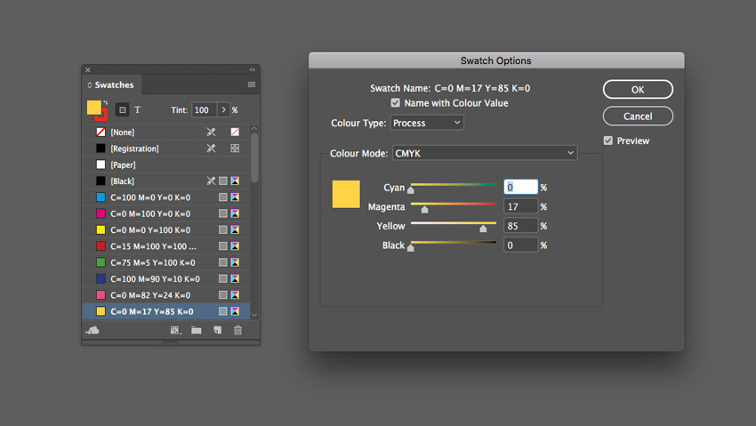
With your document created, expand the Swatches panel (Window > Color > Swatches).
Choose New Color Swatch from the panel’s drop-down menu (at top-right). Set the Color Mode to CMYK for print or RGB for web, and set the levels to C=0 M=82 Y=24 K=0 or R=234 G=76 B=125.
Click Add and OK.
Create a second new swatch, C=0 M=17 Y=85 K=0 or R=255 G=211 B=50.
Step 2
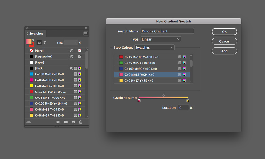
Choose New Gradient Swatch from the Swatches panel’s menu.
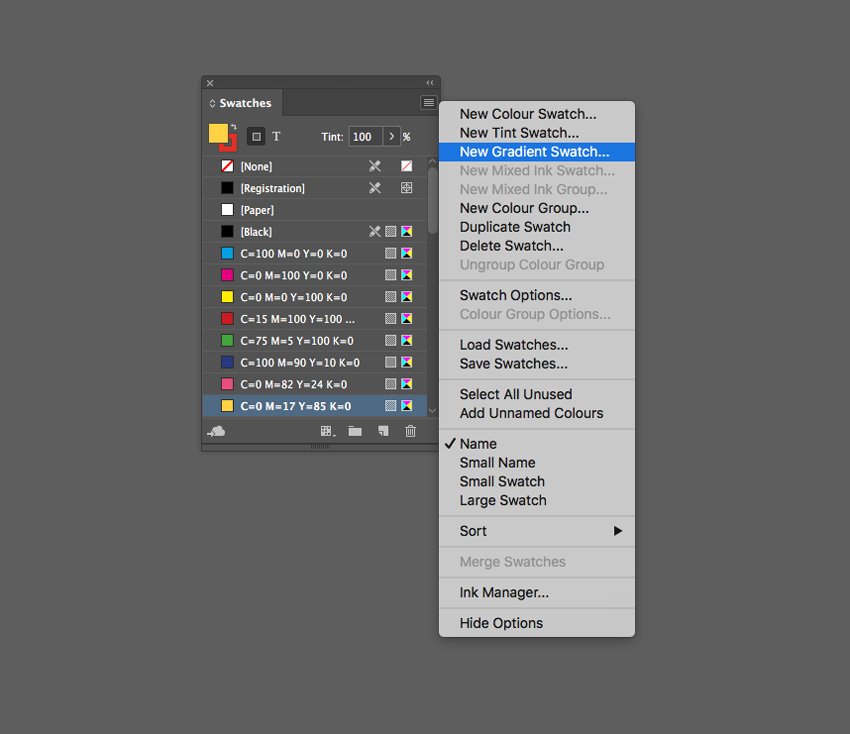
Name the swatch Duotone Gradient, set the Type to Linear, and choose Swatches from the Stop Color menu.
Click on the left-hand stop on the Gradient Ramp and set this to your first pink swatch, C=0 M=82 Y=24 K=0. Set the right-hand stop to the yellow swatch, C=0 M=17 Y=85 K=0.
Click Add and OK.
Step 3
Create a shape on the page you’d like to apply the gradient to. Use the Rectangle Tool (M) to create a background shape. Here I’ve used the Ellipse Tool (L) to create a circle (holding Shift to keep the proportions).
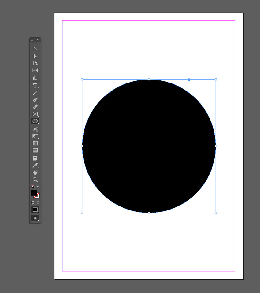
Apply the Duotone Gradient swatch to the Fill Color of the shape from the Swatches panel.
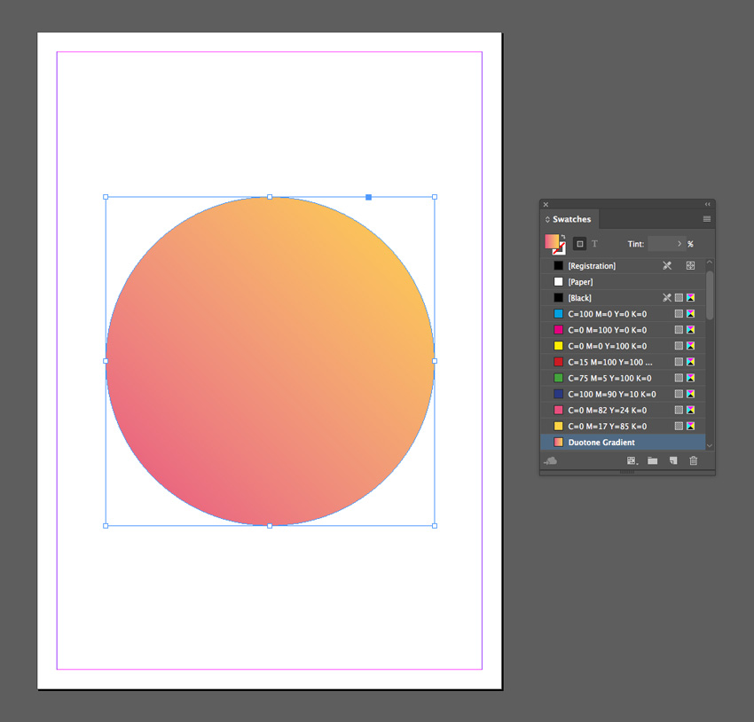
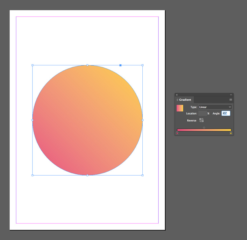
You can use the Gradient panel (Window > Color > Gradient) to adjust the Angle of the gradient.
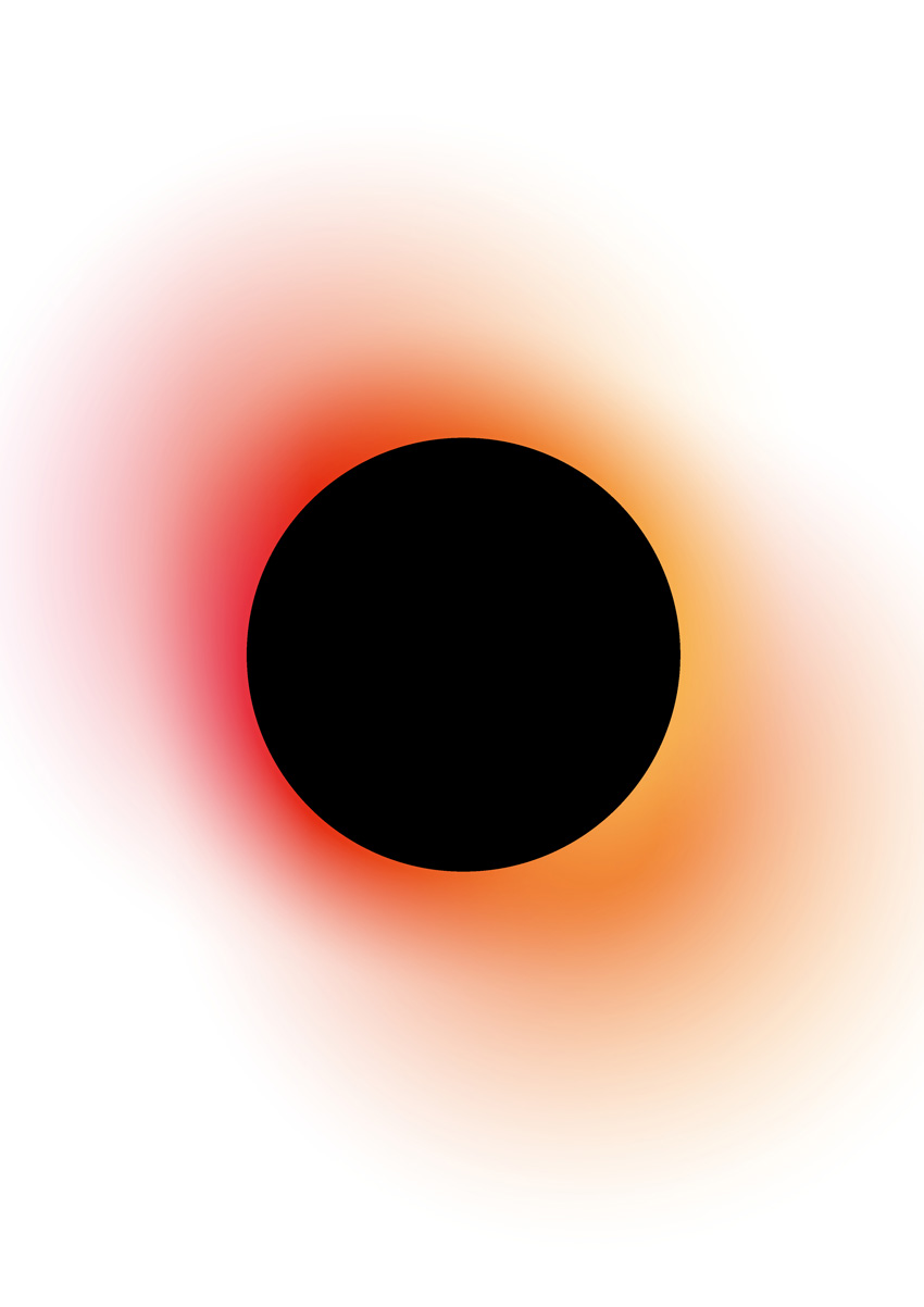
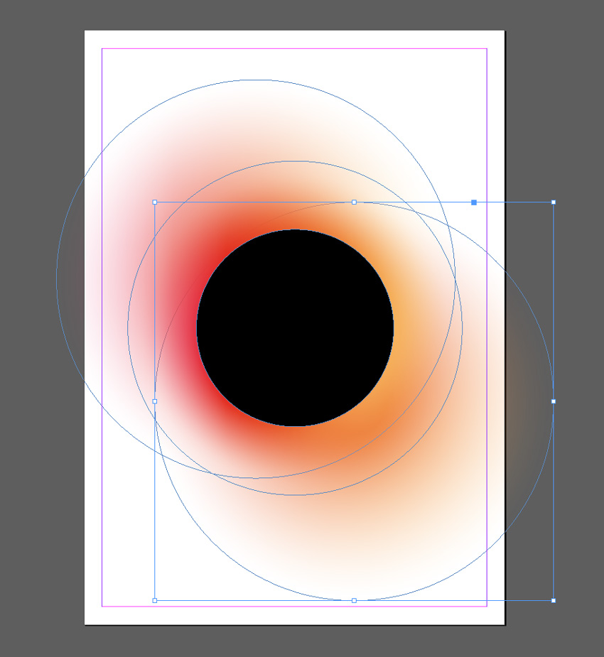
2. Blackout Gradient Effect
This is a high-impact gradient effect that gives an eclipse effect. This works best as a standalone effect using a circle design. Why not try placing text or an image inside the inner circle for extra impact?
Step 1
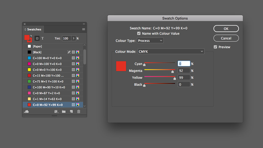
From the Swatches panel (Window > Color > Swatches), choose Create New Swatch. Create a hot pink swatch, C=0 M=87 Y=2 K=0 or R=232 G=59 B=140.
Create two more new swatches:
C=1 M=14 Y=63 K=0 or R=254 G=219 B=117
C=0 M=92 Y=99 K=0 or R=229 G=45 B=20
Step 2
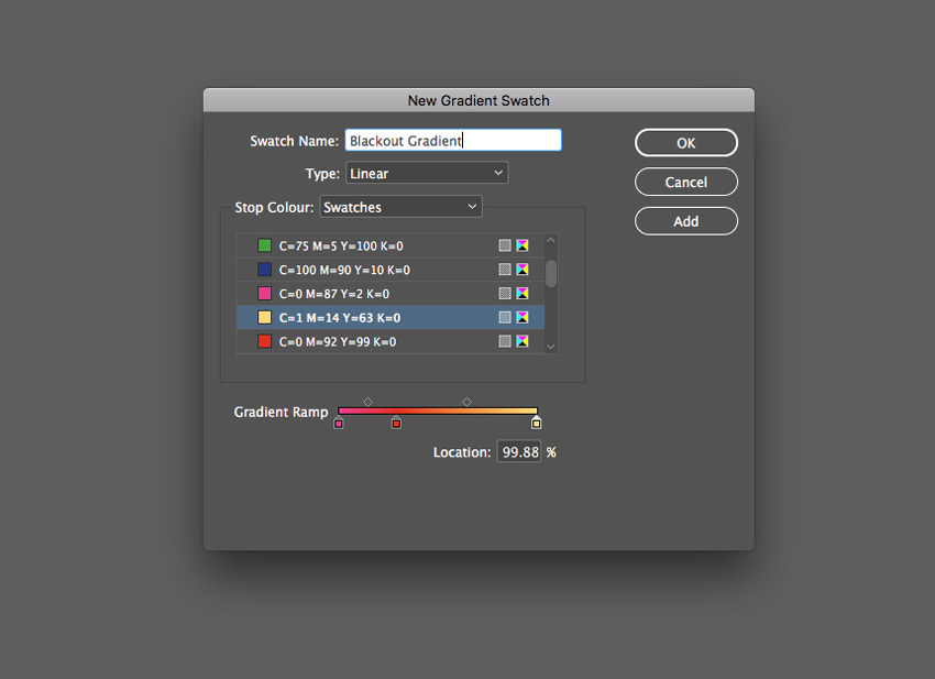
Choose New Gradient Swatch from the Swatches panel’s menu.
Name the swatch Blackout Gradient, set the Type to Linear and choose Swatches from the Stop Color menu.
Click on the left-hand stop on the Gradient Ramp and set this to your hot pink swatch, C=0 M=87 Y=2 K=0. Set the right-hand stop to the pale yellow swatch, C=0 M=92 Y=99 K=0.
Click on the ramp about a third across from the left to add a third stop, setting this to your red swatch, C=0 M=92 Y=99 K=0.
Step 3
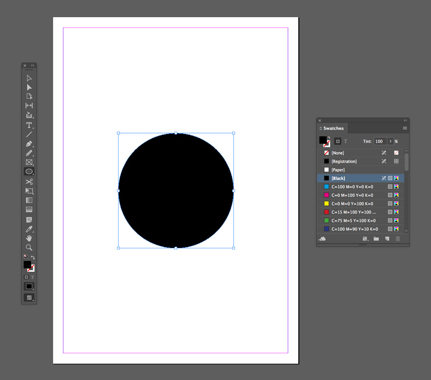
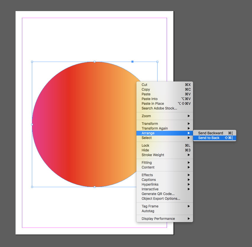
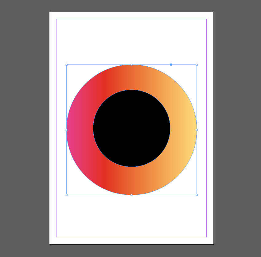
Take the Ellipse Tool (L) and drag onto the page to create a small circle. Set the Fill Color to [Black].
Then create a second larger circle over the top, setting the Fill to Blackout Gradient.
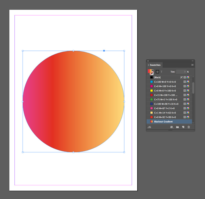
Right-Click on this larger circle and choose Arrange > Send to Back.
Step 4
With the Blackout Gradient circle selected, go to Object on the top main menu and choose Effects > Gradient Feather.
Set the Type to Radial, and move the dark stop on the ramp about two-thirds of the way along.
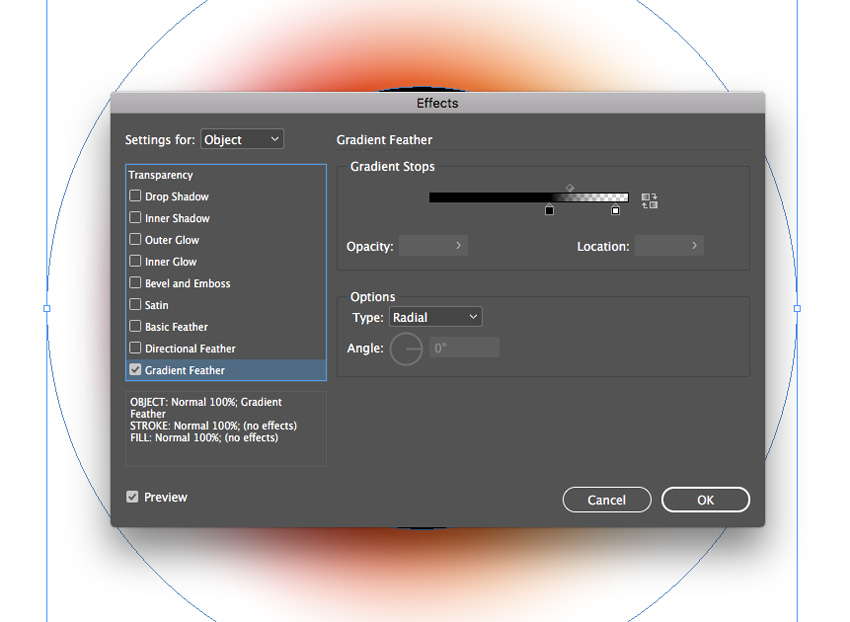
Click OK to exit the window.
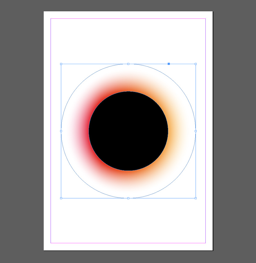
Step 5
Edit > Copy and Edit > Paste the gradient circle, sending it to the back as before. Scale it up to a slightly larger size and position it towards the top-left of the design.
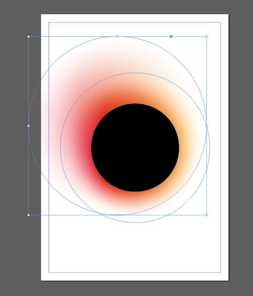
Edit > Paste again, moving this circle to the bottom-right of the design.

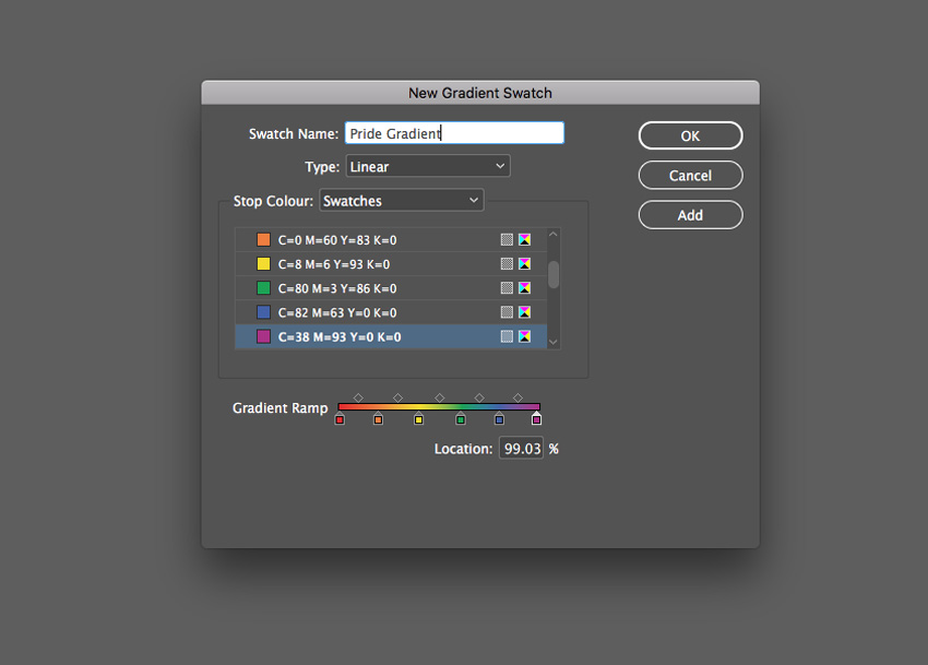
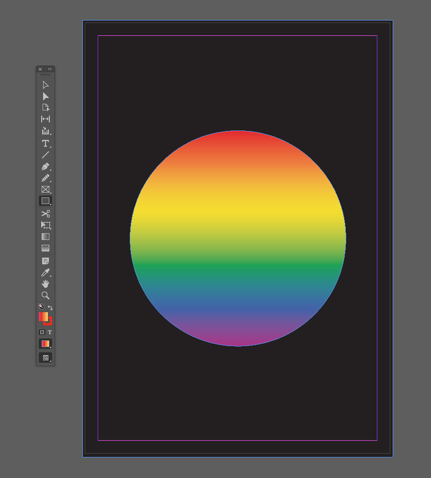
3. Pride Gradient Effect
Show your support of Pride this summer (LGBT Pride Month takes place in June) with this gradient set in the colors of the Pride flag.
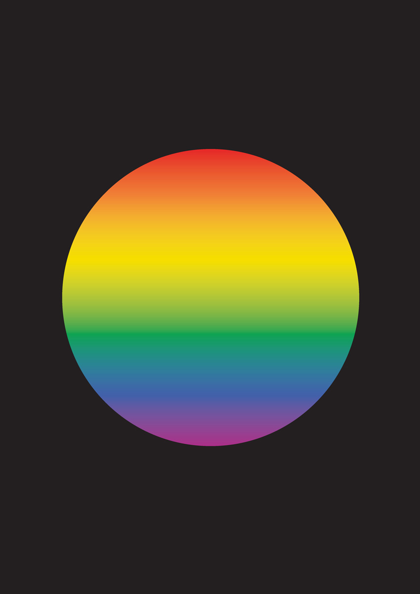
Step 1
From the Swatches panel (Window > Color > Swatches), choose Create New Swatch. Create a red swatch, C=0 M=93 Y=86 K=0 or R=230 G=42 B=40.
Create five more new swatches:
C=0 M=60 Y=83 K=0 or R=240 G=127 B=54
C=8 M=6 Y=93 K=0 or R=245 G=222 B=0
C=80 M=3 Y=86 K=0 or R=12 G=164 B=81
C=82 M=63 Y=0 K=0 or R=66 G=96 B=169
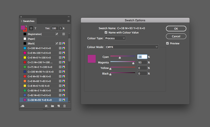
C=38 M=93 Y=0 K=0 or R=171 G=45 B=136
Step 2
Choose New Gradient Swatch from the Swatches panel’s menu.
Name the swatch Pride Gradient, set the Type to Linear, and choose Swatches from the Stop Color menu.
Click on the left-hand stop on the Gradient Ramp and set this to your new red swatch, C=0 M=93 Y=86 K=0. Set the right-hand stop to the violet swatch, C=38 M=93 Y=0 K=0.
Click on the ramp to add four more stops, setting them to (from left to right) orange, yellow, green, and blue from your palette of new swatches.
Then click Add and OK.
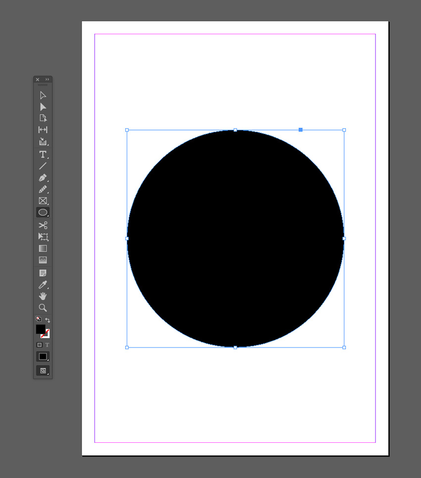
Step 3
Create a shape on the page you’d like to apply the gradient to. Here I’ve used the Ellipse Tool (L) to create a circle (holding Shift to keep the proportions).
Apply the Pride Gradient swatch to the Fill Color of the shape from the Swatches panel.
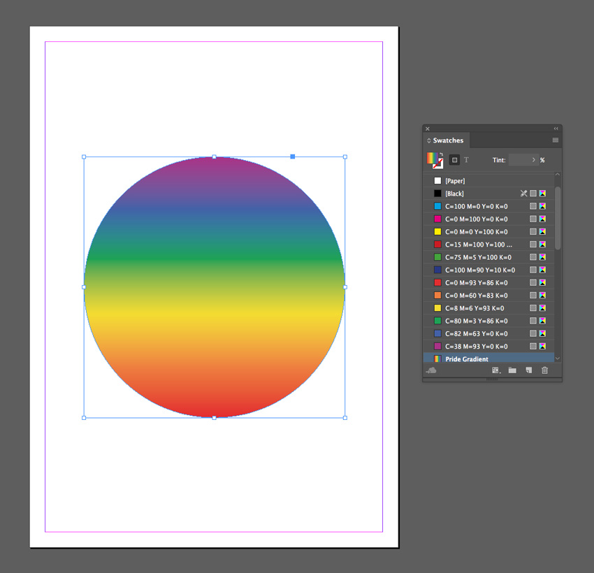
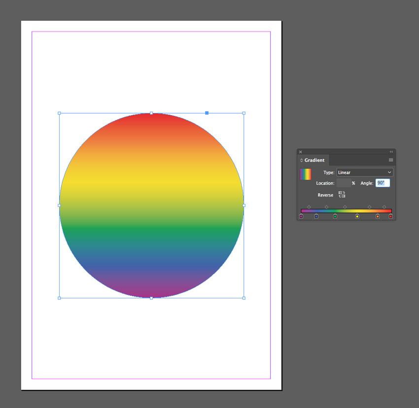
You can use the Gradient panel (Window > Color > Gradient) to adjust the Angle of the gradient.
Step 4
You can set the shape against a dark background for impact.
Use the Rectangle Tool (M) to create a frame across the whole page and set the Fill Color to [Black]. Right-Click on the shape and choose Arrange > Send to Back.
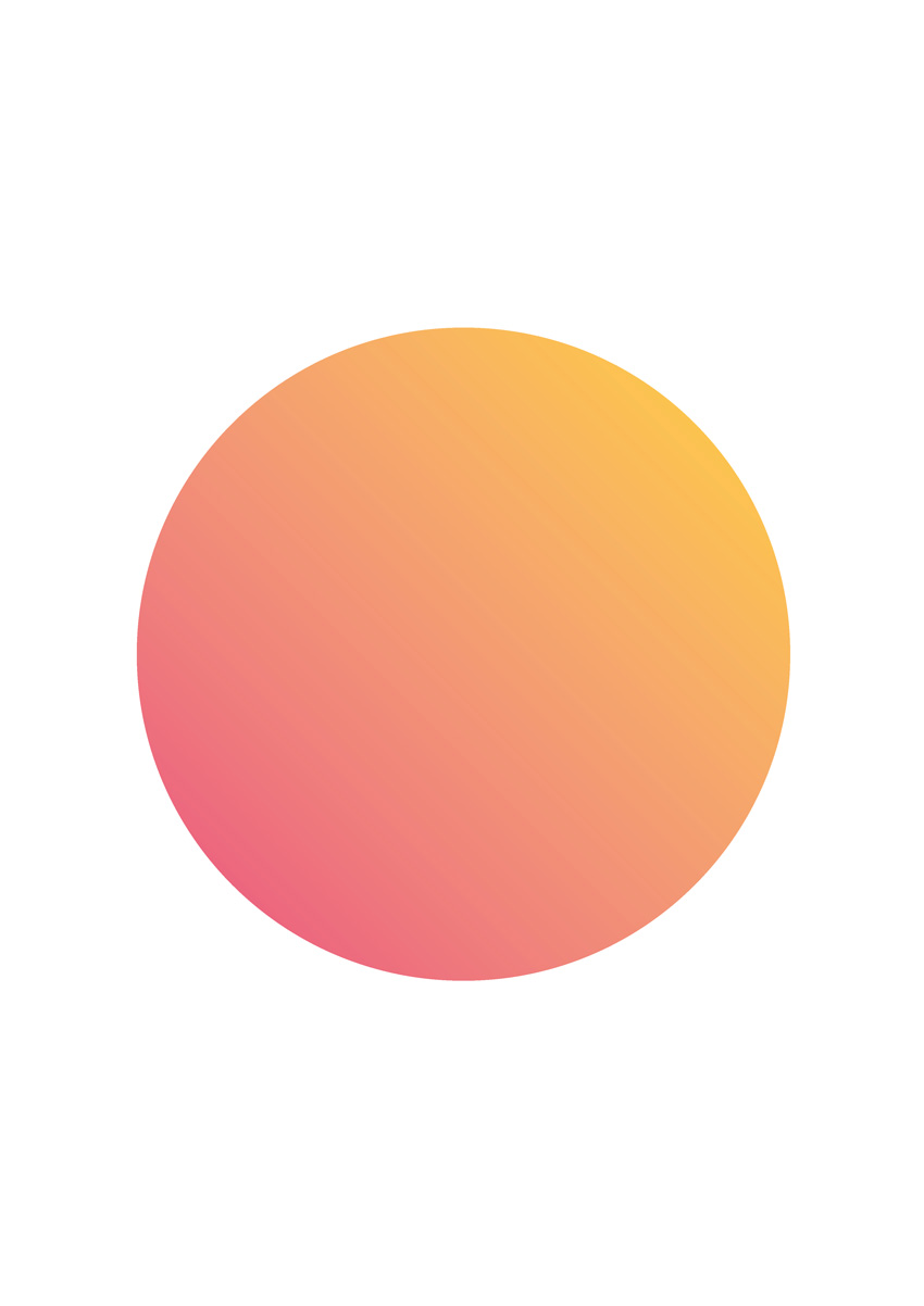
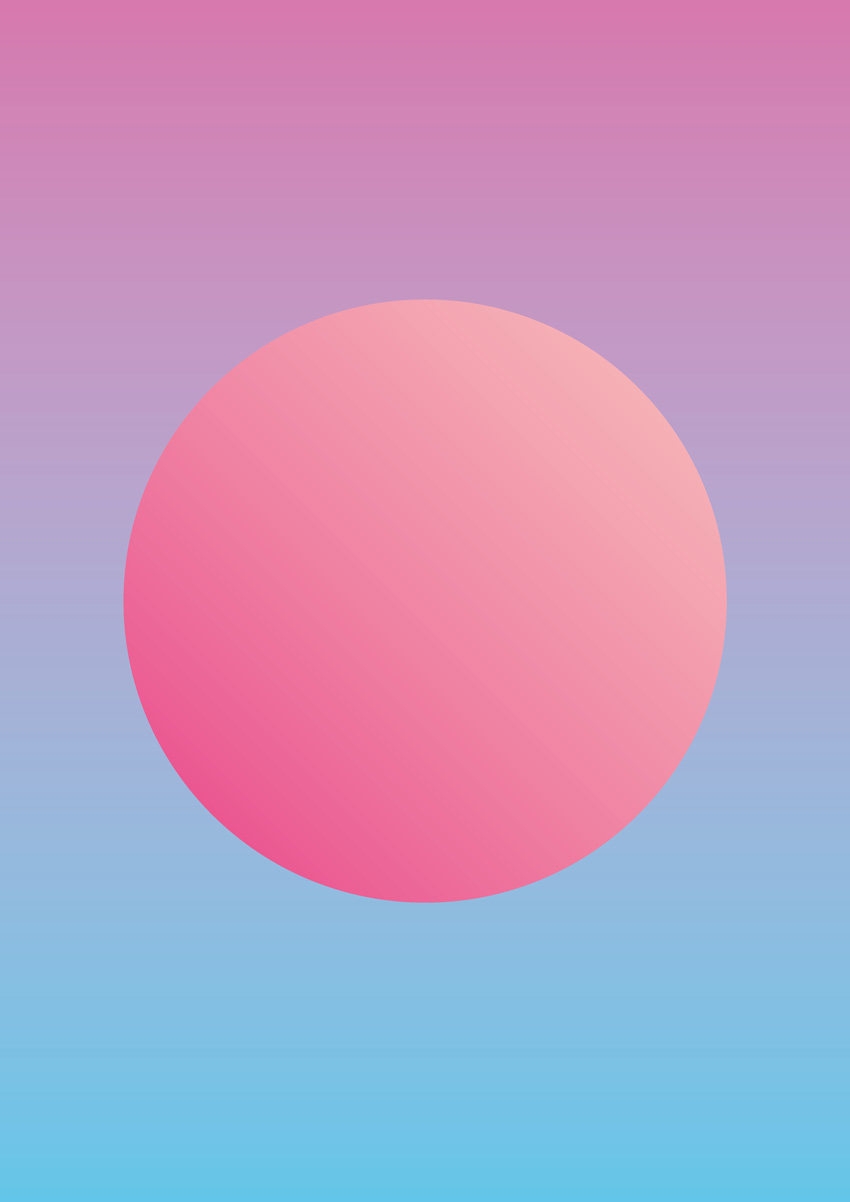
4. Pastel and Neon Double Gradient Effect
This is a popular take on the gradient trend that looks incredible on posters and magazine covers. It’s simple to create, and you can switch up colors to create an almost endless range of results.
Step 1
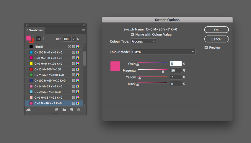
From the Swatches panel (Window > Color > Swatches), choose Create New Swatch. Create a lavender swatch, C=14 M=65 Y=0 K=0 or R=215 G=119 B=174.
Create three more new swatches:
C=59 M=0 Y=6 K=0 or R=98 G=198 B=233
C=0 M=33 Y=22 K=0 or R=248 G=192 B=186
C=0 M=86 Y=7 K=0 or R=233 G=62 B=136
Step 2
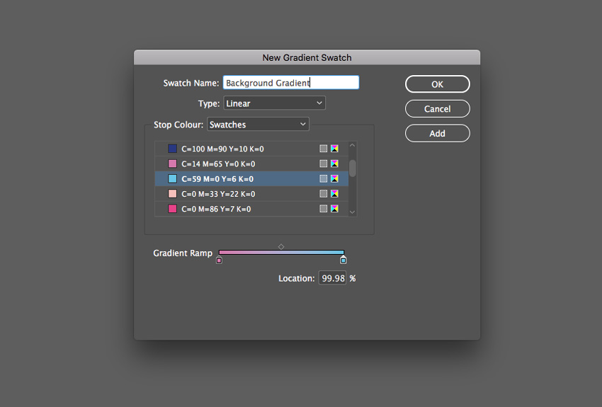
Choose New Gradient Swatch from the Swatches panel’s menu.
Name the swatch Background Gradient, set the Type to Linear and choose Swatches from the Stop Color menu.
Click on the left-hand stop on the Gradient Ramp and set this to your new lavender swatch, C=14 M=65 Y=0 K=0. Set the right-hand stop to the blue swatch, C=59 M=0 Y=6 K=0.
Then click Add and OK.
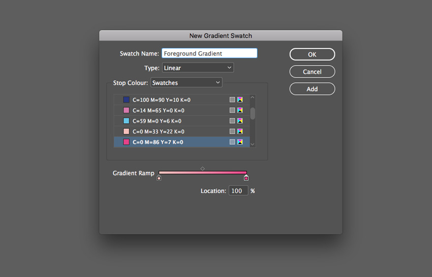
Step 3
Create a second New Gradient Swatch. Name this swatch Foreground Gradient, set the Type to Linear, and choose Swatches from the Stop Color menu.
Click on the left-hand stop on the Gradient Ramp and set this to your pale pink swatch, C=0 M=33 Y=22 K=0. Set the right-hand stop to the bright pink swatch, C=0 M=86 Y=7 K=0. Click Add and OK.
Step 4
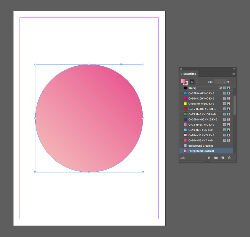
Create a shape on the page you’d like to apply the gradient to. Here I’ve used the Ellipse Tool (L) to create a circle.
Apply the Foreground Gradient swatch to the Fill Color of the shape from the Swatches panel.
Step 5
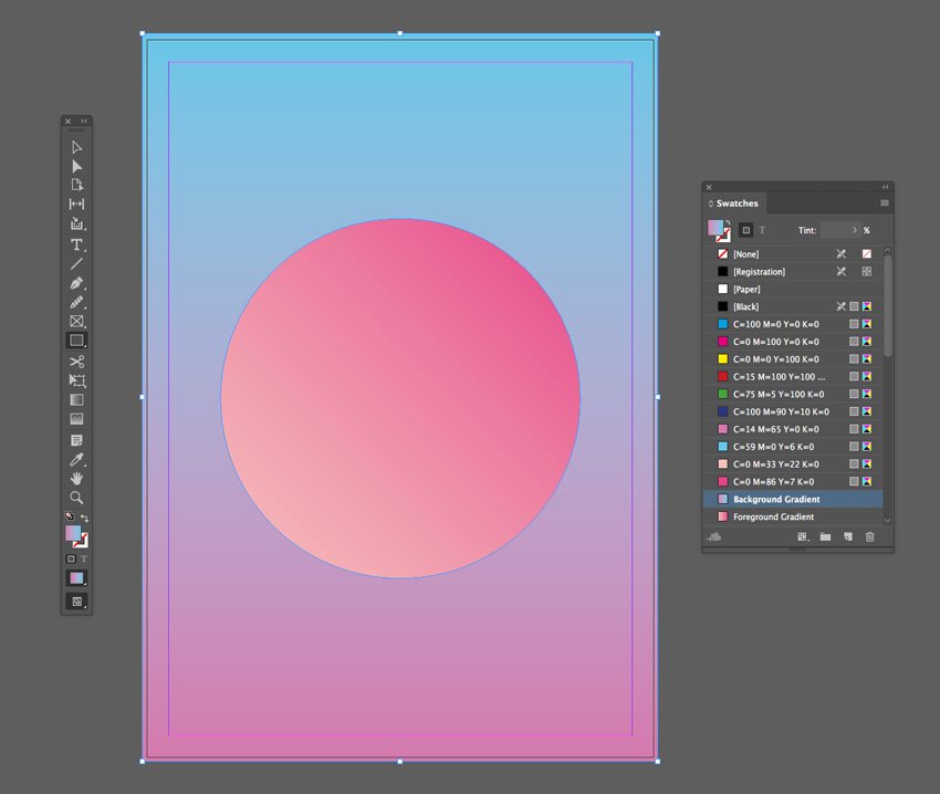
Create a shape across the whole page using the Rectangle Tool (M) and Right-Click > Arrange > Send to Back.
Apply the Background Gradient swatch to the Fill Color of the shape.
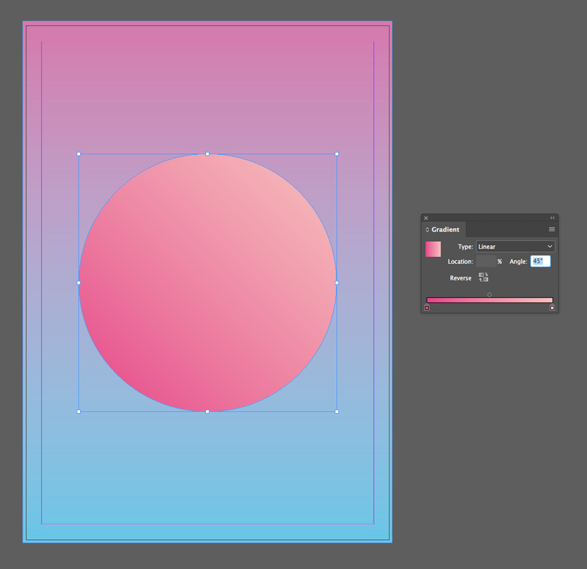
You can adjust the Angle of the gradient and strength of each of the colors from the Gradient panel (Window > Color > Gradient).
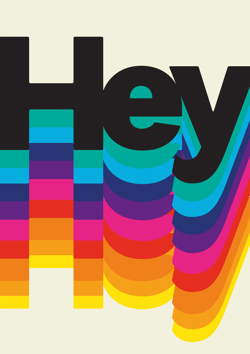
5. Retro Gradient Effect
This funky effect takes inspiration from 1960s and 70s graphic design. It’s a more chunky, dissected take on the gradient trend, and it's great for giving typography a retro flavor.
For this effect, you’ll need to download Charlevoix Pro ExtraBold.
Step 1
From the Swatches panel (Window > Color > Swatches), choose Create New Swatch from the panel’s main menu.
Create a yellow swatch, C=3 M=6 Y=91 K=0 or R=255 G=226 B=9.
Create ten more new swatches, to create a full rainbow palette plus one pale swatch and one dark swatch:
C=0 M=44 Y=93 K=0 or R=246 G=159 B=25
C=0 M=59 Y=94 K=0 or R=240 G=128 B=26
C=0 M=92 Y=92 K=0 or R=230 G=45 B=32
C=0 M=93 Y=0 K=0 or R=231 G=36 B=134
C=77 M=100 Y=0 K=0 or R=98 G=36 B=131
C=100 M=90 Y=22 K=5 or R=39 G=52 B=117
C=73 M=9 Y=4 K=0 or R=6 G=173 B=224
C=77 M=4 Y=47 K=0 or R=0 G=170 B=155
C=7 M=3 Y=17 K=0 or R=242 G=241 B=222
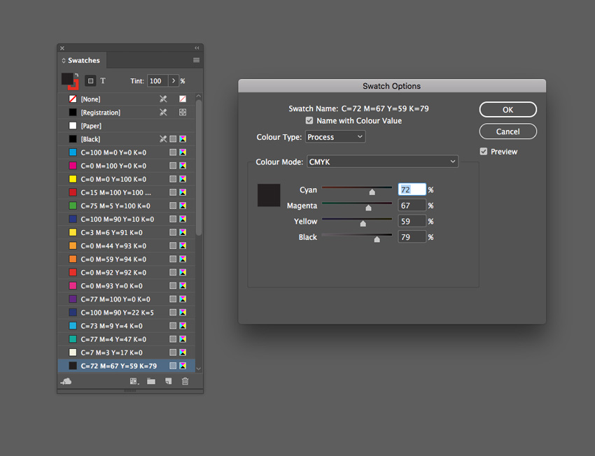
C=72 M=67 Y=59 K=79 or R=35 G=31 B=32
Step 2
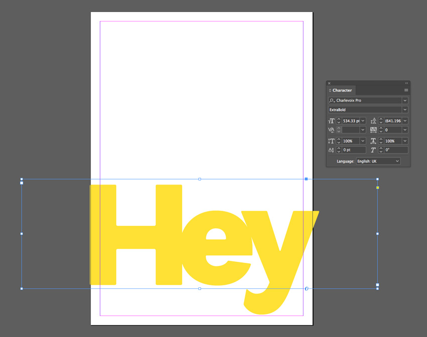
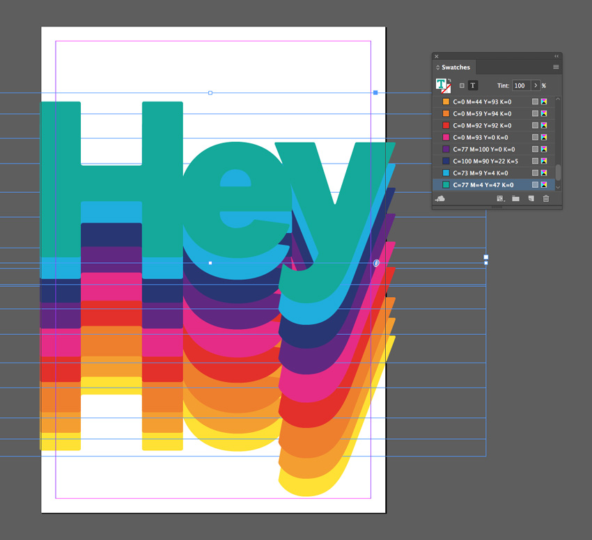
Use the Type Tool (T) to create a large text frame across the bottom of the page.
Type in a single word, such as ‘Hey’, and from either the top Controls panel or the Character panel (Window > Type & Tables > Character), set the Font to Charlevoix Pro ExtraBold. Blow up the Font Size so that the text extends across the whole page, crossing the trim edge on both sides.
Set your Type Tool cursor between each of the letters and reduce the Kerning (letter-spacing) from the Character panel, so that the letters are pushed closer together.
Set the Font Color, from the Swatches panel, to your new yellow swatch, C=3 M=6 Y=91 K=0.
Step 3
Select the text frame and Edit > Copy, Edit > Paste in Place, using the arrow keys to move this second frame upwards slightly.
Adjust the Font Color to your orange swatch, C=0 M=44 Y=93 K=0.
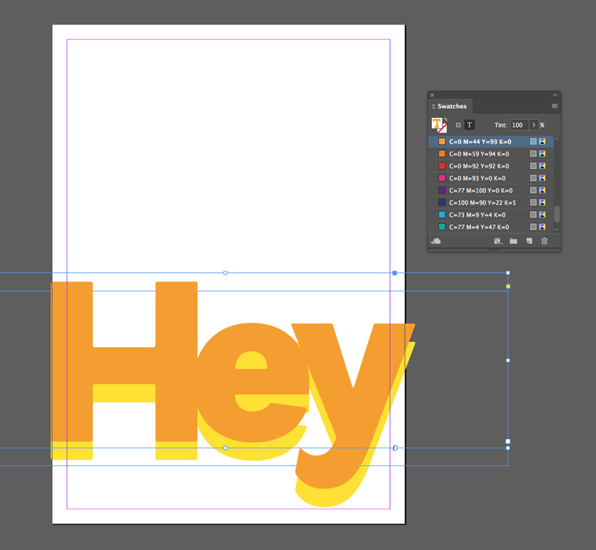
Step 4
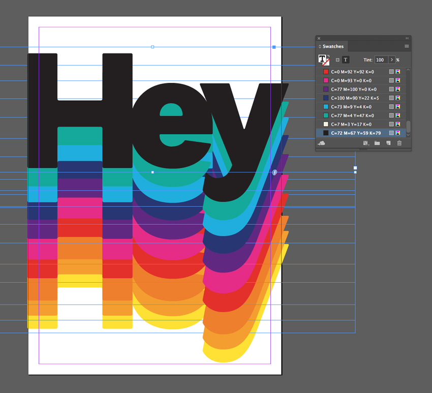
Continue to Edit > Paste in Place more text frames, shifting them upwards and adjusting the Font Color until you have created a gradual rainbow effect, as shown below.
For your final text frame, set the Font Color to your off-black swatch, C=72 M=67 Y=59 K=79.
Step 5
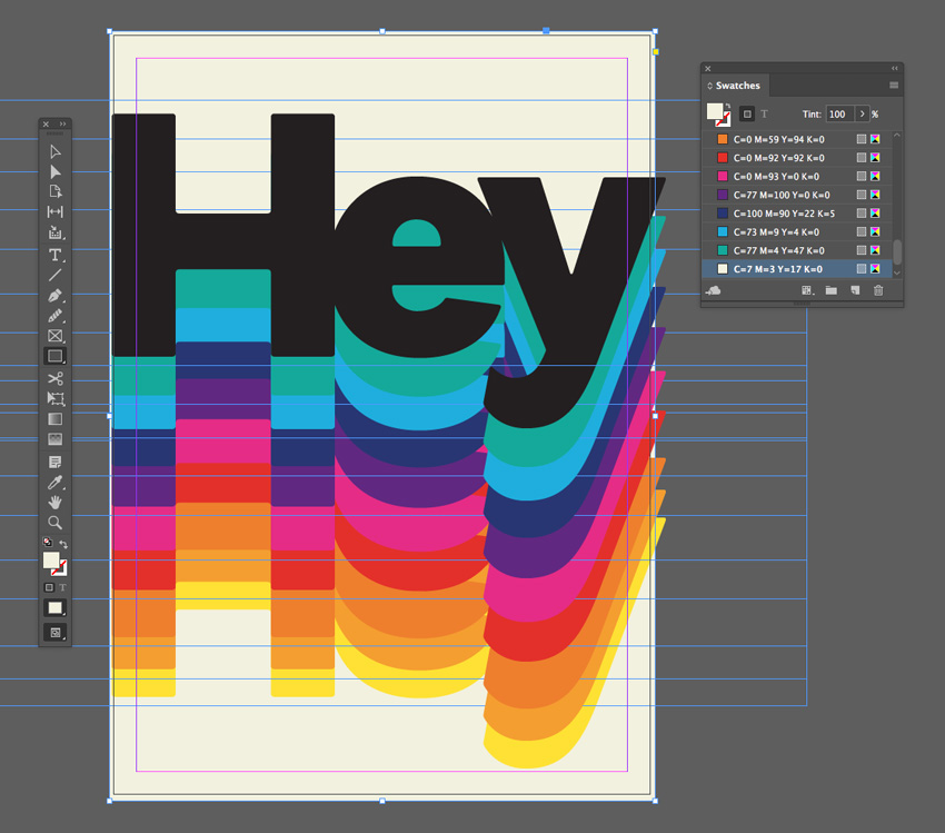
To add a final retro vibe to your effect, create a shape across the whole page using the Rectangle Tool (M) and Right-Click on it and Arrange > Send to Back.
Set the Fill Color to the beige swatch, C=7 M=3 Y=17 K=0.
Hey! Awesome Work!
And there we have it! Five quick and effective gradient effects that can transform any lacklustre layout.
Why not add cool typography to your gradient designs to transform them into posters or flyers? Head over to GraphicRiver or Envato Elements to source great fonts for your next project.
Looking for more InDesign text effect tutorials? Don't miss these:

How to Create a Bold 90s Text Effect in Adobe InDesign

How to Create a Quick Retro Video Glitch Text Effect in Adobe InDesign

How to Create an ‘Everything Will Be Alright’ Neon Poster in Adobe InDesign

How to Create a 3D Paper Cut-Out Text Effect in Adobe InDesign
Original Link:
TutsPlus - Design
More About this Source Visit TutsPlus - Design