
Some of Our Sources
- Slashdot
- Team Treehouse
- The Logo Smith
- Smashing Magazine
- Six Revisions
- Fuel Your Creativity
- Naldz Graphics
- Crazy Leaf Design
- Fudge Graphics
- Daily Now
Help Webnuz
Referal links:
Art Therapy: Paint What You Feel

Do you remember how it felt to paint something as a child? It was a very messy activity, but it was such fun to get creative with all those colors! Well, at least until you started to expect something from your art, for example to picture an object realistically and to get your teacher's approval. The process of painting then became less important than the end result.
Today, you may feel paralyzed just thinking of taking a brush again. It's so hard to paint something, and you don't want to make a fool of yourself! But the truth is, it's very easy to paint. Children do it, don't they? Children don't think about the future so much, and they don't make plans—they just enjoy the moment. This lets them paint without any anxiety and fear of judgment, and this is something you can learn from them!
But what can you paint without analyzing and planning? The answer is: your emotions. It's not only relaxing, but it's also healthy to acknowledge what you feel and allow yourself to feel it without judgment. The best thing about it is that you can't do it wrong. Nobody can tell you what such a painting is supposed to look like—only you. Keep reading if you want to learn how to start!
This tutorial is part of the Art Therapy series. It teaches you how to
use art for relaxation and fun, without putting too much pressure on
yourself.
What You Will Need
For painting:
A set of paints—you can use anything you can get, but the best, in my opinion, are acrylics. You can usually get a set of 12 tubes in a stationery shop quite cheaply, as it's considered a beginner's set. They blend nicely, dry fast, and can be applied thickly on the paper. Watercolors can be more easily available, but they're not so easy to play with.
A few brushes—at least a big, wide one, and a smaller one. The big ones are really expressive, so they're perfect for this exercise.
Two sheets of thick paper—you don't need to buy special, expensive paper for painters if you don't want to. An art pad with thicker sheets should do just fine, though if you want to keep the painting afterwards, you may need to put it inside a clip frame to straighten it.
A glass of water—water makes the acrylics smoother, and you'll also want to clean your brush every time you switch to another color. Just make sure to keep it away from the glass you drink from!
Paper towels—to clean your brush after taking it out of the water, as well as for emergency cleaning.

For the tutorial:
A pencil- A drawing compass
- A ruler

Before you start creating, make sure your workspace is not prone to staining. Place some spare sheets of paper under your "canvas" to have full freedom of painting—you won't have to slow down close to the edges. Children don't care about these things so much, but it may be hard for you to fully enjoy the activity if you're worrying about making a mess!
Colors and Emotions
Although emotions are not visual and they don't have any colors, we can associate certain colors with certain feelings. Some become linked by our experience, while others may be programmed in our mind before we're even born. Synesthetes also find it very natural to describe feelings as colors.
I'll show you a popular description of the meaning behind the colors, but keep in mind that various cultures assign different meanings to colors, so it's not really a universal description—just a popular one. You can use this list to confront your own notions about colors and feelings, which can be especially useful if you've never done that before.
Black
It's the color of mystery, but it also symbolizes all the darkest feelings: grief, despair, sorrow. Just as black can't get any darker, these feelings can't get any deeper. Black covers everything just as these dark feelings can stop you from feeling anything else. Black can also be used to hide what you really feel—emotions you're ashamed of or the ones you don't want to acknowledge. It's the color of domination and isolation.


Grey
It's the color of neutrality, dullness, but also apathy, numbness. Grey is more neutral than white, because it's neither dark nor bright. It can symbolize indecisiveness, the fear of choosing a side, of appearing too bold or even of being visible at all. It can be a symbol of depression, of all the colors-emotions reduced to similar shades of grey—a state not as dark as the sorrow of black, but a constant tiredness of not feeling anything at all. On the other hand, grey can symbolize stability and rationality, especially when put next to vibrant colors.


Red
It's the color of energy, passion, ambition, but also desire and love. It symbolizes fierce feelings that come quickly and overwhelm you with their power, guiding you towards a certain goal that becomes more important than everything else. Red is about feeling "with all your heart", be it love or anger. It also symbolizes sexual attraction and danger.


Orange
It's like a more rational, calmer type of red. It symbolizes joy and optimism; it can be about motivation, but without the blinding effect of red. It's about cooperation, social activities, the power of working together, and also extrovert energy. Orange can also symbolize instinct and reckless acting.


Brown
Brown is really nothing else than dark, desaturated
orange, but because it's the color of ever-present dirt, humans tend to treat it as
one of the main colors. Brown, like the ground, symbolizes stability,
permanence, reliability, and conservatism, but also dirtiness and foulness.


White
It can be considered a default color. It symbolizes spiritual purity, light, perfection, innocence. A white sheet of paper is perfect before you put anything on it; it's good and complete on its own. Therefore, white is all about feeling confident and calm, without any stress to be something else. Every color can get neutralized by adding white to it, making their feelings calmer and less overwhelming. White is the color of enlightenment and spiritual awakening; a symbol of perfect contentment and balance between all the other colors (which create white when put together).


Yellow
It's the color of joy, enthusiasm, happiness, and general cheerfulness. Yellow is the brightest of hues, and as such it symbolizes the optimism that brightens everything put next to it. On the other hand, yellow can also symbolize stubbornness and cowardice.


Green
It's the color of hope, youthfulness, spirit, and also balance, calm, and safety. Green is the color of natural growth, of doing the things the right way, of harmony and peace. It's the symbol of life and being alive in general. It also have negative connotations like jealousy, spite, and maliciousness.


Blue
It's the color of rationalism, wisdom, loyalty, and stability. It symbolizes calm, faith, and trust. It can be associated with conservatism, dutifulness, and introversion. It represents the mind rather than emotions; following logic rather than the gut. But it's also associated with sadness, "feeling blue", melancholy.


Purple
It's the color of magic, mystery, of the extraordinary. It can symbolize creativity, independence, going against the flow, spirituality, imagination, but also pride, immaturity, narcissism.


Pink
It's the color of recklessness, lightheartedness, of being silly and immature, but also of kindness, caring, gentleness, romantic love, and femininity. It symbolizes delicate, "quiet" feelings, as well as being detached from reality.


How to Create Your Emotional Color Palette
What colors do your emotions have? Let's find out! There are so many emotions that it may be hard to tackle them all, so we're going to use a simplified model—Robert Plutchik's wheel of emotions.
This exercise helps understand the emotions you may not even be aware of, and get a better insight into your inner state.
Step 1
Take one sheet of your thick paper. Place your drawing compass in the middle and draw a circle.

Step 2
Put the compass on the circle and mark the same distance outside of it. Then put the compass in the center again and draw a bigger circle through the mark (if you do it properly, it will be twice as big, but it's not really necessary to do it so precisely).

Step 3
Repeat the previous steps to create one more circle.

Step 4
Take the ruler and pencil, and draw a line across the smallest circle. Sketch it lightly—it's just a guide line!

Step 5
Draw another line, perpendicular to the other.

Step 6
Draw two more lines to divide each quarter into halves.

Step 7
These were guide lines for the lines we actually need. Draw them now by cutting each triangle in half. These are the final lines, so you can press harder.


Step 8
Connect each end of the triangle with the outer circle using the ruler.


Step 9
Time to put the emotions in there! In Plutchik's model, the center is taken by the most intense emotions, and they get gradually weaker towards the biggest circle. Fill the center with:
- Rage
- Loathing
- Grief
- Amazement
- Terror
- Admiration
- Ecstasy
- Vigilance
The order is important!

Step 10
Now add the secondary emotions:
- Rage →
anger →
annoyance - Loathing → disgust → boredom
- Grief → sadness → pensiveness
- Amazement → surprise → distraction
- Terror → fear → apprehension
- Admiration → trust → acceptance
- Ecstasy → joy → serenity
- Vigilance → anticipation → interest
There are also tertiary emotions, combined from the two others:
- Annoyance + interest = aggressiveness
- Interest + serenity = optimism
- Serenity + acceptance = love
- Acceptance + apprehension = submission
- Apprehension + distraction = awe
- Distraction + pensiveness = disapproval
- Pensiveness + boredom = remorse
- Boredom + annoyance = contempt
Notice that in this model the antagonistic emotions are placed opposite to each other—for example, joy-sadness, anger-fear, etc.

Step 11
Time to color the emotions! take a look at the primary emotions in the center and try to feel what color they have to you. You'll probably find some that you can get straight from the tube. Put them in their place.

Step 12
Other emotions, especially the secondary ones, may need mixing to get the proper color. Fill the whole wheel, coloring each emotion as you see fit. Don't worry if some get repeated, or if you need to guess others because you don't feel the color clearly—it's your wheel, and you can fill it any way you want!

How to Paint Your Emotional Landscape
Now you know something about your emotions and the colors you assign to them. Time to start painting! Painting your emotions has many benefits:
- You don't need to feel pressure about being "good enough", so you can fully relax.
- You can better understand your emotional state at the moment.
- You can change your mood by using the colors for emotions you want to feel (especially if you're susceptible to suggestion).
- You can experiment and have fun, with no expectations about the outcome.
Obviously, I can't tell you exactly how to paint such a painting, but I can suggest a direction. See how I've created my own mood painting to understand what it's about.
Step 1
I've started in the center with something optimistic and pleasant to my eyes. I didn't paint anything specific—just a few strokes that felt nice under my brush, to better understand how it works and what to expect from various movements.

Step 2
I've added another patch of color, this time playing with the shape of the strokes. Their direction and thickness can be just as expressive as the color itself. Keep in mind you can adjust the level of blending by controlling the wetness of the brush.
You don't need to stick to the colors you've placed on the wheel. You can use it as a palette, but after that exercise you should simply feel what colors are pleasant to you, and which have negative connotations you'd prefer to avoid.


Step 3
I've added a huge blob of yellow, painting "waves" and covering the previous elements with it. Because why not? Nothing can stop me!

Step 4
You can get very expressive by adding the paint directly to the "canvas". This will force you to use the whole amount, and you can create nice, strong strokes with it.

Don't be afraid to paint over the edges—even if you limit yourself all the time, allow yourself to feel more open here and now.

Step 5
You can blend various patches of colors with a wet brush.

Step 6
Using two colors at once can give you fantastic results as well!


Step 7
You can paint on a previous patch of color. The effects will be different depending on the wetness of the surface—play with it to see for yourself!

Step 8
There's no happiness without sadness, so I decided to add a pinch of negative emotions to this landscape. It may look out of place first...

... but you can balance it with other colors. This reminds me that we can't be happy and enthusiastic all the time—negative feelings are just the way our body says something's wrong. Sadness is normal—it's just a part of ourselves, not an enemy to fight and get rid of. If you feel "black", don't be afraid to add it—instead, see how you can make it a natural part of the landscape.

Step 9
Fill the whole scene this way, playing with colors, the shapes of the strokes, and the amount of paint.

Step 10
A smaller brush will let you add interesting accents here and there.
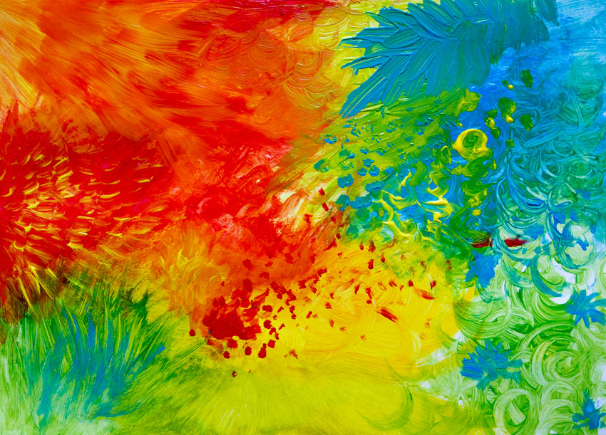
Beautiful!
Just looking at my mood painting makes me feel good and relaxed, and the thick strokes are so nice to touch. I hope you achieved the same pleasant effect with my guidance! If you want to try other relaxing art activities, don't forget to check the other parts of the series:
 DrawingArt Therapy: What It Is and How It May Help You
 DrawingArt Therapy: How to Draw a Mandala
 Drawing TheoryArt Therapy: How to Draw a Stick-Figure Comic
You can also enjoy simple tutorials created for people with little or no experience at drawing:
 FoodHow to Draw an Apple
 NatureHow to Draw a Leaf Step by Step
 FoodHow to Draw 10 Different Varieties of Berry
 DrawingHow to Draw a Bird Step by Step

Original Link:
TutsPlus - Design
More About this Source Visit TutsPlus - Design