
Some of Our Sources
- Mashable
- The Logo Smith
- Smashing Apps
- Abduzeedo
- Naldz Graphics
- Fudge Graphics
- Design Modo
- Codrops
- Dev To
- The Verge
Help Webnuz
Referal links:
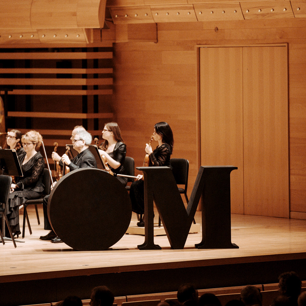
Brand Identity and Graphic Design for The Metropolitain Orchestra
Brand Identity and Graphic Design for The Metropolitain Orchestra
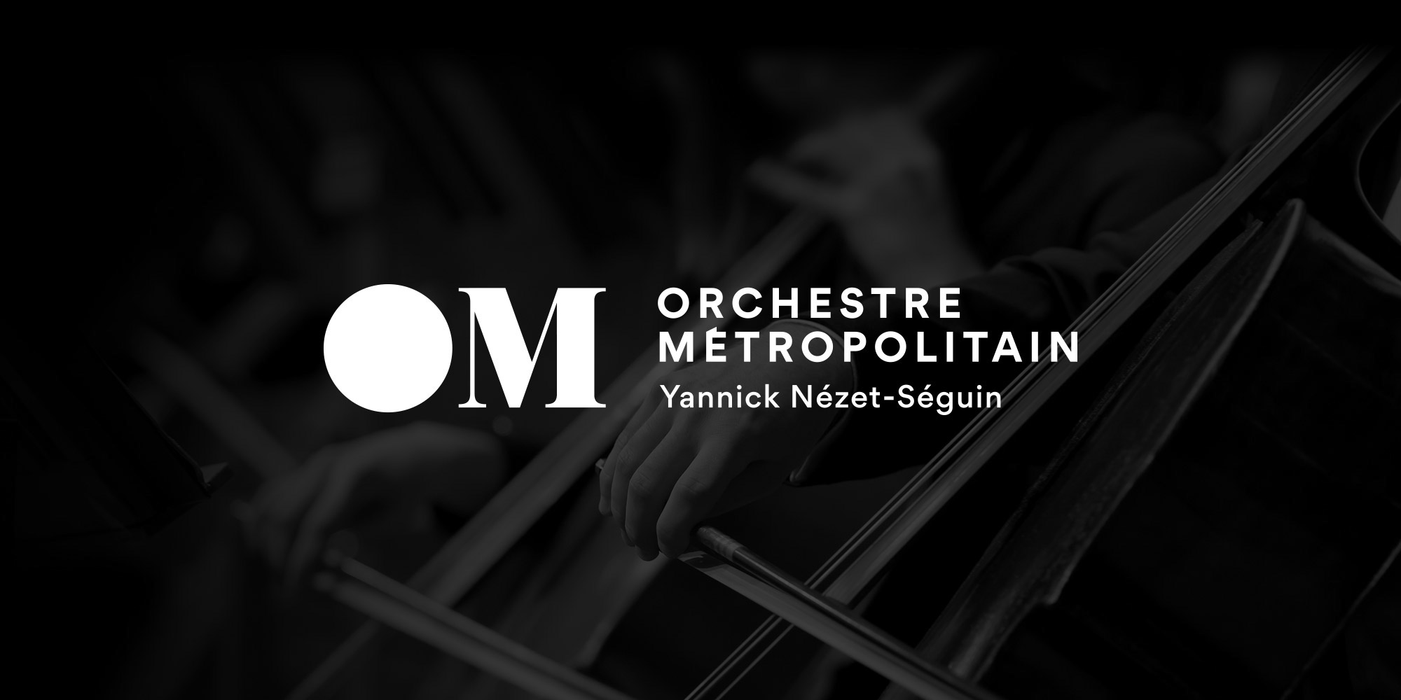
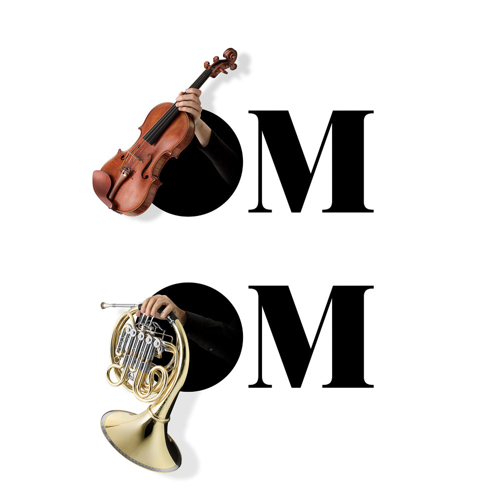
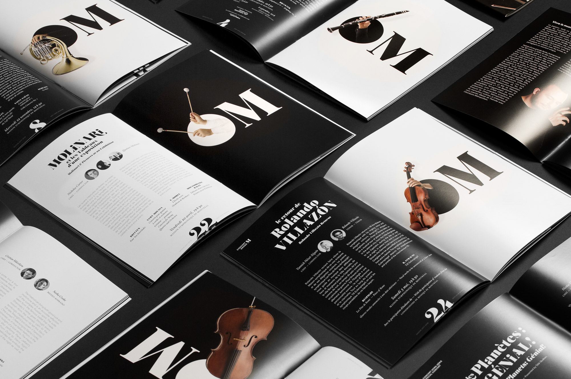
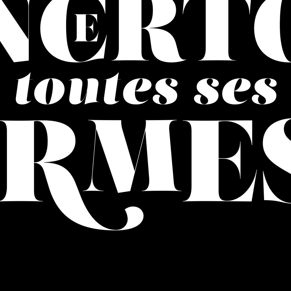
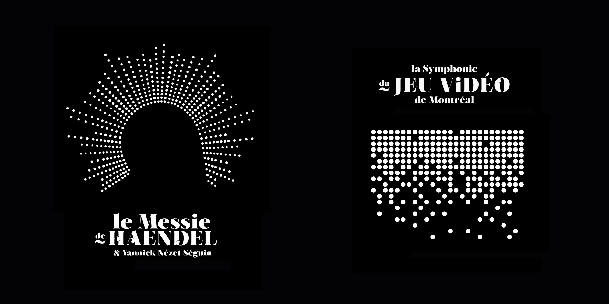
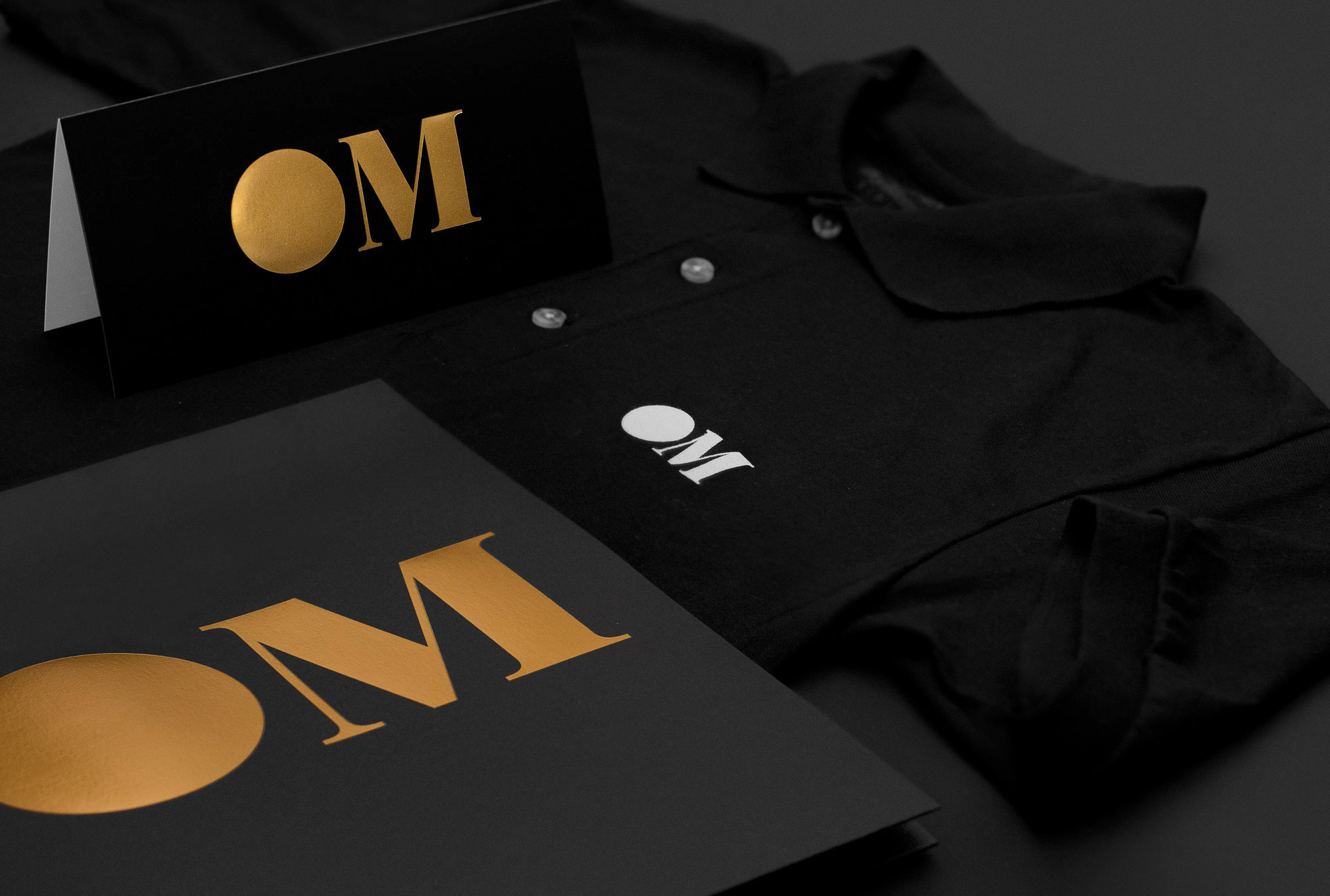
ThebyHAUS Studioshared a great brand identity and graphic design project on their Behance profile. It's the new identity for The Metropolitain Orchestra with Yannick Nzet-Sguin. They describe it as a rethought the identityby playing with contrasts and sensations. Thenew logo is a monogram composed of two letters: one anchored in modernity, the other in aclassical tradition. Moreover, the perfect circle which replaces the letter O is exploited throughout agraphic design platform as a window where the music is expressed. A lyrical and opulent typographic game completes the identity system. Thus, OM proudly takes the place it deserves: an orchestra assumed, relevant, well of its time, but still and always resolutely classic - in their own words.
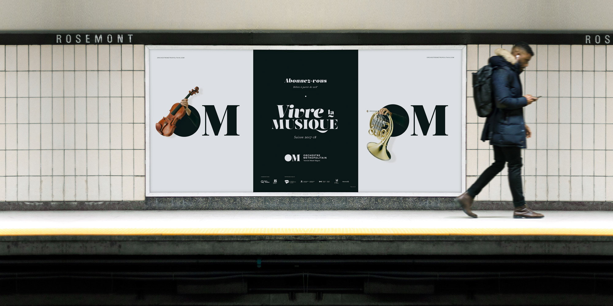
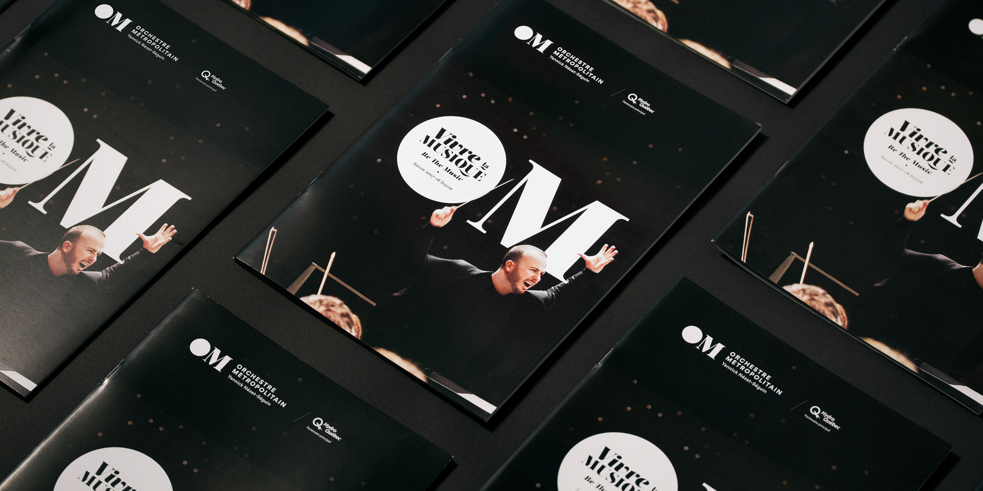
The project is a great example of modernizing but still keeping it simple and elegant. You can see from the before and after that the circle from the original logo was preserved and became the O of Orchestre as they mentioned. Below we showcase a bit more of the project and some of its graphic design applications. Also make sure to check out the website at https://orchestremetropolitain.com
Brand Identity and Graphic Design
Before and after


Original Link: http://feedproxy.google.com/~r/abduzeedo/~3/n7OgORLGwWU/brand-identity-and-graphic-design-metropolitain-orchestra
Abduzeedo
 Abduzeedo is a collection of visual inspiration and useful tutorials
More About this Source Visit Abduzeedo