Visual Identity: Beautiful Branding for Studio PPlogo
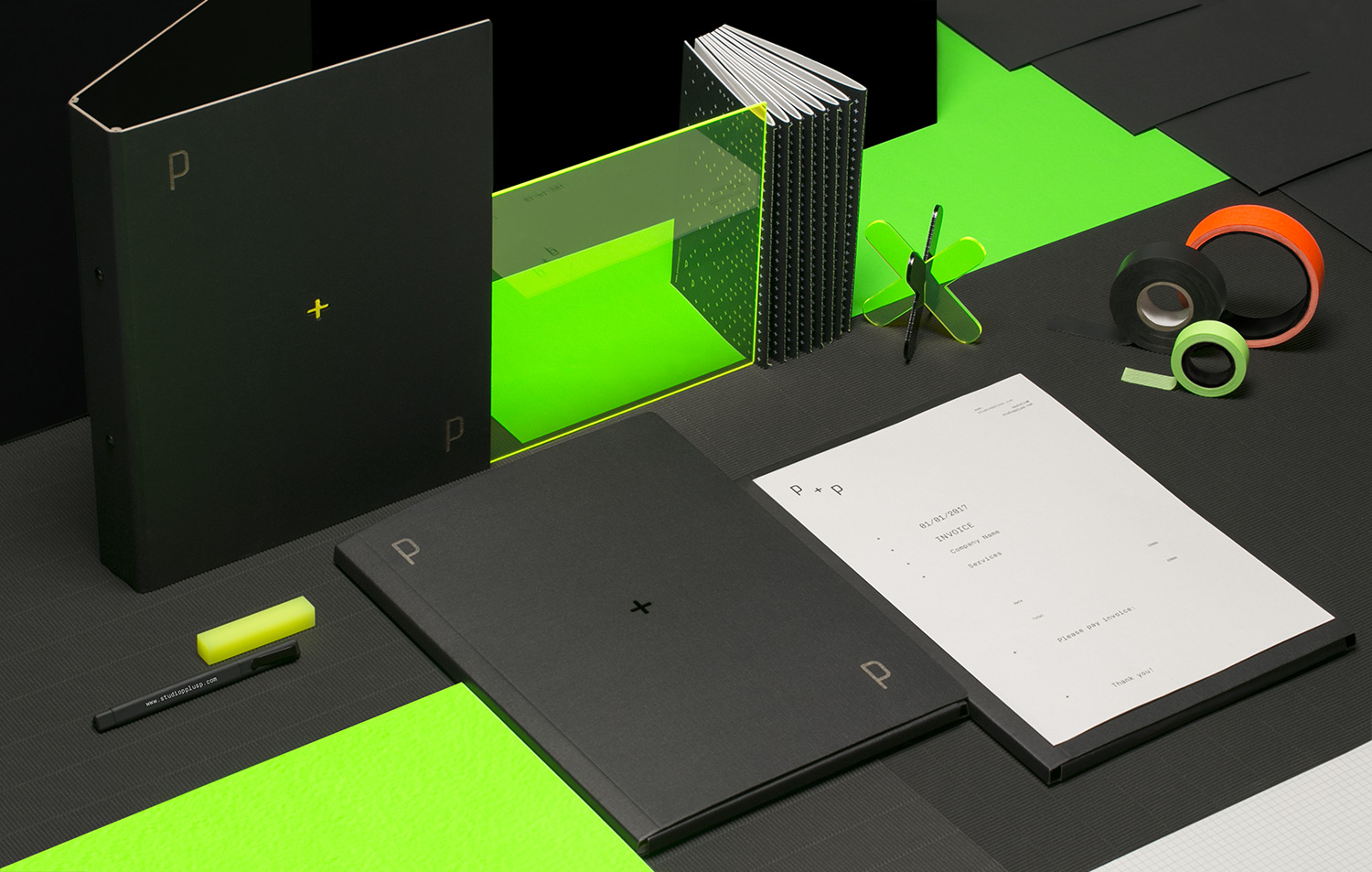
Visual Identity: Beautiful Branding for Studio P+Plogo abduzeedoMay 03, 2017The folks over at Studio P+P just shared a beautiful branding and visual identity project. This time it was not for a client but for themselves, which makes it eve harder to pull it off in my opinion. The outcome, however is top notch, from the simple and minimal approach to the vibrant color palette, there's so much to love about this visual identity project. Below you can see a bit more.
The Studio P+Plogo reflects the minimal and functional approach ofthe studio works. Those were the words from the designers behind it. They also mentioned that the logo is adaptable to the different media formatsand the symbol "+" can exist separately as an independent graphic element.
About the colors the designers chose to use black and white for theprimary color palettewith the secondary colors fluorescent orange and fluorescent green. "The secondary colours communicateindividuality and an experimental approach of the studio." they said.
Visual Identity
Credits
- Photography:Elena Pirogova Mares
- Set Design:Anna Sbiera
Original Link: http://feedproxy.google.com/~r/abduzeedo/~3/1LpTQ-MmawY/visual-identity-beautiful-branding-studio-pp-logo
Abduzeedo
 Abduzeedo is a collection of visual inspiration and useful tutorials
More About this Source Visit Abduzeedo


