When you mention M&Ms or Pringles, everyone remembers the colorful button-shaped chocolate characters and themustachioed man, which naturally drive us to remember the brands they are associated with. Mascots are a great way of keeping businesses in the minds of customers.
Mascots are fun, useful brand/service and event ambassadors. Therefore they should beappealing in order to grab the attention oftheir target audience, and must reflect the spirit and nature of the "product".
In most cases, mascots are used for educational purposes, entertainment, or both.
In this tutorial, you will learn more about how to take a client brief from illustration to final mascot design.
Let's start creating!
1. Research, Concepts & Sketch
Step 1
I receive plenty of character design requests for several types of businesses, but I can tell you there are no correct steps to follow when designing a character, but there are a few tips you can follow to achieve the right look.
One client brief I handled was focused on creating "afictional,health conscious character which is supposed to bring fun and excitement to kids' meal choices while also serving as an ambassador to balanced and wholesome eating".
So typically, you would start with some quick research of current character trends, similar brand avatars, and an analysis of what could possibly work and reflect the brand's personality, keeping in mind that it targets kids on an educational level.
Here are a few tips on designing characters for kids:
Keep the character design simplified.
Draw simplified shapes and expressions kids can relate to.
Take time to explore possibilities, sketch concepts out, and make sure it's different from what's in the market.
Eyes communicate emotions, and they are the first thing we view when connecting with a character.Slightly large eyes bring out warmth and appeal tokids.
The character should have an assertive stance.
Slightly wide smiles always win the heart.
Keep an open mind. Clients tend to have their own vision and will tend to direct you in the way they need the character developed to suit their business.What you start with may vary by the end of the process.
Sketch out at least three rough concepts for the client to review.
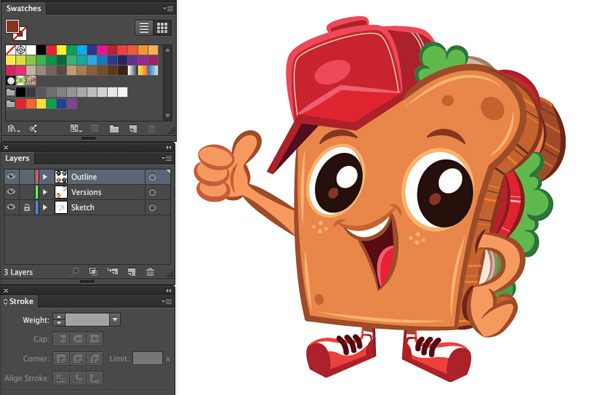
A sportive apple, a toast-headed boy, and a lunch bag were among the sketches.
The client's feedback was to create a "sandwich boy", with arms and legs, but no body. So I sketched a cleaned out version, and it was immediately approved.
Step 2
I illustrated a sandwich with big bubble eyes, a wide smile, sports cap, trainers, and a thumbs-up pose.
When approved, save your image as JPG, to place it into Adobe Illustrator.
The size of the artboard doesn't matter, because with vector, all artwork isinfinitely scalable.
File > Place (Command-Shift-P), and a preview icon of your sketch file will appear. Click on the artboard to place the image onto the artboard.
Open theLayers panel, Window > Layers.
Double click the first layer in the Layers panel, and name it "Sketch".
CheckLock,Dim Images to: 20%and clickOK.
Create New Layer, on top of the Sketch layer, and name it “Outline”.
File > Save(Command-S) and OK.
2.Outline, Brushes & Line Weights
Step 1
Let's start outlining the artwork. There are many ways to do this.
Select yourPen Tool(P).Open theStroke panel.Select a black Strokeof0.75pt,Fill to None, Rounded Caps/Corners andbegin tracing over the main parts of the artwork.
As a start, trace the basic line work and leave out the organic shapes, curved lines and ellipses.
Next, select theEllipse Tool (L) with Fill to None and black Stroke, andtrace over the ellipses in the illustration. At some points, you may need to select the Scissor Tool (C)to split paths at anchor points or along segments, and then delete the excess paths.
Step 2
As you can see, the illustration looks rigid and lifeless, with plain 0.75 pt strokes. We need to bring it alive by creating some thickness to the lines. However, having similar thickness doesn’t help ease the eyes any more than the thin stroke. Instead, we need to add variation to the widths of those lines. We can do that by playing with the line weight.
Line weight is a form of style and expression.
It can distill images in our brains, taking mass visual dataand transforming it into a simplified interpretation of that form. Just by varying the thickness of lines and outlines of the illustration,we can give flat artwork movement, character and added strength to create a type of third dimension!
This is definitely a style technique that I think everyone should experiment with, in order to get a better understanding of why line weight is important.
When it comes to line weight, there is no rule on whether to use or not to use line work at all. Not using any line work can give the mascot a light visual feel, but at the same time it can limit its usage. Using varied line work can give the image more presence and definition.
Step 3
To accomplish the thickness effect, grab the Width Tool from the tool palette (Shift-W), andsimply click and drag anywhere on the stroke to change the width of that point.
Click and drag to control the width at each desired point. Drag inwards to reduce the line weight, and drag out to increase it. The fun thing is that the transitions are instant and smooth, so you don’t have to spend time tweaking.
Gradually you will begin to see the character develop beautifully.
Step 4
For curves, I like to create custom brushes.
Rather than eyeballing line weights, you can set up Variable Width Profiles that automatically apply to a line.
Select the Line Segment Tool (\)and draw three to five lines,holding down theShiftkey to keep the line fixed horizontally.
Then select theWidth Tool(Shift-W) and create different width profiles for the strokes. This will enable you to adjust the settings that you want the profile to duplicate.
Next, hit the Add to Profilesbutton at the bottom of the Profile panel, in theStroke panel.
This will pop open the Variable Width Profile window, to enable you to name the stroke. Click OK.
Delete the custom line paths created after their profiles have been saved.
Step 5
Now take the Pencil Tool (N), and trace in the remaining curves, with the Stroke Profileand Stroke Width of your choice.
It’s important to understand that when you apply Variable Width Strokes, the nature of the path stays the same. It edits the stroke independently of the path.
Step 6
To finalize the outlines, take the Pen Tool (P) and fill out the black zones of the illustration to give it depth, wherever suitable.
Then tweak paths as you see visually appropriate.
Once you are happy with the outcome,File > Save.
3. Color Variations
We need to expand our artboard in order to create different versions of our character.
Typically four versions of the mascot character are delivered to clients:
Outline
Greyscale
Flat color
Color with effects
Step 1
File > Document Setup > Edit Artboards
Expand the artboard to dimensions that fit two characters on top of the board and two underneath.
Object > Select All (Command-A)toselectall theelements.
Then Object > Expand Appearanceto transform the strokes into filled shapes. This will allow you to resize the illustration to any size without losing quality.
Command-G to Group the elements together.
Then Duplicate the group, in order to create three other copies of the mascot on the artboard. Select the group, hold down the OptionandShiftkeys, and drag to copy and constrain your selection.
Step 2
Lock the "Outline" Layer.From theLayerspanel,Create New Layerunder "Outline" and name it "Versions".Here we will create the other four versions of our mascot.
Start with the black and white.Select the Pen tool (P), with White Fill and Stroke to None.Trace around the outline borders of the mascot. This will create the white base in our black and white character version.
Duplicate the white background we created, to the mascot on the right, by holding down theOptionandShiftkeys and dragging it across, so we can create the greyscale version.
Step 3
Let's create our "Greyscale" version mascot.
Open the Swatches panel. You will find a folder in the library that is "Grey" with a range of grey swatches.
Select the Pen Tool (P), and experiment with the grey tones from the Swatches panel,to fill in white spaces between the black outlines,withStroketoNone.
Your character will begin to appear alive.
Lets take it to another level.
Unlock the "Outline" layer from the Layers panel. Select the Direct Selection Tool (A), and experiment with switching some black paths or shapes to white or grey tones.
Changing the outline colors and black shapes will diminish the aggressiveness of the black outline.
Lock the "Outline" layer from theLayers panel.With the Selection Tool (V), grab all the grey layers we created.
Duplicatethe grey shapes we created to the mascot below, by holding down the Altkey and dragging, so we can create the color version without having to trace under the outline again.
Step 4
Here we will give our mascot color.
Select thePen Tool (P), and experiment with the color tones to fill in the white spaces between the black outlines. Make sureStrokeis set toNone.
Unlockthe "Outline" layer again from theLayers panel.
Ungroup (Command-Shift-G) the grouped outline, so we can give each stroke a color. Select theSelection Tool (V), and alter the color of the outline paths and shapes.
This will tone down the black outline effect.
Awesome! Looks great.
Step 5
To create the "Effects" version, Delete the fourth mascot outline, by selecting all its parts from both the "Outline" and "Versions" layers.
Next, with the Selection Tool (V), select all the color components of our "Color Version" mascot, hold down theOption-Shiftkeys, and drag to copy and constrain the selection.
The tricky part about effects is that you have to make lighting decisions, on where there might be shadows and were we can add light effects.
Let's start with the shadows.
Lockboth layers from theLayerspanel, andCreate New Layerbetween "Outline" and "Versions", called "Shadow".
Select the Pen Tool (P) with a mid-grey swatch, and draw in areas where there might be shadows.
Step 6
Open theTransparency panel.Select All (Command-A), and change the Blending Mode to Multiply.
It will look dark, and not matching, but it will help you determine if the shadow falls in the right place.
Next you need to change the grey tones to a lighter version of the color underneath it. So if it's brown, go for a pale brown alteration. Tweak as you find fitting.
Step 7
NowLock the"Shadow" Layer from theLayerspanel, andCreate New Layeron top of "Outline" and name it "Light".
Select thePen Tool (P)and add in white light, but don't overdo it. Just small touches.
Step 8
Finally,take the Selection Tool (V).
Drag over each mascot version, andGroup (Command-G) it to its relative components, so each color version is grouped to itself, and nothing is misplaced when the client accesses the file.
Then Select All (Command A), and move them to the "Light" Layer, and rename it "Mascot", so they are all on one unified layer.
Awesome Work!
We are done! By using basic Adobe Illustrator tools and shortcuts,we learnt to create a simple mascot design, for kids, in four different color versions.