
Some of Our Sources
- BoingBoing
- Smashing Magazine
- TutsPlus - Design
- Vandelay Design
- Crazy Leaf Design
- Web Design Ledger
- Line 25
- CSS Tricks
- Web Resource Source
- The Verge
Help Webnuz
Referal links:
10 Top Tips for Designing Your Own Business Cards

Business cards are essential for any business, whether freelance illustrator or big design agency. Cards are a great way to establish new connections at networking events and to showcase your brand. Business cards may be small, but they need to pack a punch to have the potential to win new business.
Here, we’ll take a look at ten professional tips for designing your own business cards, from how you should get started to how to use typography, graphics and print effects to leave a lasting impression.
Browse even more business card templates over on Envato Market, to find your perfect card design.
Or why not take a look at this tutorial about how to customize a minimal business card template, and make it unique to you? If you're looking for something more advanced, check out our Designing Professional Business Cards course.
1. Lay Down a Grid... and Stick to It!
The first thing you should do once you have opened up your software of choice (look to Adobe InDesign, Quark and Adobe Photoshop for print-friendly layoutprograms) and created your business card document (complete with a bleed, of course!), is to lay out a grid on both the front and reverse pages of your card.
Yup, it might seem obvious, but structuring your design with the help of a grid is going to make your cards appear more balanced and pleasing to the eye.
This colorful business card template is structured on a really simple grid, but it looks really attractive.

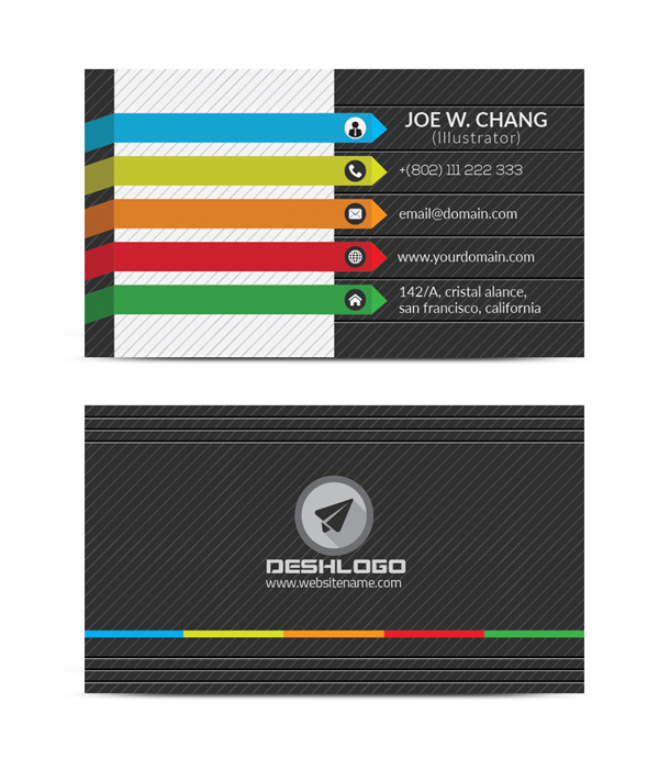
Mixing up smaller square sections with longer rectangles creates interest and gives you perfect places for dropping in different items of info, whether that’s a social media icon or a phone number.

As you’re designing, keep referring to the grid for lining up text and graphics—you’ll notice a difference in the quality of your design, and it’s such an effortless way of introducing a simple structure to your cards.
If you’re working in InDesign, you can easily insert a grid by going to View > Grids & Guides > Show Document Grid. You can also edit the proportions of your grid from Preferences > Grids.
If you’re in Photoshop, add a grid to your canvas by going to View > Show > Grid; and edit the grid’s settings from Preferences > Guides, Grid & Slices.
2. Simple Can be Effective... I Promise
OK, admittedly there are some clearly non-minimal card designs scattered throughout this article, but you should never underestimate the understated power of a confidently minimal business card.
While some lose their heads and cram that tiny rectangle with all manner of photos, colors, drop shadows, Word Art (*shudder*)—you name it, it’s probably on a business card somewhere—you can restrain yourself, and produce a card that is simple, minimal and elegant.
Minimal designs certainly don’t have to be boring. Take a look at this simple card template—using a high-contrast black-and-white scheme, boxing headers in a simple frame and using a sans serif typeface set in confident uppercase results in a layout that’s a breath of fresh air.

It’s clear, concise, design-forward and lacks fuss—isn’t that what most people want in a creative freelancer or employee?
So, if in doubt about where to begin with designing your business cards, why not take a step back and experiment with applying less, not more, to the design. You’ll be pleasantly surprised with the result.
3. Get Playful
Novelty business cards are having a moment, and they’re certainly a great way to grab someone’s attention. If your target client leaves that networking event clutching dozens of business cards, a quirky design is a sure-fire way to make sure they sit up and notice your card when they get back to the office.
Why not play on the idea of the hand-held card? Consider designing your business card as a travel postcard, luggage tag, concert ticket or a playing card, as in this vintage-inspired novelty template.

Integrate your occupation and contact details into the design seamlessly and use appropriate typefaces, colors and textures to achieve your desired result. Novelty designs only work when they look completely authentic and clever, so be brave and develop your idea fully.
If you’re creating a playing-card design, for example, look for vintage-inspired fonts and papery, grungy textures to sit on the background of your design. You can also apply a sepia-toned filter to your photo to achieve a Victoriana-style effect.
You can do this in Photoshop by applying a Black & White Adjustment layer from the Layers panel. Double-click on the Tint color square at the top of the window that opens, and adjust this to a yellow/oatmeal color.

Click OK to saturate the photo with a sepia tint.

Find real-life examples of playing cards and tickets, and take note of their thicknesses and print finishes. Are you able to replicate this in your final design as closely as possible? A final tip—for vintage-inspired novelty designs, avoid gloss finishes or overly bright foiling; these could spoil your authentically old-fashioned design.
4. Introduce Photos in a Creative Way
Photos are not all that common on business cards, and for good reason. It can be difficult to make photos look good on such a small space; at best they can lack impact, and at worst can make your cards appear sloppy and unprofessional.
Having said that, when photos are arranged in the right way, they can look fantastic. If you work in a visually creative field, like photography or fashion design, a business card can be a great place to showcase some of your best work.
Rather than simply slapping a photo onto your layout and hoping for the best, try setting a number of different photos in unusual, geometric frames, as in this photo-heavy card template.

Framing your images creatively in hexagons, circles or triangles makes a collage effect look instantly more interesting.
Integrating a photo into the background of your card can also look great, although this tends to work better with low-contrast images like the ones on this starry sky business card. Detailed images with a lot of color and light-dark variation, like portraits, might be trickier to lay text over in a legible way.
5. Stay On-Trend With Flat Graphics
To keep at the forefront of your field, you want to avoid your business cards feeling outdated or poorly designed. Keeping abreast of current design trends and applying them to your design will keep your cards looking fresh and modern. It will also send out the message that you know what looks good now, and that you can create designs that will appeal to modern consumers.
Flat-style graphics are a super-simple way of achieving this on-trend effect.
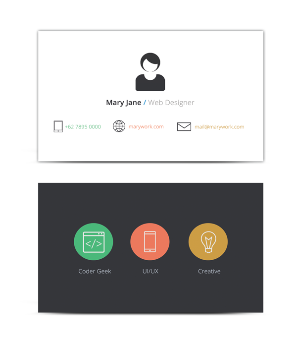
Flat design has wide appeal and looks great. Clean shapes, button icons and infographic-inspired illustrations will give your business cards that much sought after 2D appeal, as you can see on this simpleflat design template.
Think simple, quirky and playful... and avoid drop shadows, highlights and gradients at all costs.
Download some great free flat icon designs from flaticon.comto use on your card designs.
They’re great for livening up contact details (phone, email and website details) and making them ‘pop’ on the design.
6. Black + White + Bright Colors = Surprisingly Chic
Stuck on which colors to use on your business card? Try out this colorful yet elegant combination for a card that ticks boxes for tech- and print-industry occupations...
Set the background and text of your card in black (or a chic slate grey—try C=58 M=48 Y=47 K=38) and white. Then apply a single bright accent color to text, banners or logos to really make the information shout.
It’s a chic way of lifting your cards from dreary monochrome territory to something easier-on-the-eye, without committing to too much color.
If you’re feeling brave, bring in a whole spectrum of rainbow-inspired color onto the design, but in small doses, as in this elegant business card example.
Grounding your color palette with more corporate black-and-white will keep your color experiments looking professional, not garish.
7. Add a Logo
Even if you’re a sole freelancer, consider designing a logo to represent your small business. Logos are more memorable than names alone, and are a great opportunity to showcase visually the kind of creative business that you want to be.
If you’re stuck for where to start, just take your initials, or even just the first letter of your first name, as in this logo-embellished business card, set in a lovely sans serif typeface and framed with a geometric border. Simple! This sort of logo will look great if you work in graphic design or web design.
Logos based on your signature, or using hand-written typefaces that mimic this look, also work really well on business cards. It’s a more personal, friendly-looking approach to logo design, and will suit illustrators and fashion designers.
Make a feature of your logo on your business cards—banish other graphics and blow up your logo to large size to create a high-impact backdrop to your contact details.
8. Make a Visual Nod to Your Occupation
Sometimes business cards can look a little... well... samey. So many people have well-designed business cards these days that it can be difficult to make your card really stand out.
Think about how you can transform your business card into a statement about what you do. Are you a photographer? Create a lightbox-style design, or fill one side of the card with a camera illustration, as in this cool business card template.

Illustrator or artist? Why not transform one side of your card into a painter’s palette?
Web designer? How about setting your text in the style of HTML code? Set neon green text against a black background for a design that is equal parts ‘coding genius’ and ‘Matrix’—web design agencies will love it!
When I used to work at a media agency, we had to contact photographers at short notice for shoots and PR events. Some photographers would be picked on the basis that they’d been reliable in the past, but sometimes we were desperate and had to pick a completely new photographer. One aspiring photographer had sent us a business card, but it was really the design of the card that made us pick him for the job. He had designed the card in a polaroid-inspired, vintage style, which made the card look instantly different from dozens of others.
The moral of the story? If you want to win new business, ensure your business card will sell your services without the need for you to be physically present.

Creating a design that says something about what you do in a unique, eye-catching way is always going to set you apart from others.
9. Don’t Be Shy
Networking and trying to win new business is no time to be shy. You want to convince potential clients that you’re a confident person to work with, and that you’re not afraid to discuss new ideas and face creative challenges head-on.
OK, so we can’t all be outgoing smooth talkers, but even wallflowers will benefit from a business card design that’s, well, a bit shouty. Try out a simple typographic layout, with bold, simple colors, as in this outgoing business card template.

It looks really cool, but it also has the added benefit of making your card very visible. If you’re a graphic designer or typesetter it showcases your awesome typography skills too!
Most digital printing services are now able to print a number of different designs in one print batch, so try out printing a range of different colors for your cards. A big pile of multi-colored typographic cards is irresistible for clients at networking events and trade shows.
10. Think Outside the ‘Box’
Even though we live in an overwhelmingly digital age, print business cards still have a firm place in the world of business networking. Why is this? Perhaps because sharing a tactile, physical card with another individual in person has more meaning and more memorability than sending an email or a LinkedIn request.
Business cards are tactile—their thickness, print texture and shape adds to the overall memorability of the networking experience.
So make sure to think about how your business card will feel to a person. For example, a thicker card might give a luxurious feeling to the card, and in turn communicate that you were willing to spend money on producing the best cards possible. Therefore a person can conclude that presentation is very important to you, which is very reassuring for a client looking to employ a creative.
Think about print finishes too—a matte coating on a slightly textured card is both on trend and feels velvety smooth to touch. Gloss coating is not enjoying a moment in the sun right now, but gloss finishes might look great on small touches, like logos and typography, to catch the light and introduce a bit of contrast to the design.
Your card doesn’t necessarily need to conform to the traditional sharp-cornered rectangle either, and you don’t need to do any fancy (and costly!) laser-cutting to make a difference.
Doing something as simple as die-cutting the card to create rounded corners gives cards a subtle point of difference that shows that you made that extra bit of effort. These sleek business cards are otherwise nothing special, but their rounded corners just make you want to pick them up and run your finger around their edges.

When you’re designing, always think about the end product and how it will look in print. A subtle print finish or die-cut can make a world of difference.
Conclusion
In this article we’ve looked at ten ways that you can improve the design of your business cards, to help you win new business and establish a brand for yourself.
Whenever you’re looking to give your cards a refresh, keep this checklist to hand to give you a bit of added inspiration:
- Lay down a grid (and stick to it!) to give your card layout a better structure.
- Resist over-embellishing your cards and try out a minimal look for subtle impact.
- Be playful with novelty concepts for your business cards, and make your designs fun!
- Introduce photos in a unique way, using frames and grids, to keep your images interesting not bland.
- Keep your business cards on-trend with flat graphics and icons.
- Apply a tried and tested color palette—black + white + bright color—for a colorful design that’s still ultra-professional.
- Add a logo to your cards to reinforce your business’s brand. Create a logo from your own initials if you don’t already have one.
- Make a nod to your occupation with your design, using graphics and strong styles to communicate your field of work.
- Don’t be shy—use shouty typographic effects and strong colors to communicate confidence to your potential clients.
- Think outside the ‘box’—apply die-cuts and luxurious print finishes to your card to make the final product extra-special.
Ready to create your own business cards? Read about how you can update a minimal template and make it your own, or find out how to create a branded business card.
Or why not check out a wide range of business card templates on Envato Market to find your next business card inspiration?
Original Link:
TutsPlus - Design
More About this Source Visit TutsPlus - Design