Your Web News in One Place

Help Webnuz

Referal links:

Sign up for GreenGeeks web hosting
December 3, 2012 01:30 pm PST

Create Fan Art for Mortal Kombats "Liu Kang" in Photoshop

Liu Kang is one of the most iconic characters from the world of Mortal Kombat. In this tutorial, George Patsouras will discuss how to paint a Bruce Lee-inspired Liu Kang in Photoshop. Since this will deal with portrait painting, you can use these techniques to recreate the Liu Kang painting, or you can come up with something entirely on your own. Let’s get started!


Step 1

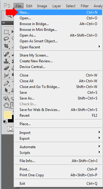
The first step is to create a new document for your painting. Simply go to ‘File’ > New


Step 2

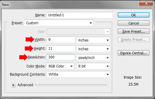
You’ll be asked to decide on the dimensions of the canvas, as well as the resolution. Type ’300′ for the resolution, as this is standard printing size and will allow us to achieve a fairly detailed portrait. Make a habit of working with a large canvas when painting! Now we can decide on the canvas size. Usually for portrait work I find that 9 inches by 11 inches works best, but there are no rules when it comes to this. Just go with what feels right – remember, we can easily crop, expand, and further manipulate the image if needed, so don’t be afraid to experiment to achieve the best results possible.


Step 3

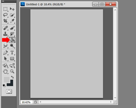
Use the Gradient tool (G) to fill in the canvas with a very light gray tone to ensure our eyes won’t be overwhelmed during the sketching process. Since we’re going to be tackling the line work first, color won’t even be considered at this point.


Step 4

We’re almost ready to begin sketching! Before laying down a single stroke however, it’s essential to study any useful reference material before beginning on the subject. In this case I referenced some screenshots from the original ‘Mortal Kombat’ movie, as well as the 2012 video game, and even Bruce Lee, whom the character itself is inspired by. I envisioned Liu Kang having his hands posed together, so I looked at some reference photos of that as well (hands can be very difficult to draw/paint, so reference material in that regard is especially helpful). My goal with this image was to pretty much mix up all the incarnations together to come up with something unique, while staying true to the character.

Once we have our references in place and have a solid understanding of the subject matter, it’s time to begin drawing. I create a new layer, and select a pure black color as the foreground color. I use a fairly small hard-edged brush (anywhere from 8px to 12px should be fine, generally speaking) at this stage with a very low opacity of 20%. This ensures that my preliminary work will be fairly loose, and will enable me to focus on gesture and proportions without getting caught up in details. Keep in mind that these are just guidelines, if you feel something else for you works better, than don’t be afraid to experiment and alter the tutorial to fit your needs.

I start by drawing a circle for the head, and draw a vertical line directly in half to establish the line of symmetry on the face. Then I draw another ‘axis’ for the eyes, which also helps establish the perspective of the face. The technique I use for drawing heads is exactly the same as those discussed in Andrew Loomis’ ‘Drawing The Head and Hands’. The ‘ball and plane’ method ensures that the face will always be correctly proportioned at any angle, so I highly recommend this material if you’re serious about drawing heads.

Once the head is loosely established, I begin to quickly draw the hands, thinking of them as huge blocks as opposed to individual fingers. I quickly mark down where the fingers are as well. Remember to think of hands as a bunch of cylinders when drawing and painting them; This will not only make it easier to draw and paint, but you’ll also get more believable results using this technique as well.


Step 5

Once everything is vaguely defined and readable, it’s time to begin refining the sketch to give it a crisper look. You can do this in two ways, really; You can clean up the existing layer using the Eraser (E) tool, or you can simply create a new layer on top of it and draw over the existing line work. I generally prefer the latter as my line work is always a bit messy on my first pass. In this case, I lower the opacity of the original layer down to roughly 60%, and create a new layer titled ‘sketch’. Using the Brush tool with an opacity of 25%, I draw over the existing line work and fill out the details as well.

One thing that I need to mention at this point is that the composition is pretty much symmetrical, which means we don’t necessarily need to draw the whole image; Just half would suffice, as we can easily duplicate it and flip it around. Firstly, drag a guide to split the composition in half. To do this, make sure the rulers/guides are activated (Command/Ctrl + R). Simply hold down the vertical ruler and drag it halfway on the image to create a new guide, which will split the composition in half. You can move the guide again if you wish to ensure that the composition is split evenly. Once that’s done, simply refine the line work on one side as much as you can. When it’s finalized, simply duplicate the layer (right click on the layer, and select ‘Duplicate Layer’) and flip it horizontally (Command/Ctrl + T, right click, select ‘Flip Horizontally’). Make sure it’s placed properly on the image (i.e. not too close to the existing layer, and not too far). Here you can see the final line work:


Step 6

The next step is the easiest one, and arguably the most important – picking a color theme. I knew right off the bat that I wanted warm tones throughout the image, as that would fit perfectly with the character. I use the Gradient tool (G) to quickly fill in the background color with a fairly dark red-ish color.


Step 7

With our color theme in mind, it’s time to establish our basic colors for each element of the painting. To keep things organized, keep everything in layers. In this case, I created a layer for the Skin, Bandana, and Hair and named them accordingly. The trickiest color choice would be the skin; We need to pick a color that’s a nice balance between peach and the general color theme of the image. The trick is not too go too crazy with the saturation, and keeping the skin tone fairly bright in comparison to the background.

Choosing the local colors for the bandana and hair is much simpler in comparison; The bandana is basically a brighter and more saturated color variation of the background, while the hair is simply a much darker and slightly less saturated variation of the background color. I apply the colors on all the said elements exclusively with a hard edged brush set too 100% hardness for a crisp and clean definition, and make sure not to paint outside of the line work we’ve already established.


Step 8

Once our base tones are clearly established, the next step is to decide on the lighting. Ask yourself where is the light source coming from, and shade accordingly. In this case, I choose a standard 45 degree light, which is excellent for helping define the forms of the figure. I decide to focus on shading the skin, so I pick a darker, slightly more saturated red-ish tone for the shadows, and a much brighter, slightly more warm color the highlights.

My color choices are fairly close to the base color we established, as I prefer to work in fairly limited color ranges at this point to focus strictly on values. Some artists actually prefer to work strictly in grayscale to focus on values first, and add colors at a later stage. Personally I find that method fairly time consuming, but I do value it’s importance with values and lighting, so I make sure to focus on that during the beginning stages of the painting process. Also remember that colors can easily be changes early on, so if you’re not happy with your color choices early on, don’t be afraid to scrap it and change it for something else.


Step 9

Once we have our light source defined, the next step is to push it even further to make it even more evident. Doing this is as simple as picking a much brighter highlight color the skin; In this case, I simply select the lightest tone with the color picker tool (Alt+ left click) and pick a much brighter, and slightly more yellowish tone to reflect the highlight color. Always remember to do some slight variations for your skin choices for a more believable result. For example, don’t just simply use the same color tone with just the brightness adjusted; Also do some adjustments to the color as well; For example, if you’re painting skin against a red background, make sure this is reflected on the figure by playing up the reddish tones in the shadowed areas of the skin. Also make sure your highlight color has some variation to the tone as well; Usually a bright yellow tone as chosen here will yield fairly believable results.


Step 10

We’ve worked on shading the skin long enough; Now it’s time to paint the hair! The technique is the same as shading the skin; Begin by painting the highlights reflecting the same light source from the left. Pick a brighter, and slightly less saturated and more warmer tone, and begin shading the hair. Think of the hair as big strands first, as opposed to thin lines, which will give you a ‘straw-like’ effect which we don’t want. To avoid this, use a larger brush than you think you need; Detailing the hair too early will not only be very time consuming and difficult, but the results won’t be as good and natural looking as if you would obtain using larger brushes at this point. You’ll notice that I barely even touched the right side of the hair at this point, as this area is fairly shadowed. You’ll also noticed I tried out some ‘Bruce Lee’ inspired scratches on his face as well.


Step 11

I decide the background is a bit too saturated and reddish for my tastes; I want more natural looking tones that would also compliment his skin tone better as well, so I decide to quickly alter it by using Photoshop’s Hue/Saturation tool (Image > Adjustments > Hue Saturation) and altering the tone slightly for a more greenish-yellowish hue.

I enhance the results even further by using Photoshop’s ‘Color Balance’ tool (Image > Adjustments > Color Balance), and play up the greens on the ‘Shadows’ options for an even more natural looking effect. I notice the shading resembles fire a bit as well, which is excellent given the character utilized this as well. I use a large, soft edged brush to add some slight ‘flames’ as well. I don’t want them to be clearly defined as that would take away too much attention from the figure. Instead I choose to be subtle to keep the focus on the figure.

Speaking about the figure, we need to do some slight color variation on him to reflect the new background shading as well. I again select the Color Balance tool (Image > Adjustments > Color Balance) and play up the greens a bit for the shadows. This unifies the image and really brings everything together. I also decide to do some more shading work on the hair, picking again a lighter and slightly more yellowish-tone to reflect the shading already established. I also uses smaller brushes at this point, but with fairly soft edges to keep the hair nice and smooth. Additionally, I use a soft-edged brush with an opacity of 33% to blend the harsh transitions on the skin for a much more smoother and natural looking feel.


Step 12

I’m happy with my color choices, but I’d like to push them even further to really help the figure pop out of the background. To do this, I decide to play up the complimentary colors here, so I introduce more Cyan and Greenish tones for the background. I paint everything manually at this stage with a fairly large, and soft-edged brush. Using complimentary colors neutralizes the color tones, which is great here as we want the focus to be on the figure, and not on the background. Of course, we also need to find a good balance as well, so I do keep some of the warmer tones on the left side of the image, to not only unify it with the figure, but to also play up the lighting we have already established as well.

I also decide to play up the cuts on his face, so I choose a slightly brighter tone and paint in the lighter parts of the scar, and also randomly place them surrounding that area to give his skin more texture as well. The technique is a bit random and messy, but ironically that works well for the effect we’re trying to achieve here, so don’t be too ‘careful’ here. Just go with what feels right.

I also vaguely introduce a greenish-blue tone on the right side of the skin; This would be coming from an invisible light source to the right, but would also keep to the tones we’ve established on the background (it’s essentially a much brighter and saturated variation of the more greenish tones in the background). Not only does adding this tone help unify the figure more with the environment further, but it also helps bring out the structure and from of the anatomy of the face as well, which is always a plus. It’s worth noting that I handle this in a new layer; Adding another light source this late during the painting process is a bit risky, I admit, so I make sure to keep it on a separate layer in case I’m not satisfied with the results. This is why painting with a program like Photoshop is very beneficial, you never have to worry about taking these types of risks since reverting back to the original image literally takes seconds to do. So don’t be afraid to be bold and experiment!


Step 13

I like the effect that the added light source brings, so I decide to play it up more by incorporating it on the right side of the image. To help unify the image, it’s important that all the elements of the figure are affected by this light source, as that would be the case in real life. I add the bright blue/green tone on the right side of his face, the right side of the hands, and finally, the right side of the hair. Again, I’m using several layers here just to make sure I don’t mess anything up, and merge them only when I’m completely satisfied with the results. It’s worth noting that I’m using a soft-edged brush for this step; The added light source doesn’t need too much definition as that would be too distracting, so a softer look is definitely preferred in that regard.


Conclusion

I’m satisfied with how the image is turning out, but I want it to be a bit darker and grittier, so I decide to give him more scars. Again, this is a fairly risky addition, so I make sure to handle it with a new layer. I pick a darker and much more saturated tone for the cuts and bruises, and make special care in making sure that they follow the form of the anatomy for a much more natural looking result. After I’m satisfied with the effect, I merge it down with the skin layer. At this point I also decide to introduce more ‘reddish’ tones on the bandana. To do this, I select a fairly bright and saturated red tone and apply it on the bandana with a soft edged brush, with a fairly low opacity. This creates great color harmony and helps to separate the hair, bandana, and skin more, which is always a plus.

The image is pretty much finished at this point; I simply have to do some slight color enhancement with Photoshop’s ‘Color Balance’ tool, playing up more Cyan and Greenish tones for the ‘Shadows’, and more Yellowish tones for the ‘Highlights’ to unify and enrich the color tones even further. I hope you enjoyed this tutorial, and make sure to leave any questions/comments here, as I’d be more than happy to answer any inquiries. Happy painting!


Original Link: http://feedproxy.google.com/~r/psdtuts/~3/bJ-UcTWAkGY/

Share this article:    Share on Facebook
View Full Article

TutsPlus - Design

TutsPlus+ is a blog/Photoshop site made to house and showcase some of the best Photoshop tutorials around.

More About this Source Visit TutsPlus - Design