
My name is Marcos Torres, I'm Graphic Artist from Porto Alegre, Brasil. You can get to know more about me by acessing my Personal Website or by following me on Twitter: @marcos333. You can also see some of my last projects at my Flickr.
An Interest In:
Web News this Week
- March 30, 2024
- March 29, 2024
- March 28, 2024
- March 27, 2024
- March 26, 2024
- March 25, 2024
- March 24, 2024
Some of Our Sources
- Technology Review
- Pearsonified
- Abduzeedo
- TutsPlus - Design
- You The Designer
- Stylized Web
- Wal You
- Spyre Studios
- Android Headlines
- The Verge
Help Webnuz
Referal links:
September 10, 2012 03:52 pm GMT


Original Link: http://feedproxy.google.com/~r/abduzeedo-tutorials/~3/Va7swA8HiBM/create-playstation-controller-illustrator
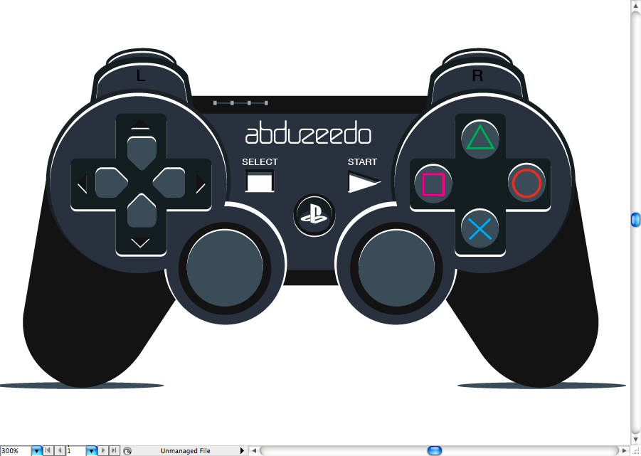
Create a Playstation Controller in Illustrator
For our tutorial this week we're going to show you a simple way to create a realistic, but illustration style, Playstation Controller using Illustrator. Since I'm a video game enthusiast, although I actually never had a Playstation, this was really fun to do, hope you guys enjoy doing it too.
This is a tutorial less focused on drawing skills and more into the Illustrator tools, so this should not be that hard for begginers. You execute it using a mouse or even a track pad, good luck.
Sketch
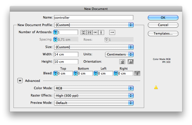
Ok, let's begin by opening Adobe Illustrator, create a new canvas with 14 x 10 cm , RGB, 300 dpi.
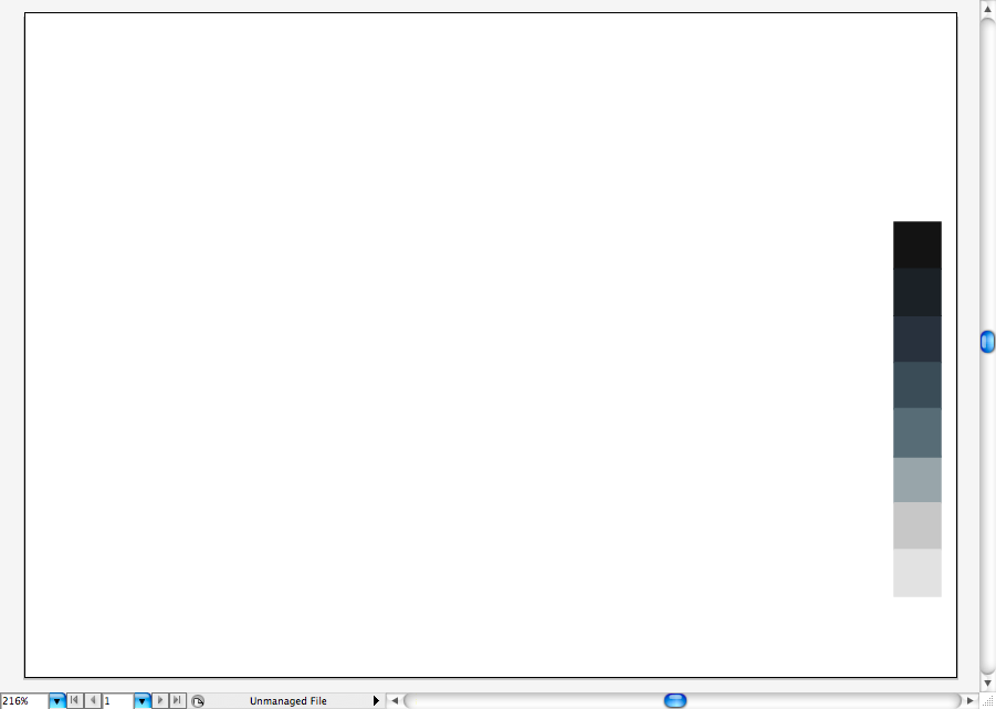
In order to make things easier, I decided to create a color pallete that contains the only colors we will use during this tutorial, this includes the gradients.
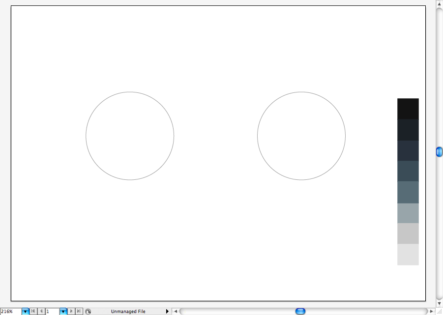
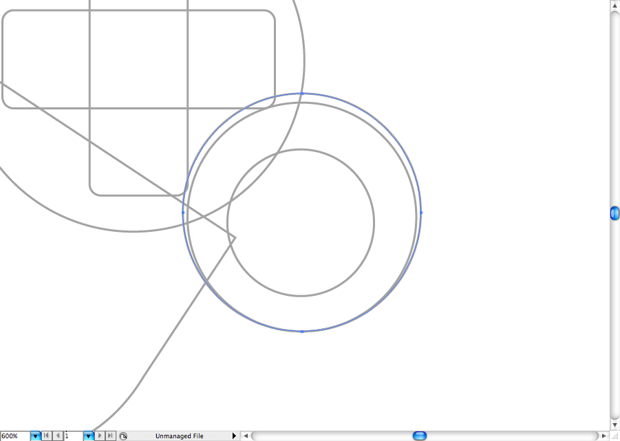
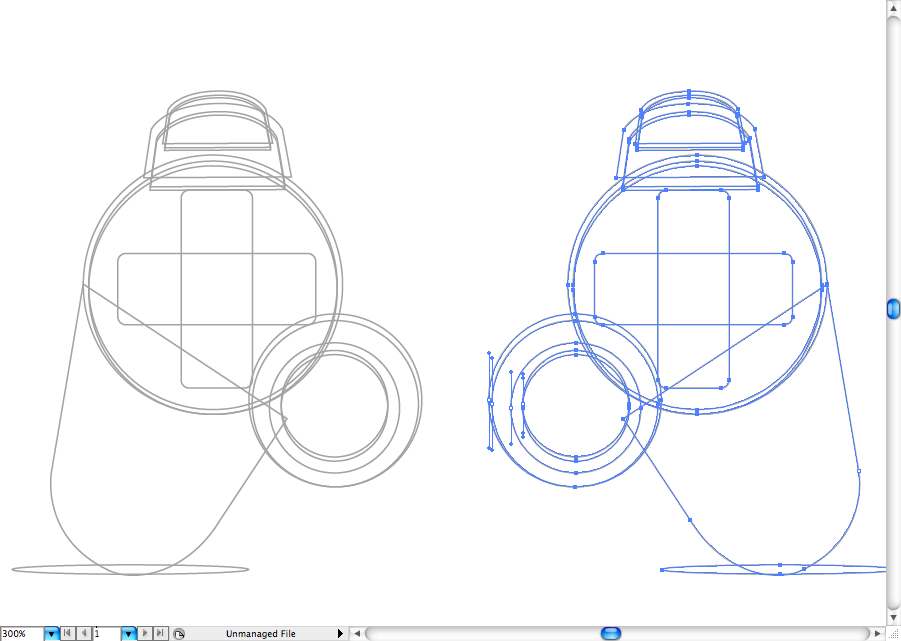
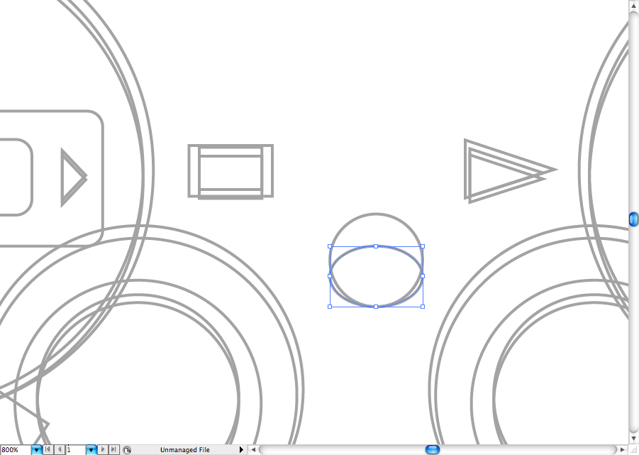
Using the ellipse tool (L), create two spheres with the same horizontal alignment.
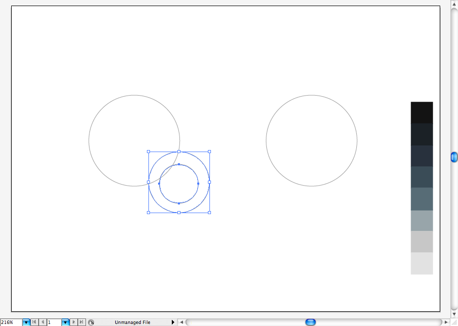
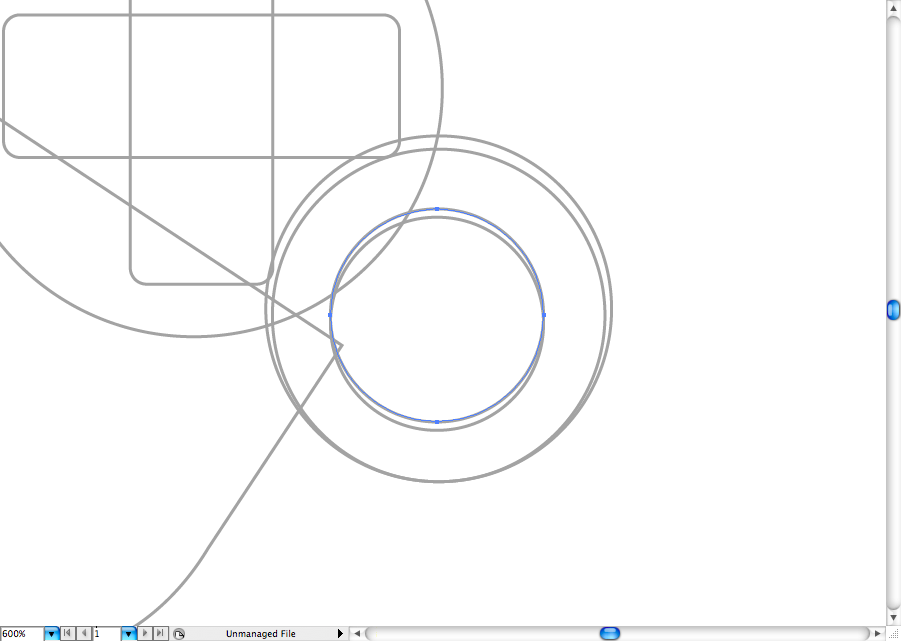
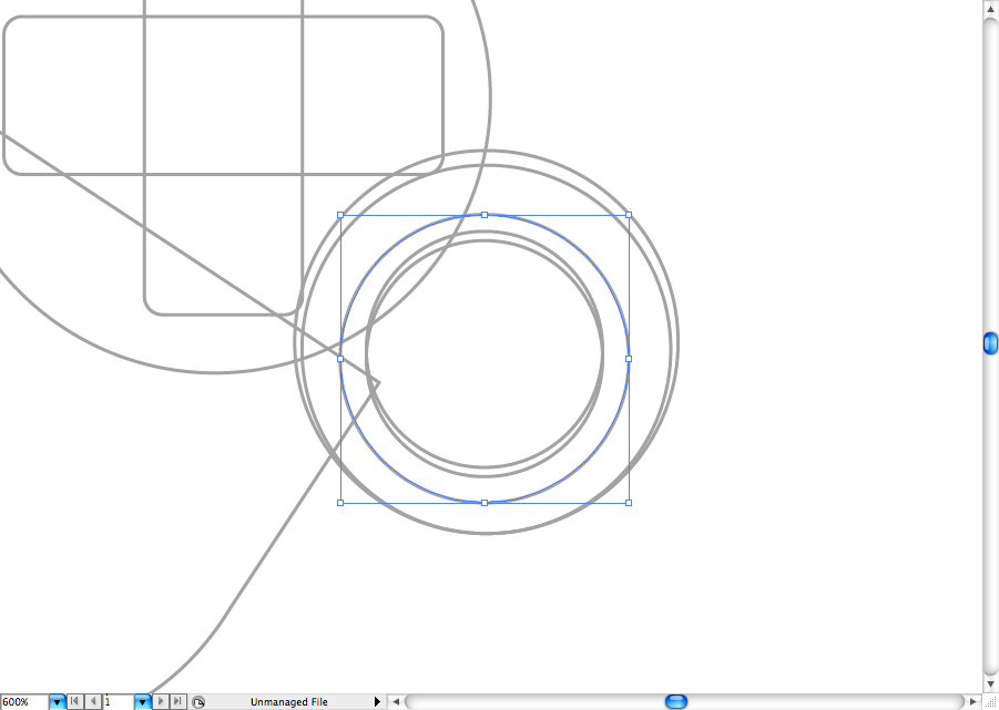
I think it will be a lot easier If we design one side tha duplicate it later, so let's do it with the left side. Create two more spheres using the previous tool this will be the left analog stick.
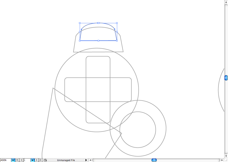
Using the pen tool (P) create the left grabber. Use the direct selection tool (A) to organize and balance the vector points.
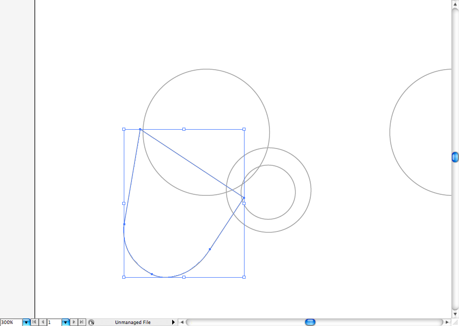
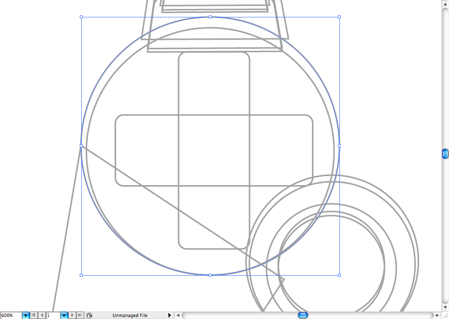
Use again the ellipse tool (L) to create what will be the shadow later.
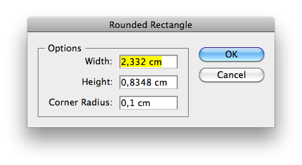
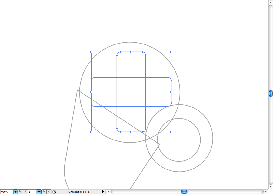
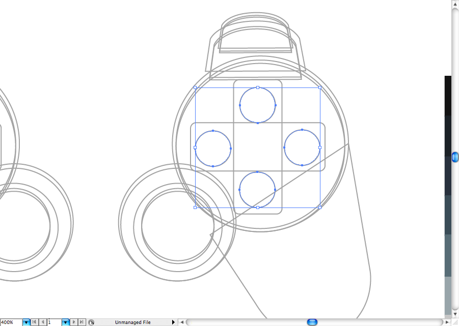
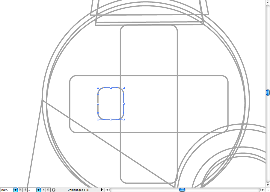
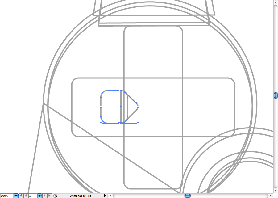
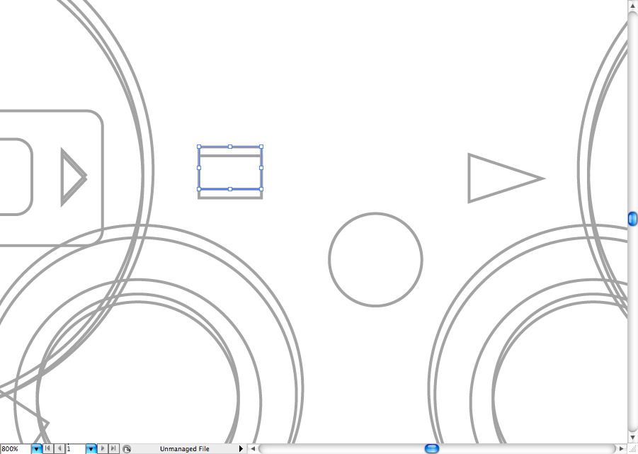
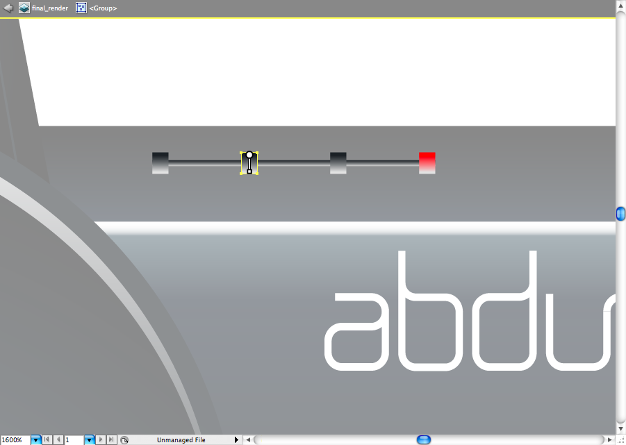
Now click on the round rectangle tool to configurate it like the panel bellow, it's really important that you use the same corner radius. Make one rectangle than duplicate it using the selection tool (V) + alt , then rotate the copy till you have cross like this. We will add the buttons there later.
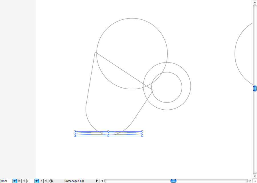
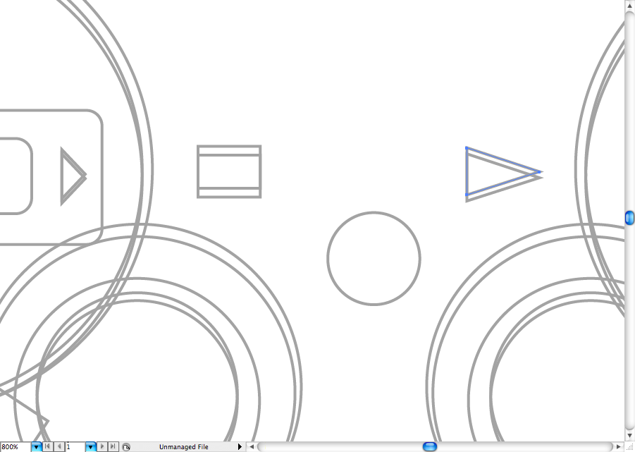
Using the pen tool (P), create this trapezium shaped form that will be the L1 and L2 button. Duplicate it using the selection tool (V) + alt, then resize it.
As you can see I duplicated it a fez more times, as this parts will be the light reflexes and divisions that you will see further.

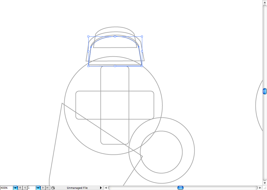
I did the ssame process on the analog stick, duplicate the main shape to create the light reflex later.
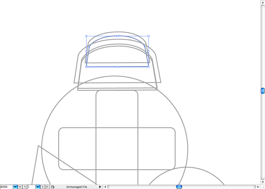
And this one is for the shades of it.
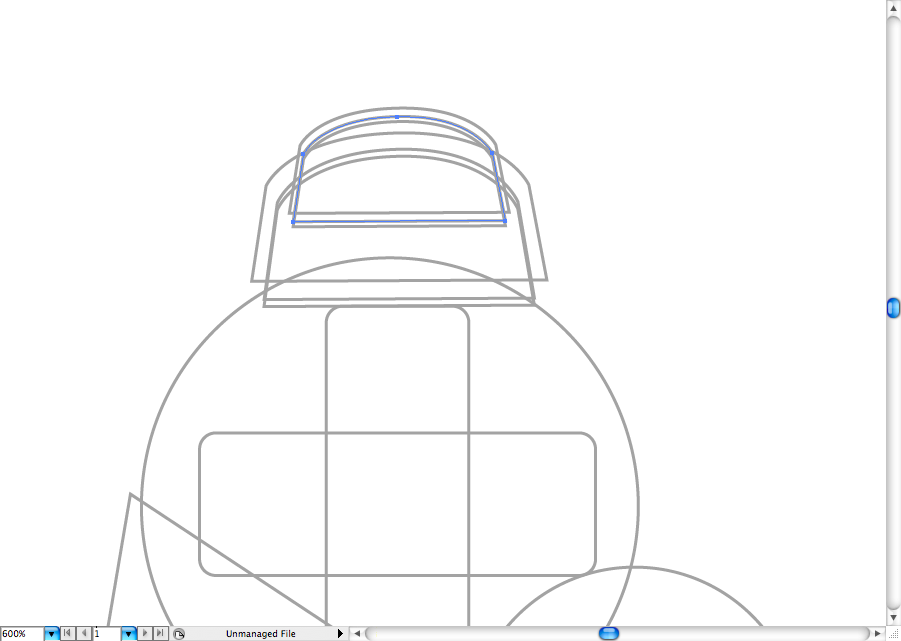
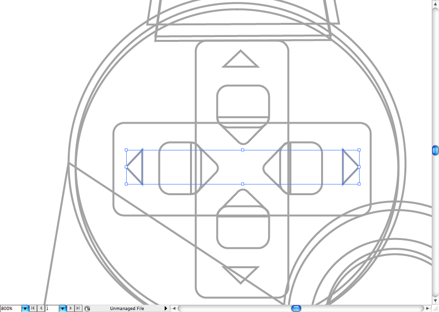
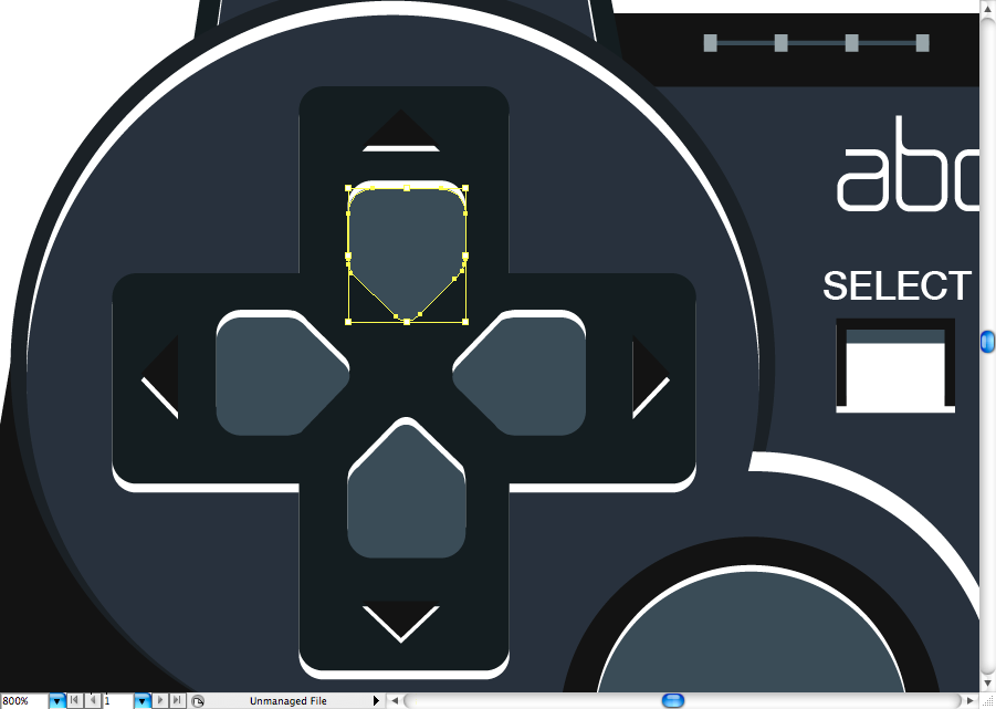
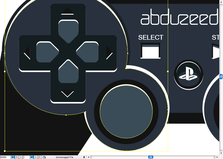
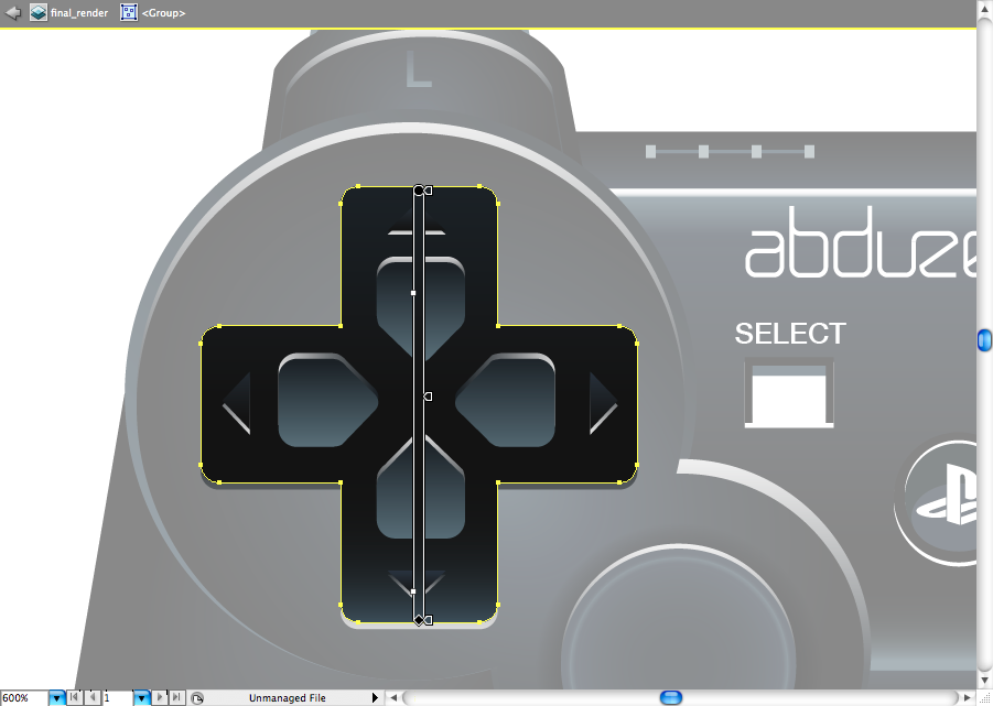
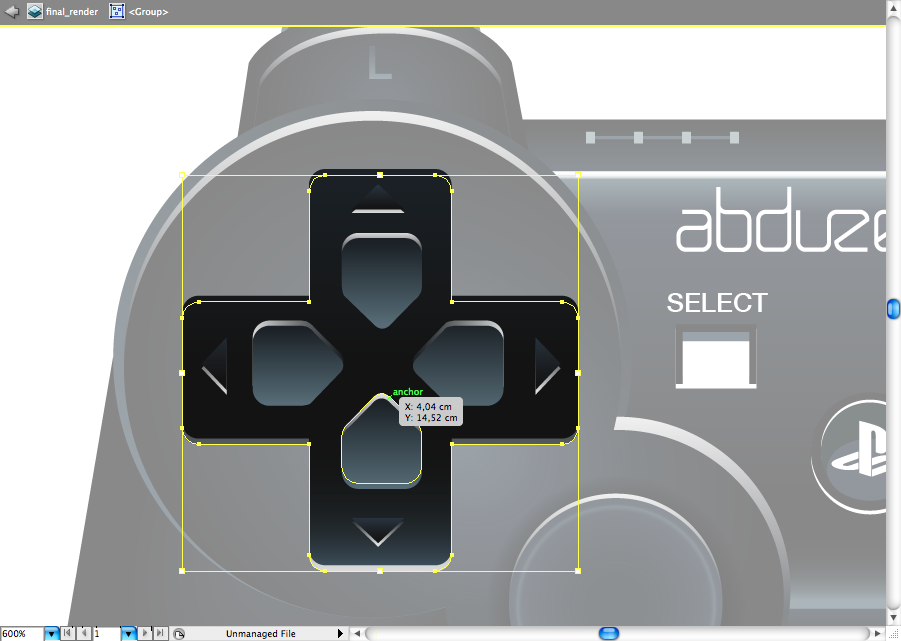
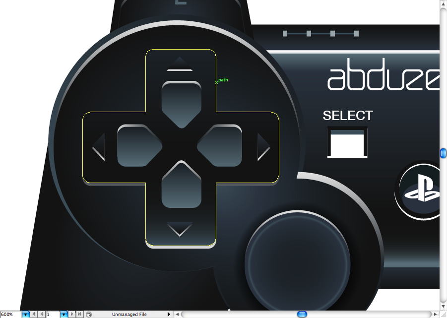
Repeat the same process for the D-pad as the screengrabs bellow, there's no tricks here.
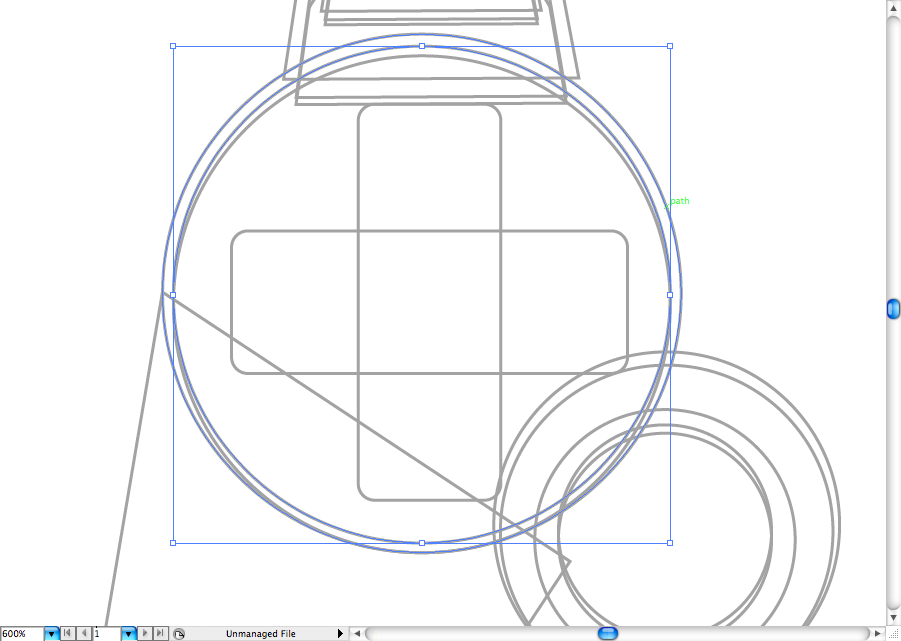
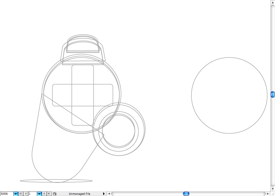
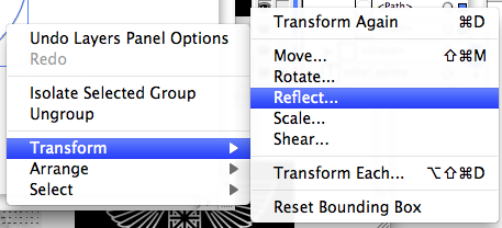
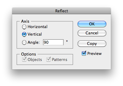
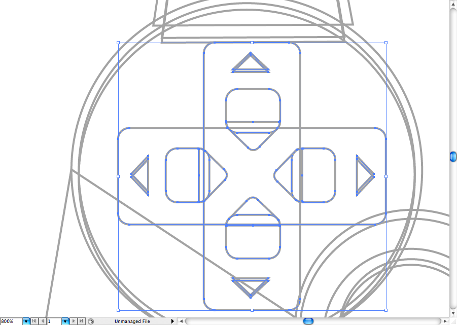
Ok, now we are ready to duplicate it, select all the shapes, use the selection tool (V) + alt to duplicate them, then right click over it and go to Transform > Reflect. Choose to rotate the vertical Axis.
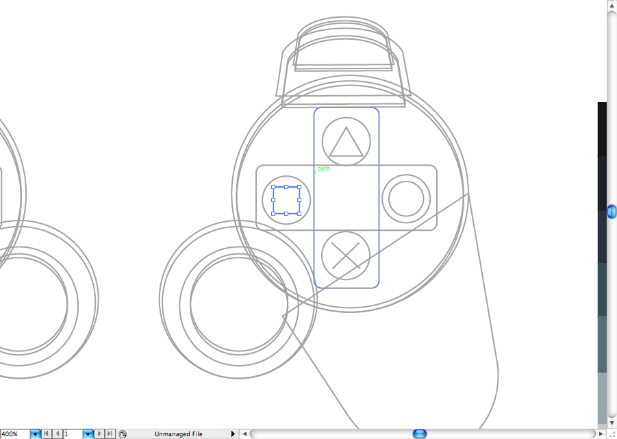
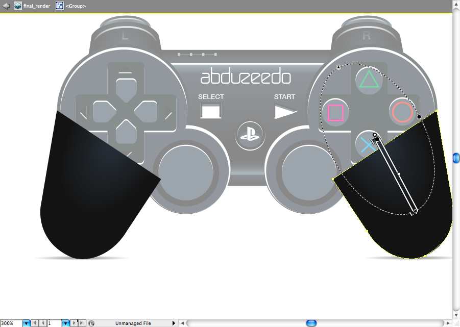
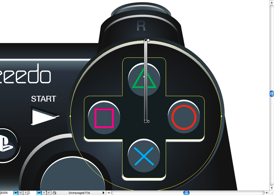
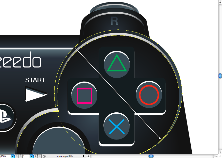
Ok, now let's proceed by create the buttons of the right D-pad, use the ellipse tool (L) for this.
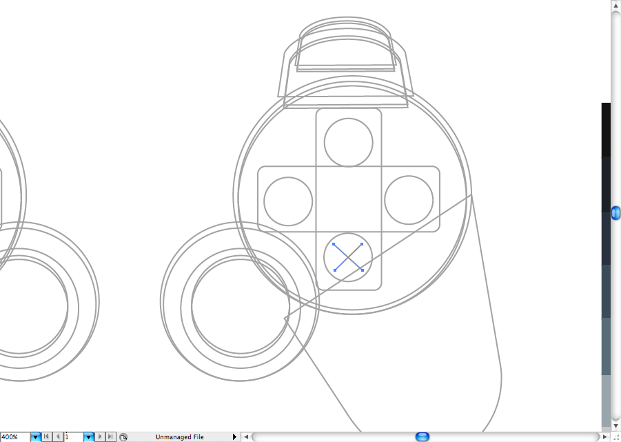
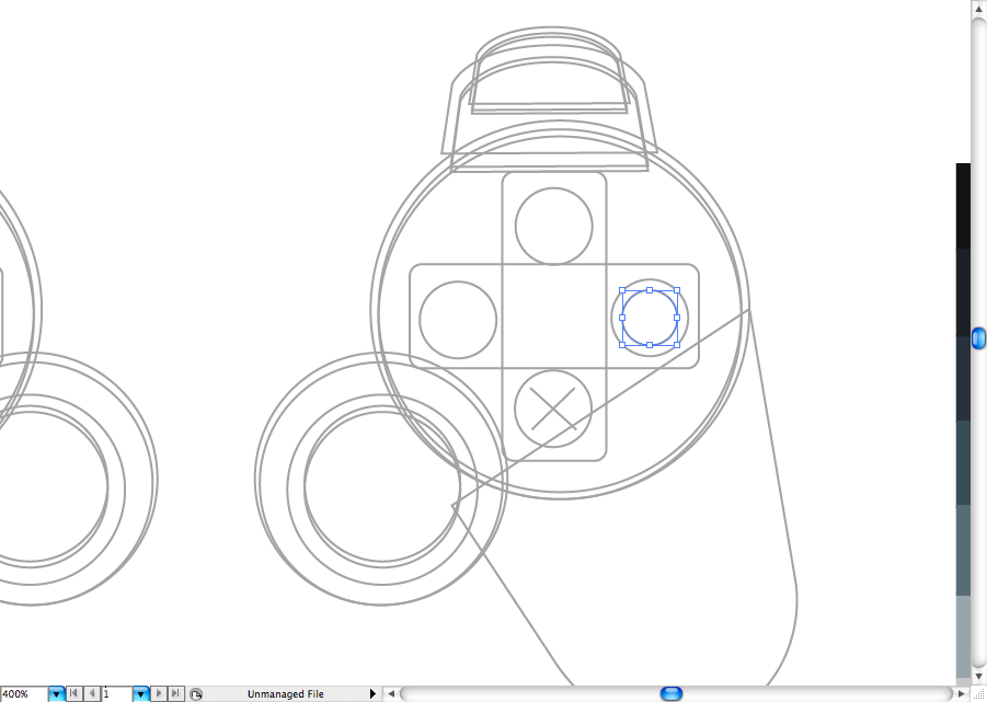
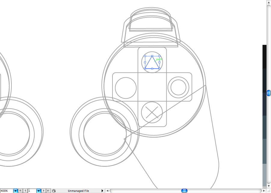
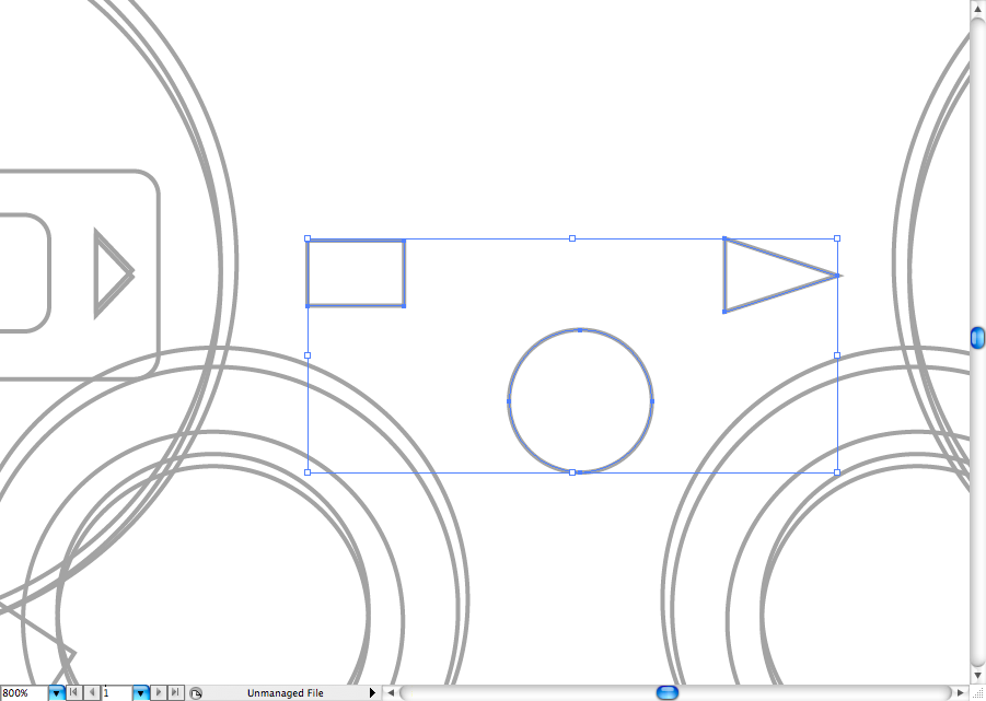
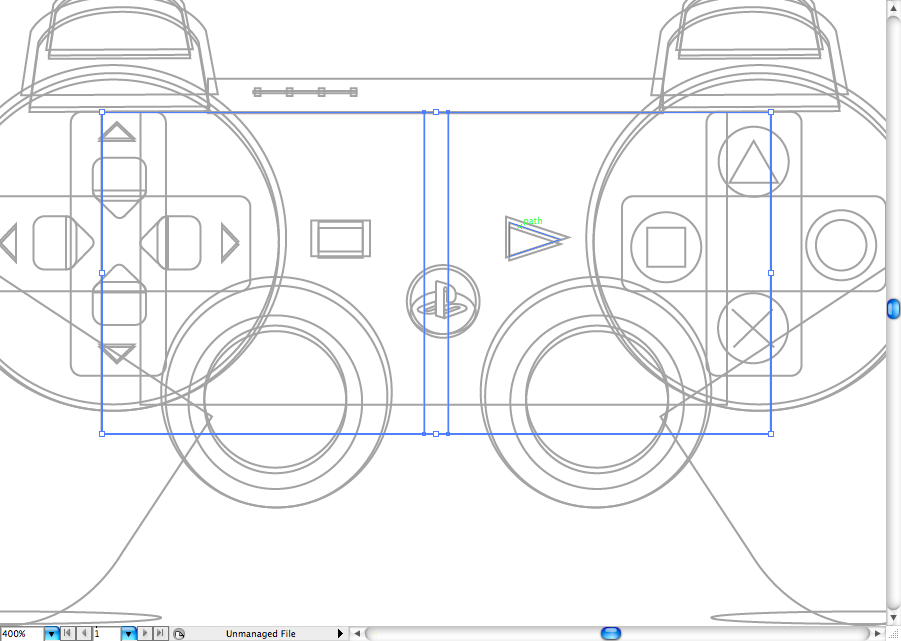
Use the segmetn tool (\) to create the 'X', the ellipse tool (L) to create the 'o', the star tool to create the triangle, and finally the rectangle tool (M) to create the square.
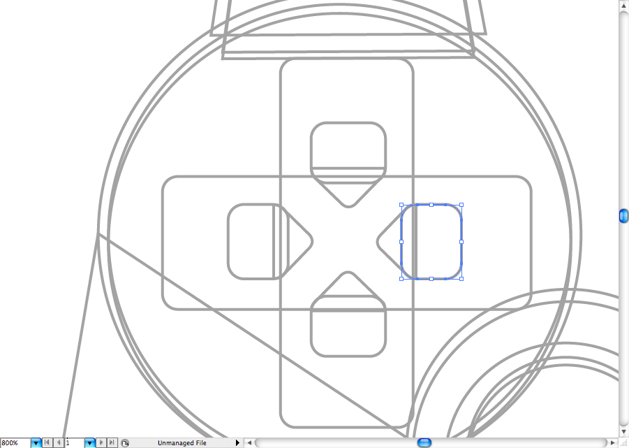
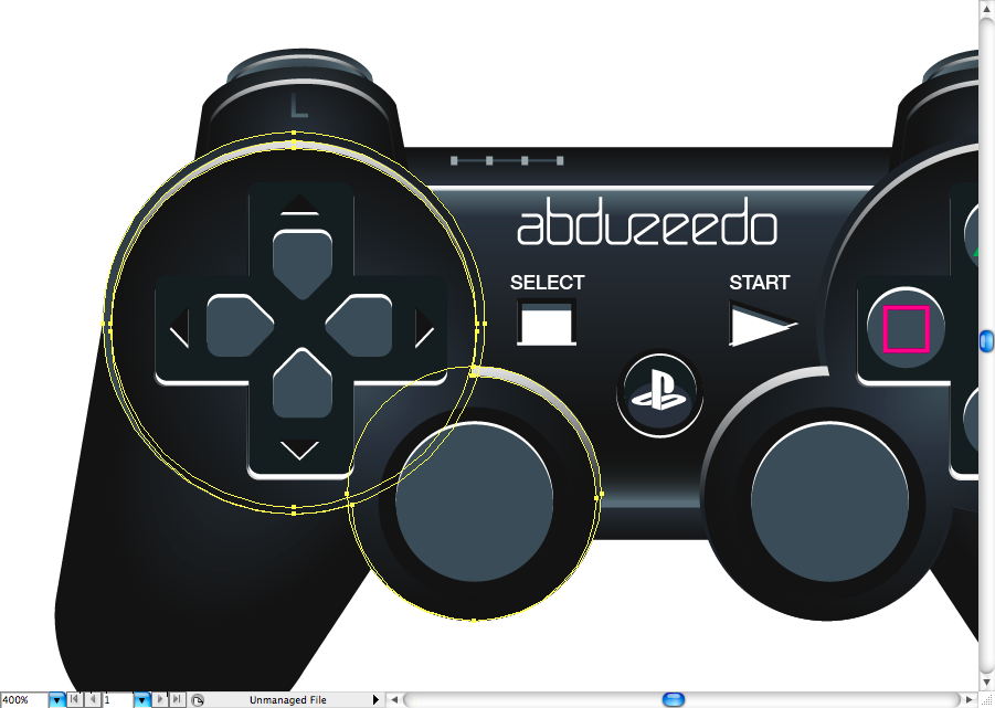
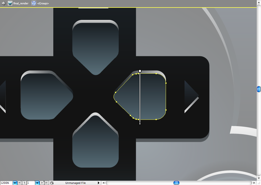
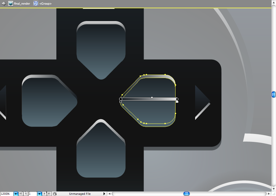
Let's skip to the left side, the direcional may take you sometime to adjust, since it's rounded. The easiest way to do it is to create a rounded rectangle, then make the rounded triangle by using the pen tool (P).
Duplicate it and rotate it till you got the four you will need.
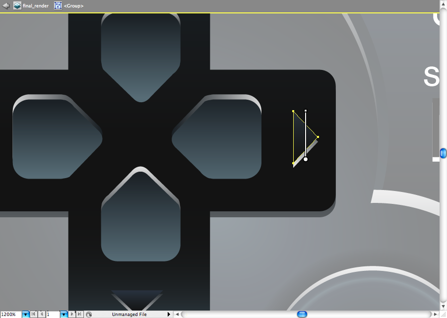
Now make some triangles using the star tool or the polygon tool. Duplicate them later to create the light reflex.
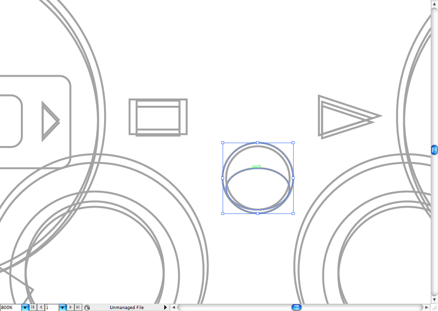
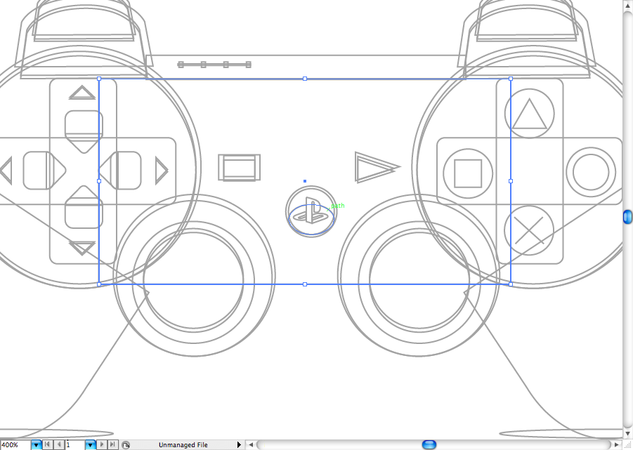
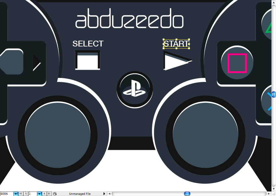
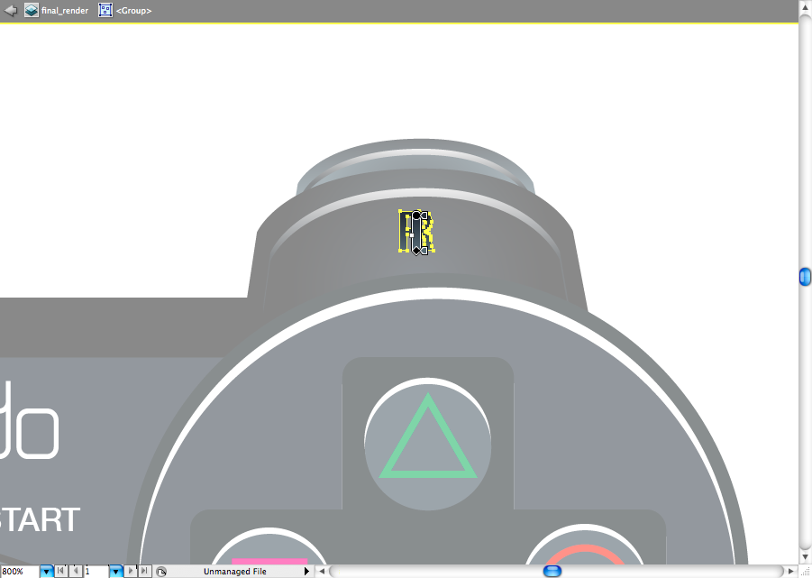
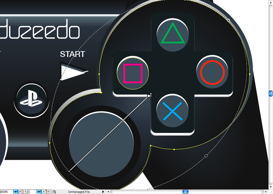
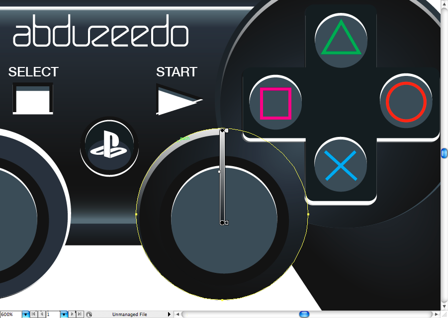
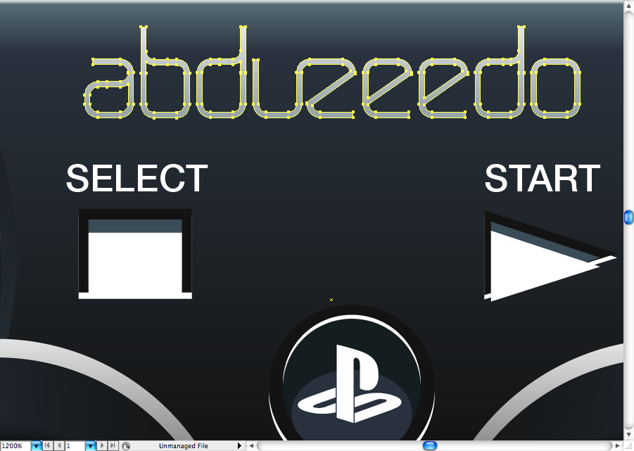
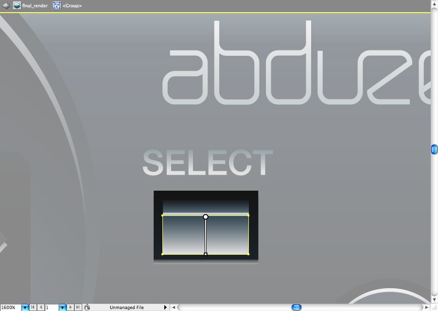
Yeah, we can forget the classic 'SELECT' and 'START' buttons (and the Plastation button). So, using the ellipse tool (L), the rectangle tool (M) and the star tool, you can create them on the center of the control pad. You will have to duplicate them a few times to create the reflex and the shaded of it.
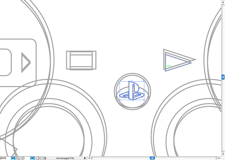
The Pst button got a special effect that we will add later, for now you can create three ellipses as the sample bellow and put the Pst logo on the middle (or put your logo If rather).
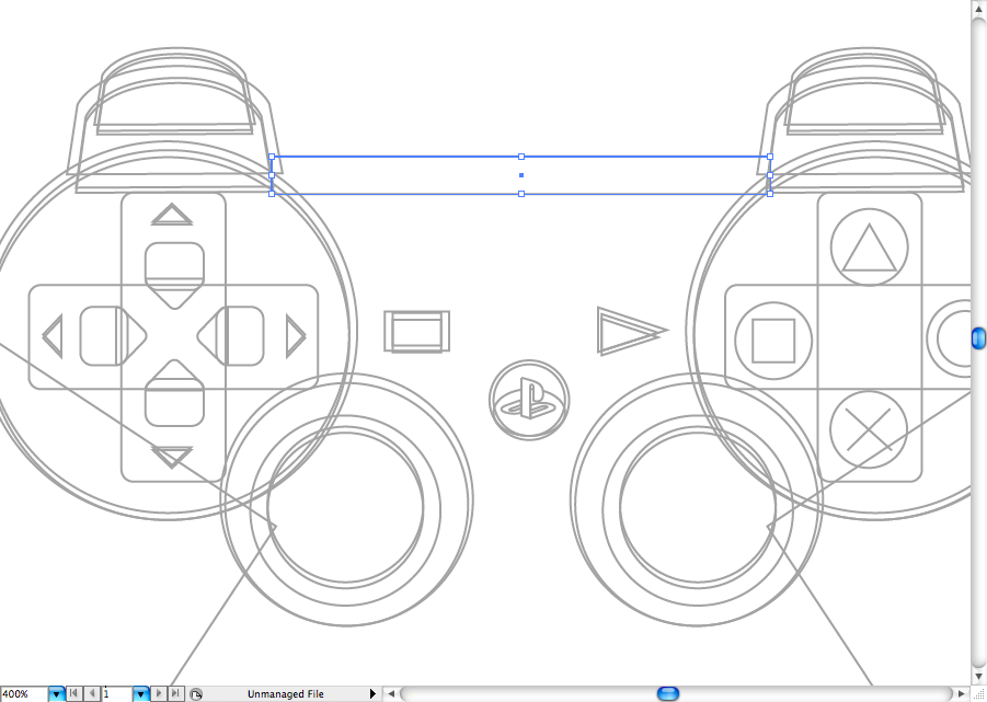
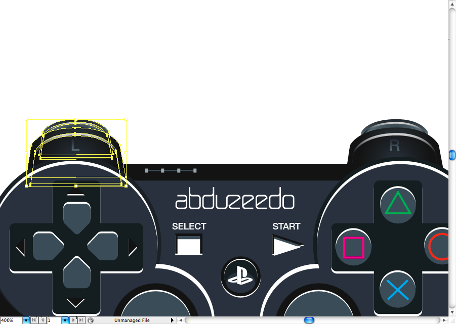
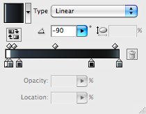
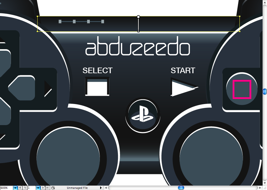
Now it's time to create the pad body, using the rectangle tool (M), make this thin rectangle on the top.
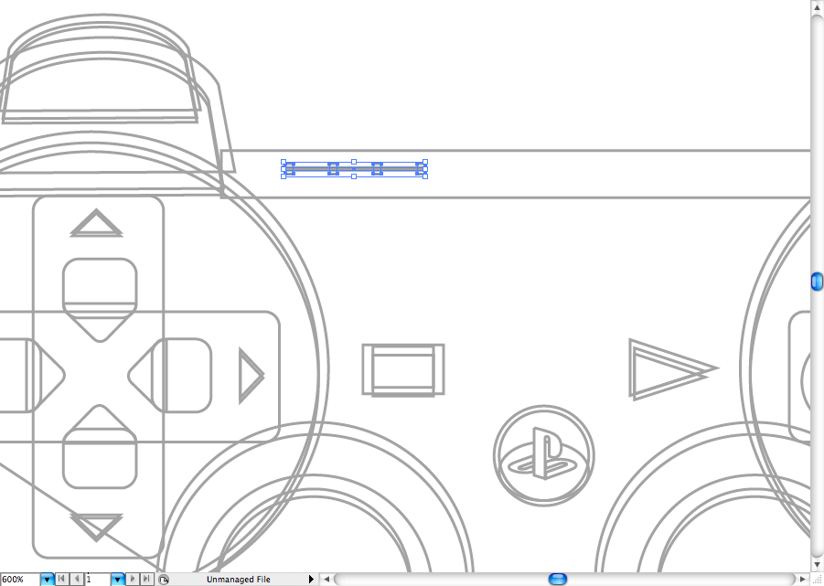
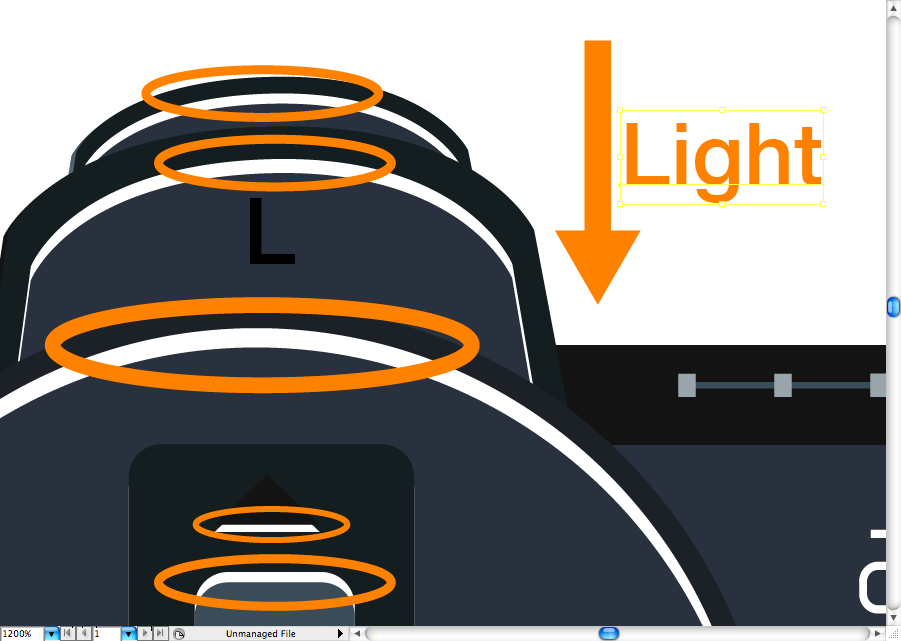
I still don't now how to call this little leds on the top of the pad, anyway, you can create them using the rectangle tool (M).
And here a few rectangles you should create on the center of the pad using the previous tool.
I decided to use your logo on the top, you can get it here of use the original form Sony If you want to.
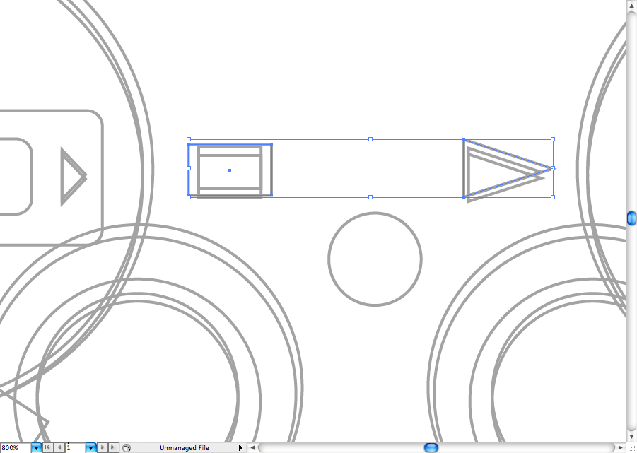
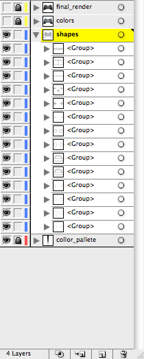
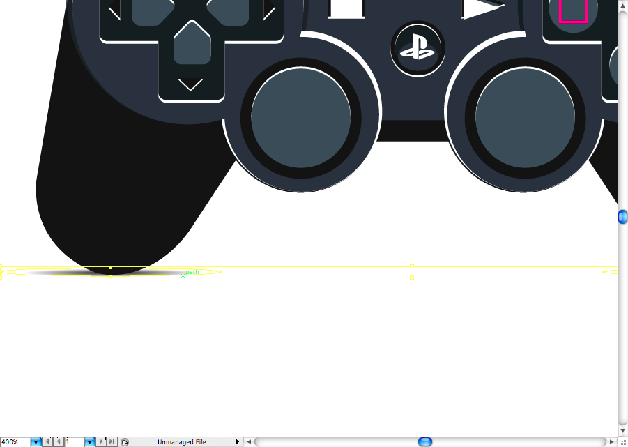
I would advise you to group the shapes on a more dimensional way, I mean, out the shapes that are buttons on hte front nad the body shapes on the back, this will be clear further, but it's really important to organize them.
Color
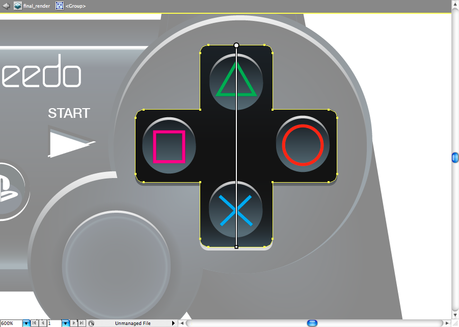
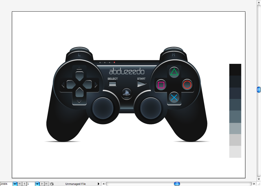
So, here' a colorful render of the controller, some may ask e why I didn't skip directly to the gradient part, well, it's quite simple: layers hierarchy. So, now you should use the eye dropper tool (I) and get each of this colors on your sketch. You will notice that the layers may be on the wrong order, so that's the time to avoid later headaches.
You aldo may have notice that I united some shapes as the D-pad buttons, this is quite simple: Select the two shpes you want to unite (in this case the round rectangle and the round triangle), go to pathfinder panel > Unite.
I used the same process on this other two shapes, as you may notice.
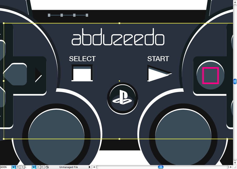
I also wrote the titles 'START' and 'SELECT' using the helvetica medium, but you can use other sans serif font If you don't have this one.
You probably already notice on this sketch some white lines, so this was what I was talking about when I said light reflexes. As you can see, the light comes from the top, so that's why I made this white mark on some shape, take you time to figure out by yourself too.
Gradients
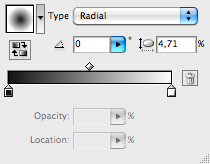
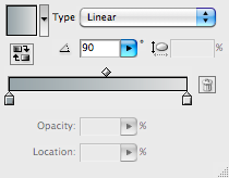
Ok, now it's time to start with the gradients in order to make this control pad ore realistic. This may look complex, but it's way more easier than you cna imagine. Let's start with R1/R2 button. As I said before, I used the colors from that color pallete to create even this gradients, now it's more about adjusting them using the gradient tool (G) and the gradient panel, it's really important to set them correctly as radial or as linear gradients.


As you can see, all the gradients beside the white ones, are radial. Use the color pallete to find the ideal color range, I won't tell exactly as this should a observation exercis for you guys.
Don't forget to break the font in outlines (command + shift + O / ctrl + shift + O), as it's impossible to aplly gradient on editable font.
Duplicate or repeat the same process for the L1/L2 button.
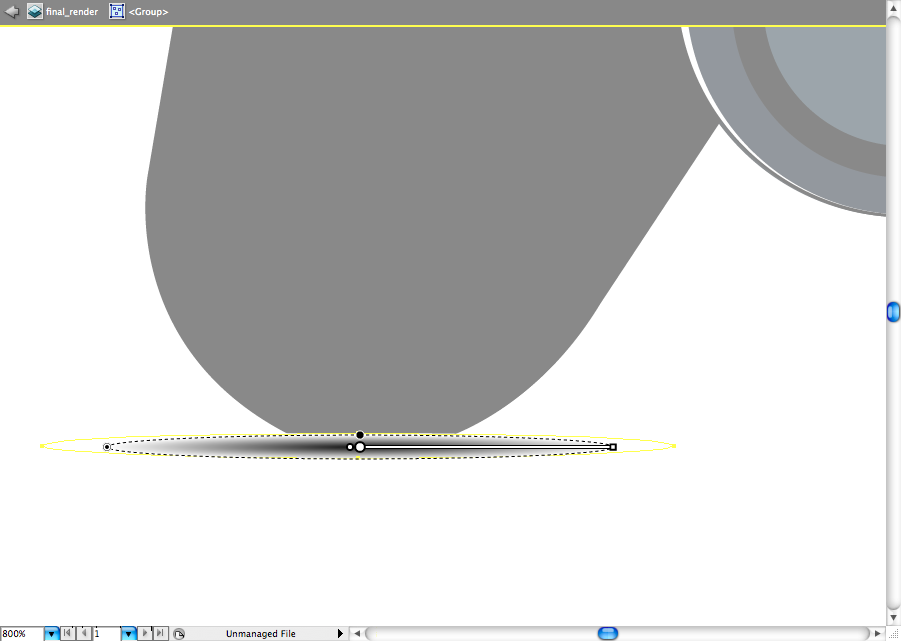
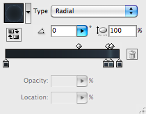
I really hate having to use blur on Illustrator, as this effect is really heavy, so the best way to make this shape is by creating a radial gradient, then adjust the range of it using the gradient tool (G) as you can see bellow.
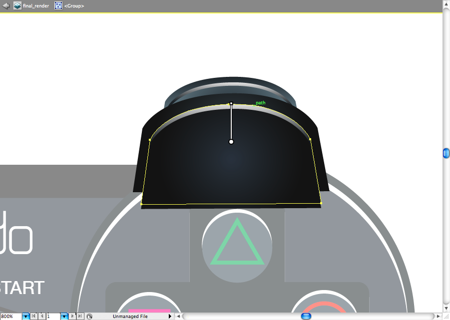
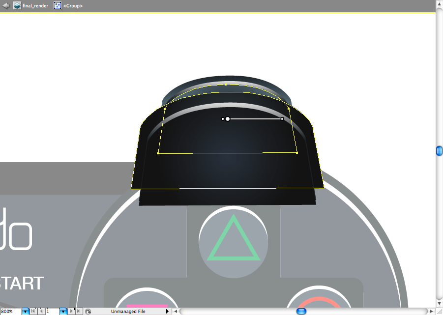
Let's skip to the pad body, this gradients are a bit more complex, I must admit.
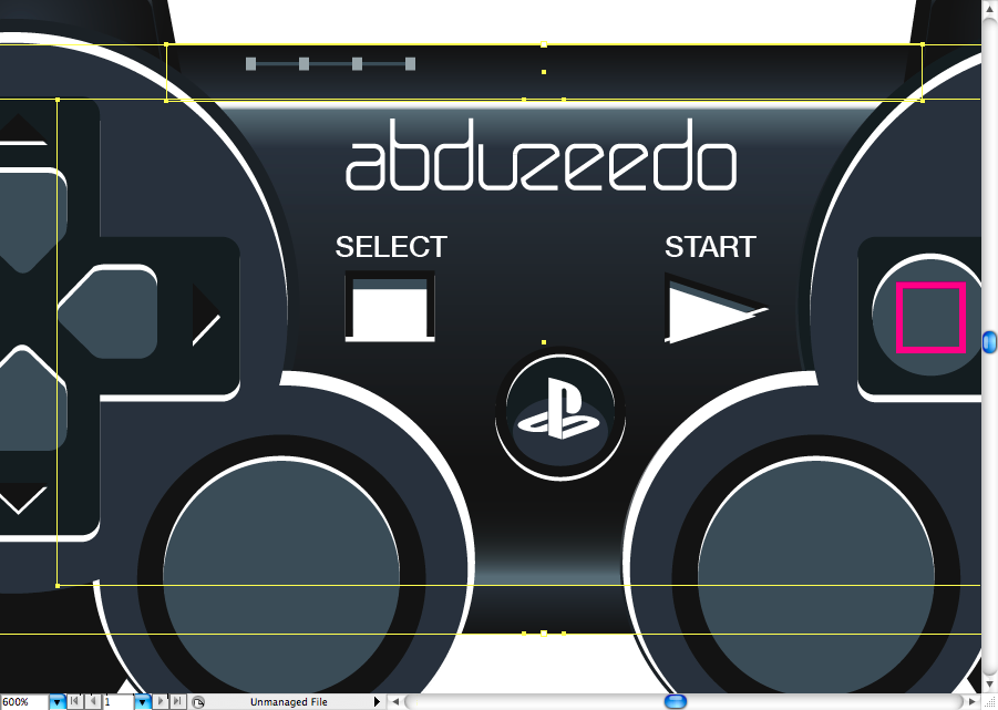
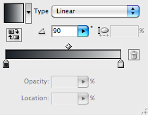
As you can see, the shape on the top and the one on the botton use the same linear gradient with a darker and lighter area, this is piece of cake to adjust.
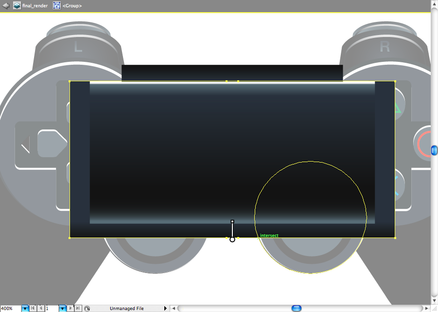
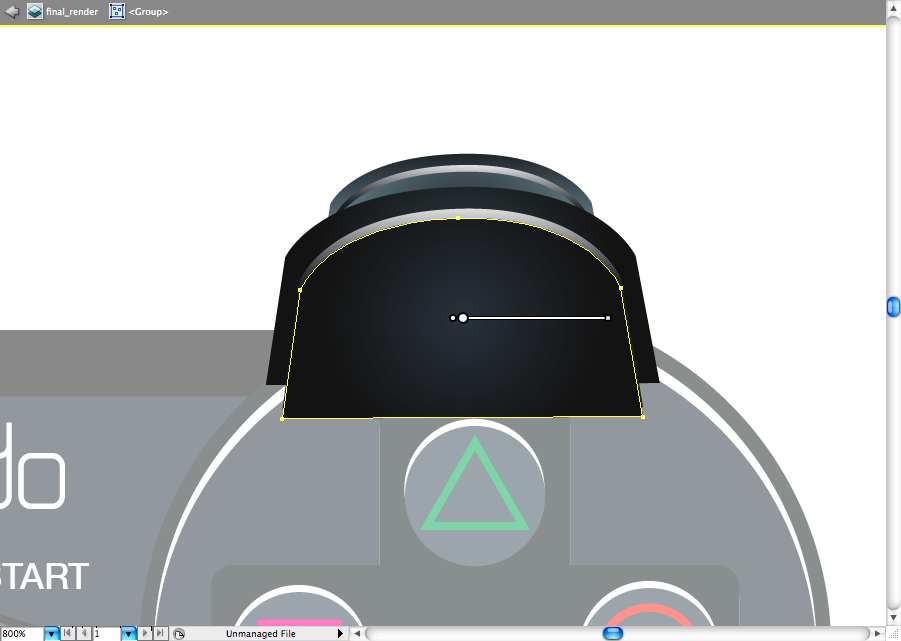
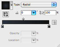
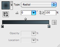
You may have problems on creating this one, but please don't get nervous about it, If you adjust the gradient panel settings as the ones bellow, this will be easier. The logic of this one it's that he got some light on the top and a bounced light form the bottom.
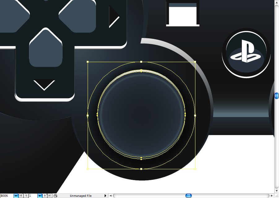
I used a radial soft gradient on both of the grabbers, this should be use to adjust.
I used the same proccess of the L1/R1 button on the buttons pad. You can even copy the same gradients tu use on it, but don't forget to adjust it correctly using the gradient tool (G).
Later you will just haeve to copy the same setting to the other side.
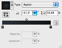
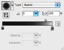
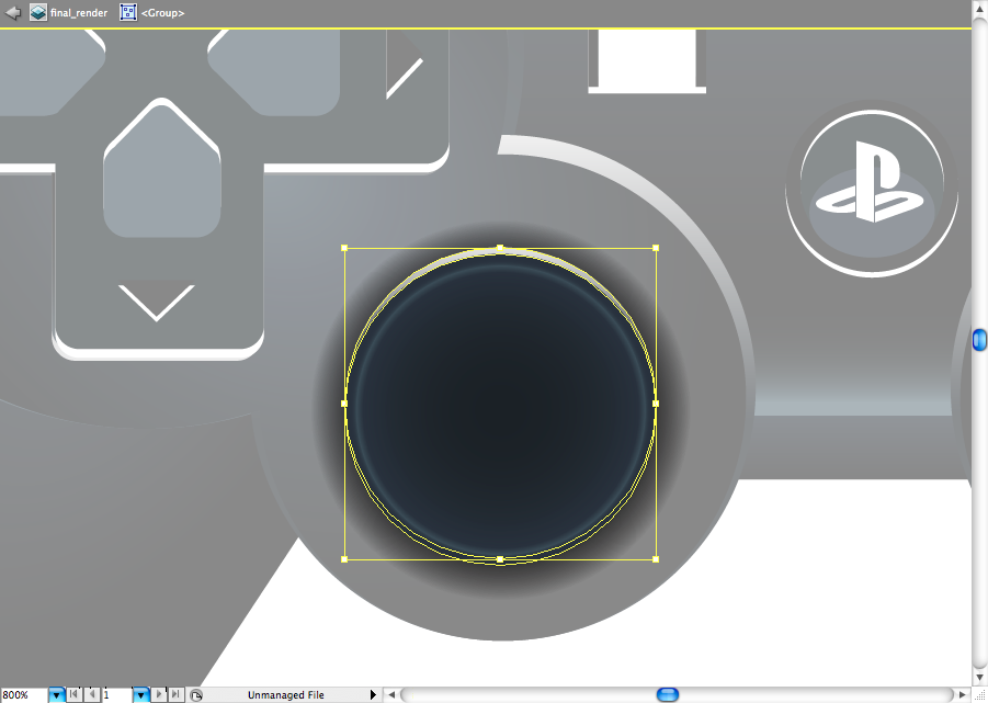
I must admit that the analog stick gradient is way more complex, let's start by creating the shading one. You're going to make a black to black radial gradient, but one of the sides mus have a opacity at 0%, configure this on the gradient panel.
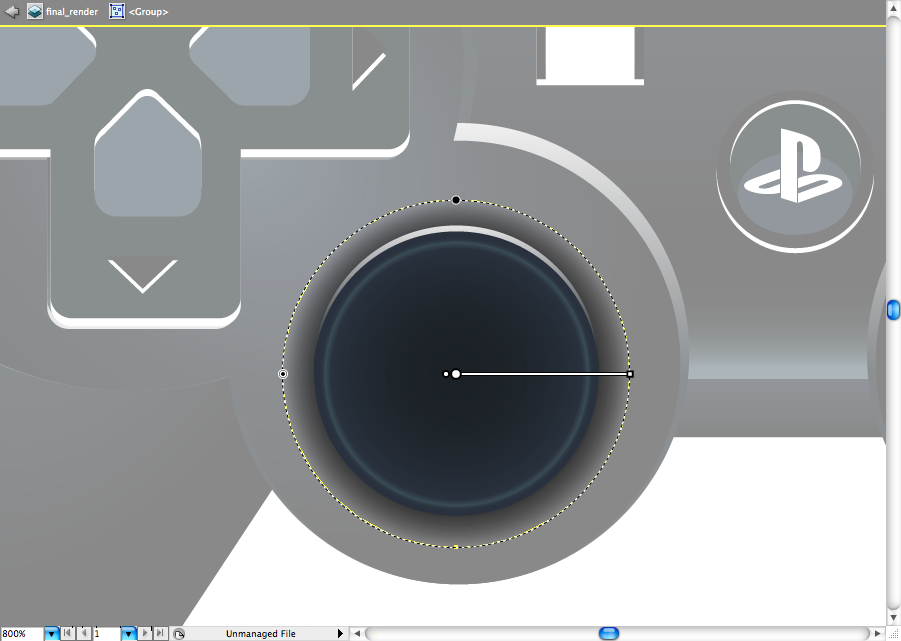
You can alos use a Multiply blending mode on it later, so this will give a better aspect on it.
The light reflex it's basically the same on you used previously.
Ok, now this radial gradient it;s a bit more complex, you should first adjust the colors on the gradient panel, then adjust it using the gradient tool (G).

The cross of the D-pad is going to use a more specific linear gradient, also it got a reflex on the bottom, as we want to give depth on it.
The directionals are wuite simple, just a linear two colors gradient, they also got a reflex on the top as well.
The tiny triangles got a light repfex on the bottom, as we're trying to give depth on it again.
Now you can repeat the same proccess used on the left side on the buttons pad, it's easy as that.
 e
e
Let's not forget about the little leds, they don't need big adjustments, just some simple linear gradients as you can see bellow.
I also broke the type in outlines (command + shift + O / ctrl + shift + O) so I could add a light gradient on it.
This Pst button got me a bit busy, but it's not that hard to achieve. I first used the same radial gradient on each of the internal spheres.
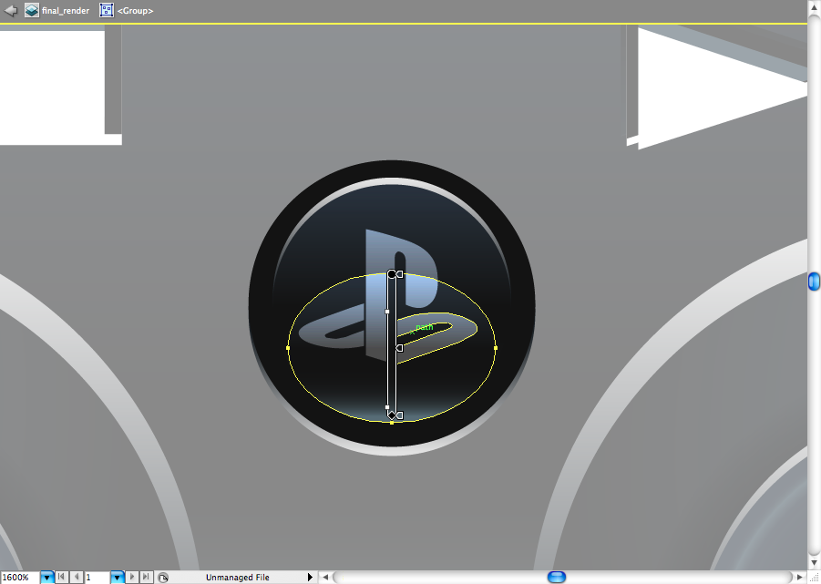
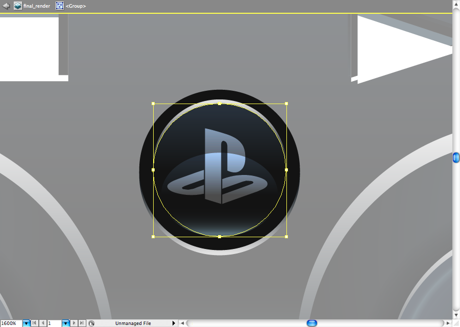
Later I just used the same gradient settings for the light reflexes.


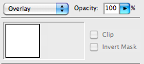
I used a white logo then just set the bleding mode called Overlay and duplicate it to get a brighter effect.
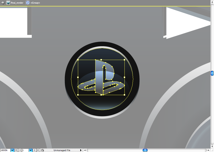
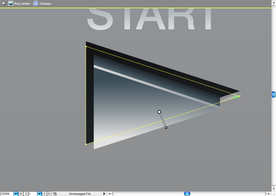
the 'START' button had some little adjustments, as teh triangles are a bit desunited.
I added two shapes in here, but you can actually use only one, just adjust you gradient with white solid top.
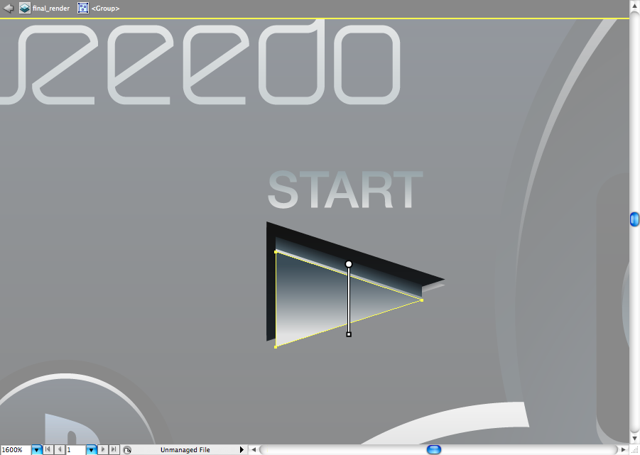
This one was adjusted to give a aspect of button (I mean the shape, not the gradient).
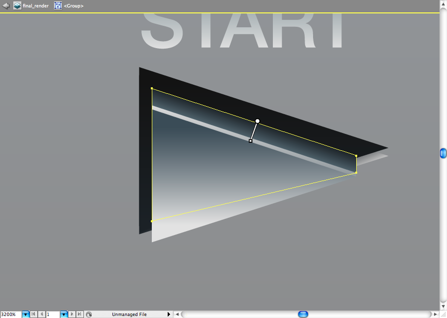
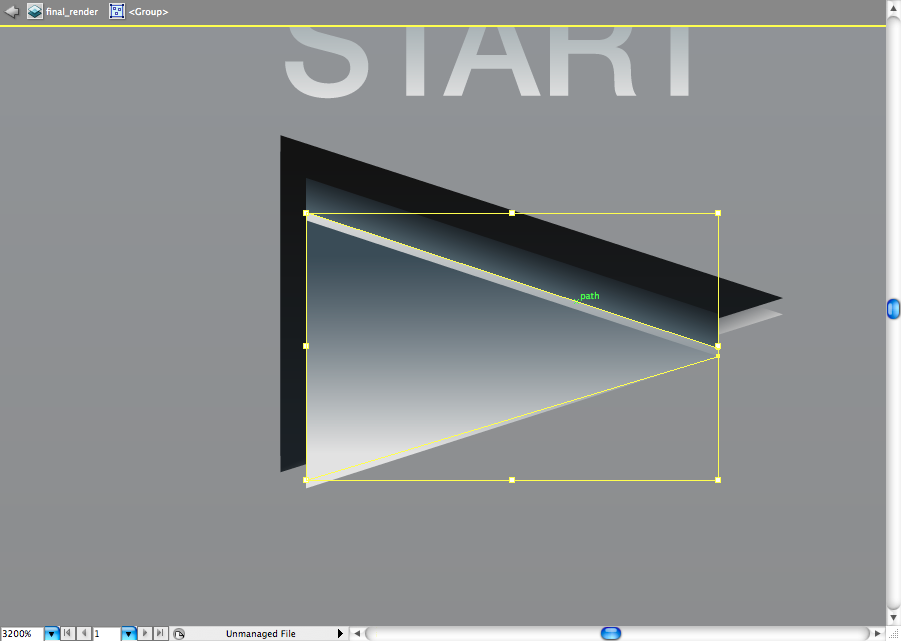
As you can see, there's also a gradient on the bottom of this button so I could reach the "cavity" illusion I wanted.
I applied the same dynamics on this other little bud, so you should know by this point how to solve it.

I hope you guys made to this point, congratulations and see you next time.
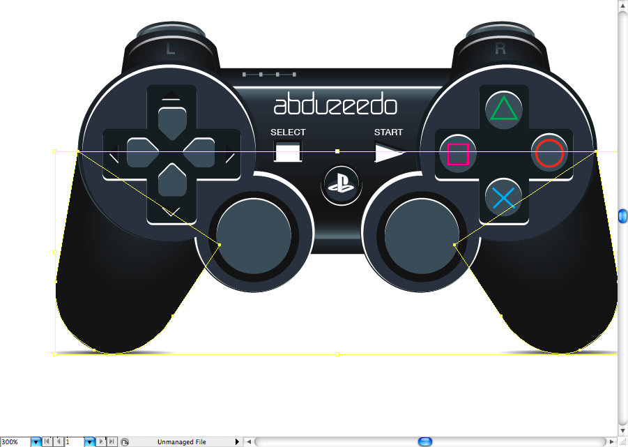
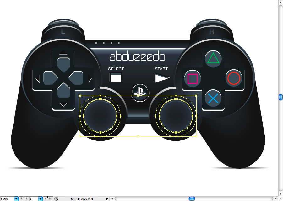
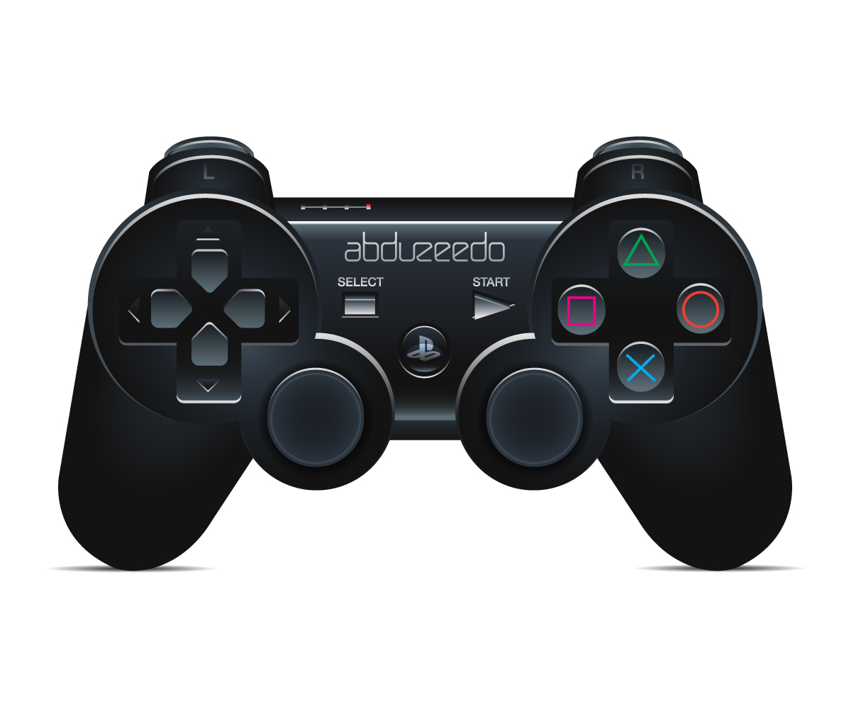
Final Result
Download the Adobe Illustrator File
Download the Adobe Illustrator file used for this tutorial
Original Link: http://feedproxy.google.com/~r/abduzeedo-tutorials/~3/Va7swA8HiBM/create-playstation-controller-illustrator
Share this article:
Tweet

View Full Article
Abduzeedo
 Abduzeedo is a collection of visual inspiration and useful tutorials
More About this Source Visit Abduzeedo