
An Interest In:
Web News this Week
- April 29, 2024
- April 28, 2024
- April 27, 2024
- April 26, 2024
- April 25, 2024
- April 24, 2024
- April 23, 2024
Some of Our Sources
- Mashable
- Techcrunch
- Simplebits
- Web Designer Wall
- Noupe
- My Ink Blog
- Wal You
- CSS Tricks
- Design Modo
- Android Headlines
Help Webnuz
Referal links:
How to Create Diagonal Lines with CSS
A few days ago, I received my invite to Google Music. While browsing the app, I noticed a tiny, but neat trick they use to create tabs and diagonal borders with plain-old CSS. I’ll show you how to do the same in your projects today!
Prefer a Video Tutorial?
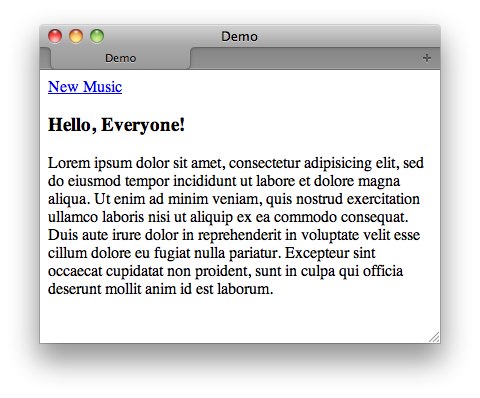
Step 1: The Markup
We begin with some simple markup.
<!DOCTYPE html> <html lang="en"><head> <meta charset="utf-8"> <title>Demo</title></head><body><a href="#">New Music</a><div><h3> Hello, Everyone! </h3><p>Lorem ipsum dolor sit amet, consectetur adipisicing elit, sed do eiusmod tempor incididunt ut labore et dolore magna aliqua. Ut enim ad minim veniam, quis nostrud exercitation ullamco laboris nisi ut aliquip ex ea commodo consequat. Duis aute irure dolor in reprehenderit in voluptate velit esse cillum dolore eu fugiat nulla pariatur. Excepteur sint occaecat cupidatat non proident, sunt in culpa qui officia deserunt mollit anim id est laborum.</p></div></body></html>
We’ll keep this demo as simple as we possibly can.
Step 2
Next, only for the layout, let’s apply a background color and a bit of spacing to the body element.
body {background: #e3e3e3;font-family: sans-serif;width: 400px;margin: 100px auto;}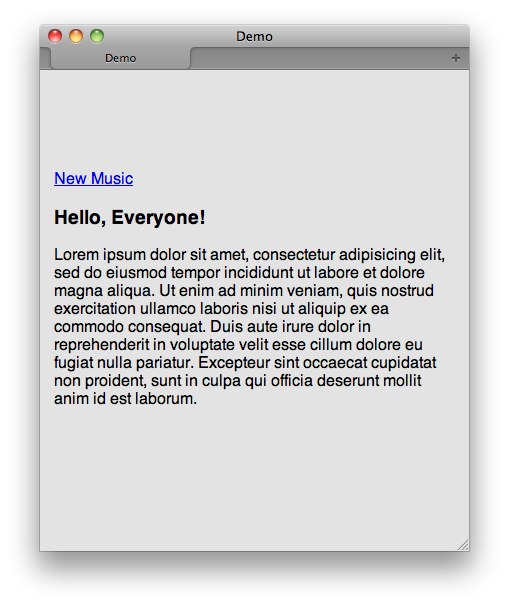
Step 3
Now, we’ll style the anchor tag somewhat — apply a new color, make it bold, add some borders, etc.
a {padding: 10px;text-decoration: none;color: white;font-weight: bold;display: block;border-right: 30px solid red;border-bottom: 30px solid #4c4c4c;}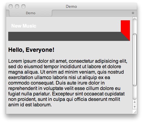
Notice how, when you set large border widths, at the point the two intersect, it creates a diagonal line? I wonder if we can use that intersection as a tab edge? Let’s try reducing the height to zero.
a {padding: 10px;text-decoration: none;color: white;font-weight: bold;display: block;border-right: 30px solid red;border-bottom: 30px solid #4c4c4c; height: 0;}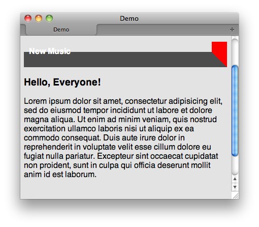
Getting closer! Maybe if we now adjust the line-height of the anchor tag, we can make the text fit into that box!
a {padding: 10px;text-decoration: none;color: white;font-weight: bold;display: block;border-right: 30px solid red;border-bottom: 30px solid #4c4c4c; height: 0;line-height: 50px;}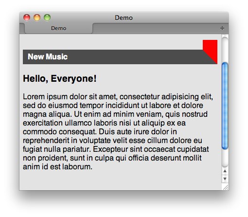
Step 4
We’re getting there! But, certainly, we don’t need that ugly red border on the right. Is there a way to specify that it should receive the body‘s background color without restating the hex value? Yep! We use the transparent keyword for this purpose.
a {padding: 10px;text-decoration: none;color: white;font-weight: bold;display: block;border-right: 30px solid transparent;border-bottom: 30px solid #4c4c4c; height: 0;line-height: 50px;}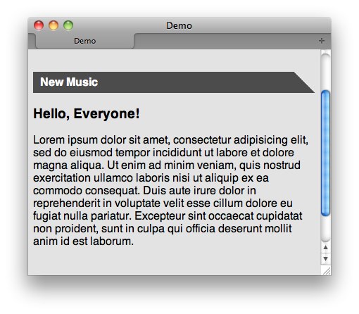
Step 5
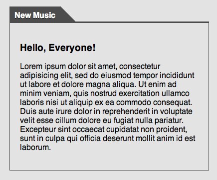
The obvious issue, at this point, is that it looks a bit odd, when the background stretches for the entire width of the container. The natural instinct might be to update the display to inline. However, as the image below shows, that won’t work.
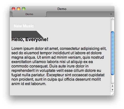
We need the element to retain its block-like nature in order for it to honor the 0 height. The answer to this dilemma is to use display: inline-block;, or to float the anchor tag, and then clear the elements that follow it. We’ll use the former.
a {padding: 10px;text-decoration: none;color: white;font-weight: bold;display: inline-block;border-right: 30px solid transparent;border-bottom: 30px solid #4c4c4c; height: 0;line-height: 50px;}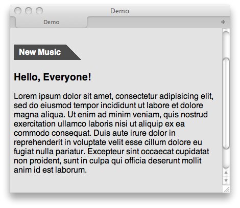
Much better!
Step 6
Lastly, let’s style the div below it a bit, and we’ll be just about finished!
div { border: 1px solid #4c4c4c; border-top: 3px solid #4c4c4c; padding: 20px;}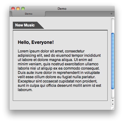
Uh oh. We have a problem. It looks like Firefox and Webkit don’t exactly agree on how to render elements with zero heights and displays of inline-block.
On a casual note, this one had me a bit stumped. Without resorting to hacks, I couldn’t get Firefox and Chrome to render the layout exactly. If you find a way, let me know in the comments! Update – refer to the comments for a work-around.
Step 7
There are ways to target Webkit browsers with CSS, but it’s important for me to note that tricks like this should only be used in situations of last resort. In other words, don’t try this at home kiddos (unless you have to). In our situation, it appears that it would be smarter to use floats to accomplish this layout. Nonetheless, let’s be dangerous and experiment with some alternate techniques.
Many aren’t aware that media queries can be used to target Webkit browsers. Watch what happens when we use a webkit-specific property as the condition for the media query…
@media screen and (-webkit-animation) {a {margin-bottom: -4px;}}Ta da! It works. Remember though – only reach for this trick if you have no other option!
Final Product
It’s a simple enough technique, but, nonetheless, one we should all have in our tool belts. Have you used any neat tricks like this in your projects? Let me know in the comments!
Original Link: http://feedproxy.google.com/~r/nettuts/~3/fxZ5Jjq506Y/
TutsPlus - Code
 Tuts+ is a site aimed at web developers and designers offering tutorials and articles on technologies, skills and techniques to improve how you design and build websites.
More About this Source Visit TutsPlus - Code