
An Interest In:
Web News this Week
- April 27, 2024
- April 26, 2024
- April 25, 2024
- April 24, 2024
- April 23, 2024
- April 22, 2024
- April 21, 2024
Some of Our Sources
- Simplebits
- Web Designer Wall
- The Logo Smith
- Abduzeedo
- Inspiredology
- Naldz Graphics
- FanExtra - PSD
- Fudge Graphics
- Web Design Ledger
- Hashedout
Help Webnuz
Referal links:
Character Design for the Boomrock Saints
In this tutorial we will demonstrate how to use Illustrator and Photoshop to create character designs for the Boomrock Saints. Let’s get started!
Preparation
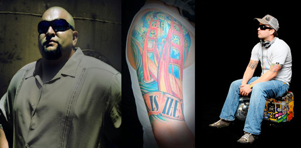
Below are the reference photos, which were given to me by the group. Josh is on the left and Brian is on the right. In the middle is Brian’s tattoo, which we will incorporate into the design later on.
Step 1
Create a new document 1600px x 1600px and set the background to a light gradient. Add a new layer to your document and begin by loosely building a foundation for your characters.
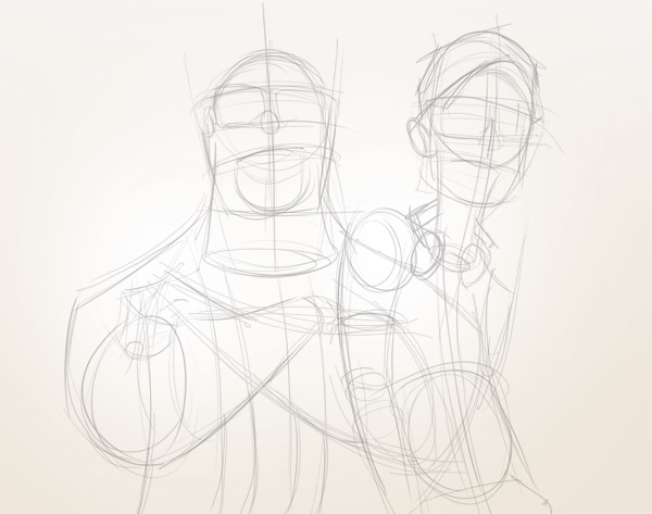
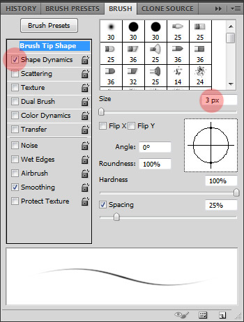
With a tablet, I typically use a standard 3px brush in a color slightly darker than the background. I make sure to have “Shape Dynamics” checked so I can control my pen’s pressure.
Step 2
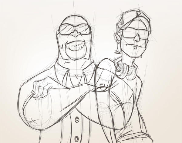
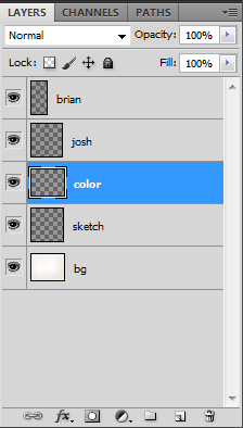
Lower the opacity of your first layer to 50% and add two new layers on top of it"one for each character.
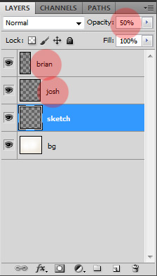
Use these new layers to go over the messy sketch lines to clean it up a bit and to add in the details. Be careful not to mix up the layers so later you can adjust the character positions if needed. It’d be a good idea to name them like in the image above. At this point, the characters are starting to take shape. It’s okay to still keep everything rough at this stage.
Step 3
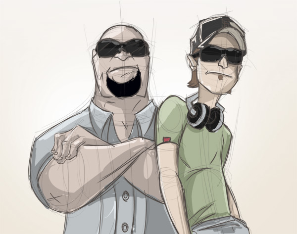
Add a new layer in between the first “sketch” layer and the character layers and name it “color”.
Use this layer to experiment and roughly block in the characters with a chosen color palette. In this case, the group wanted something “guerilla” so naturally I went with earth tones.
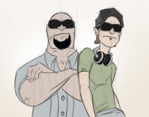
Next, roughly add in the lighting and shading. I have chosen the main light source to be to the left of the characters so the light will hit the hardest from the left on exposed skin/clothing. The parts which are not exposed will either be left “as is” or shaded in if they are behind another element such as the right side of Brian’s torso being covering by his right arm. Similarly, most of Josh’s torso on the left side is shaded since it’s being covered by Brian who is directly in front of him.
Step 4
Once you are satisfied, it is time to take the illustration into Adobe Illustrator to clean up the outlining. Hide all layers except the outline, save it as a jpeg, and open it in Illustrator. Since I’m using a tablet, I can do the outlining with my tablet pen rather than a mouse. For those who aren’t working with tablets, this part can be done with the pen tool as well. There are many tutorials on the Internet for pen tool inking in Illustrator along with tutorials for various other methods. This is the method I like.
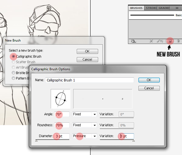
Create a new brush by opening up the brush palette and clicking on the ‘new brush’ icon at the bottom. In the dialog box that pops up, select ‘Calligraphic Brush’, click OK, and set the angle, roundness, diameter, and variation of this new brush to the settings shown below.
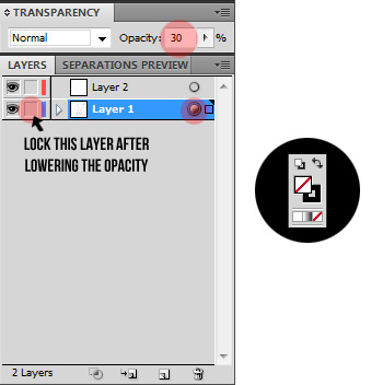
Select the contents of your layer by clicking the circle to the right of the layer in the Layers palette. Lower the opacity to 30% and lock the layer. Choose the color black for the stroke and none for the fill.
Step 5
Now we’re ready to start cleaning up the outline. When inking, make sure to vary the weight of the lines to produce a more dynamic effect.
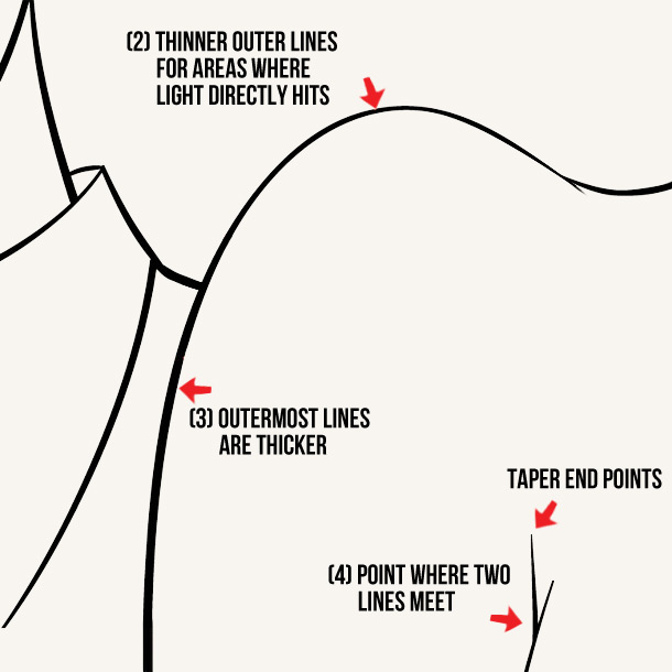
Some quick tips to remember when dealing with line weights:
- Create an illusion of depth. If an object or person is closer to you, the lines will generally be thicker. So, if this drawing had a background of a cityscape, the lines that make up the cityscape would be thinner than the lines of the character.
- Pay attention to the light source. Wherever the light is hitting, the lines will generally be thinner. Wherever the light isn't hitting, the lines will generally be thicker.
- The outer-most lines of any object or person will generally be thicker than the lines within. This is to help define that object or person apart from the others.
- Widen the end points of lines that get cut off by another line. Take a look at the image below to see what I mean.
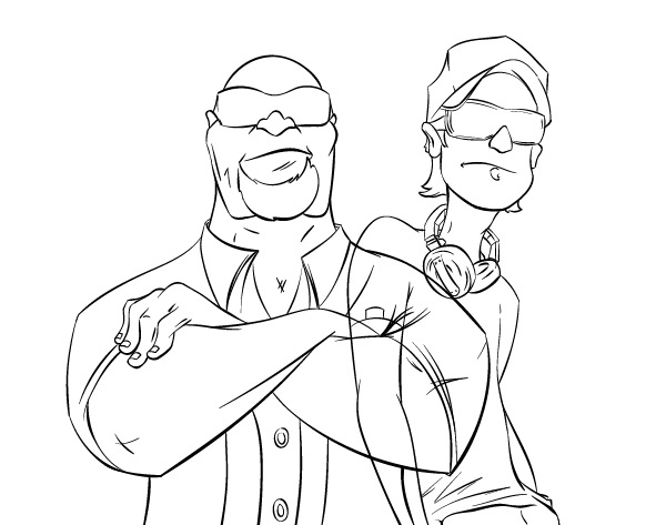
Once finished, you should have something similar to this:
Step 6
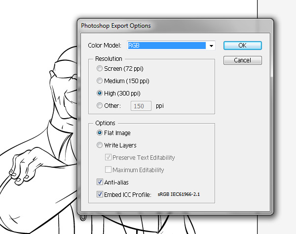
Now we can bring the file back into Photoshop and start the coloring and rendering. Export the file from Illustrator (File > Export) and select ‘psd’ from the dropdown list. In the dialog box that pops up, set the resolution to ‘high (300dpi)’ and hit OK.
Step 7
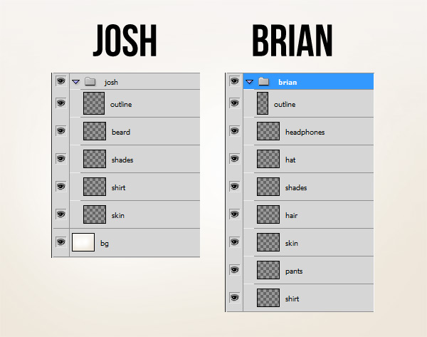
For this portion, what I usually do is create a separate layer for each color or element on each character underneath the outline layer. So it would look something like this:
Then, I simply color in each element on their own respective layers. Also, you may have noticed that I lightened the outlines for each character a tad. I feel this makes the illustration look more natural as opposed to having a dark black outline.
Step 8
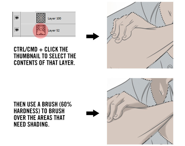
Now since we have the characters colored, all that’s left is the rendering. I usually start off with the shading and move onto the lighting. Create a separate layer for ‘Shading’ above the base color layer for each element. Now, using the colored image in step 3 as a reference, shade in the characters using a brush set at about 60% hardness.
My technique is to select whatever element I’m shading by Command/Ctrl-clicking the layer thumbnail and brushing over the areas that need shading.
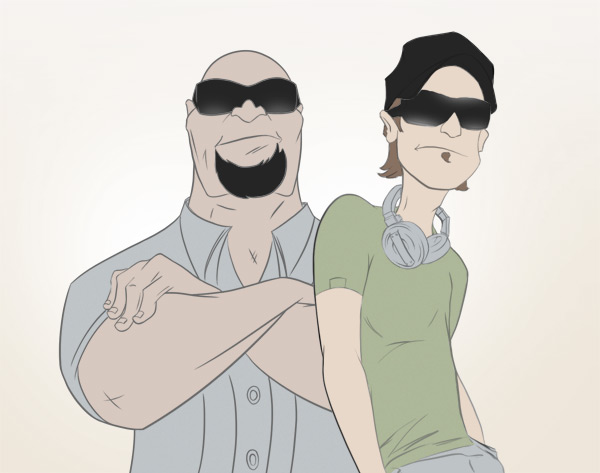
Do this for all elements of both characters and you should have something similar to this:
After seeing the result, if you decide you want certain shaded areas to be even darker, you can create a new layer for just the darker areas and use the same technique above to color it in. Having darker areas in your illustrations helps create more of a dynamic outcome.
Step 9
Next, we do the lighting. Add a new layer above the ‘Shading’ layer for each element. With the ‘Lighting’ layer selected, use the same technique of Command/Ctrl-clicking the layer thumbnails to select their content and add in bits of lighting where needed.

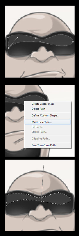
For the reflections in the shades, use the pen tool to create a shape around the inner perimeter. Then, right click that shape, click on ‘Make Selection’, and click OK in the dialog box that pops up. Once the shape is selected, select white as your color and use the gradient tool to create a subtle reflection dragging from top to bottom at a slight angle. Once you’re finished, reduce the opacity of this new shape to about 30% or whatever percentage you feel looks just right.
Step 10
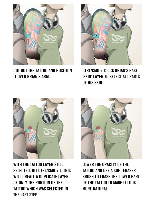
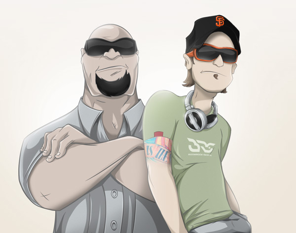
Lastly, we add the finishing touches such as the tattoo on Brian’s arm, the logo on Brian’s shirt, the SF logo on Brian’s hat, and some extra lighting on both characters to really pinpoint the light source.
Here is the method I used to tattoo Brian’s arm.
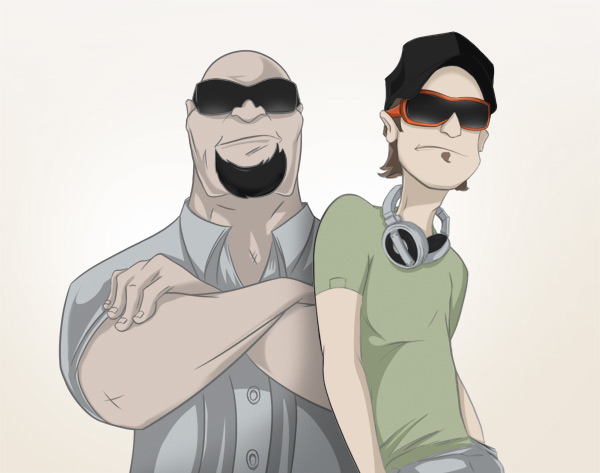
After seeing the entire illustration completed, the group asked if Brian could be "beefed up" a bit to reflect more of his natural self. So, I made some quick adjustments by widening the body a bit and adding some definition to the right arm, which you can see in the final design below.
Conclusion
I hope this tutorial has inspired you to use these techniques to help develop your own styles of illustration. Try to build a solid foundation with the sketch from the start and you’ll have a lot more fun developing it into an inked/colored character.
Original Link: http://feedproxy.google.com/~r/psdtuts/~3/SDvE7EpkD7g/
TutsPlus - Design
More About this Source Visit TutsPlus - Design