
Hey buddies! I'm Marcos Torres, a 20 years old art director/freelancer from Brazil, I'm here to bring some new interesting stuff to you. You can see my portfolio at https://flickr.com/marcostorres. Any request or jobs opportunities send to [email protected], also follow me on Twitter https://twitter.com/marcos333 to get in touch with cool design news.
Some of Our Sources
- Team Treehouse
- Just Creative
- Smashing Apps
- TutsPlus - Design
- Line 25
- Stylized Web
- Spyre Studios
- Daily Now
- Dev To
- Hashedout
Help Webnuz
Referal links:
May 9, 2011 08:48 am GMT

Original Link: http://feedproxy.google.com/~r/abduzeedo-tutorials/~3/qaWEbCEg0JU/tips-creating-fluffy-characters
Tips on Creating Fluffy Characters
One of the best things about clients is that they're always surprising us with some random and misterious pitch works. One of my last briefings was to create a fluffy character , but since I always made illustrations more realistic and fantasious, this was quite a challenge for me. As some of you may have thought, I tought that creating a fluffy characters would be as easy as drawing an apple, but I was wrong and on this tutorial I will explain the reasons why.
So, you may be asking yourself, why is not that simple? Well, character design actually is a specialization as you may know, so as every specialization on art/design area, they have some rules and guidelines that may be helpful when creating. So, before we start our tutorial, let's first understand why should we learn more about it: character design is a very requested service in areas like advertisement, visual identity and brand design, comics and children's products (books, packages, websites, etc). Basically, it's an awesome thing to know how to do, even if you don't work as a illustrator or artist. Ok, so let see some examples of illustrators that work in this area in order to get used with some aspects:
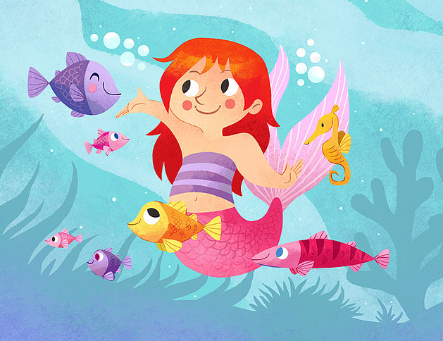
Melanie Matthews
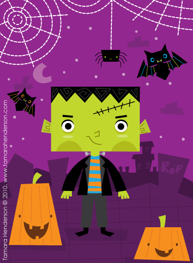
Tamara Henderson
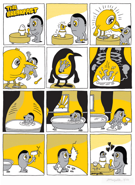
Jeremy Ville
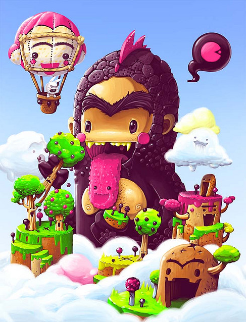
Bruno Mota
Ok, now we are inspired, so let's do it!
The tips I will describe are all based on my observations and experiences while trying to reach good results on character design, but I'm open for any tips and tricks you may know, so please comment and share your knowledge with us. For the next steps I selected some famous fluffy characters to prove my theories.
1) Remarkable and Simple Silhouette
First of of all, let's try a bit of trivia, can you recognize those characters bellow?
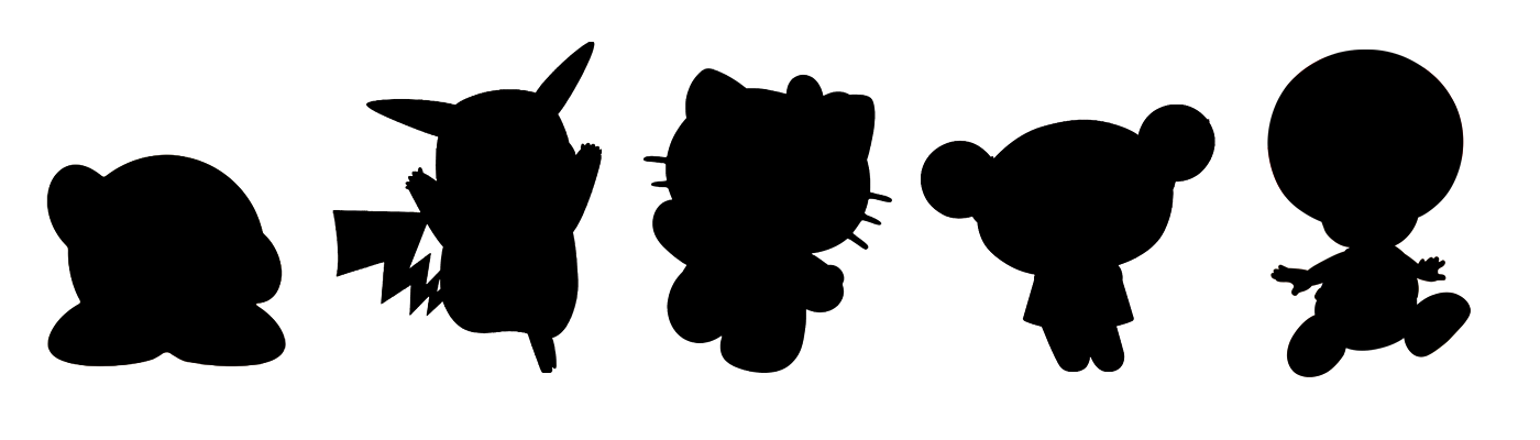
Did you recognize most of them? If not it maybe because you wasn't born on the 80's / 90's hehehe just kidding. But if you really did recognized them is because my first tip is correct: you should always try to create a remarkable silhoutte for your character, it must be so remarkable that you can recognize it even years without seen it. The fact is that some of theses characters are used as brands, take a look at Hello Kitty for example, her head shape is used as logo, you can see it in every material produced. So my tip is to use simple silhouttes, because more realistic and detailed silhouttes can be mistaken with other characters or maybe even not understood. Also remeber that it should be easy as a kid can remember how to draw it.
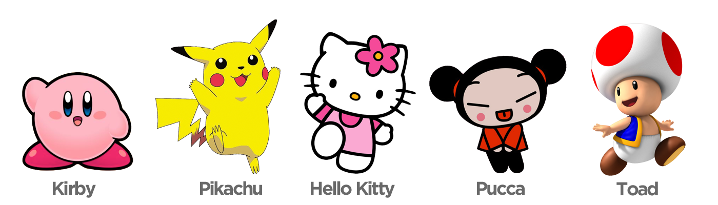
If you want to know more about theses characters, please click the following links: Kirby, Pikachu, Hello Kitty, Pucca, Toad.
2) Few and Light colors
One of the best ways to discover the predominant colors of a photo is by pixelating it, you will get the main colors as pixels. So, I decided to apply this technique in those characters in order to show that they use a really limited color pallete, but why? As you need to create an identification with the public, you should not only try to use predominant colors, but also use few and never change them, in any situation. For example, Pikachu has yellow as his predominant color and black and red as secondary colors, even if we changed these colors, we would still identify these pixels as Pikachu, because yellow is a intrinsec color to this character.

Also, as you want to get something more childlike, you should use a light color pallete and light gradients. High contrasts are not recommended (Pucca is a definetely a exception in this case), because they can only be achieved with solid colors, what doesn't fit into something more soft.
3) Simple Trace
This may sound obvious, but do you remember when you was a kid and when you had that coloring books with characters in outlines? Well, some of us started to learn how to draw by those books because of the drawings that we used to coloring, they were really easy to draw. As you can see bellow, these are characters really easy to draw , made with simple trace, not using any hashing or pen/brush marks, most of them have a vector look indeed.
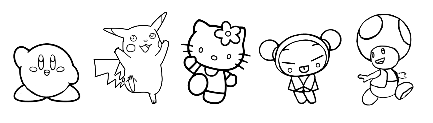
So, try to simplify things, it must be understandable seen from meters away, uniform lines should be the way to it. The part that actually you should work harder on them are the eyes, try always to create them simple, but catchy eyes, use glows or light gradients, make them notable.
4) Round and Disproportional Shapes
Disproportion is a clear characteristic of child illustration, but why? In my point of view, kids rather see disproportional illustrations because they are more related to fictional worlds. Also, realistic illustrations brings us too much close to reality, so there are more details, more colors, more shapes and different traces. When you're a kid this maybe too much to process/understand and also it may look a bit agressive in some cases. Quick tip: The bigger the eyes, the more child look you will give to you character, the same thing with the head, so try to apply disproportion on this kind of way.
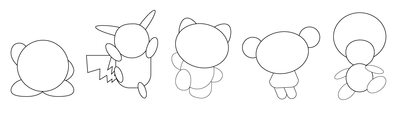
Ok, but what about the rounded shapes? As some of you have already study in design disciplines such as Gestalt, the circular shapes refer to security, stability, feminism . So, the fact is that you should avoid squared or triangular shapes on these kind of character. You may say Pikachu have a lightining tail that don't follow this rule, but in this case that's not a problem since his tail is in that shape only to remind us of his powers as the rest of his body is round.
5) Few and Notable Details
Ok, as I said before we should try to make it simple, but with touch of personality. I think you got to insert a few and precise details in your character, not just clothes, but something really unique on him. Bellow are all the characters analised one by one:
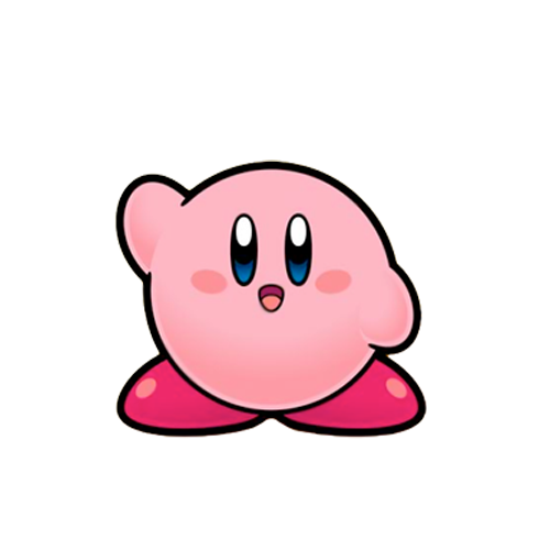
Kirby may look a lot simple but if there are some details remarkable on her are the eyes and mouth really close to each other and also big pink shoes.
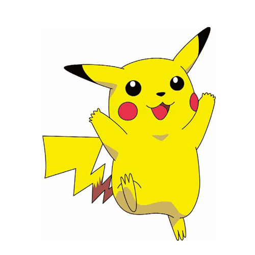
Pikachu is a more elaborate character with his remarkable lightning shaped tail and his red cheeks.
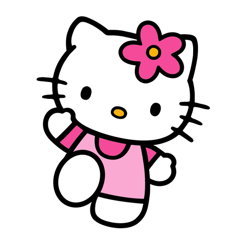
Hello Kitty is another character that appeals to simplicity into it's best, but using some classic details as the ornament on her head, that may change, but is always on the same side.
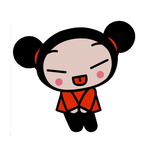
Pucca got a really memorable face due to her niponic eyes and her hair design.
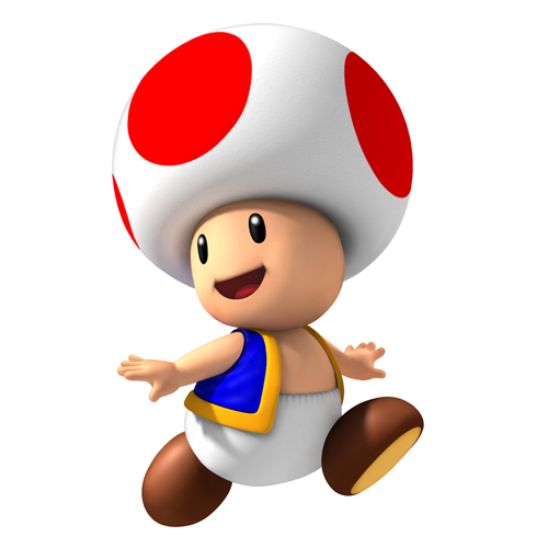
Finally Toad remind us a mushroom mixed with a baby, his little coat it's what gives a final touch to it.
So...Let's try!
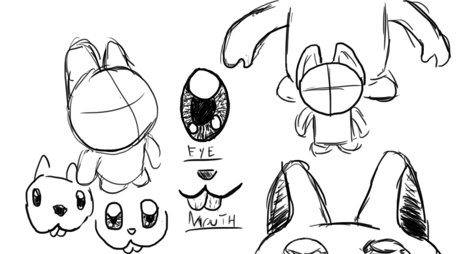
Now let's try to pratice all these tips on a whole new character. After some skecthes I developed this bunny look a like character trying always to stick with the five tips.
Bunny - Time lapse - vector process from Marcos Torres on Vimeo.
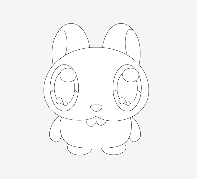
Step 1 (Remarkable and Simple Silhouette)
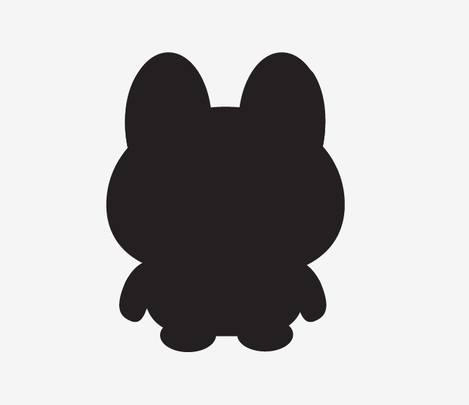
After the skecthing and creation of the character I had to see if his silhouette was not confuse or similar to other character already created.
Step 2 (Few and Light colors)
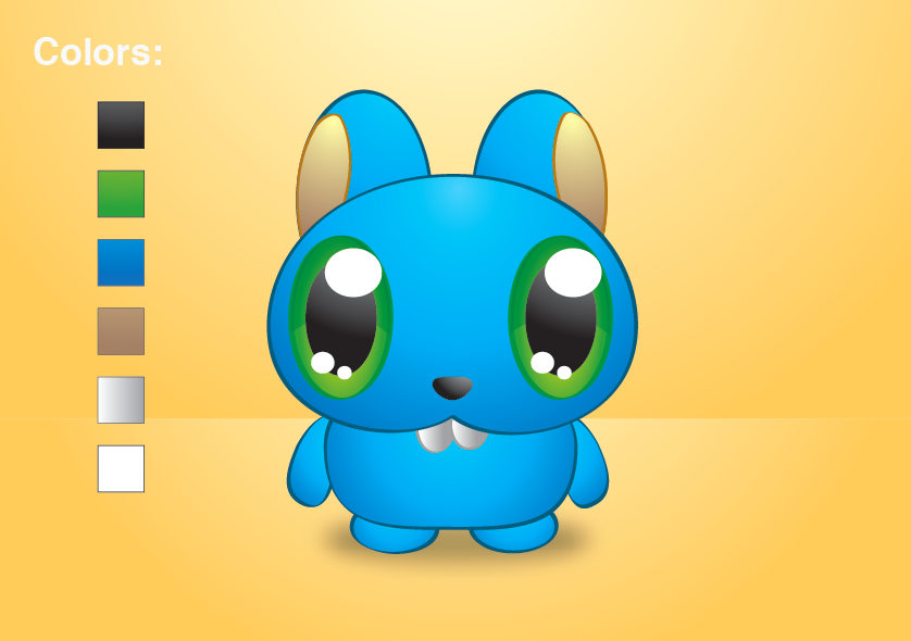
I decided to use 6 colors on this character, being the light blue the predominant color, and green and light yellow the secondary colors.
Step 3 (Simple Trace)
As I did it all in vector, I tried to make it the flat as I could.
Step4 (Round and Disproportional Shapes)
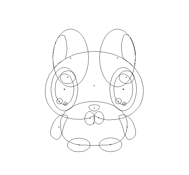
Above you can see only the outlines of the character, I tried the most to use only round shapes and make big eyes and head, a really disproportional body that would evoke something more childlike.
Step 5 (Few and Notable Details)
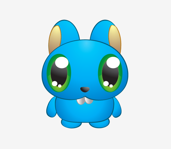
So the main characteristics of this character are his little teeth and his big eyes, that's what I think is most memorable by looking at him.
Final Considerations
Well I know this was kind of a more theoric tutorial, after doing some practical tutorials I decided to try this kind. I did this because I think sometimes just learning how to draw something exactly won't help you to draw better. It can help, but it won't answer questions as "why to do it?" , "when to use it?" and "how should I do it?". I hope you understand the whole idea of this tutorial and have a nice time trying to create your own characters.
Original Link: http://feedproxy.google.com/~r/abduzeedo-tutorials/~3/qaWEbCEg0JU/tips-creating-fluffy-characters
Share this article:
Tweet

View Full Article
Abduzeedo
 Abduzeedo is a collection of visual inspiration and useful tutorials
More About this Source Visit Abduzeedo