
An Interest In:
Web News this Week
- April 2, 2024
- April 1, 2024
- March 31, 2024
- March 30, 2024
- March 29, 2024
- March 28, 2024
- March 27, 2024
Some of Our Sources
- Simplebits
- TutsPlus - Code
- Pearsonified
- Six Revisions
- Inspiredology
- Reencoded
- CSS Globe
- Stylized Web
- Spyre Studios
- Dev To
Help Webnuz
Referal links:
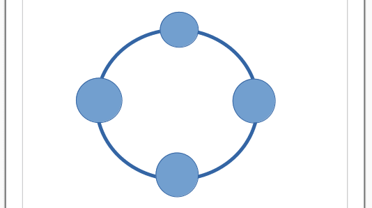
CSS Animation: A circle with smaller circles orbiting it.
Here is what we will be making
Starting with the HTML
- We create a container
.containerwhich centers all other content - Another container
.hero-circlethat contains the content - Add
imginside.hero-circle - Created another container
.hero-rotateinside.hero-circle - Lastly we add 4 divs
.planetinside.hero-rotateeach container animg
HTML
<div class="container"> <div class="hero-circle"> <img class="inner-img" src="https://images.unsplash.com/photo-1465414829459-d228b58caf6e?ixlib=rb-0.3.5&q=80&auto=format&crop=entropy&cs=tinysrgb&w=600&h=338&fit=crop&s=7ab1744fe016fb39feb2972244246359" alt="" /> <div class="hero-rotate" id="circle"> <div class="planet"> <img src="https://images.unsplash.com/photo-1465414829459-d228b58caf6e?ixlib=rb-0.3.5&q=80&auto=format&crop=entropy&cs=tinysrgb&w=600&h=338&fit=crop&s=7ab1744fe016fb39feb2972244246359" alt="" /> </div> <div class="planet"> <img src="https://images.unsplash.com/uploads/1413142095961484763cf/d141726c?ixlib=rb-0.3.5&q=80&auto=format&crop=entropy&cs=tinysrgb&w=600&h=338&fit=crop&s=86dc2dcb74588b338dfbb15d959c5037" } alt="" /> </div> <div class="planet"> <img src="https://images.unsplash.com/photo-1484402628941-0bb40fc029e7?ixlib=rb-0.3.5&q=80&auto=format&crop=entropy&cs=tinysrgb&w=600&h=338&fit=crop&s=6237e62a10fa079d99b088b0db0144ac" alt="" /> </div> <div class="planet"> <img src="https://images.unsplash.com/uploads/141310026617203b5980d/c86b8baa?ixlib=rb-0.3.5&q=80&auto=format&crop=entropy&cs=tinysrgb&w=600&h=338&fit=crop&s=882e851a008e83b7a80d05bdc96aa817" alt="" /> </div> </div> </div></div>Now The CSS
Our outermost div (.container) is covers the entire screen and centers .hero-circle. We'll also add custom properties for the diameter(width and height) of the .hero-circle and the diameter of .planet. This way all we need to do is change the value of those custom properties to make it responsive on small screens
.container { display: grid; width height:100vh; place-items: center; overflow: hidden; background-color: black; --circleDiameter: 300px; --planets: calc(var(--circleDiameter) / 5)}Now we set the width and height of our content container .hero-circle to the --circleDiameter custom property
.hero-circle { position:relative; width: var(--circleDiameter); height: var(--circleDiameter)}What's next is to place the center image at the center of .hero-circle
.inner-img { position:absolute; top:50%; left:50%; transform: translate(-50%,-50%); border-radius:10px; width:90px; height:90px;}that's one way to center a div
We then create the big circle .hero-rotate
.hero-rotate { position: relative; top: -7px; left:-7px; width: 100%; height: 100%; border: 7px solid white; border-radius: 100%; animation: rotate 30s linear infinite;}We'll add the animation later
Add styles to .planets and the image inside each planet
.planet { position: absolute; width: var(--planets); height: var(--planets); border-radius: 100%; animation: maintain 30s linear infinite;}.planet>img { width: 100%; height: 100%; object-fit: cover; border: 5px solid white; box-shadow: 0 0 5px 0 rgba(0, 0, 0, 0.3); border-radius: 50%; animation: scale 1s linear infinite alternate; }At this point we haven't added the animations yet and we should have something like this.
You only see one image on the circle because they are stacked on each other.
To place the .planets evenly around the bigger circle .hero-rotate, we'll be using the --planets custom property to calculate where to place each circle for responsiveness.
Since there are four .planets we would place them top-center, left-center, bottom-center and right-center
place .planets
.planet:nth-child(1) { top: calc(-1 * var(--planets) / 2); left: calc(var(--circleDiameter)/ 2 - var(--planets) / 2)}.planet:nth-child(2) { top: calc(var(--circleDiameter)/ 2 - var(--planets) / 2); right: calc(-1 * var(--planets) / 2);}.planet:nth-child(3) { top: calc(var(--circleDiameter)/ 2 - var(--planets) / 2); left: calc(-1 * var(--planets) / 2);}.planet:nth-child(4) { left: calc(var(--circleDiameter)/ 2 - var(--planets) / 2 ); bottom: calc(-1 * var(--planets) / 2);}You can adjust the position as you like
Animations
Animations are simple.
First we rotate the outer circle .hero-rotate which will make it seem like it's the .planets that are moving
the rotate animation
@keyframes rotate { 0% { transform: rotate(0) } 100% { transform: rotate(360deg); }}
From the above preview we could see that the images are turning over because of the rotatoin and we don't that.
To solve that we simply make .planet rotate in the opposite direction and also add scale animation to the images
@keyframes maintain { 0% { transform: rotate(0); } 100% { transform: rotate(-360deg); }}@keyframes scale { 0% { transform: scale(1.2); } 100% { transform: scale(1); }}The final out put
That's it, if anything is unclear, ask in the comments and I'll explain further.
ciao
Original Link: https://dev.to/dawkaka/css-animation-a-circle-with-smaller-circles-orbiting-it-307f
Dev To
 An online community for sharing and discovering great ideas, having debates, and making friends
More About this Source Visit Dev To