
An Interest In:
Web News this Week
- April 17, 2024
- April 16, 2024
- April 15, 2024
- April 14, 2024
- April 13, 2024
- April 12, 2024
- April 11, 2024
Some of Our Sources
- Slashdot
- Techcrunch
- Technology Review
- Smashing Magazine
- CSS Globe
- Line 25
- Specky Boy
- CSS Tricks
- Hashedout
- TechPowerUp
Help Webnuz
Referal links:
Your GitHub year in review - 10 fun ways to visualize your contributions
Love 'em or loathe 'em, GitHub contribution graphs are often a great way to help share a story.
That little collection of s and s can show when you started a new job, made your first open source contribution, got GitHub Actions working for the first time(!), or even took some time off to travel or begin your adventure as a new parent.
E.g. here's the first manually-created annotated contribution graph that I created back in 2012 highlighting some of the things I got up to that year:

I was clearly working too many weekends and not taking enough vacation in 2012, but it sure was fun. Anyway...
If you follow developers on social media then there's a good chance you've have seen a smorgasboard of contributions graphs, videos and all sorts of fancy visualizations highlighting their 2022 year in review.
Much like Spotify's annual "Wrapped" and Reddit's -themed "Recap" they all offer a fun way to highlight your work.
In no particular order, here are 10+ ways you can do the same. Enjoy!
1. GitHub Unwrapped
GitHub Unwrapped is a fun and festive way to view your public activity for 2002. In addition to showing you what times and days of the week you're most productive, it'll generate a Christmas tree showing your open and closed issues.
You can share the URL or the video file it creates on social media like thousands of others - see #githubunwrapped on Twitter.

My colleague @abbycabs claims the spike above is due to maternity leave. Let's hope so!
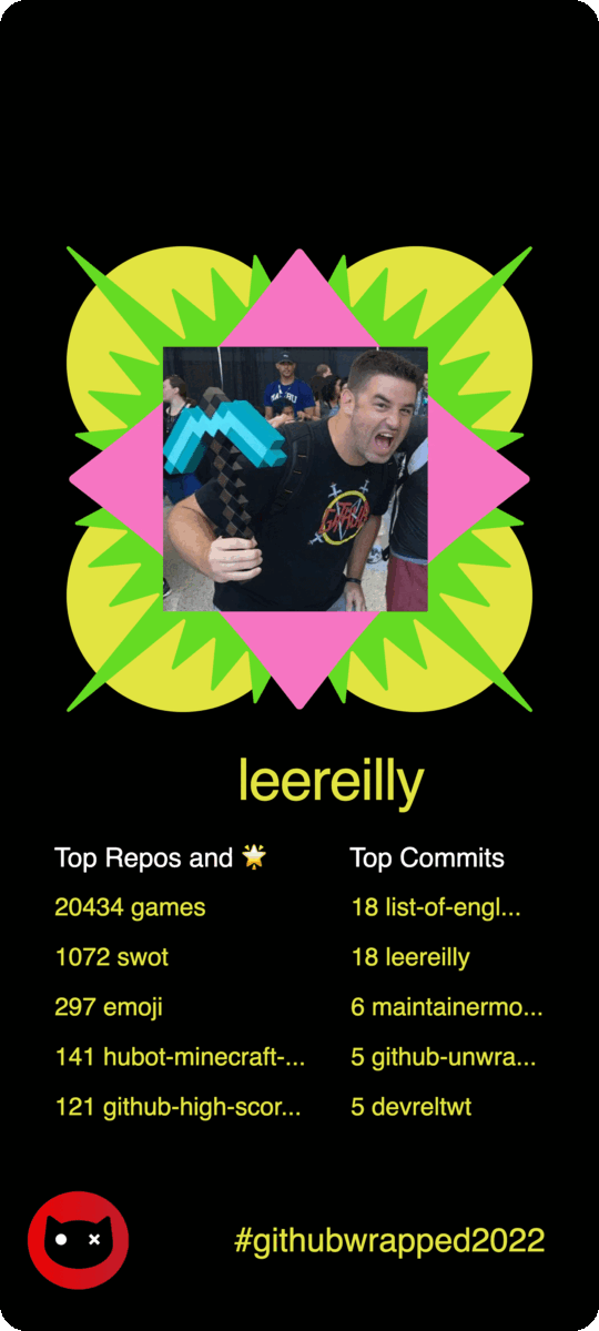
2. GitHub Wrapped
GitHub Wrapped by Neat is a neat little little app showing total number of commits, contributions, stars you've given and received. The images generated would look great on your profile READMEs.

The developers wrote a great little writeup about how they made it and reached 8000 users in just two weeks.
3. GitHub Trends Wrapped
Lines of code changed Bar charts Scatter charts Contributions by month, day, time Weekend activity GitHub Trends Wrapped has all that and more.

This is the thing that all PHBs will be looking for come performance review time if you're cursed lucky enough to have them.
Narrator: Hopefully not.
4. GitHub Cities
You shouldn't build a city on rock and roll. Nor should you build one from your GitHub contributions. That said, @honzaap has managed to create a fantastic visualization using three.js.

Idea: Someone should add a wee car or airplane or something that can be controlled with arrow keys. #hint-hint #hacktoberfest #good-first-issue
5. Open Source Wrapped
Open Source Wrapped is like Spotify Wrapped, but for your open source contributions. You can download and share the images it generates, or set them as your phone's background if you're vain like me
See what other folks are sharing on Twitter with #githubunwrapped2022.
6. GitHub Skyline
GitHub Skyline provides a sci-fi-ish, synthwave-y visualization of your contributions for a given year that's viewable in your browser, in real life, or in virtual reality.

You can even download the .stl file and print it on a 3D printer. It's the perfect decoration for your desk or mantelpiece! Here's one that @mishmanners created earlier:
 First day of 2023 and had to print my 2022 GitHub Skyline.
Def should have done less contributions and then I wouldn't have ran out of filament and had to settle for snow capped buildings
Get yours
skyline.github.com twitter.com/i/web/status/122:44 PM - 01 Jan 2023


Did you know: There's an easter egg in your GitHub Skyline.
7. GitHub Wrap App
Made with Next.js, Tailwind, and the Mona Sans font, GitHub Wrap will generate a portrait-style image that would look great as your phone's background, or that empty photo frame you've been meaning to put something in.

Read more about how @harshil1712 built it.
8. GitHub Town
Inspired by GitHub Skyline and GitHub Cities, @mornhee created this terrific 3D scene with blocks representing months and contributions represented by skyscrapers.

Did you know: There's a browser extension that provides an isometric view of contribution graphs on user profiles.
9. GitHub Contributions Chart Generator
As the name implies, GitHub Contributions Chart Generator will prompt you for a username and generate that user's contribution graph going back every year until their account was created.
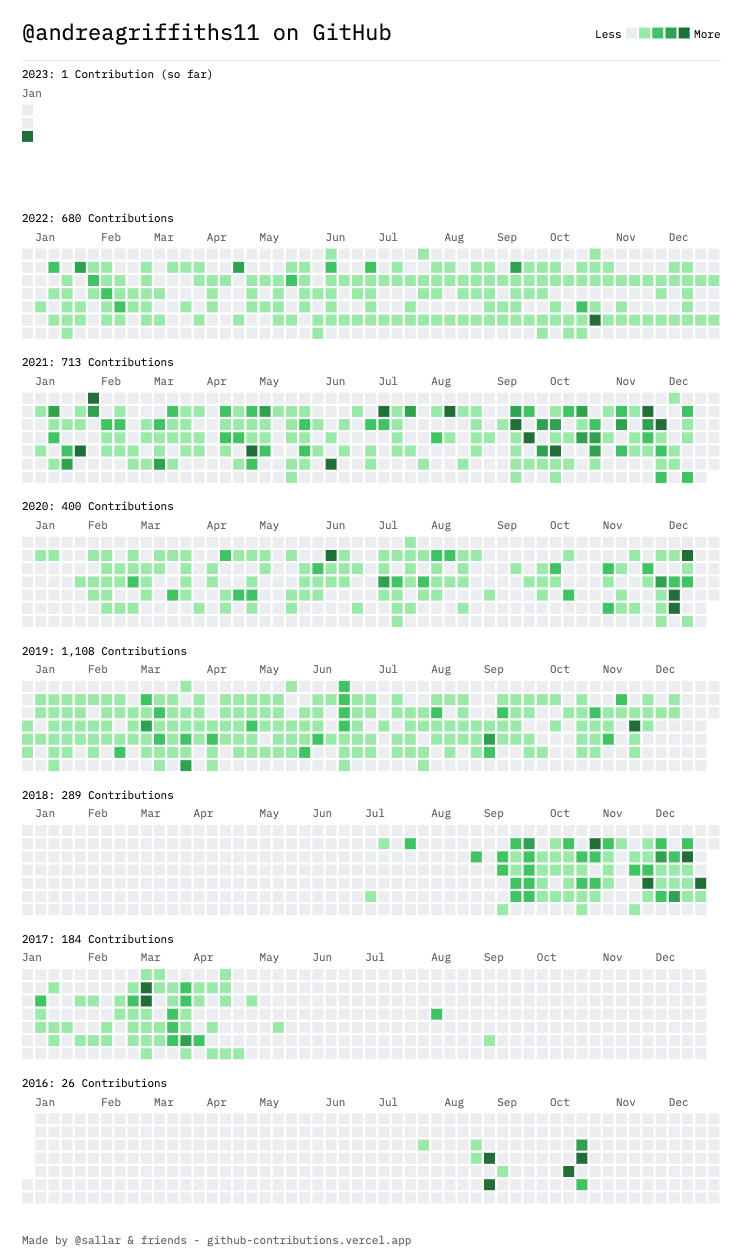
It's a great way to look back over the years and tell and illustrate a story.

 Shu@shuding_
 My 10 years on GitHub20:00 PM - 02 Jan 2023


View #githubcontributions on Twitter to see even more.
ProTip: If you fancy trying to visualize this data yourself, you can also download the data in JSON format with the handy link in the bottom left of that webpage.
10. Build your own GitHub contributions visualization
Speaking of JSON, you can use the GitHub GraphQL API to grab the contributions for a given period with a query like the following:
query ContributionGraph { user(login: "filmgirl") { contributionsCollection( from: "2022-01-01T00:00:00+00:00" to: "2022-12-31T00:00:00+00:00" ) { contributionCalendar { weeks { contributionDays { contributionCount weekday date } } } } }}Try it for yourself on the handy GitHub GraphQL Explorer and you'll see a response similar to the following:
{ "data": { "user": { "contributionsCollection": { "contributionCalendar": { "weeks": [ { "contributionDays": [ { "contributionCount": 0, "weekday": 6, "date": "2022-01-01T00:00:00.000+00:00" }, ... ... ... { "contributionCount": 0, "weekday": 6, "date": "2022-12-31T00:00:00.000+00:00" } ] } ] } } } }}That's the easy part. Now for the fun part!
Use that data pragmatically along with your favorite data visualization techniques and libraries and you can get very creative!
You could create An ASCII art chart with chartscii to show your activity for the previous week:
Mon (4.7%) Tue (5.3%) Wed (5.7%) Thu (11.8%) Fri (68.3%) Sat (3.3%) Sun (0.8%) Or create an amazing ASCII line graph showing your rollercoaster of activity over your last couple of sprints using asciichart (available for C, C#, C++, Elixir, Java, JavaScript, Go, Haskell, Perl, Python, PHP, Rust, and well... you get the picture).
10 --- 09 - 08 - 07 - 06 05 04 - - 03 02 - - 01 -- -- 00 ----- Or perhaps a multi-line graphic with Chart.js to see how you rank with a friend, colleague, or arch-nemesis?

There are lots of fun and creative ways to visualize that data.
Build something fun? Proud of something that one of the things above generated? Share it in a comment below!![]()
Remember: there's more to life than green squares on a contribution graph, commits, and lines of code. These are all shared for fun to share on your social feed or parent's refrigerators as appropriate
![]()
Original Link: https://dev.to/github/your-github-year-in-review-10-fun-ways-to-visualize-your-contributions-392o
Dev To
More About this Source Visit Dev To