
An Interest In:
Web News this Week
- April 2, 2024
- April 1, 2024
- March 31, 2024
- March 30, 2024
- March 29, 2024
- March 28, 2024
- March 27, 2024
Some of Our Sources
- Mashable
- TutsPlus - Code
- TutsPlus - Design
- You The Designer
- Inspiredology
- Reencoded
- Wal You
- Web Resource Source
- Android Headlines
- Willems Lab
Help Webnuz
Referal links:
Pandas - Visualizing Dataframe Data - 7 Days of Pandas
Welcome to the sixth article in the "7 Days of Pandas" series where we cover the pandas library in Python which is used for data manipulation.
In the first article of the series, we looked at how to read and write CSV files with Pandas. In this tutorial, we will look at some of the most common operations that we perform on a dataframe in Pandas.
In the second article, we looked at how to perform basic data manipulation.
In the third article, we looked at how to perform EDA (exploratory data analysis) with Pandas.
In the fourth article, we looked at how to handle missing values in a dataframe.
In the fifth article we looked at how to aggregate and group data in Pandas
In this tutorial, we will look at how to plot data in a pandas dataframe with the help of some examples.
Data visualizations are a great way to present data and can help us find insights that may not have been obvious with the data in just tabular form. For example, if you have the data of salaries of employees in an office, a bar chart would give you a much more intuitive feel for comparing them.
How to visualize data in pandas dataframes?
You can use the pandas dataframe plot() function to create a plot from the dataframe values. It creates a matplotlib plot. You can specify the x and y values of the plot with x and y parameters respectively and the type of plot you want to create with the kind parameter.
Let's look at some common types of plots that you can create from pandas dataframe data.
Before we begin, let's first import pandas and create a sample dataframe that we will be using throughout this tutorial.
import pandas as pd# employee datadata = { "Name": ["Tim", "Shaym", "Noor", "Esha", "Sam", "James", "Lily"], "Gender": ["M", "M", "F", "F", "M", "M", "F"], "Age": [26, 28, 27, 32, 24, 31, 33], "Department": ["Marketing", "Product", "Product", "HR", "Product", "HR", "Marketing"], "Salary": [60000, 70000, 82000, 55000, 58000, 55000, 65000]}# create pandas dataframedf = pd.DataFrame(data)# display the dataframedf| Name | Gender | Age | Department | Salary | |
|---|---|---|---|---|---|
| 0 | Tim | M | 26 | Marketing | 60000 |
| 1 | Shaym | M | 28 | Product | 70000 |
| 2 | Noor | F | 27 | Product | 82000 |
| 3 | Esha | F | 32 | HR | 55000 |
| 4 | Sam | M | 24 | Product | 58000 |
| 5 | James | M | 31 | HR | 55000 |
| 6 | Lily | F | 33 | Marketing | 65000 |
Scatter Plot
To create a scatter plot with dataframe data, pass "scatter" to the kind parameter of the plot() function. For example, let's create a scatter plot of the "Age" vs "Salary" data in the above dataframe.
df.plot(x="Age", y="Salary", kind="scatter")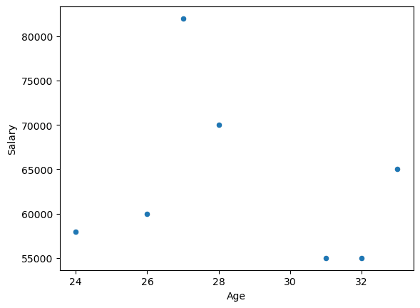
You can also customize the plot with additional parameters to the plot() function. For example, let's add a title to the plot and change the color of the points.
df.plot(x="Age", y="Salary", kind="scatter", title="Salary v/s Age", color='red')
Bar Plot
To create a bar plot, pass "bar" as an argument to the kind parameter. Let's create a bar plot of the "Salary" column in the above dataframe.
df.plot(y="Salary", x="Name", kind="bar")
You can also customize the plot with additional parameters to the plot() function. For example, let's rotate the xtick labels slightly and change the color of the bars.
df.plot(y="Salary", x="Name", kind="bar", rot=30, color="teal")
Histogram
A histogram is used to look at the distribution of a continuous variable. To plot a histogram on pandas dataframe data, pass "hist" to the kind parameter.
For example, let's plot a histogram of the values in the "Age" column.
df.plot(y="Age", kind="hist", bins=3)
You can also directly apply the plot() function to a pandas series.
df['Age'].plot(kind="hist", bins=3)
We get the same result.
You can similarly plot other types of plots (for example, line plot, pie chart, etc.) with the plot() function using the appropriate parameters.
Original Link: https://dev.to/piyushraj/pandas-visualizing-dataframe-data-7-days-of-pandas-1l0p
Dev To
More About this Source Visit Dev To