
An Interest In:
Web News this Week
- April 2, 2024
- April 1, 2024
- March 31, 2024
- March 30, 2024
- March 29, 2024
- March 28, 2024
- March 27, 2024
Some of Our Sources
- BoingBoing
- Engadget
- Just Creative
- Smashing Magazine
- Abduzeedo
- Fuel Your Creativity
- Noupe
- Web Design Ledger
- Specky Boy
- The Verge
Help Webnuz
Referal links:
Learn CSS layouts by example - Flex (part 1)
Mastering CSS layouts is one of the most challenging parts of web design. Specially, if you just go to the documentations and start reading dry materials with very basic examples, it's even harder to get a practical understanding of the concepts.
In this series of posts, you'll learn CSS layouts through practical examples you can use in your projects.
Preparation
The simplest way to directly see the result of our work is to build our website with DoTenX UI-builder.
If you don't have an account there, you can create one for free and follow along this tutorial. It's worth mentioning you can build unlimited number websites on DoTenX for free and whenever you reach the initial limit of your projects, you can ask for an increase.
Note: When you create a project on DoTenX, switch to advanced mode because we want to have full control over the html elements and styles.

Example 1 - Profile card
Let's design the following layout as our first example.

CSS properties we learn:
- display
- flex-direction (column)
- justify-content
The component is borrowed from a great design by Syed Raju here.
Step 1:
We start by adding a Box which renders a div element to our page.

Now we go directly to the CSS properties section in the Styles tab where we directly add the CSS properties.

Add the following property-value pairs:
display: flexflexDirection: columnalignItems: centerwidth: 300pxbackgroundColor: hsla(0, 0%, 98%, 1)
The very first step in adding/applying flexbox layout is to set display property to flex, which creates a flex container for us (an area of a document laid out using flexbox).
We want the elements in our flex container to be placed in a column that's why we set the flex-direction to column.
You might notice we used camelCase instead of kebab-case to refer to the CSS property and that's because DoTenX UI-builder follows ReactJS naming conventions. When you render the page, the resulting CSS properties will be rendered in kebab-case.
We want to horizontally align children elements (flex items) in centre, that's why we set align-items to center.
Finally, we set the width and background-color values.
Step 2:
Add an image to the div by dragging an Image element from the Elements tab and dropping it inside the Box.

I've used this image from Freepik, but you can use the url of the image you like or upload an image.
Step 3:
Add a Tex element after the Image element which will ultimately render a p tag.
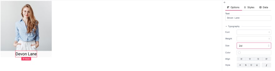
Set the text and size to the desired values (I've set it to 2xl in this example). As our focus is on the flexbox I'm using the simple options of UI-builder to set the font-size which is another advantage of using DoTenX UI-builder, allowing us to focus on what we want.
Step 4:
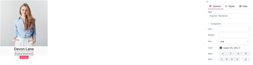
Exactly same as step 3 just with a different text and a smaller size, and a slightly faded color.
Step 5:
As a final touch, to implement our component more accurately, we set the top margin of our texts and give a border radius of 10px to the flex container we created in step 1, and give it bottom padding.
In this published page you can see the end result:
https://gracious-lederberg-3196150654.web.dotenx.com/index.html
Example 2 - Profile card row
The same beautify design can be used to show more interesting features of flexbox layout.

CSS properties we learn:
- flex-direction (row)
- justify-content
Step 1:
Add a Box with width of 100% with the following properties:
display: flexflexDirection: rowwidth: 100%
Using these properties we have made the div a flex container with a horizontal layout. Remember that the default value of flex-direction is row anyway. We also set the width to make sure our div expands the entire width of the page (Leave a comment if you know an alternative for width: 100%).

Step 2:
Add four copies of the profile-card we created in the Example 1 to the div we created in Step 1.
To avoid repeating the steps you can use the trick I used. Just export the element from the Layout tab and add the exported element to the Box. This is very similar to the concept of re-usable components used in advanced scenarios such as using React, Vue, etc.
Export:
Use:
After adding the cards to the parent div, you can check the preview and you should have something like this:

Step 3:
As you can see in the preview, all of our items are placed next to each each other without any space between them.
To fix this, set justify-content property of the flex container Box to space-around and this is the result:

Here you can find the published result (all the image are from Freepik):
https://gracious-lederberg-3196150654.web.dotenx.com/flex-row.html
Try-it: Now resize your browser window to see the result in smaller screens. Do you see any problem? How do you think we can solve the issue? Comment down below and don't forget to follow for the next parts of this series showing you how to deal with such cases.
Summary
In this tutorial we saw how to build vertical and horizontal layouts using Flexbox. We learned about some of the commonly used terms, such as flex container and flex item.
We also learned about setting the direction of the layout, and adjusting the arrangement of the flex items. It is worth mentioning, as a rule of thumb, if you want to set the order of flex items in the same direction as the flex container, use justify-content, otherwise use align-items.
If you have any questions, feel free to ask and see you in the next tutorial.
Original Link: https://dev.to/mohsenkamrani/learn-css-layouts-by-example-flex-part-1-4g62
Dev To
 An online community for sharing and discovering great ideas, having debates, and making friends
More About this Source Visit Dev To