An Interest In:
Web News this Week
- April 2, 2024
- April 1, 2024
- March 31, 2024
- March 30, 2024
- March 29, 2024
- March 28, 2024
- March 27, 2024
Importance of hierarchy on website
Hi !
I would love to talk about the importance of hierarchy on the website. I would give you some examples of real projects that you can learn from. I will show what is considered to be a good web design practice and bad.
Why it's useful to know
This blog would be very useful for designers and software engineers. As I realized, it's a good practice to know the basics of what other specialist do in other departments.
For example, If you are a front end engineer, it would be great to know the basics of web design. This way, you can have much more thorough communication with other specialist in the project
I'm not here to judge other project, but to learn from them.
How to overwhelm user
Hierarchy on the website is crucial. I'm sure that you had experience visiting websites when everything is being thrown at you at a one time and it "shouts" with lots of colors, actions and text at you. It's so easy to get confused and lose the point what am I supposed to do here.
If you want your website to be successful and easy-to-use you need to "point" the user where he should look first, second and third, etc.
Bad practice #1
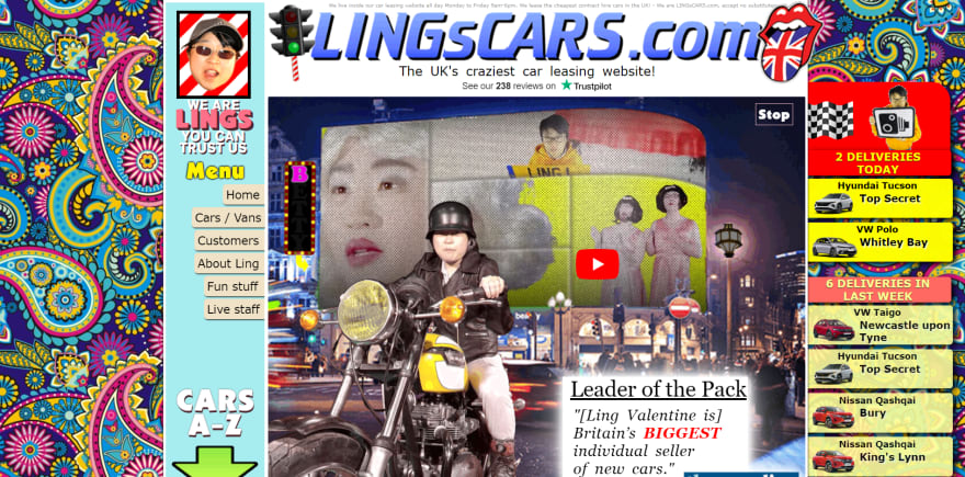
Let's take a look at this website:
Tell us about your feelings. Are you confused?
Let's go deeply into the website structure:
1) How am I supposed to look through the website ? Top to bottom or left to right ?
2) Too many colors and fonts
3) Give more space to the elements (in the good examples you can see what I mean by that)
Bad practice #2:
Now, let's take a look at another website:
1) What's wrong with navigation bar ? It's taking 30% of the screen size.
2) Action is happening on the background that just distracts the user from understanding the content.
3) What's with the text shadow?
I think your website structure is great, when you can see an answer to a question: What do you want me to do on your website?.
In the examples above there are no clear indications of paths that I need to follow on the website. You just get lost.
Good example #1
Now, let's take a look at good examples.
Here let's talk about the way developers want us to look through the website.
1) Background image
2) Big text We help ecommerce evolve
3) Button
Good example #2
Another great example - React JS website.
What are your feelings now ?
1) Great CTA(Call-to-action) asking user to click the button
2) Amazing color contrast
3) Clear and concise nav bar
I think you can see the difference and the effort that was put into design.
If you have any ideas about the design of the websites above, drop them in the comments.
Stay tuned and have a wonderful week !
Original Link: https://dev.to/mnosov622/importance-of-hierarchy-on-website-38c0
Dev To
 An online community for sharing and discovering great ideas, having debates, and making friends
More About this Source Visit Dev To


