
An Interest In:
Web News this Week
- April 13, 2024
- April 12, 2024
- April 11, 2024
- April 10, 2024
- April 9, 2024
- April 8, 2024
- April 7, 2024
Some of Our Sources
- Team Treehouse
- Pearsonified
- Abduzeedo
- TutsPlus - Design
- Web Designer Depot
- Web Design Ledger
- Stylized Web
- Wal You
- Spyre Studios
- Android Dissected
Help Webnuz
Referal links:
Tailwind CSS tutorial 11: Place Items
In the article, we will go into detail on how to use place-items.
Place Items
Format
place-items-{alignment}
| Alignment | Tailwind Class | CSS Property |
|---|---|---|
| Auto | place-items-auto | place-items: auto; |
| Start | place-items-start | place-items: start; |
| End | place-items-end | place-items: end; |
| Center | place-items-center | place-items: stretch; |
| Stretch | place-items-stretch | place-items: stretch; |
let's see each of this in action,
Auto
If the items have no parents then this class is used that defines the absolute positioned.
<li class="flex w-full items-center px-4 py-2"> <div class="place-items-auto grid h-32 w-full grid-cols-3 gap-2"> <span class="rounded-md bg-red-500 px-3 py-2 text-white">1</span> <span class="rounded-md bg-green-500 px-3 py-2 text-white">2</span> <span class="rounded-md bg-blue-500 px-3 py-2 text-white">3</span> <span class="rounded-md bg-indigo-500 px-3 py-2 text-white">4</span> <span class="rounded-md bg-purple-500 px-3 py-2 text-white">5</span> <span class="rounded-md bg-yellow-300 px-3 py-2 text-white">6</span> </div> <div class="ml-5 w-1/3 text-right"> <div class="rounded-2 inline-block whitespace-nowrap rounded bg-pink-500 px-2 py-1 font-mono text-xs font-semibold text-white">place-items-auto</div> </div></li>Output:
Start
Use place-items-start to place grid items on the start of their grid areas on both axes:
<li class="flex w-full items-center px-4 py-2"> <div class="grid h-32 w-full grid-cols-3 place-items-start gap-2"> <span class="rounded-md bg-red-500 px-3 py-2 text-white">1</span> <span class="rounded-md bg-green-500 px-3 py-2 text-white">2</span> <span class="rounded-md bg-blue-500 px-3 py-2 text-white">3</span> <span class="rounded-md bg-indigo-500 px-3 py-2 text-white">4</span> <span class="rounded-md bg-purple-500 px-3 py-2 text-white">5</span> <span class="rounded-md bg-yellow-300 px-3 py-2 text-white">6</span> </div> <div class="ml-5 w-1/3 text-right"> <div class="rounded-2 inline-block whitespace-nowrap rounded bg-pink-500 px-2 py-1 font-mono text-xs font-semibold text-white">place-items-start</div> </div></li>Output:
End
Use place-items-end to place grid items on the end of their grid areas on both axes:
<li class="flex w-full items-center px-4 py-2"> <div class="grid h-32 w-full grid-cols-3 place-items-end gap-2"> <span class="rounded-md bg-red-500 px-3 py-2 text-white">1</span> <span class="rounded-md bg-green-500 px-3 py-2 text-white">2</span> <span class="rounded-md bg-blue-500 px-3 py-2 text-white">3</span> <span class="rounded-md bg-indigo-500 px-3 py-2 text-white">4</span> <span class="rounded-md bg-purple-500 px-3 py-2 text-white">5</span> <span class="rounded-md bg-yellow-300 px-3 py-2 text-white">6</span> </div> <div class="ml-5 w-1/3 text-right"> <div class="rounded-2 inline-block whitespace-nowrap rounded bg-pink-500 px-2 py-1 font-mono text-xs font-semibold text-white">place-items-end</div> </div></li>Output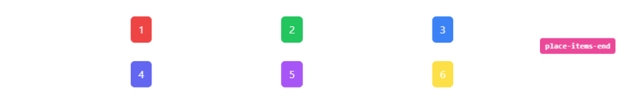
Center
Use place-items-center to place grid items on the center of their grid areas on both axes:
<li class="flex w-full items-center px-4 py-2"> <div class="grid h-32 w-full grid-cols-3 place-items-center gap-2"> <span class="rounded-md bg-red-500 px-3 py-2 text-white">1</span> <span class="rounded-md bg-green-500 px-3 py-2 text-white">2</span> <span class="rounded-md bg-blue-500 px-3 py-2 text-white">3</span> <span class="rounded-md bg-indigo-500 px-3 py-2 text-white">4</span> <span class="rounded-md bg-purple-500 px-3 py-2 text-white">5</span> <span class="rounded-md bg-yellow-300 px-3 py-2 text-white">6</span> </div> <div class="ml-5 w-1/3 text-right"> <div class="rounded-2 inline-block whitespace-nowrap rounded bg-pink-500 px-2 py-1 font-mono text-xs font-semibold text-white">place-items-center</div> </div></li>Output: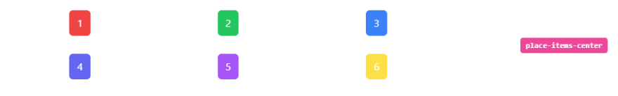
Stretch
Use place-items-stretch to stretch items along their grid areas on both axes:
<li class="flex w-full items-center px-4 py-2"> <div class="grid h-32 w-full grid-cols-3 place-items-stretch gap-2"> <span class="rounded-md bg-red-500 px-3 py-2 text-white">1</span> <span class="rounded-md bg-green-500 px-3 py-2 text-white">2</span> <span class="rounded-md bg-blue-500 px-3 py-2 text-white">3</span> <span class="rounded-md bg-indigo-500 px-3 py-2 text-white">4</span> <span class="rounded-md bg-purple-500 px-3 py-2 text-white">5</span> <span class="rounded-md bg-yellow-300 px-3 py-2 text-white">6</span> </div> <div class="ml-5 w-1/3 text-right"> <div class="rounded-2 inline-block whitespace-nowrap rounded bg-pink-500 px-2 py-1 font-mono text-xs font-semibold text-white">place-items-stretch</div> </div></li>Output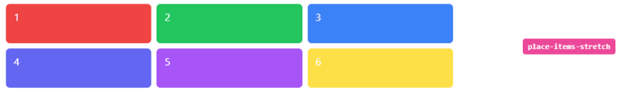
Full code:
The overall code will be attached to repo link.
Overall Output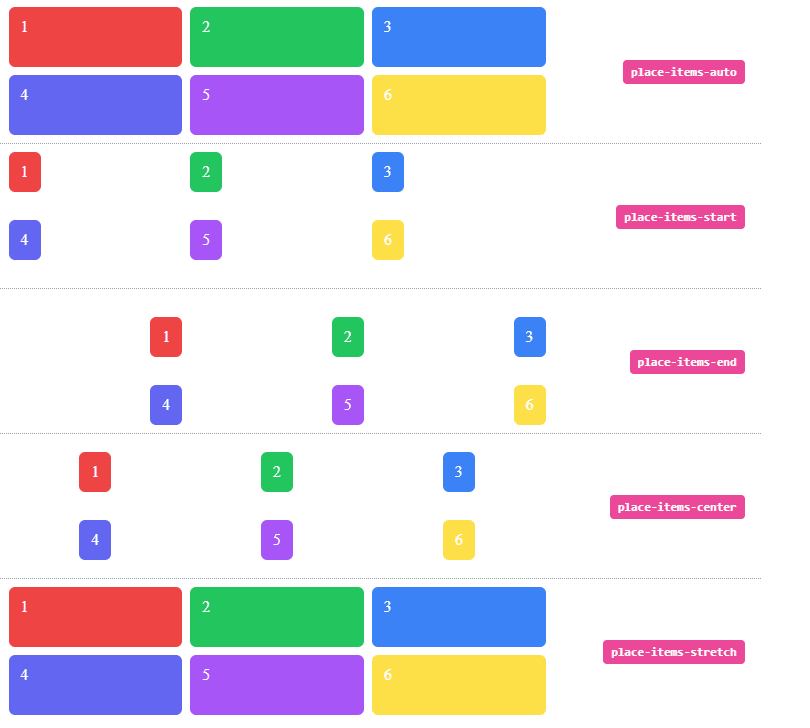
Resources:
tailwind.css
Thank you for reading :), To learn more, check out my blogs on Justify-Content, Responsive Navbar and Justify-Item.
If you liked this article, consider following me on Dev.to for my latest publications. You can reach me on Twitter.
Keep learning! Keep coding!!
Original Link: https://dev.to/shubhicodes/tailwind-css-tutorial-11-place-items-118e
Dev To
 An online community for sharing and discovering great ideas, having debates, and making friends
More About this Source Visit Dev To