
An Interest In:
Web News this Week
- March 28, 2024
- March 27, 2024
- March 26, 2024
- March 25, 2024
- March 24, 2024
- March 23, 2024
- March 22, 2024
Some of Our Sources
- Engadget
- Smashing Magazine
- Creative Curio
- Fudge Graphics
- Web Design Ledger
- CSS Globe
- CSS Tricks
- Freelance Switch
- Codrops
- Willems Lab
Help Webnuz
Referal links:
Tailwind CSS tutorial 10: Place Content
In the article, we will go into detail on how to use place-content.
Place Content
The CSS place-content property is the shorthand of align-content and justify-content property. The shorthand properties in CSS means that you can set the multiple properties values in a single property. Here the place-content property can hold the value of the align-content and justify-content property values.
Format
place-content-{alignment}
| Alignment | Tailwind Class | CSS Property |
|---|---|---|
| Start | place-content-start | place-content: start; |
| End | place-content-end | place-content: end; |
| Center | place-content-center | place-content: stretch; |
| Between | place-content-between | place-content: between; |
| Around | place-content-around | place-content: around; |
| Eenly | place-content-evenly | place-content: evenly; |
| Stretch | place-content-center | place-content: stretch; |
let's see each of this in action,
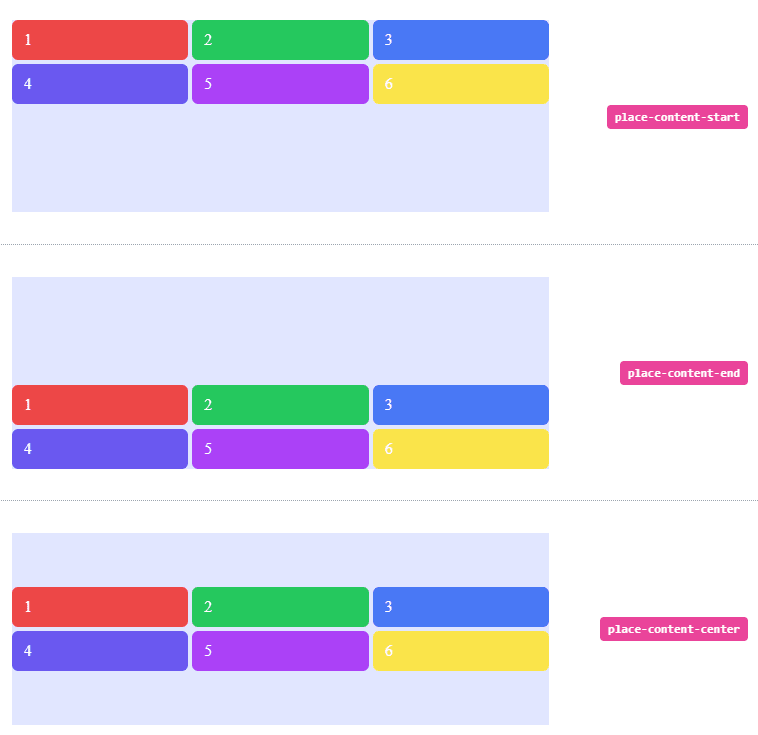
Start
Use place-content-start to pack items against the start of the block axis:
<li class="flex h-64 w-full items-center px-4 py-2"> <div class="grid h-48 w-full grid-cols-3 place-content-start gap-1 bg-indigo-100"> <span class="rounded-md bg-red-500 px-3 py-2 text-white">1</span> <span class="rounded-md bg-green-500 px-3 py-2 text-white">2</span> <span class="rounded-md bg-blue-500 px-3 py-2 text-white">3</span> <span class="rounded-md bg-indigo-500 px-3 py-2 text-white">4</span> <span class="rounded-md bg-purple-500 px-3 py-2 text-white">5</span> <span class="rounded-md bg-yellow-300 px-3 py-2 text-white">6</span> </div> <div class="ml-5 w-1/3 text-right"> <div class="rounded-2 inline-block whitespace-nowrap rounded bg-pink-500 px-2 py-1 font-mono text-xs font-semibold text-white">place-content-start</div> </div></li>Output: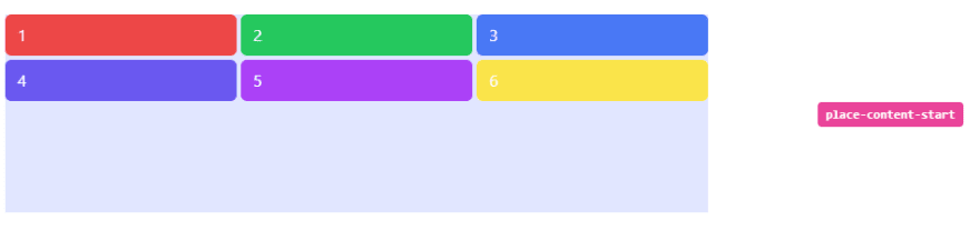
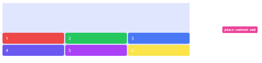
End
Use place-content-end to to pack items against the end of the block axis:
<li class="flex h-64 w-full items-center px-4 py-2"> <div class="grid h-48 w-full grid-cols-3 place-content-end gap-1 bg-indigo-100"> <span class="rounded-md bg-red-500 px-3 py-2 text-white">1</span> <span class="rounded-md bg-green-500 px-3 py-2 text-white">2</span> <span class="rounded-md bg-blue-500 px-3 py-2 text-white">3</span> <span class="rounded-md bg-indigo-500 px-3 py-2 text-white">4</span> <span class="rounded-md bg-purple-500 px-3 py-2 text-white">5</span> <span class="rounded-md bg-yellow-300 px-3 py-2 text-white">6</span> </div> <div class="ml-5 w-1/3 text-right"> <div class="rounded-2 inline-block whitespace-nowrap rounded bg-pink-500 px-2 py-1 font-mono text-xs font-semibold text-white">place-content-end</div> </div></li>Output
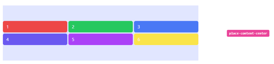
Center
Use place-content-center to pack items in the center of the block axis:
<li class="flex h-64 w-full items-center px-4 py-2"> <div class="grid h-48 w-full grid-cols-3 place-content-center gap-1 bg-indigo-100"> <span class="rounded-md bg-red-500 px-3 py-2 text-white">1</span> <span class="rounded-md bg-green-500 px-3 py-2 text-white">2</span> <span class="rounded-md bg-blue-500 px-3 py-2 text-white">3</span> <span class="rounded-md bg-indigo-500 px-3 py-2 text-white">4</span> <span class="rounded-md bg-purple-500 px-3 py-2 text-white">5</span> <span class="rounded-md bg-yellow-300 px-3 py-2 text-white">6</span> </div> <div class="ml-5 w-1/3 text-right"> <div class="rounded-2 inline-block whitespace-nowrap rounded bg-pink-500 px-2 py-1 font-mono text-xs font-semibold text-white">place-content-center</div> </div></li>Output:
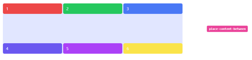
Between
Use place-content-between to distribute grid items along the block axis so that that there is an equal amount of space between each row on the block axis.
<li class="flex h-64 w-full items-center px-4 py-2"> <div class="grid h-48 w-full grid-cols-3 place-content-between gap-1 bg-indigo-100"> <span class="rounded-md bg-red-500 px-3 py-2 text-white">1</span> <span class="rounded-md bg-green-500 px-3 py-2 text-white">2</span> <span class="rounded-md bg-blue-500 px-3 py-2 text-white">3</span> <span class="rounded-md bg-indigo-500 px-3 py-2 text-white">4</span> <span class="rounded-md bg-purple-500 px-3 py-2 text-white">5</span> <span class="rounded-md bg-yellow-300 px-3 py-2 text-white">6</span> </div> <div class="ml-5 w-1/3 text-right"> <div class="rounded-2 inline-block whitespace-nowrap rounded bg-pink-500 px-2 py-1 font-mono text-xs font-semibold text-white">place-content-between</div> </div></li>Output
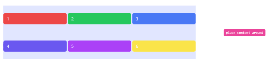
Around
Use place-content-around distribute grid items such that there is an equal amount of space around each row on the block axis:
<li class="flex h-64 w-full items-center px-4 py-2"> <div class="grid h-48 w-full grid-cols-3 place-content-around gap-1 bg-indigo-100"> <span class="rounded-md bg-red-500 px-3 py-2 text-white">1</span> <span class="rounded-md bg-green-500 px-3 py-2 text-white">2</span> <span class="rounded-md bg-blue-500 px-3 py-2 text-white">3</span> <span class="rounded-md bg-indigo-500 px-3 py-2 text-white">4</span> <span class="rounded-md bg-purple-500 px-3 py-2 text-white">5</span> <span class="rounded-md bg-yellow-300 px-3 py-2 text-white">6</span> </div> <div class="ml-5 w-1/3 text-right"> <div class="rounded-2 inline-block whitespace-nowrap rounded bg-pink-500 px-2 py-1 font-mono text-xs font-semibold text-white">place-content-around</div> </div></li>Output
Evenly
Use place-content-evenly to distribute grid items such that they are evenly spaced on the block axis:
<li class="flex h-64 w-full items-center px-4 py-2"> <div class="grid h-48 w-full grid-cols-3 place-content-evenly gap-1 bg-indigo-100"> <span class="rounded-md bg-red-500 px-3 py-2 text-white">1</span> <span class="rounded-md bg-green-500 px-3 py-2 text-white">2</span> <span class="rounded-md bg-blue-500 px-3 py-2 text-white">3</span> <span class="rounded-md bg-indigo-500 px-3 py-2 text-white">4</span> <span class="rounded-md bg-purple-500 px-3 py-2 text-white">5</span> <span class="rounded-md bg-yellow-300 px-3 py-2 text-white">6</span> </div> <div class="ml-5 w-1/3 text-right"> <div class="rounded-2 inline-block whitespace-nowrap rounded bg-pink-500 px-2 py-1 font-mono text-xs font-semibold text-white">place-content-evenly</div> </div></li>Output
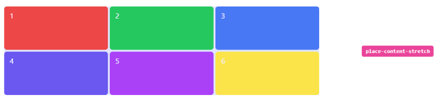
Stretch
Use place-content-stretch to stretch grid items along their grid areas on the block axis:
<li class="flex h-64 w-full items-center px-4 py-2"> <div class="grid h-48 w-full grid-cols-3 place-content-stretch gap-1 bg-indigo-100"> <span class="rounded-md bg-red-500 px-3 py-2 text-white">1</span> <span class="rounded-md bg-green-500 px-3 py-2 text-white">2</span> <span class="rounded-md bg-blue-500 px-3 py-2 text-white">3</span> <span class="rounded-md bg-indigo-500 px-3 py-2 text-white">4</span> <span class="rounded-md bg-purple-500 px-3 py-2 text-white">5</span> <span class="rounded-md bg-yellow-300 px-3 py-2 text-white">6</span> </div> <div class="ml-5 w-1/3 text-right"> <div class="rounded-2 inline-block whitespace-nowrap rounded bg-pink-500 px-2 py-1 font-mono text-xs font-semibold text-white">place-content-stretch</div> </div></li>Output
Full code:
The overall code will be attached to repo link.
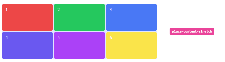
Overall Output

Resources:
tailwind.css
Thank you for reading :), To learn more, check out my blogs on Justify-Content, Responsive Navbar and Justify-Item.
If you liked this article, consider following me on Dev.to for my latest publications. You can reach me on Twitter.
Keep learning! Keep coding!!
Original Link: https://dev.to/shubhicodes/tailwind-css-tutorial-10-place-content-57ae
Dev To
 An online community for sharing and discovering great ideas, having debates, and making friends
More About this Source Visit Dev To