
An Interest In:
Web News this Week
- April 2, 2024
- April 1, 2024
- March 31, 2024
- March 30, 2024
- March 29, 2024
- March 28, 2024
- March 27, 2024
Some of Our Sources
- Just Creative
- Joshua Blankenship
- You The Designer
- Creative Curio
- My Ink Blog
- Specky Boy
- Freelance Switch
- Web Resource Source
- Codrops
- The Verge
Help Webnuz
Referal links:
Build a Reusable Card Component with Chakra UI
Cards are common UI components used to display a group of information in an organized layout. They are widely used components on many websites because they are intuitive and aesthetically pleasing and keep content hierarchy easy to understand.
You can find Cards used in a wide range of scenarios ranging from user profiles, event information, project portfolio, and more.
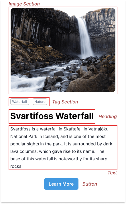
Here's the design of the card component we'll be building together in this tutorial

Analysing the card component
Before we start writing any code, let's take a closer look at the Card to identify the fields and parts of the Card.
From the card design, we notice there are five sections of the Card:
Setting up your project
To get started, you are going to need to install Chakra UI inside your project.
npm i @chakra-ui/react @emotion/react @emotion/styled framer-motionAfter installing Chakra UI, you need to set up the ChakraProvider at the root of your application.
In your index.js file, put in the following:
import * as React from 'react'// 1. import `ChakraProvider` componentimport { ChakraProvider } from '@chakra-ui/react'function App() { // 2. Wrap ChakraProvider at the root of your app return ( <ChakraProvider> <TheRestOfYourApplication /> </ChakraProvider> )}In your components directory in your project, create a new file called Card.jsx This is where we'd be building out the Card Component.
Developing the Image section
To build out the image section, we need to import Image from Chakra UI at the top of our file
import { Image } from '@chakra-ui/react'Next, we're going to add in the required styles to our Image.
<Image src='https://images.unsplash.com/photo-1667420170858-39d40cb413e3?ixlib=rb-4.0.3&ixid=MnwxMjA3fDB8MHxwaG90by1wYWdlfHx8fGVufDB8fHx8&auto=format&fit=crop&w=1770&q=80' alt='Svartifoss Waterfall' borderRadius='xl' objectFit='cover' mx='auto' />I recommend using the
<Img />component or the framework-specific Image component if you're working on SSR applications.
Developing the Tag section
You'd notice the tags are stacked horizontally with a bit of spacing between them. This gives us a pointer that the HStack component is to be used here.
So, we import HStack and Tag Components at the top of our file.
import { HStack, Tag } from '@chakra-ui/react'We also add in a margin top of 20px and a spacing of 12px.
<HStack mt='5' spacing='3'> {['Waterfall', 'Nature'].map((item) => ( <Tag key={item} variant='outline'> {item} </Tag> ))} </HStack>By default, Chakra UI uses a comprehensive numeric spacing scale where 1 spacing unit is equal to 0.25rem, which translates to 4px.
Building the Heading and Text
We've just created the tags, now it's time to Build out the text content for our Card.
Clearly, we notice there's a heading and body text so let's import the heading and text components from Chakra UI.
import { Heading, Text } from '@chakra-ui/react' <Heading my='4' size='lg'> Svartifoss Waterfall </Heading> <Text> Svartifoss is a waterfall in Skaftafell in Vatnajkull National Park in Iceland, and is one of the most popular sights in the park. It is surrounded by dark lava columns, which gave rise to its name. The base of this waterfall is noteworthy for its sharp rocks. </Text>Adding the Button
Chakra UI provides a Button that offers out-of-the-box user interactions like Hover.
So, we import Button from Chakra UI.
From our design, we also observe that the Button component is centered on our Card. We can achieve this easily using the Center component.
import { Button, Center } from '@chakra-ui/react'Now we go ahead to add the required styles.
<Center my='6'> <Button colorScheme='blue'>Learn more</Button></Center>Cleaning up the UI
At the moment, we notice, there is no horizontal padding on some parts of our UI. Let's fix this by wrapping a Box around the entire content.
We'll also be adding a couple of styles to this box - a white background color, a padding of 6, and a maximum Width of 420px.
<Box maxW='420px' bg='white' p='6'> ...</Box>To have a distinct visual look from the rest of the background, let's create a parent Box and add a gray background.
We can also place the Card at the center of the screen by using a Center component.
Feel free to skip this if you don't want to center your Card.
Your final code should look like this:
import { Box, Button, Center, Heading, HStack, Image, Tag, Text,} from '@chakra-ui/react';export function Card() { return ( <Center as='section' bg='gray.100' h='100vh'> <Box maxW='420px' bg='white' p='6'> <Image src='https://images.unsplash.com/photo-1667420170858-39d40cb413e3?ixlib=rb-4.0.3&ixid=MnwxMjA3fDB8MHxwaG90by1wYWdlfHx8fGVufDB8fHx8&auto=format&fit=crop&w=1770&q=80' alt='Svartifoss Waterfall' borderRadius='xl' objectFit='cover' mx='auto' /> <HStack mt='5' spacing='3'> {['Waterfall', 'Nature'].map((item) => ( <Tag key={item} variant='outline'> {item} </Tag> ))} </HStack> <Heading my='4' size='lg'> Svartifoss Waterfall </Heading> <Text> Svartifoss is a waterfall in Skaftafell in Vatnajkull National Park in Iceland, and is one of the most popular sights in the park. It is surrounded by dark lava columns, which gave rise to its name. The base of this waterfall is noteworthy for its sharp rocks. </Text> <Center my='6'> <Button colorScheme='blue'>Learn more</Button> </Center> </Box> </Center> );}Build faster with Chakra UI
Chakra UI provides you with many composable components you can put together to create beautiful and more advanced Cards. You can also go further to modify this Card by creating multiple cards and rendering them within a Simple Grid.
For a more visual walkthrough, find the video tutorial on YouTube and the direct GitHub repo here.
Original Link: https://dev.to/estheragbaje/build-a-reusable-card-component-with-chakra-ui-4456
Dev To
 An online community for sharing and discovering great ideas, having debates, and making friends
More About this Source Visit Dev To