
An Interest In:
Web News this Week
- March 29, 2024
- March 28, 2024
- March 27, 2024
- March 26, 2024
- March 25, 2024
- March 24, 2024
- March 23, 2024
Some of Our Sources
- The Logo Smith
- Smashing Magazine
- Smashing Apps
- Six Revisions
- Web Designer Depot
- Crazy Leaf Design
- Reencoded
- CSS Tricks
- Spyre Studios
- Dev To
Help Webnuz
Referal links:
Data Science: Better graph with matplotlib and python
Data visualization is used to shows the data in a more straightforward representation and more comfortable to be understood. It can be formed in histograms, scatter plots, line plots, pie chart, etc. Many people are still using Matplotlib as their back-end module to visualize their plots. In this story, I will give you some tricks, 5 powerful tricks in using Matplotlib to create an excellent plot.
Why use plots and charts?
Plotis the representation of data graphically in any format. It is the most efficient way of communicating facts with non-technical professionals and helps them draw inferences from the data. Plot is a powerful way to graphically represent your data. It makes it easier for Data Analysts, and Data Scientists toanalyze dataandderive meaningful insights. There are a lot of tools available that can help you visualize your data such as Tableau, Looker, Sisense, etc. As Data Science is all about Numerical Data that is processed with scientific methods and algorithms, plotting is a way to converts the dataset into visual content. Datasets can be represented graphically with plots or graphs.
Important steps for better plots in data science
Shown below are the important aspects of Data Science Visualization in the field of Data Science:
- Data Cleaning
- Data Exploration
- Identifying Trends
- Presenting Results
1) Data Cleaning
Visualization can help detect Null values of data items in large datasets by representing them distinctively. Data could consist of redundancy and noise which needs to be eliminated before analysis. Visualizing these datasets gives you a complete overview without assumptions about the correctness of the data.
2) Data Exploration
The visual representation of data helps both technical and non-technical professionals/personnel have an overview of what the data is about. They can then tinker and also draw conclusions based on what they see.
3) Identifying Trends
Data Scientists and Data Analysts, at times, work with real-time data to derive meaningful trends. As real-time data is always fluctuating, it becomes difficult to analyze it. This is where the data can be visualized using charts and graphs for better understanding. This helps in making informed decisions not just in Data Science but in Business Intelligence in general.
4) Presenting Results
The result of analysis at any point of processing can always be visualized. The visualization can be done by anyone with knowledge of Data Science Visualization Tools, not just a Data Scientist. So far the data is from a supported data source, a Data Science Visualization Tool can represent it in its supported formats such as Graphs, Curves, or Charts
Type of Data Plots & their Significance
Following are the 7 most commonly used Data Plotting Types in the field of Data Science Visualization:
- Bar Plots
- Line Plots
- Scatter Plots
- Area Plots
- Histogram
- Pie Chart
- Bubble plot
1) Bar Plot
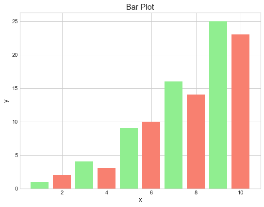
A Bar Plot is very easy to understand and therefore is the most widely used plotting model. Simplicity and Clarity are the 2 major advantages of using a Bar Plot. It can be used when you are comparing variables in the same category or tracking the progression of 1 or 2 variables over time. For example, to compare the marks of a student in multiple subjects, a Bar Plot is the best choice.
2) Line Plot

A Line Plot is widely used for the comparison of stockpiles, or for analyzing views on a video or post over time. The major advantage of using Line Plot is that it is very intuitive and you can easily understand the result, even if you have no experience in this field. It is commonly used to track and compare several variables over time, analyze trends, and predict future values.
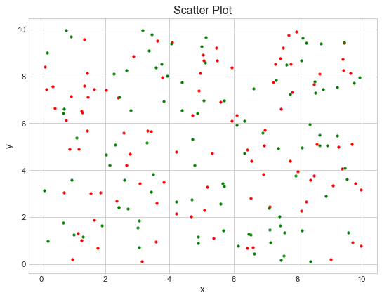
3) Scatter Plots
A Scatter Plot uses dots to illustrate values of Numerical Variables. It is used to analyze individual points, observe and visualize relationships between variables, or get a general overview of variables.
4) Area Plots

An Area Plot displays Quantitative Data graphically. It is very much like Line Plot but with the key difference of highlighting the distance between different variables. This makes it visually clearer and easy to understand. It is generally used to analyze progress in Time Series, analyze Market Trends and Variations, etc.
5) Histogram

A Histogram graphically represents the frequency of Numerical Data using bars. Unlike Bar Plot, it only represents Quantitative Data. The bars in the Histogram touch each other i.e. there is no space between the bars. It is generally used when you are dealing with large datasets and want to detect any unusual activities or gaps in the data.
6) Pie Chart

A Pie Chart represents the data in a circular graph. The slices in a Pie Chart represent the relative size of the data. Pie Chart is generally used to represent Categorical Data. For example, comparison in Areas of Growth within a business such as Profit, Market Expenses, etc.
7) Bubble Plots

A bubble plot is a scatter plot where the circle size is mapped to the value of a third numeric variable and You can also map a 4th value to the color of bubble.
Enough talking let get to the spicy stuff . We will be using python for plotting graphs, all of the above graphs are created with python and matplotlib.
Get Started
Matplotlib
Matplotlib is a comprehensive library for creating static, animated, and interactive visualizations in Python. Matplotlib makes easy things easy and hard things possible.
- Createpublication quality plots.
- Makeinteractive figuresthat can zoom, pan, update.
- Customizevisual styleandlayout.
- Export tomany file formats.
- Embed inJupyterLab and Graphical User Interfaces.
- Use a rich array ofthird-party packagesbuilt on Matplotlib.
To install matplotlib run pip install matplotlib or if you are using conda environment (as you should be) use conda install matplotlib. That's it we are all set...
[!note]-
For the tutorial I will be using some dataset and some libraries which are not part of this tutorial. This is a intermediate level tutorial if you want to start with basic follow this tutorial.
- Styling GraphThere are lot of ways to style our graphs we can use built in styles, create our own styles or can combine both ways and get benefit of both worlds.Theme:
colors = cycler(color=plt.get_cmap("tab20").colors) # ["b", "r", "g"]mpl.style.use("seaborn-pastel")# mpl.style.use("seaborn-whitegrid")mpl.rcParams["figure.figsize"] = (20, 5)mpl.rcParams["axes.facecolor"] = "white"mpl.rcParams["axes.grid"] = Truempl.rcParams["grid.color"] = "lightgray"mpl.rcParams["axes.prop_cycle"] = colorsmpl.rcParams["axes.linewidth"] = 1mpl.rcParams["xtick.color"] = "black"mpl.rcParams["ytick.color"] = "black"mpl.rcParams["font.size"] = 12mpl.rcParams["figure.titlesize"] = 25mpl.rcParams["figure.dpi"] = 100mpl.rcParams["savefig.dpi"] = 100mpl.rcParams["legend.fontsize"] = 20mpl.rcParams["legend.frameon"] = Falsempl.rcParams["legend.facecolor"] = "white"mpl.rcParams["legend.edgecolor"] = "white"mpl.rcParams["legend.fancybox"] = Falsempl.rcParams["legend.numpoints"] = 1mpl.rcParams["legend.scatterpoints"] = 1mpl.rcParams["legend.markerscale"] = 1mpl.rcParams["legend.labelspacing"] = 0.5mpl.rcParams["legend.handlelength"] = 2mpl.rcParams["legend.handletextpad"] = 0.8mpl.rcParams["legend.borderpad"] = 0.5mpl.rcParams["legend.borderaxespad"] = 0.5mpl.rcParams["legend.columnspacing"] = 2mpl.rcParams["legend.framealpha"] = Nonempl.rcParams["legend.edgecolor"] = "inherit"You can use seaborn-pastel or seaborn-whitegrid as a base theme and add your own parameters to customize. As I mostly have starched image that's why I have figure size to (20,5), you can also change the font size and fonts etc. That's it now you will have better plots to present to your boss or non-technical personnel. In future article we will talk about each type of chart and how to use them and when to use them so stay tuned and save the series.
References
Original Link: https://dev.to/azadkshitij/data-science-better-graph-with-matplotlib-and-python-3f0b
Dev To
More About this Source Visit Dev To