
An Interest In:
Web News this Week
- April 2, 2024
- April 1, 2024
- March 31, 2024
- March 30, 2024
- March 29, 2024
- March 28, 2024
- March 27, 2024
Some of Our Sources
- TutsPlus - Code
- Joshua Blankenship
- Spoon Graphics
- Smashing Apps
- Vandelay Design
- Naldz Graphics
- Web Design Ledger
- Reencoded
- 24 Ways
- Spyre Studios
Help Webnuz
Referal links:
What display: grid does?
In my experience, a lot of problems with CSS happen because developers have problems understanding the display property. So I created a live cheat sheet. In this article I'll talk about display: grid.
But before embarking on reading I leave the link on my Substack newsletter about CSS. You know what to make
Also, thank you so much, my sponsors: Ben Rinehart, Jesse Willard, Tanya Ten, Konstantinos Kapenekakis. I didn't write this article without their support.
Let's go!
Default behavior
1. The the width property of elements with display: grid fills up all available space by the text direction. The height property is calculated automatically depending on the content.
If the element has display: block by default we won't see any changes after changing the block value on grid.

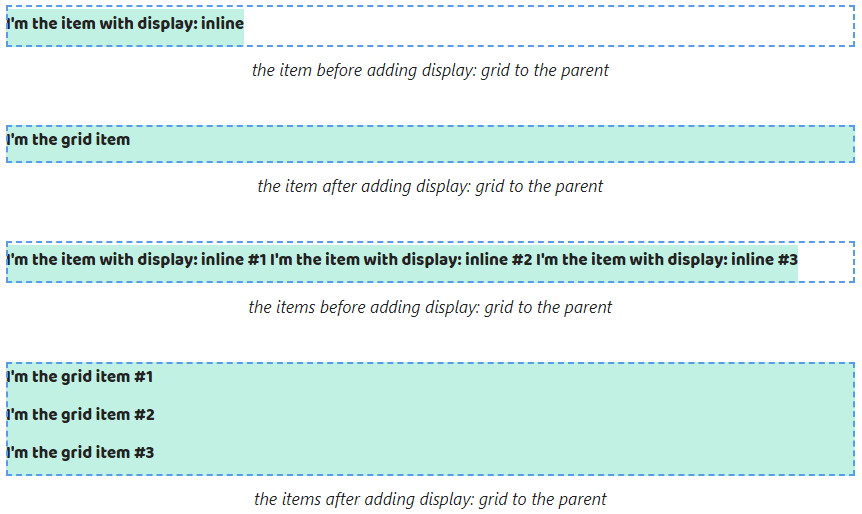
And they happen for elements with display: inline. The width property stops depending on the content after the inline value on grid.

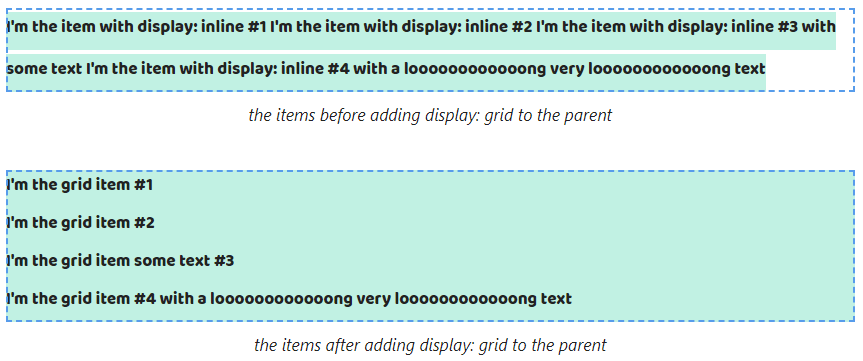
If the content of elements with display: grid doesn't fit on one line then browsers will move it to a new line. The width property will equal the width property of the parent.
If we change the block value on grid then we won't see changes as with the width property.
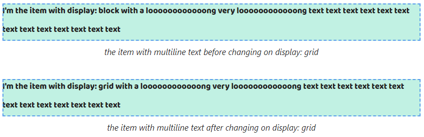
And if we change the inline value to grid the width property stops depending on the maximum line length.

2. By default elements with display: grid are positioned in a column. So if we change the block value to grid elements will save its position.

And if we change the inline value to grid we will get they are positioned in a column.

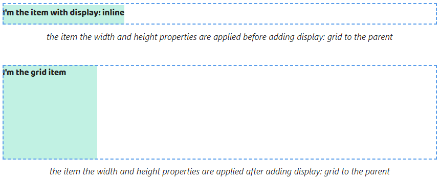
3. The width and height properties can be set to elements with display: grid. Therefore we don't notice changes when changing the block value to grid.

The width and height properties start to apply after changing the inline value to grid.

4. The padding and border properties can be set for elements with display: grid. If the element has display: block by default we won't see any changes after changing the block value on grid.


And we'll see them after changing the inline value to grid because vertical paddings and borders stop ending up outside the parent.


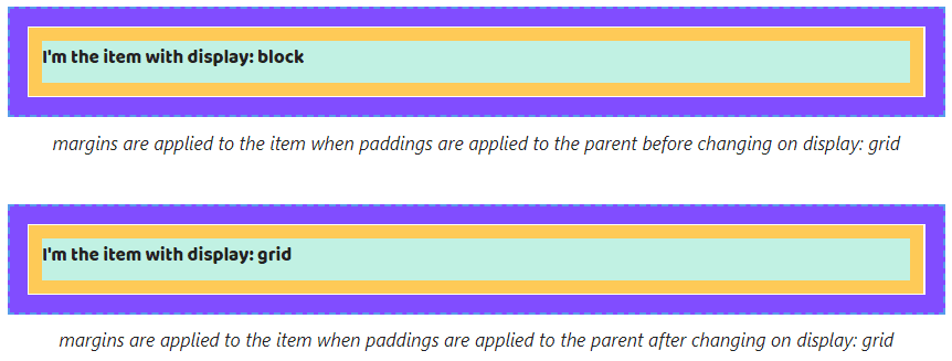
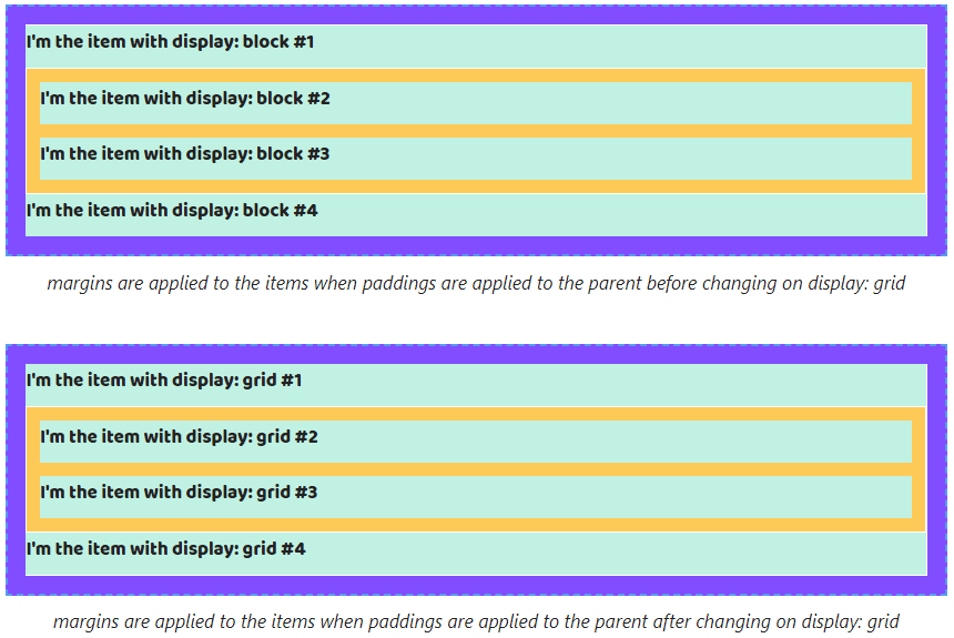
Since vertical margins of elements with display: block might end up outside the parent, this behavior stops after changing the block value to grid.

However, as with elements with display: block adding the border or padding properties to the parent stops this margins behavior.

As with elements with display: block adding to the parent the overflow property with a value that's different from visible cancels margins behavior.

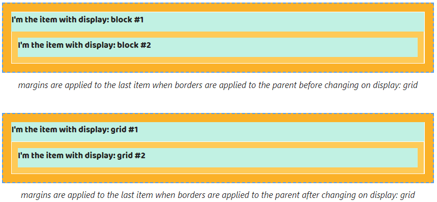
If the parent has a few elements with display: block top margins will end up outside it from the first element and the bottom from the last. Changing the block value to grid doesn't cancel that.


As with a single item case, adding the padding, border or overflow properties to the parent stops this behavior for elements with display: grid too.


Also, margins between adjacent elements continue collapsing when changing the block value to grid Also. The gap between elements will equal the largest.
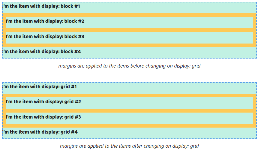
And collapsing is saved after adding the padding, border and overflow properties.


Since vertical margins of elements with display: inline might end up outside the parent, this behavior saves after changing the inline value to grid.
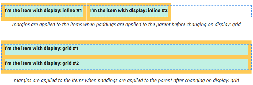
When changing the inline value to grid, margins don't overlap paddings or margins that are set to the parent.


When we change the inline to grid and the parent has multiline elements top margins will end up outside it for only the first element and bottom margins for the last.
Margins from other elements stop overlapping siblings by vertical. They will be collapsed.

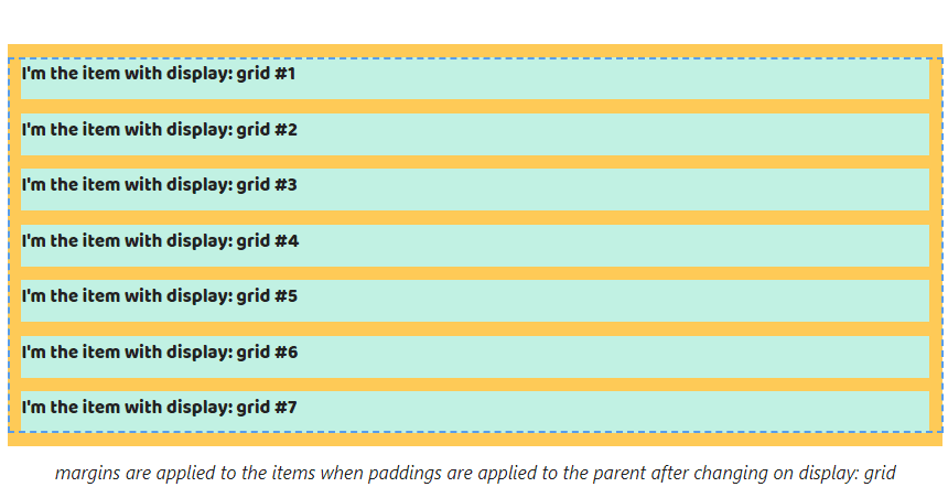
Also, changing the inline value to grid leads margins again displays when the overflow is applied. The value should be different from the visible.

If we define margin: auto to elements with display: block or display: inline that continues doesn't work after adding display: grid.


Defining the width property to elements with display: block allows work of margins horizontal. That saves after changing the block value on grid.

In addition, changing the inline value on grid allows using margin: auto if the width property is defined to them.

Default behavior of grid items
Note! grid items are childs of the element with display: grid or display: inline-grid
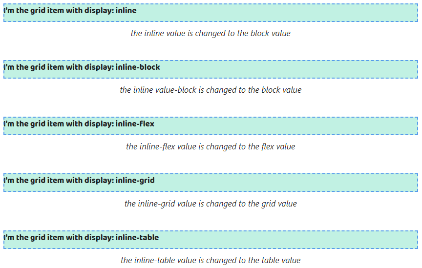
5. Grid items always are blockified. It means all block values are saved.

All inline values will be changed on block values. So the inline and inline-block values will be changed to block, inline-grid -> grid, inline-grid -> grid and inline-table -> table.
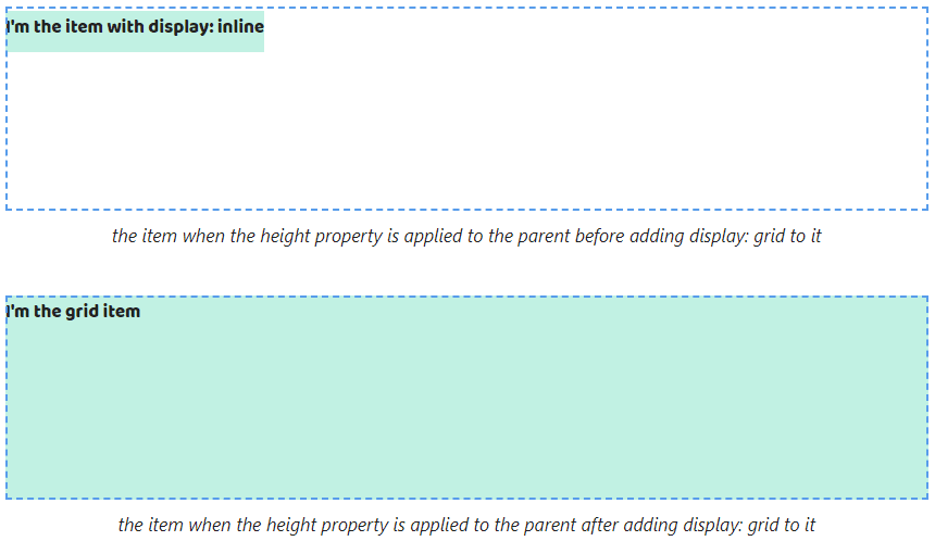
6. The width property of grid items is equal to the width property of the parent. The height property tries to fill all space.
Thus the width property keeps being equal to the width property of the parent for childs with display: block. The height property stops depending on the content but looks the same when the height property isn't defined to the parent.


In this case, if it's defined filling all space of the height property is more noticeable.


In the case of childs with display: inline we will get the width property stops depending on the content. The height property looks the same like before if the height property isn't defined to the parent.
If the height property is defined to the parent we will better see how the property stretches.
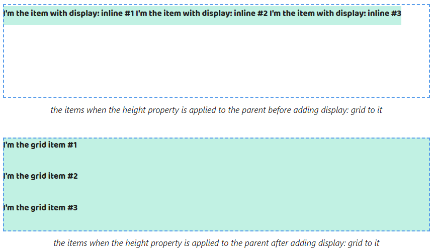
If the content of a grid item doesn't fit on one line then browsers will move it to a new line. The width property will equal the width property of the parent.
As a result, the content of childs with display: block will be displayed the same after adding display: grid to its parent.

The width property of the childs with display: inline stops to be calculated depending on the maximum line length.

By default, grid items start on a new line. For this reason childs with display: block still saves position.

In contrast to the case with childs with display: block, childs with display: inline changes default position.
Box model features of grid items
8. The width and height properties can be set to grid items. It's why we won't see some changes after changing the display property of the parent with the block value to grid.

When considering childs with display: inline we already can set the width and height properties after adding display: grid to the parent.
9. The padding and border properties can be set too. They will work without changes for childs with display: block.


When it comes to childs with display: inline vertical paddings and borders stop ending up outside the parent.


Pay attention, vertical margins don't end up outside the parent. That leads to we'll see changes if display: block is set to childs.

If the parent has two childs with display: block margins stop ending up outside it from the first child and the bottom from the last.


In the case, we set margins for adjacent childs with display: block they stop collapsing.

Vertical margins of childs with display: inline cease to end up outside the parent when adding display: grid to it.

Also, margins cease to overlap paddings and borders.


When applying margin: auto the width and height properties of the childs are calculated depending on the content after adding display: grid to the parent. All space between the childs and the parent's borders will be shared evenly.
We'll see the width property stops to be equal to the width property of the parent after changing the block value on grid.

The width and height properties keep behavior after changing the inline value on grid.

Adding margin: auto to grid items stops filling all space of the width and height properties.

Original Link: https://dev.to/melnik909/what-display-grid-does-3ain
Dev To
 An online community for sharing and discovering great ideas, having debates, and making friends
More About this Source Visit Dev To