
An Interest In:
Web News this Week
- April 14, 2024
- April 13, 2024
- April 12, 2024
- April 11, 2024
- April 10, 2024
- April 9, 2024
- April 8, 2024
Some of Our Sources
- Web Designer Wall
- Just Creative
- Smashing Apps
- Vandelay Design
- FanExtra - PSD
- Noupe
- My Ink Blog
- Freelance Switch
- Daily Now
- TechPowerUp
Help Webnuz
Referal links:
Crafting my Portfolio - Preparing Base
This is a Series of Posts where I'm sharing my journey(sort of) while i craft my Portfolio.
I've been a fan of Vue and Nuxt ever since I first found out about it thanks to dev.to. To me, a JS allergic person, it was the sanest framework ever in my personal opinion and I still think so. The reason was simple enough, the syntax is easily understandable. Like, even if I show some Vue code to a newbie dev, they'll instantly understand it. The next day, the first thing I did was open MDN and started learning JS (which I still haven't finished learning even half since last 2 years)

ahem.. anyway, time to start the post.
Deciding Stack
So it is already clear I'll Nuxt. Although the current stable release is version 2 and version 3 is still in RC status, I'll still use version 3.
CSS Framework
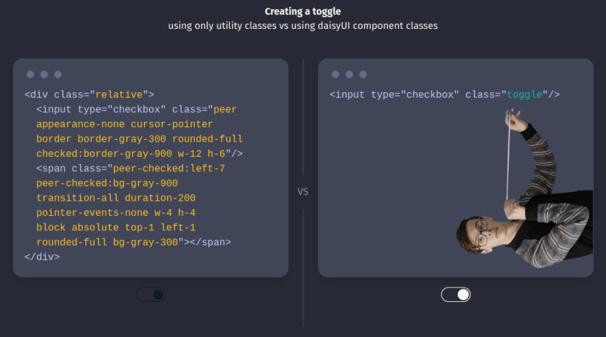
I'm a huge fan of MDB. Bootstrap + Material Design, what else can one ask for. Instantly beautiful sites with least effort. But this time I'll be using Tailwind CSS. Reason? I just feel like it, and also 'cuz of Daisy UI. I absolutely love how it reduces the amount of classes needed to design stuff. Since it's a Component library for Tailwind, it can also use normal Tailwind classes.
In addition, I also decided to use tailwind typography plugin. As it adds some default style for Typography and Daisy UI also recommended it.
Fonts
For fonts, ofcourse... I decided to use something fancy. I decided to use:
- Mansalva as Sans Font.
- Nanum Pen Script as Serif Font.
- Fira Code as Mono Font.
Quite a pairing, right? I know.
Setting Up
Finaly time to start with the Setup. I'll first setup an empty projecy using nuxi then I'll start adding modules needed one by one.
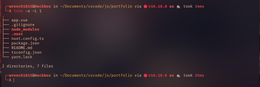
1. Initialize Project
Following the Docs, first I'll use
npx nuxi init portfolio'portfolio' being the name of my project. Next cd into the directory created
cd portfolioAnd finally download the Depden... Dependec... Deps
yarn install
This will provide me a directory tree like this
2. Add Modules
> Tailwind CSS
First, I'll start by adding Tailwind CSS. Luckily, there is a Nuxt module for it and it also supports Nuxt 3, which means less work for me. Following Nuxt Tailwind Docs, I'll first install Tailwind module with
yarn add --dev @nuxtjs/tailwindcssNext I'll add it into modules section of nuxt.config.ts and tailwindcss property
....modules: ['@nuxtjs/tailwindcss']// tailwindtailwindcss: {},....
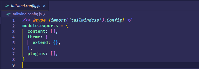
Next, I'll generate the base tailwind.config.js file with
npx tailwindcss initThis will generate me an empty config file
Although the Tailwind module for Nuxt automatically handle adding a base CSS file, I'll still add it or else the VS Code extension for tailwind won't work. I'll name it tailwind.css and add it in assets/css/tailwind.css
@tailwind base;@tailwind components;@tailwind utilities;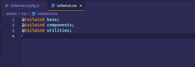
> Daisy UI and Typography plugin
Time to add Daisy UI. From its Docs, first I'll add it in deps. Also, I'll be adding all modules as 'dev' to see what will happen when the project is moved into production.
yarn add --dev daisyuiNext we add it in 'plugins' array in tailwind.config.js
....plugins: [require("daisyui")],....I'll also install Tailwind Typography plugin
yarn add --dev @tailwindcss/typographyNow into the tailwind.config.js it goes. It must be before Daisy UI.
....plugins: [require('@tailwindcss/typography'), require('daisyui')],....Now tailwind.config.js looks like this

> Theme Change
Daisy UI comes with multiple themes, and I want to be able to toggle between themes by toggling a button. As per Daisy UI Docs, it is recommended to use Theme Change package to help to easily toggle themes and also stores theme preference in Local Storage.
yarn add --dev theme-change> Google Fonts
I also need to load my Fancy Font pairing in my Portfolio. We could just load font files... or we could install one more package to manage it for us. (Yeah, I know the build size will increase, and I honestly don't care about it) And luckily there is a Nuxt module that is also compatible with Nuxt 3.
Install it
yarn add --dev @nuxtjs/google-fontsAdd it in modules in nuxt.config.ts
....modules: ['@nuxtjs/tailwindcss', '@nuxtjs/google-fonts'],....This concludes Installation.
3. Configuration
Time to configure all the packages I installed previously. First, I'll configure daisy UI. It by default comes with few themes and came to like its 'Pastel' and 'Dracula' themes, and I'll be using them as themes for Light and Dark mode respectively.
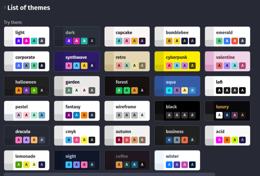
To tell Daisy UI to only include those 2 themes in my build, I'll add the following the theme names in the themes array (or whatever it might be called) in tailwind.config.js. I'll also be telling it what dark theme I'll be using.
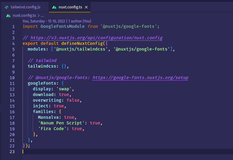
....// daisyUI configdaisyui: { themes: ['pastel', 'dracula'], darkTheme: 'dracula',},....Next I'll add my fonts into the Project. For that I'll add some configurations for handling fonts and font families in nuxt.config.ts which are documented here. I'll also import the types at top. (Pardon if I'm using wrong method for importing types, I'm new to TS)
import GoogleFontsModule from '@nuxtjs/google-fonts'; // for types....// @nuxtjs/google-fonts: https://google-fonts.nuxtjs.org/setupgoogleFonts: { display: 'swap', download: true, overwriting: false, inject: true, families: { Mansalva: true, 'Nanum Pen Script': true, 'Fira Code': true, },},....Next I'll tell Tailwind about my fonts and update its default Sans, Serif and Mono font families.
....theme: { extend: {}, fontFamily: { sans: ['Mansalva', 'cursive'], serif: ['"Nanum Pen Script"', 'cursive'], mono: ['"Fira Code"', 'monospace'], },},....This is how my nuxt.config.ts and tailwind.config.js files look like now.

Demo Component
As a tradition, we usually create a Hello World Program when we start out. In similar manner, I'll create a Component to test if everything is working correctly or not.
I'll use nuxi to create a new Component named 'HelloDaisyUi'. It will create a component folder and my component file in it as well with some boiler code.
npx nuxi add component HelloDaisyUI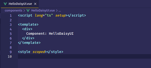
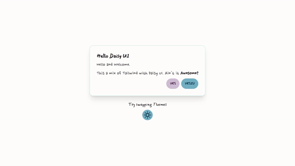
Now for this Component, I'll add a centered Card with a Title, some text, Two Buttons and a toggle for toggling themes. First the Card
<script lang="ts" setup></script><template> <div class="container mx-auto"> <section class="flex flex-col justify-center items-center h-screen px-2 gap-6" > <div class="card bg-base-100 shadow-xl border border-accent"> <div class="card-body"> <h2 class="card-title text-2xl">Hello Daisy UI</h2> <p class="font-serif text-2xl">Hello and Welcome.</p> <p class="font-serif text-2xl"> This a mix of Tailwind with Daisy UI. Ain't it <span class="font-bold">Awesome?</span> </p> <div class="card-actions justify-end"> <button class="btn btn-primary">Yes</button> <button class="btn btn-danger">Yesss!</button> </div> </div> </div> </section> </div></template><style scoped></style>This will result into this UI. As expected, everything is working normal and the light theme and Fonts working as well.

Next, I'll add some markup for theme toggle. Looking at Daisy UI docs, I'll use Swap with button to implement the toggle component.
....<div class="text-center"> <p class="text-xl pb-3">Try swapping Themes</p> <button class="btn btn-circle swap swap-rotate"> <!-- sun icon --> <svg class="swap-off fill-current w-10 h-10" xmlns="http://www.w3.org/2000/svg" viewBox="0 0 24 24" > <path d="M5.64,17l-.71.71a1,1,0,0,0,0,1.41,1,1,0,0,0,1.41,0l.71-.71A1,1,0,0,0,5.64,17ZM5,12a1,1,0,0,0-1-1H3a1,1,0,0,0,0,2H4A1,1,0,0,0,5,12Zm7-7a1,1,0,0,0,1-1V3a1,1,0,0,0-2,0V4A1,1,0,0,0,12,5ZM5.64,7.05a1,1,0,0,0,.7.29,1,1,0,0,0,.71-.29,1,1,0,0,0,0-1.41l-.71-.71A1,1,0,0,0,4.93,6.34Zm12,.29a1,1,0,0,0,.7-.29l.71-.71a1,1,0,1,0-1.41-1.41L17,5.64a1,1,0,0,0,0,1.41A1,1,0,0,0,17.66,7.34ZM21,11H20a1,1,0,0,0,0,2h1a1,1,0,0,0,0-2Zm-9,8a1,1,0,0,0-1,1v1a1,1,0,0,0,2,0V20A1,1,0,0,0,12,19ZM18.36,17A1,1,0,0,0,17,18.36l.71.71a1,1,0,0,0,1.41,0,1,1,0,0,0,0-1.41ZM12,6.5A5.5,5.5,0,1,0,17.5,12,5.51,5.51,0,0,0,12,6.5Zm0,9A3.5,3.5,0,1,1,15.5,12,3.5,3.5,0,0,1,12,15.5Z" /> </svg> <!-- moon icon --> <svg class="swap-on fill-current w-10 h-10" xmlns="http://www.w3.org/2000/svg" viewBox="0 0 24 24" > <path d="M21.64,13a1,1,0,0,0-1.05-.14,8.05,8.05,0,0,1-3.37.73A8.15,8.15,0,0,1,9.08,5.49a8.59,8.59,0,0,1,.25-2A1,1,0,0,0,8,2.36,10.14,10.14,0,1,0,22,14.05,1,1,0,0,0,21.64,13Zm-9.5,6.69A8.14,8.14,0,0,1,7.08,5.22v.27A10.15,10.15,0,0,0,17.22,15.63a9.79,9.79,0,0,0,2.1-.22A8.11,8.11,0,0,1,12.14,19.73Z" /> </svg> </button></div>....The code will result in this UI.

Now time to implement theme toggling. Consulting docs, I'll use the toggle method, well of course after all I just have 2 themes.
In the script tag of the component, first I'll import 'theme change' then when the component is mounted, I'll initialize and also add the data attributes to my button to toggle the theme. Also using the vue magic and the data-act-class="" attribute, I'll make it handle the state of swap on it's own. Basically this attribute add a class when the theme toggle is in active state.
<script lang="ts" setup>import { themeChange } from 'theme-change';onMounted(() => { themeChange(false);});</script>....<button class="btn btn-circle swap swap-rotate" data-toggle-theme="pastel,dracula" data-act-class="swap-active">....</button>....The code will result in following behaviour.

HAA EZZZZ Dark Theme setup for my Portfolio. And this Concludes the Base Setup Part. See ya in next part.
Cover Credits: Artem Maltsev
Original Link: https://dev.to/wrench1815/crafting-my-portfolio-preparing-base-2eep
Dev To
 An online community for sharing and discovering great ideas, having debates, and making friends
More About this Source Visit Dev To