
An Interest In:
Web News this Week
- April 25, 2024
- April 24, 2024
- April 23, 2024
- April 22, 2024
- April 21, 2024
- April 20, 2024
- April 19, 2024
Some of Our Sources
- TutsPlus - Code
- The Logo Smith
- Abduzeedo
- You The Designer
- Creative Curio
- Line 25
- Stylized Web
- Wal You
- Design Modo
- The Verge
Help Webnuz
Referal links:
How to Create a Glassmorphism Effect with Pure CSS
Glassmorphism is a new design trend that started in 2021 after many developers complained about the controversial style of another design trend, neomorphism. Today, many websites and UI implement the glassmorphism effect, including major tech giants like Apple and Microsoft.
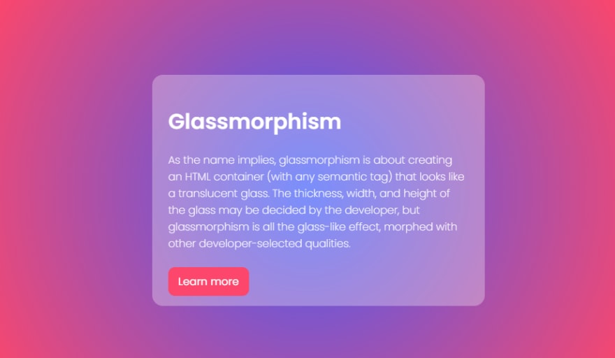
As the name implies, glassmorphism is about creating an HTML semantic container that resembles translucent glass. While the developer may decide the other style properties of the container, glassmorphism itself is the glass-like effect morphed with other developer-selected CSS properties.
Although some web applications generate the glassmorphism effect, and all you have to do is copy and paste the code in your code editor, it is a big challenge for a developer to know how to create one with CSS without external assistance. In this article, you will learn how to create a glassmorphism card using pure CSS.
Adding the backdrop-filter Property
The CSS backdrop-filter property with a value blur adds glassmorphisms glassy effect to the element.
.glass { backdrop-filter: blur(10px); }Since the backdrop-filter property was recently introduced, not all browsers are fully compatible with it, and therefore requires the vendor prefix -webkit- to work.
Adding the Background-color Property
While the backdrop-filter property and blur value produce the glassy effect, the background-color property of the glass container defines the glassy effects clear visibility. The CSS rgba property is the preferred solution for specifying the background color of the glass container, with rgb having a value of 255 respectively and the alpha channel, a, a value that gives the glass container a bit of transparency.
.glass { backdrop-filter: blur(10px); -webkit-backdrop-filter: blur(10px); background-color: rgb(255, 255, 255, 0.3); }Adding your Preferred Dimensions
Other properties added to these styles, such as the .glass container dimensions, are defined and designed to the developers taste.
.glass { backdrop-filter: blur(10px); -webkit-backdrop-filter: blur(10px); min-height: 250px; width: 450px; border-radius: 1rem; background: rgb(255, 255, 255, 0.3); padding: 1.5rem; color: #fff; }One crucial property to note is the background of the parent of the .glass container. The background, which may be an image or color gradient, goes a long way in revealing the beauty of glassmorphism. In my opinion, a gradient background is beautiful and better. You may choose yours.
And here is the result!
In this article, you learned what glassmorphism is and how to create one using pure CSS.
You can access the codepen of the result here and update the styles to your preference.
Original Link: https://dev.to/drprime01/how-to-create-a-glassmorphism-effect-with-pure-css-eca
Dev To
 An online community for sharing and discovering great ideas, having debates, and making friends
More About this Source Visit Dev To