
An Interest In:
Web News this Week
- April 23, 2024
- April 22, 2024
- April 21, 2024
- April 20, 2024
- April 19, 2024
- April 18, 2024
- April 17, 2024
Some of Our Sources
- Pearsonified
- Spoon Graphics
- Smashing Magazine
- Smashing Apps
- Fuel Your Creativity
- Noupe
- Freelance Switch
- Design Modo
- Codrops
- Android Headlines
Help Webnuz
Referal links:
Making a fast website is SUPER EASY
That's right, I said it. Making a fast website is super easy, barely an inconvenience.
I've built a website that gets a perfect score in Google Lighthouse and that can be deployed right to the edge.
It's built completely in a high-performant, battle-tested language that will last for ages.
Want to see for yourself how fast it really is? You can check it out right here: https://enterspeed-hw.netlify.app/
Did you see how fast it was?
Okay, Ill admit, this was a cheap shot. Some of you might sit with a bitter feeling in your mouth, feeling cheated about this almost clickbaity article. But hang on, theres a point to the madness.

The point is anyone can make a fast website. Making a website that looks good and has the functionality you want while being high-performant is where the challenge lies.
We have properly all stumbled on a post on LinkedIn where someone is bragging about their website scoring 100/100 in Google Lighthouse.
A score like that is also quite an achievement and should indeed be celebrated. However, I think many of us also have seen high performant websites which, how should I put it Looks like shit. Excuse my language.
You know the type. Late 2000s-look, barely any images, maybe a few sorry-looking icons, and just text as far as the eye can see.
Dont get me wrong for some websites, e.g., blogs, this makes perfect sense. However, for a website whose goal is to convert customers by selling goods or services, the website should also be attractive to look at.

Whether a website looks good or not is of course, unlike a performance score, highly subjective. As the saying goes: The beauty is in the eye of the beholder.
The visual aspect of a site can be costly. Each image, video, custom font, animation library, etc. is an extra request for the user and additional kilobytes which must be transferred to the client.
Another side of the coin is the websites functionality. My beautiful Hello world-example above, written in pure HTML, properly doesnt scale that well to a full-blown company site.
Then we introduce some kind of framework that increases the bundle size and the response time. How much overhead this framework adds can also vary depending on which you choose, as we found out in our previous article: We measured the SSR performance of 6 JS frameworks - here's what we found.
Okay, now we got the foundation in place now for the content. Marketing comes up with new ideas almost as often as a new JS framework is introduced. They dont want to bother you all the time, and just as important, you dont want to be bothered every time theres a tiny change to be made.
So now we go and implement a CMS. Depending on how we implement it, this can also introduce additional overhead in the performance. If we render it using SSG, it wont have any meaningful performance changes. However, if we use SSR (or for some reason you choose CSR please dont), then we start seeing some extra requests enter the picture.
Okay, now we have given marketing what they want a way to edit and publish content, theyre properly satisfied now, right? Oh, my sweet summer child, you have clearly never worked with a marketing department.
Remember the scene in Lord of the Rings where the thousands of orcs attack Minas Tirith? Picture this scene, Minas Tirith is your website, and the thousands of orcs are the shitton of tracking scripts that marketing wants to implement. In this case, your Gandalf, trying your best to defend Minas Tirith.

As fun as it is to blame marketing for everything, the truth of the matter is they of course play a vital role.
If a website doesnt get any visitors, it doesnt matter how fast it is. Moreover, if these visitors dont convert (buy, sign up, book a call, download material, etc.) it also doesnt matter.
So, should we then just give the marketing department free rein?
Eh
Just like a kid with a bowl of sugar, we should still keep a watchful eye and not allow them to turn their bowl of oatmeal with sugar into a bowl of sugar with oatmeal.
As many studies have shown, theres a direct correlation between how fast a website is and how well it converts.
Also in terms of search engine optimization, core web vitals became an official Google ranking factor in 2021.
Therefore, we must balance the visual elements, the websites functionality, and the websites performance so they all can co-exist.

I know what youre thinking: Enough fluff talk, this isnt marketing, what can I actually do? (Sorry, having switched from marketing to development myself, I simply cant help it).
And dont worry, in the second part of this article we will look at some actionable tips
Making your website fast, functional, and visually pleasing
Lets try to hit that magical trifactor that makes everyone happy.
Images
Lets start with one of the big performance sinners images. Images take up a huge part of the website's total size.
As of August 2022, images made up on average 45% on desktop and 44% on mobile of a pages total weight. The number of image requests made up 32% on desktop and 30% on mobile of a page's total requests (Source: HTTP Archive).
Optimizing the images can therefore result in big and easy wins. Ive previously made an article about this exact subject: How to optimize your images for performance.
I will quickly summarize the points from the article and move on to a concrete example.
1. Choose the right image format (JPEG, PNG, GIF, SVG, WebP)
Each image format has its purpose. For instance, PNGs can be great for icons and smaller images, but the file size can quickly become pretty huge for larger images.
2. Be careful with using animated GIFs
GIFS can be fantastic for small videos, for instance in tutorials, but they come with a cost. File sizes can be enormous, so consider using a video instead.
3. Always try to compress images
It always amazes me how many kilobytes can be saved by running images through a compressing tool. I once managed to compress an SVG file with around 97% - absolutely bonkers.
One of my all-time favorite tools to use is TinyPNG (aka. TinyJPG). Their UI is beautiful, dead simple and more importantly they have some insane compression results. They allow compression of PNGs, JPEGs, and WebP-files.
Remember to always check the quality after. One thing many compression tools dont do well is trying to compress gradient colors the result can be quite janky.

Online tools I can recommend:
- TinyPNG
- Squoosh
- Vecta.io (Only SVG)
- Kraken.io
- Compressor.io
Tip: Squoosh lets you adjust the quality (compression rate) and see the results live.
4. Scale down your images
Theres absolutely no reason in serving a 3000px width image. Moreover, theres no reason in serving a 500px width image if you only render it in 300px.
5. Serve responsive images
Instead of using a single image for both desktop and mobile, consider serving 3 5 different sizes of the image depending on the viewport.
Check out Mozilla's article on responsive images here: Responsive images on MDN.
6. Lazy load images
Never load images until its necessary. Lazy loading images helps reduce the number of initial requests and page size resulting in a much faster site.
Nowadays were blessed with a built-in lazy loading attribute supported by all major browsers: Browser-level image lazy-loading for the web.
Warning: Never lazy-load your LCP element!
Now, lets look at an example of how we could optimize one of the big image performance sinners the hero image.
Optimizing the hero image
Almost all modern websites use some kind of image in their hero section (the area right under the logo and navigation often mostly used on the homepage).
The hero section may be the most important part of your website since it is responsible for quickly telling the visitor:
- What you offer (your product or service)
- What your USPs are (Unique Selling Proposition)
- Communicating trust (why the visitor should trust your site)
- The main call to action (Sign up, book call, buy now, etc).
There is a thousand way to design a hero section, but for now, we will split it into two categories:
A) Full-size hero image (background)
B) Partial-size hero image (often placed in the right section of the screen and taking up somewhere between 1/2 to 1/3 of the width).
The reason why the hero image is interesting from a performance perspective is that it often will be the LCP element (Largest Contentful Paint), which in the Lighthouse performance scoring is the second largest weighted metric with a 25% weight, only outdone by TBT (Total Blocking Time) with a 30% weight.
Moreover, the hero image tends to also be one of the largest when it comes to file size (especially for full-size hero images).
For the partial-size hero images, depending on their size, they may not be the LCP this can very well be the heading text especially on mobile where designers tend to shrink the image to make room for the text and buttons.
So, lets optimize our hero image. For this example, our hero image will be a full-size hero image.
The first thing we should do is make sure we dont lazy load our hero image (some might choose to add the lazy=true attribute to all images) since this will negatively impact our score.
The next thing we should do is preload it. Setting your hero image to preload will enable the browsers preload scanner to load the element early in the page lifecycle.
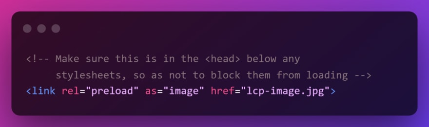
Source: https://web.dev/preload-scanner/
Be aware, that if you use responsive images (different images depending on viewport size), then you need to specify the imagesrcset attribute on the element.
Thing brings us to the next tip. Use responsive image sizes.
Were using a full-size background image with a width of 1920px. Loading a 1920px width image on for instance an iPhone SE which has a 375px width viewport would be absolutely insane.
By shrinking from 1920px width to 375px width you can reduce your image size to just a 1/10 of the original size. Talk about saving data.
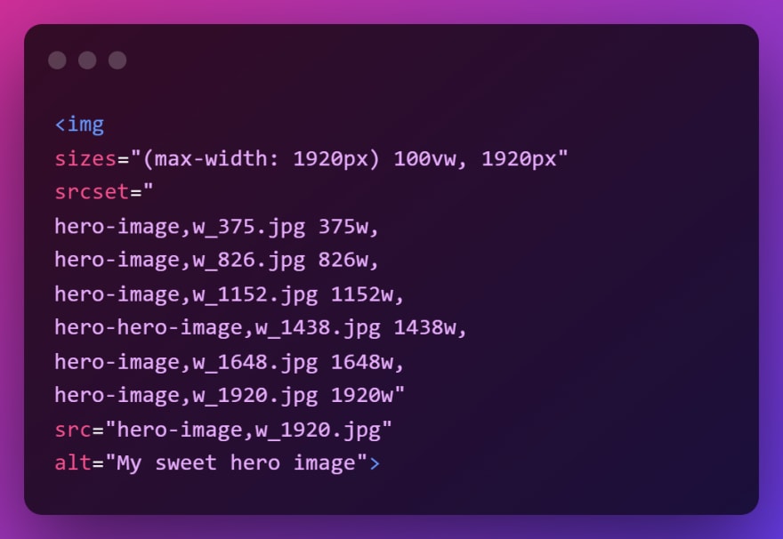
I know what youre thinking. Making all these variations sounds like a lot of work. I feel you Im lazy too, but luckily there are awesome tools available.
The Responsive Image Breakpoints Generator automatically creates the number of images you wish based on your resolution range. Moreover, it even generates the HTML img tag for you.
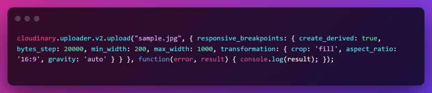
The tool is created by Cloudinary (another fantastic service), which also has an API available to upload your images to the cloud and automatically generate breakpoints programmatically.
Long live the lazy
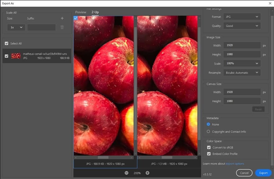
Now lets look at optimizing the main image size. In this example, I will be using Photoshop, but there are plenty of free tools available for doing the same.
We want to build this fantastic hero for our website:

We have found this beautiful image we want to use (Shout out to the photographer Matheus Cenali).
Our largest image size will be 1920x1080. Unfortunately, the image is a bit too big with a resolution of 1920x1440. Time for some cropping.
I select the crop tool in Photoshop and input the resolution I want.

Sweet, no redundant pixels here.
Next, I click File > Export > Exports as. Here I can choose image format and for JPG select image quality while inspecting quality and file size.
If you dont want to use their predefined Quality scale (Good, Very Good, Excellent, etc.) you can use their legacy export tool, which lets you select a quality from 0 100, similar to Squoosh. Youll find the under File > Export > Save for Web (Legacy).
I usually end up selecting the Good-quality, since it often hits the sweet spot between quality and file size.
Now, we could be satisfied with the 188,9 KB file size, which also isnt that bad for a large background image, but let me show you another cool trick.
As you could see from our hero example above, we want to have a black overlay over the image to better view the text and make the CTAs stand out.
Aha! Then we just add some CSS to create a black overlay with some opacity, right? Yes, we could do that, but check this out.
Now I take the same Apple image as above, open it in Photoshop and right click the layer, and select Blending options. Click color overlay, select a black color, and chose an opacity (in this example we use 60%).

Now lets try to export it again in the Good-quality as before, which resulted in a 188,9 KB file size.
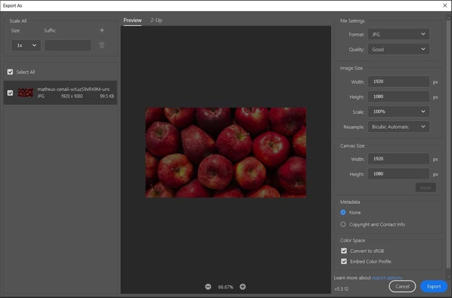
Our file size has shrunk to 99,5 KB! Thats almost a 50% reduction. Fewer image details result in a smaller image size.
The same would have been the case if we have chosen to blur our image:
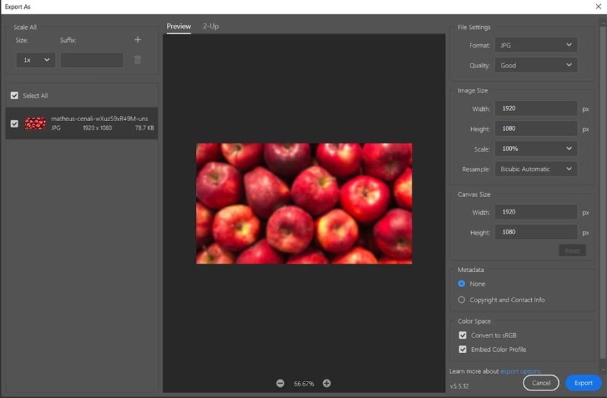
Now we have a 78,7 KB file size. I wonder what happens if we add a black overlay to our blurred image?
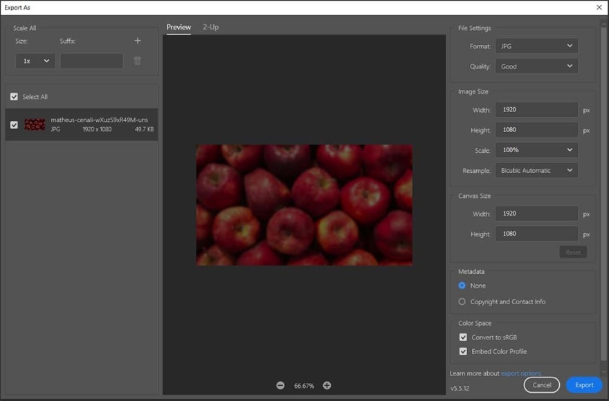
We will end up with an impressive file size of 49,7 KB. This gives you an idea of how many kilobytes can be saved when playing around with effects in Photoshop.
Okay, enough about images we could go on forever optimizing the various assets. Lets take a look at fonts.
Fonts
If there are one thing designers absolutely love, its fonts. So, it was no wonder that the entire web design community almost went bananas when Google recently launched their Color Fonts on Google Fonts, which to be honest is a pretty cool feature.

So, lets talk about fonts and how to optimize them. Were not going to cover every aspect in this article since, believe it or not, actually is quite a big subject.
First, why are fonts/typography important for web design? Lets take a look.
1. Readability
Remember the old days of the web where it seemed like a universal law that your site should have an 11px body font? (What is this? A website for ants?)
Luckily the days of squinting our eyes together to browse the web are over. Now most, but definitely not all, websites run a decent font size.
The choice of font is of course also important. The Bureau of Internet Accessibility has recommended the following fonts for accessibility: Times New Roman, Verdana, Arial, Tahoma, Helvetica, and Calibri.
2. Legibility
Related to readability, legibility is the measure of how distinguishable individual characters and words are to the eye of the reader; readability is the measure of how easy it is to read the text overall (Source: Legibility & readability).
3. Color and contrast
Not everyone perceives colors the same way. Some color combinations can be very difficult or impossible for some people to read.
Usually, this is because of poor color contrast (the foreground and the background color being similar).
The WebAIM guidelines recommend an AA (minimum) contrast ratio of 4.5:1 for all text. However, large text (120 150% larger than the default body) is an exception, here the ratio can go down to 3:1 (Source: Color and contrast accessibility).
4. Branding
Thats right, you thought we were done with marketing, but just like the Undertaker, they sneak their way in when you least expect it.

Fonts are a crucial part of the brand. They can evoke emotions and communicate the what core of the brand is to the consumers.
Dont believe me? Check out these fantastic logo swaps and prepare to feel uncomfortable.
Choosing the right font combination for your website can be what makes or breaks a good design. Check out Canva's ultimate guide to font pairing.
Before moving on to how to optimize fonts for performance, we also need to talk about the two basic types of web fonts: Web-safe fonts and Web fonts.
Web-safe fonts
These are the fonts that are pre-installed on your device also known as system fonts. Examples of these are Arial, Times New Roman, and Courier.
Web fonts
These are fonts not pre-installed on your device and which must be downloaded by the browser before they can be displayed. These can either be self-hosted (on your own web server) or via a third-party host like Google Fonts, Adobe Typekit, etc.
The attentive reader properly already knows which type were going to optimize thats right, web fonts. As nice as it could be to only use web-safe fonts in your design, its hard to make a website look good with just these.
So, lets see what we can do.
The first thing you should do is to make sure youre not downloading unnecessary font variations.
If youre using a theme, boilerplate, etc., it may come with a lot of unnecessary font variations.
Take for instance the popular Roboto font it comes in 12 different styles (6 different font weights with an italic and non-italic version of each). Each variation is extra kilobytes the user must download.
Luckily, its easy to find out which styles you are using and which you are not. Afterward, you can change your link / @import to only download these variations.
Next, lets see how these fonts may impact our performance score. Web fonts can negatively impact core web vitals like Cumulative Layout Shift (CLS) and Largest Contentful Paint (LCP), and non-core web vitals like First Contentful Paint (FCP), which is also used to calculate the Lighthouse performance score with a 10% weight.
So, how do we optimize all of these? We cant.
Wait, what? We cant?
No, optimizing fonts for CLS and LCP/FCP conflict with each other. It all has to do with how we use the font-display property.
When loading custom fonts, each browser has its own behavior. Edge swaps it out with a system font until its ready, Chrome and Firefox will wait 3 seconds before swapping it out with a system font and Safari will simply hide it until the font is ready.
We can modify this default behavior by using font-display.
So first lets try to optimize for LCP/FCP.
The First Contentful Paint will often be your text which, as we learned previously, also can be your Largest Contentful Paint. The quicker these elements load the better.
Therefore, the loading behavior of Chrome, Firefox, and Safari, can potentially harm these metrics. The same if you choose to manually set font-display to block, which gives the font face a short block period and an infinite swap period.
We can avoid these invisible fonts by setting the font-display to swap making the block period extremely small. This will load a system font and swap the font when the custom font is ready.
Pretty nifty, but do you know what can happen when you swap content during load? Your layout can shift, resulting in a poor Cumulative Layout Shift (CLS) score.
So, unfortunately, theres no solution that fixes all things. If your text is your LCP, it makes sense to use the swap method, since LCP and FCP have a total weight of 35% (25% + 10%) in the Lighthouse performance score.
But theres also a way we can reduce the amount of layout shift happening. We can make sure our fallback font best matches our custom font. You can use the Font style matcher tool for this.
Now, lets try to optimize how fast we get the actual font. We can use preconnect to establish early connections to important third-party origins, here our fonts.

The next thing we can do is to tell the browser to load our font early in the pages lifecycle. We do this using preload in the link element.
That way our font is less likely to block the pages render since it will load before the browsers' main rendering engine starts.
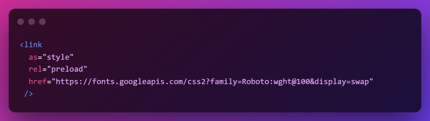
Lastly, if you choose to self-host your fonts, make sure you use a modern web font format here WOFF 2.0. WOFF 2.0 offers up to 30% better compression than its predecessor WOFF.
Third-party scripts (Tracking scripts and other fun stuff)
Now for something thats even more frustrating than the Game of Thrones ending (Im sorry Bran, but anyone has a better story than you) third-party scripts.
From Facebook to Google Analytics, to LinkedIn Insight Tag. The amount of third-party scripts almost seems endless.
When a certain department, who shall remain nameless, then comes to you and ask you to also add the Facebook Page Plugin so our customers easily can follow our company page, you can almost feel your soul leave your body.

But dont worry, theres a way to overcome these obstacles. Remember what we said about balance?
Lets start with the easy one a third-party script rendering content, like the Facebook Page Plugin.
Scripts which are responsible for rendering some kind of content should always be lazy-loaded, meaning the request is first made when you scroll to the content.
The Facebook Page Plugin actually has this built in. Simply insert data-lazy=true and youre good to go.
Now for the more annoying part all the tracking scripts.
If your website only targets European visitors, youre in luck. Due to the GDPR, and the ePrivacy Directive you cant legally set a tracking cookie until the user has accepted it.
This means your initial load time and here your Core Web Vitals wont be affected by these third-party scripts.
Problem solved. Shut down your website for the rest of the world and move to Europe dont worry, we got beer
No? Okay, let me show a trick then.
Hold back your requests

First things first. You should of course only load third-party scripts which are needed on the particular page. This means, that if you have a cool animation that requires animate.css (not a script but a stylesheet but bear with me) that you use on your company page then this shouldnt be loaded on every other page.
You can use a tool like Google Tag Manager to manage and orchestra all your scripts. This is exactly also what we are going to use for this nifty trick.
Third-party scripts like Facebook Pixel, LinkedIn Insight Tag, or even your chat plugin arent strictly necessary to request right away. They can wait until the user has interacted with the site or some time has passed.
I dont necessarily recommend doing this with Google Analytics, since you might risk losing valuable data.
However, for all the nice-to-have stuff, they can wait their turn.
So how do we do this?
Inside Google Tag Manager you set up Triggers that tell the tag/script when to fire. These triggers can be conditional, meaning you also can chain them into an OR statement.
So, for our non-critical scripts, we could set up a condition that looked for if:
- The user has clicked on any element (useful for navigation)
- Has scrolled 5% (indicated the user starts interacting with the site)
- 5 seconds have passed (our initial load is done).
Be sure to test these things out and see if everything works. As someone who lives under Margrethe Vestagers watchful eyes, I dont use this technique myself.
Loading content from your CMS
Thats right, weve saved the best for last - serving the actual content.
There are multiple ways to go about it and not a subject we can cover completely in this article.
One way to make sure your content loads really fast is to use Static Site Generation (SSG) which renders your content at build time and serves it as (you guessed it) static content.
This is really performant, but not always that flexible. Another alternative is to use something like Next.js Incremental Static Regeneration (ISR), which is a hybrid between Server Side Rendering (SSR) and Static Site Generation (SSG).
Again, cool stuff but not everyone can utilize these rendering strategies many organizations have some dynamic content that needs to be rendered via SSR.
These organizations are also typically not the type you can easily convince to move away from their old CMS and on to the latest and greatest headless CMS.

Fetching data from these CMS can be slow and risk creating a bottleneck. So, what do we do?
We decouple it, baby.
If you read my previous article, Using Google Sheets as your CMS, you might be familiar with the concept.
Using a solution like our own product, Enterspeed, you can sync your data to a high-performant data store, and still keep the editor experience. Moreover, youre able to also transform and combine multiple data sources into a single call reducing the number of requests.
Decoupling your CMS also brings other benefits. Youre able to scale down your server since its no longer going to take the high traffic load.
If you need to do maintenance, you can even shut it off without affecting your site.
Syncing your data to Enterspeed also makes it possible to migrate to another CMS or a newer version of your current one. Check out how we migrated from a Umbraco V7 setup to an Umbraco V10 setup in no time.
Not to toot our own horn, but that is pretty sweet
Closing thoughts
This article could go on forever (and it kind of feels like it already has), but we must stop at some point. We havent covered all the topics of performance optimization, since theres enough content there to cover a full book.
Some of the things we didnt cover were:
- The importance of choosing a good web host (We Netlify).
- Lazy-loading videos
- Utilizing three shaking when possible
- Minifying and compressing your CSS and JavaScript
- Using a CDN
- Reducing your TTFB
- Removing unused code
- Removing unnecessary redirects
- Utilizing caching
- Eliminating render-blocking resources
- Using code splitting when possible
- Deferring non-critical CSS
Conclusion
Its not hard to build a superfast website. It can be hard to do this while making it look visually stunning and having the functionality all department wants.
Luckily, we can solve many of these obstacles by doing some optimization tweaks and learning to achieve a balance between speed, functionality, and visual elements.
Remember, Rome wasnt built in a day. These things take time and comprise sometimes must be made. Talk to each stakeholder for the website and make sure they understand why there needs to be a synergy between all elements.
Original Link: https://dev.to/enterspeed/making-a-fast-website-is-super-easy-9lb
Dev To
More About this Source Visit Dev To