
An Interest In:
Web News this Week
- March 25, 2024
- March 24, 2024
- March 23, 2024
- March 22, 2024
- March 21, 2024
- March 20, 2024
- March 19, 2024
Some of Our Sources
- Joshua Blankenship
- The Logo Smith
- Abduzeedo
- TutsPlus - Design
- Web Designer Depot
- Specky Boy
- CSS Tricks
- Freelance Switch
- Design Modo
- Hashedout
Help Webnuz
Referal links:
how to make an Indestructible button?
Introduction
the button is a very simple component that is found on almost every website And the last thing you want when developing your site is to add another problem.
I think you already have enough layout and responsiveness problems And you don't want to add a button problem that doesn't work well
But what if you have a button that works in all conditions;
work with flex Without any strange positioning issues, and work with grid without any change in size.
It behaves as you expect it to behave. It stays where you put it in the size you specified, Smoothly interacts with the screen size, and surrounding elements, and the font size used.
If you just want to use this magic button without understanding how it works, this is the code:

But if you want to understand how it works, choose which features
you want or even modify it; complete the article with me, where I will talk in detail about how I made this button.
frist HTML :
Nothing special here but I just want to make a few notes:
If you will use button element put the type=button To tell the browser how this button behaves
<button type="button" class="Button">normal button </button>if you will use an Anchor element or a div For some reason put role=button to specify to the browser what is the role of this link.
<a href="#" role="button" class="Button">a link button</a>Note: If using role="button" instead of the semantic [button] or [input type="button"] elements, you will need to make the element focusable and define event handlers for click and keydown events. This includes handling the Enter and Space keypresses in order to process all forms of user input.
But if you do not know which one to use, I recommend reading the following: Anchors vs Buttons
CSS:
For some reason whenever I use a library or open any good website I always try to see how they program their bottons.
So this code is a collection of many libraries and websites in addition to some of my thoughts And all of this while I try to follow basic design and accessibility rules.
You are free to change the sizes and the general shape of the button Because In general, they did not affect the basic properties.
After all, imagine that the indestructible button get destroyed due to a change in font size, for example
Some basics before we start:
I will use rem and em a lot and other units of measurement, and I will explain simply during the article why I chose any one of them But if you want to know more, I advise you to read this: CSS Units Explained
In general, I use CSS custom properties in my own code, It gives me superpowers, but I won't use them in this article
any feature I will use, I will attach a link to it if you want to know more about it, and of course, I will explain to you why I used it specifically.
For credibility, I will also attach the original source which I learned the trick from
Without more talk let's start building the Indestructible button :
width & height
the trick here is not to specify a fixed size, but rather to set limits for the largest and smallest size, as the button size will depend mainly on the font size.
To determine the size we will follow the basic design rules for buttons To find out more, I recommend reading this: Button design for websites and mobile apps.
But for me after trying many values I found magic values that work with all designs.
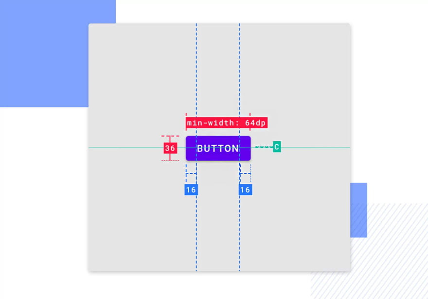
.Button { min-height: 3.25rem; max-height: 3em; width: min-content; max-width: min(100%, 90vw);}Let's talk about these values:
min-height: 3.25rem; 3.25rem = 52px From my point of view it is the smallest length any button should reach, as shorter than that does not seem right, and We will use rem To take into account this one person in a million who may change the font size settings of the browser.

max-height: 3em; we will use em here Where the size is relative to the font size of the button and in general, the way we will complete the button will make it not reach this length, but it is placed as a limit to make sure there is no sudden stretching.

width: min-content; In general, you are not required to specify a width for the button, and also where the button will work in any case without this feature, but I use it as a safety valve to prevent anything unexpected.
I chose min-content As it gives the least Problems and is more supported, also it is dynamic with the width as it takes the smallest width that the element can have.
max-width: min(100%, 90vw); This is also optional;
It might look complicated or overkill But let me explain:
You specify the largest width that the element can reach max-width
using the min() To choose the smallest value between 100% linked to the size of the parent element, which may be half the screen for example.
90vw linked to the screen size.
You do this to allow the element to expand (if desired) to either parent size or screen size, Of course, these sizes are usually linked to my CSS custom properties system.

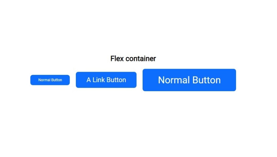
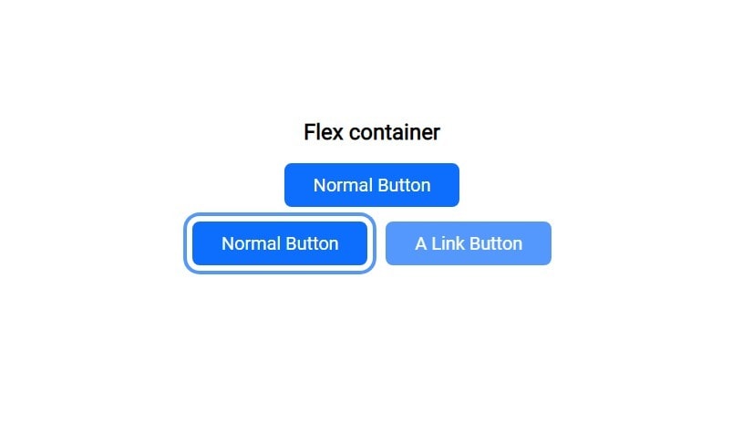
display: inline-flex;
Now you determine how the button deals with the surrounding elements and with the elements inside.
Previously I used display: Block; then i use display: inline;
Recently I was learning React and discovered MUI And as usual, the first thing I did was look at how they did their button And found them using inline-flex
inline-flex
The element behaves like an inline element and lays out its content according to the flexbox model.
.Button { display: inline-flex; justify-content: center; align-items: center; text-align: center; vertical-align: middle;}And using the magic of Flex We will center any items inside this button.
reference:
and We will use properties like text-align & vertical-align in general for:
To make sure an extra image or strange text is always in the middle
For the person who still uses an old browser (for browser support) In case flex doesn't work for some reason.

padding & margin & font-size
Here lies the magic that makes this button work in all cases and all sizes.
.Button { padding: max(0.5em, 0.5rem) max(1.5em, 1.5rem); font-size: clamp(0.875rem, 0.7rem + 0.7vw, 1.375rem);}.Button:not(:last-child) { margin: 0 1rem 0 0;}Of course, this seems more overkill than the max-width trick and it is, but You will only copy this code once and it will work in all cases.
And of course I don't need to remind you that I usually use a mixture between CSS custom properties & Sass mixin and function
Which makes it easy as I enter only one number and all these numbers will be calculated for me.
- padding: max(0.5em, 0.5rem) max(1.5em, 1.5rem); The trick here is to use max() Where if you notice that I use the same value once with rem and once with em but why?
The point of max() It is to choose which value is greater; Usually em will be bigger, Where if we assume that the font size of the button is 24px
em = 24px
and rem = 16px Follow the default browser size
So why do we do this?
In general, when using a small font size such as 12px
if you use just *em * The button dimensions will be too narrow Since it is related to the font size
em = 12px
rem = 16px Still at the default text size
And then rem will be the biggest.
In short, you use this trick to define the minimum space inside the button and at the same time it allows you to stretch with the font size.
And of course the width & height tricks will help a lot, but it can be changed according to your needs, so I rely on this trick mainly.
- font-size: clamp(0.875rem, 0.7rem + 0.7vw, 1.375rem); Honestly, I cannot explain to you how to choose these values here, as I will need another article.
But in short using clamp() Allows you to use a font that is responsive to your screen size with a minimum of 0.875rem and a maximum of 1.375rem ( for Example ).
To make it easier, you can use a font size clamp calculator
I strongly advise you to read these articles, as they will benefit you in web dev in general:
Note: There are many other ways you can achieve a responsive font size But I will dedicate an entire article to it in the future.

There is nothing special with margin we just use :not() To determine that we do not want to target the :last-child
Remember to change the direction of margin in phone mode
@media screen and (max-width: 48em) { .Button { width: 100%; } .Button:not(:last-child) { margin: 0 0 1rem 0; }}Extra features
.Button { overflow: hidden; white-space: nowrap; cursor: pointer; user-select: none; appearance: button;}overflow: hidden; To prevent anything from coming out outside the button.
white-space: nowrap; Prevent text from going to more than one line.
Although I am sure that we have built a button that does not need safety features like these, but the precaution is necessary

cursor: pointer; The cursor is a pointer that indicates a link. Typically an image of a pointing hand.
user-select: none; make The text of the element and its sub-elements is not selectable.
'user-select' is not supported by Safari, Safari on iOS.
This is an optional feature where if the button contains important text, you may allow it
- appearance: button; The appearance CSS property is used to control native appearance of UI controls, that are based on operating system's theme.
'appearance' is not supported by Safari on iOS < 15.4.
:hover & :focus
.Button { box-shadow: 0 0 0 -0.4em hsl(0, 0%, 100%), 0 0 0 -0.6em rgba(13, 109, 253, 0.7); transition: box-shadow 400ms cubic-bezier(0.66, -0.2, 0.27, 1.15);}.Button:active,.Button:hover { opacity: 0.7;}.Button:focus-visible { box-shadow: 0 0 0 0.3em hsl(0, 0%, 100%), 0 0 0 0.5em rgba(13, 109, 253, 0.7);}.Button:focus { outline: none;}Nothing special I just determined how the button behaves in different situations
If you want to know more about the :focus-visible trick I advise you to watch the video of the king of css about it
Use this instead of :focus (most of the time)
Conclusion
In general, this code is not fixed, but for my it is always present at the beginning of every project, and all I need is a few modifications to work with any site.
And believe me when you use this code with CSS custom properties & Sass You will not need to touch this code again in your life as it just works.
Although I doubt that anyone will read this article, but if you want to know how my CSS custom properties & Sass System Tell me in the comments
And in the end, this is the complete code for the example used in the article:
a,button { font: inherit;}.Button { max-height: 3em; min-height: 3.25rem; width: min-content; max-width: min(100%, 90vw); /* */ display: inline-flex; justify-content: center; align-items: center; text-align: center; vertical-align: middle; /* */ overflow: hidden; appearance: button; user-select: none; text-transform: capitalize; white-space: nowrap; text-decoration: none; cursor: pointer; /* */ padding: max(0.5em, 0.5rem) max(1.5em, 1.5rem); font-size: clamp(0.875rem, 0.7220363289rem + 0.7648183556vw, 1.375rem); /* */ font-weight: 400; background-color: hsl(216, 98%, 52%); color: hsl(0, 0%, 100%); border: 2px solid hsl(216, 98%, 52%); outline: none; border-radius: 8px; /* */ box-shadow: 0 0 0 -0.4em hsl(0, 0%, 100%), 0 0 0 -0.6em rgba(13, 109, 253, 0.7); transition: box-shadow 400ms cubic-bezier(0.66, -0.2, 0.27, 1.15);}.Button img { max-width: clamp(0.875rem, 0.7220363289rem + 0.7648183556vw, 1.375rem); margin-left: 0.5rem;}.Button:not(:last-child) { margin: 0 1rem 0 0;}.Button:active,.Button:hover { opacity: 0.7;}.Button:focus-visible { box-shadow: 0 0 0 0.3em hsl(0, 0%, 100%), 0 0 0 0.5em rgba(13, 109, 253, 0.7);}.Button:focus { outline: none;}@media screen and (max-width: 48em) { .Button { width: 100%; } .Button:not(:last-child) { margin: 0 0 1rem 0; }}
I hope you liked the article, I feel like I took a little long to talk about something that isn't a big deal.
But I felt that I should share this code with you.
since I am a human being who can make mistakes or to be less knowledgeable than you if you find any mistake or have any suggestion feel free to comment
Original Link: https://dev.to/ymhaah/how-to-make-an-indestructible-button-3f2h
Dev To
 An online community for sharing and discovering great ideas, having debates, and making friends
More About this Source Visit Dev To