
An Interest In:
Web News this Week
- April 16, 2024
- April 15, 2024
- April 14, 2024
- April 13, 2024
- April 12, 2024
- April 11, 2024
- April 10, 2024
Some of Our Sources
- Technology Review
- TutsPlus - Code
- Just Creative
- Six Revisions
- Abduzeedo
- Vandelay Design
- Reencoded
- Spyre Studios
- Android Dissected
- Willems Lab
Help Webnuz
Referal links:
Show dev: I built a collection of popover components with Tailwind CSS
Hello devs
Me and my friends built a collection of popover components using the utility-first Tailwind CSS framework classes and building a JavaScript integration with the Flowbite component library.
A popover is basically a popup-box that shows when hovering or clicking over a trigger element where you can show additional information like a paragraph, user profile info, and more.
Here's a preview of one of the popover components:

In this article I will show you the collection of popover examples and how you can get started using them in your projects.
Getting started
First of all, you need to make sure that you have Tailwind CSS and Flowbite installed in your project.
Install Tailwind CSS
You can either follow the quickstart guide or follow the next steps to install Tailwind CSS:
Install tailwindcss via NPM:
npm install -D tailwindcssnpx tailwindcss initConfigure the template paths inside the tailwind.config.js file:
/** @type {import('tailwindcss').Config} */ module.exports = { content: ["./src/**/*.{html,js}"], theme: { extend: {}, }, plugins: [],}Create a new src/input.css file and add the following content:
@tailwind base;@tailwind components;@tailwind utilities;Compile and watch for changes in CSS:
npx tailwindcss -i ./src/input.css -o ./dist/output.css --watchGreat! Now that you have Tailwind CSS installed we can proceed by installing Flowbite as well.
Install Flowbite
Install Flowbite as a dependency using NPM by running the following command:
npm i flowbiteRequire Flowbite as a plugin inside the tailwind.config.js file:
module.exports = { plugins: [ require('flowbite/plugin') ]}Include the main JavaScript file to make interactive elements work:
<script src="../path/to/flowbite/dist/flowbite.js"></script>Additionally to your own content data you should add flowbite to apply the classes from the interactive elements in the tailwind.config.js file:
module.exports = { content: [ "./node_modules/flowbite/**/*.js" ]}If you use Webpack or other bundlers you can also import it like this:
import 'flowbite';Include via CDN
The quickest way to get started working with FlowBite is to simply include the CSS and JavaScript into your project via CDN.
Require the following minified stylesheet inside the head tag:
<link rel="stylesheet" href="https://unpkg.com/flowbite@{{< current_version >}}/dist/flowbite.min.css" />And include the following JavaScript file before the end of the body element:
<script src="https://unpkg.com/flowbite@{{< current_version >}}/dist/flowbite.js"></script>Awesome! Now that you have both Tailwind CSS and Flowbite installed in your project you can use the Popover component collection right away.
Tailwind CSS Popover
Initialize a new popover by adding the data-popover-target="{elementId}" data attribute to the trigger element where elementId is the id of the popover component.

Source code:
<button data-popover-target="popover-default" type="button" class="text-white bg-blue-700 hover:bg-blue-800 focus:ring-4 focus:outline-none focus:ring-blue-300 font-medium rounded-lg text-sm px-5 py-2.5 text-center dark:bg-blue-600 dark:hover:bg-blue-700 dark:focus:ring-blue-800">Default popover</button><div id="popover-default" role="tooltip" class="inline-block absolute invisible z-10 w-64 text-sm font-light text-gray-500 bg-white rounded-lg border border-gray-200 shadow-sm opacity-0 transition-opacity duration-300 dark:text-gray-400 dark:border-gray-600 dark:bg-gray-800"> <div class="py-2 px-3 bg-gray-100 rounded-t-lg border-b border-gray-200 dark:border-gray-600 dark:bg-gray-700"> <h3 class="font-semibold text-gray-900 dark:text-white">Popover title</h3> </div> <div class="py-2 px-3"> <p>And here's some amazing content. It's very engaging. Right?</p> </div> <div data-popper-arrow></div></div>Here's another example where you can use information about a user profile instead of a description:

Source code:
<button data-popover-target="popover-user-profile" type="button" class="text-white bg-blue-700 hover:bg-blue-800 focus:ring-4 focus:outline-none focus:ring-blue-300 font-medium rounded-lg text-sm px-5 py-2.5 text-center dark:bg-blue-600 dark:hover:bg-blue-700 dark:focus:ring-blue-800">User profile</button><div id="popover-user-profile" role="tooltip" class="inline-block absolute invisible z-10 w-64 text-sm font-light text-gray-500 bg-white rounded-lg border border-gray-200 shadow-sm opacity-0 transition-opacity duration-300 dark:text-gray-400 dark:bg-gray-800 dark:border-gray-600"> <div class="p-3"> <div class="flex justify-between items-center mb-2"> <a href="#"> <img class="w-10 h-10 rounded-full" src="/docs/images/people/profile-picture-1.jpg" alt="Jese Leos"> </a> <div> <button type="button" class="text-white bg-blue-700 hover:bg-blue-800 focus:ring-4 focus:ring-blue-300 font-medium rounded-lg text-xs px-3 py-1.5 dark:bg-blue-600 dark:hover:bg-blue-700 focus:outline-none dark:focus:ring-blue-800">Follow</button> </div> </div> <p class="text-base font-semibold leading-none text-gray-900 dark:text-white"> <a href="#">Jese Leos</a> </p> <p class="mb-3 text-sm font-normal"> <a href="#" class="hover:underline">@jeseleos</a> </p> <p class="mb-4 text-sm font-light">Open-source contributor. Building <a href="#" class="text-blue-600 dark:text-blue-500 hover:underline">flowbite.com</a>.</p> <ul class="flex text-sm font-light"> <li class="mr-2"> <a href="#" class="hover:underline"> <span class="font-semibold text-gray-900 dark:text-white">799</span> <spa>Following</span> </a> </li> <li> <a href="#" class="hover:underline"> <span class="font-semibold text-gray-900 dark:text-white">3,758</span> <span>Followers</span> </a> </li> </ul> </div> <div data-popper-arrow></div></div>Here's an example where you can show a description and image similar to the Wikipedia popovers:

Source code:
<p class="font-light text-gray-500 dark:text-gray-400">Due to its central geographic location in Southern Europe, <a href="#" class="text-blue-600 underline dark:text-blue-500 hover:no-underline" data-popover-target="popover-image">Italy</a> has historically been home to myriad peoples and cultures. In addition to the various ancient peoples dispersed throughout what is now modern-day Italy, the most predominant being the Indo-European Italic peoples who gave the peninsula its name, beginning from the classical era, Phoenicians and Carthaginians founded colonies mostly in insular Italy</p><div id="popover-image" role="tooltip" class="inline-block absolute invisible z-10 w-96 text-sm font-light text-gray-500 bg-white rounded-lg border border-gray-200 shadow-sm opacity-0 transition-opacity duration-300 dark:text-gray-400 dark:bg-gray-800 dark:border-gray-600"> <div class="grid grid-cols-5"> <div class="col-span-3 p-3"> <div class="space-y-2"> <h3 class="font-semibold text-gray-900 dark:text-white">About Italy</h3> <p>Italy is located in the middle of the Mediterranean Sea, in Southern Europe it is also considered part of Western Europe. A unitary parliamentary republic with Rome as its capital and largest city.</p> <a href="#" class="flex items-center font-medium text-blue-600 dark:text-blue-500 dark:hover:text-blue-600 hover:text-blue-700">Read more <svg class="ml-1 w-4 h-4" aria-hidden="true" fill="currentColor" viewBox="0 0 20 20" xmlns="http://www.w3.org/2000/svg"><path fill-rule="evenodd" d="M7.293 14.707a1 1 0 010-1.414L10.586 10 7.293 6.707a1 1 0 011.414-1.414l4 4a1 1 0 010 1.414l-4 4a1 1 0 01-1.414 0z" clip-rule="evenodd"></path></svg></a> </div> </div> <img src="/docs/images/popovers/italy.png" class="col-span-2 h-full" alt="Italy map" /> </div> <div data-popper-arrow></div></div>Placement
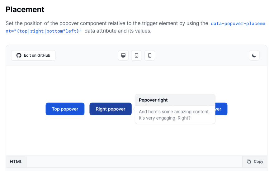
You can also set the position of the popover component relative to the trigger element by using the data-popover-placement="{top|right|bottom"left}" data attribute and its values.
Source code:
<button data-popover-target="popover-top" data-popover-placement="top" type="button" class="text-white mb-3 bg-blue-700 hover:bg-blue-800 focus:ring-4 focus:outline-none focus:ring-blue-300 font-medium rounded-lg text-sm px-5 py-2.5 text-center dark:bg-blue-600 dark:hover:bg-blue-700 dark:focus:ring-blue-800">Top popover</button><div id="popover-top" role="tooltip" class="inline-block absolute invisible z-10 w-64 text-sm font-light text-gray-500 bg-white rounded-lg border border-gray-200 shadow-sm opacity-0 transition-opacity duration-300 dark:text-gray-400 dark:border-gray-600 dark:bg-gray-800" data-popper-reference-hidden="" data-popper-escaped="" data-popper-placement="top" style="position: absolute; inset: auto auto 0px 0px; margin: 0px; transform: translate3d(59.5px, 106px, 0px);"> <div class="py-2 px-3 bg-gray-100 rounded-t-lg border-b border-gray-200 dark:border-gray-600 dark:bg-gray-700"> <h3 class="font-semibold text-gray-900 dark:text-white">Popover top</h3> </div> <div class="py-2 px-3"> <p>And here's some amazing content. It's very engaging. Right?</p> </div> <div data-popper-arrow="" style="position: absolute; left: 0px; transform: translate3d(123px, 0px, 0px);"></div></div><button data-popover-target="popover-right" data-popover-placement="right" type="button" class="text-white mb-3 bg-blue-700 hover:bg-blue-800 focus:ring-4 focus:outline-none focus:ring-blue-300 font-medium rounded-lg text-sm px-5 py-2.5 text-center dark:bg-blue-600 dark:hover:bg-blue-700 dark:focus:ring-blue-800">Right popover</button><div id="popover-right" role="tooltip" class="inline-block absolute invisible z-10 w-64 text-sm font-light text-gray-500 bg-white rounded-lg border border-gray-200 shadow-sm opacity-0 transition-opacity duration-300 dark:text-gray-400 dark:border-gray-600 dark:bg-gray-800" data-popper-reference-hidden="" data-popper-escaped="" data-popper-placement="right" style="position: absolute; inset: 0px auto auto 0px; margin: 0px; transform: translate3d(409.5px, 29px, 0px);"> <div class="py-2 px-3 bg-gray-100 rounded-t-lg border-b border-gray-200 dark:border-gray-600 dark:bg-gray-700"> <h3 class="font-semibold text-gray-900 dark:text-white">Popover right</h3> </div> <div class="py-2 px-3"> <p>And here's some amazing content. It's very engaging. Right?</p> </div> <div data-popper-arrow="" style="position: absolute; top: 0px; transform: translate3d(0px, 85px, 0px);"></div></div><button data-popover-target="popover-bottom" data-popover-placement="bottom" type="button" class="text-white mb-3 bg-blue-700 hover:bg-blue-800 focus:ring-4 focus:outline-none focus:ring-blue-300 font-medium rounded-lg text-sm px-5 py-2.5 text-center dark:bg-blue-600 dark:hover:bg-blue-700 dark:focus:ring-blue-800">Bottom popover</button><div id="popover-bottom" role="tooltip" class="inline-block absolute invisible z-10 w-64 text-sm font-light text-gray-500 bg-white rounded-lg border border-gray-200 shadow-sm opacity-0 transition-opacity duration-300 dark:text-gray-400 dark:border-gray-600 dark:bg-gray-800" data-popper-reference-hidden="" data-popper-escaped="" data-popper-placement="top" style="position: absolute; inset: auto auto 0px 0px; margin: 0px; transform: translate3d(361px, 106px, 0px);"> <div class="py-2 px-3 bg-gray-100 rounded-t-lg border-b border-gray-200 dark:border-gray-600 dark:bg-gray-700"> <h3 class="font-semibold text-gray-900 dark:text-white">Popover bottom</h3> </div> <div class="py-2 px-3"> <p>And here's some amazing content. It's very engaging. Right?</p> </div> <div data-popper-arrow="" style="position: absolute; left: 0px; transform: translate3d(123px, 0px, 0px);"></div></div><button data-popover-target="popover-left" data-popover-placement="left" type="button" class="text-white mb-3 bg-blue-700 hover:bg-blue-800 focus:ring-4 focus:outline-none focus:ring-blue-300 font-medium rounded-lg text-sm px-5 py-2.5 text-center dark:bg-blue-600 dark:hover:bg-blue-700 dark:focus:ring-blue-800">Left popover</button><div id="popover-left" role="tooltip" class="inline-block absolute invisible z-10 w-64 text-sm font-light text-gray-500 bg-white rounded-lg border border-gray-200 shadow-sm opacity-0 transition-opacity duration-300 dark:text-gray-400 dark:border-gray-600 dark:bg-gray-800" data-popper-reference-hidden="" data-popper-escaped="" data-popper-placement="left" style="position: absolute; inset: 0px 0px auto auto; margin: 0px; transform: translate3d(-261px, 29px, 0px);"> <div class="py-2 px-3 bg-gray-100 rounded-t-lg border-b border-gray-200 dark:border-gray-600 dark:bg-gray-700"> <h3 class="font-semibold text-gray-900 dark:text-white">Popover left</h3> </div> <div class="py-2 px-3"> <p>And here's some amazing content. It's very engaging. Right?</p> </div> <div data-popper-arrow="" style="position: absolute; top: 0px; transform: translate3d(0px, 85px, 0px);"></div></div>Conclusion
You can check out the whole documentation and examples of the Tailwind CSS Popover Component from the Flowbite Library itself.

Credits:
Original Link: https://dev.to/themesberg/show-dev-i-built-a-collection-of-popover-components-with-tailwind-css-cki
Dev To
 An online community for sharing and discovering great ideas, having debates, and making friends
More About this Source Visit Dev To