
An Interest In:
Web News this Week
- April 2, 2024
- April 1, 2024
- March 31, 2024
- March 30, 2024
- March 29, 2024
- March 28, 2024
- March 27, 2024
Some of Our Sources
- TutsPlus - Code
- Spoon Graphics
- FanExtra - PSD
- 24 Ways
- Stylized Web
- Specky Boy
- Design Modo
- Codrops
- Dev To
- Hashedout
Help Webnuz
Referal links:
Fantastic CSS border animation
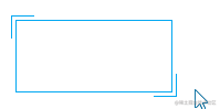
Today I visited the blog site-shoptalkshow, and it was very interesting to see such a style:

I think its style is unique, especially some of the bezels.
So, in this article we will use CSS to create a variety of wonderful border effects.
CSS Borderproperty
When it comes to borders, the first thing that comes to mind border is that the most commonly used one is solid, dashed which appears in the picture above dashed.
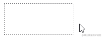
In addition to the most common solid, dashed, CSS border also supports none, hidden, dotted, double, groove, ridge, inset, and outsetother styles. Remove none, hidden to see all natively supported border styles:

These are the basics. If you want to implement a border of other styles, or add animation to the border, you need to cooperate with some other properties, or open your mind. OK, let's take a look at some additional interesting borders.
Border lengthchanges
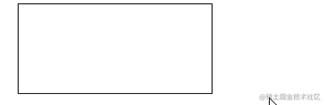
Let's start with a simpler one, to achieve a border effect like this:
This is actually two pseudo-elements that borrow elements. Only the upper and left borders, the lower and right borders of the two pseudo-elements are set respectively, hover and the height and width of the two pseudo-elements can be changed when passing. Very easy to understand.
div { position: relative; border: 1px solid #03A9F3; &::before, &::after { content: ""; position: absolute; width: 20px; height: 20px; } &::before { top: -5px; left: -5px; border-top: 1px solid var(--borderColor); border-left: 1px solid var(--borderColor); } &::after { right: -5px; bottom: -5px; border-bottom: 1px solid var(--borderColor); border-right: 1px solid var(--borderColor); } &:hover::before, &:hover::after { width: calc(100% + 9px); height: calc(100% + 9px); }}CodePen Demo -- width border animation
Next, it will start to deepen the difficulty.
Dotted Border Animation
Using the dashedkeyword, you can easily create dashed borders.
div { border: 1px dashed #333;}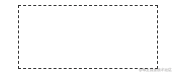
Of course, our purpose is to make the border move. There is no way to use the dashed keyword. But there are many ways to implement dashed lines in CSS. For example, gradients are a good way:
div { background: linear-gradient(90deg, #333 50%, transparent 0) repeat-x; background-size: 4px 1px; background-position: 0 0;}Take a look, the dashed lines simulated using gradients are as follows:
Well, the gradient supports multiple gradients. We can use gradients to represent all four sides of the container:
div { background: linear-gradient(90deg, #333 50%, transparent 0) repeat-x, linear-gradient(90deg, #333 50%, transparent 0) repeat-x, linear-gradient(0deg, #333 50%, transparent 0) repeat-y, linear-gradient(0deg, #333 50%, transparent 0) repeat-y; background-size: 4px 1px, 4px 1px, 1px 4px, 1px 4px; background-position: 0 0, 0 100%, 0 0, 100% 0;}The effect is as follows:

OK, at this point, our dashed border animation is actually a big part of done. Although border-style: dashed doesn't support animation, but gradient does. Let's add a hover effect to the above div, and add an animation animation when we hover, changing the background-position of the element.
div:hover { animation: linearGradientMove .3s infinite linear;}@keyframes linearGradientMove { 100% { background-position: 4px 0, -4px 100%, 0 -4px, 100% 4px; }}OK, look at the effect, hover on the time, the border can moving, because the whole animation is the first and last connected, infinite loop animation looks like a dashed border in motion all the time, this is a small blindfold or a small trick: the
border
div { border: 1px solid #333; &:hover { border: none; background: linear-gradient(90deg, #333 50%, transparent 0) repeat-x, linear-gradient(90deg, #333 50%, transparent 0) repeat-x, linear-gradient(0deg, #333 50%, transparent 0) repeat-y, linear-gradient(0deg, #333 50%, transparent 0) repeat-y; background-size: 4px 1px, 4px 1px, 1px 4px, 1px 4px; background-position: 0 0, 0 100%, 0 0, 100% 0; }}Due to the difference in the position of border and background on the box model, there will be an obvious visual misalignment:
To solve this problem, we can replace border with outline, because outline can set outline-offset. This solves the problem perfectly.
div { outline: 1px solid #333; outline-offset: -1px; &:hover { outline: none; }}Finally, take a look at the effect applied to the actual button:

The complete code of the above Demo is as follows:
CodePen Demo -- dashed border animation
Other cool uses for gradients
With gradients, more than just the above effects can be achieved.
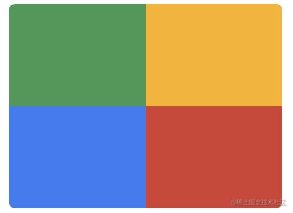
We continue to dig deep into the gradient and use the gradient to achieve such a background:
div { position: relative; &::after { content: ''; position: absolute; left: -50%; top: -50%; width: 200%; height: 200%; background-repeat: no-repeat; background-size: 50% 50%, 50% 50%; background-position: 0 0, 100% 0, 100% 100%, 0 100%; background-image: linear-gradient(#399953, #399953), linear-gradient(#fbb300, #fbb300), linear-gradient(#d53e33, #d53e33), linear-gradient(#377af5, #377af5); }}Note that the graphic generated by the pseudo element of the element is used here, and the width and height of the parent element are the same as those of the parent 200% element overflow: hidden.
Next, add rotation to it:
div { animation: rotate 4s linear infinite;}@keyframes rotate { 100% { transform: rotate(1turn); }}Take a look at the effect:
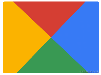
Finally, use a pseudo-element to mask the middle, and a nice border animation will come out (translucent elements will appear in the animation to facilitate understanding of the principle):

The complete code of the above Demo is as follows. I first saw this effect in this author -- Jesse B
CodePen Demo -- gradient border animation
Change the color of thegradient
After mastering the above basic skills, we can make some adjustments to the colors of the gradient, we will turn 4 colors into 1 color:
div::after { content: ''; position: absolute; left: -50%; top: -50%; width: 200%; height: 200%; background-color: #fff; background-repeat: no-repeat; background-size: 50% 50%; background-position: 0 0; background-image: linear-gradient(#399953, #399953);}Get a graph like this:

Again, let it spin together, and a single-color chasing border animation comes out:

CodePen Demo -- gradient border animation 2
Wow, very nice look. However, if it is a single line, there is an obvious defect, that is, the end of the border is a small triangle instead of vertical, which may not be applicable in some scenarios or the PM cannot accept it.

Is there any way to get rid of these small triangles? Yes, in the following we will introduce another method to use clip-path and eliminate these small triangles.
Smart Use of Conic-gradient
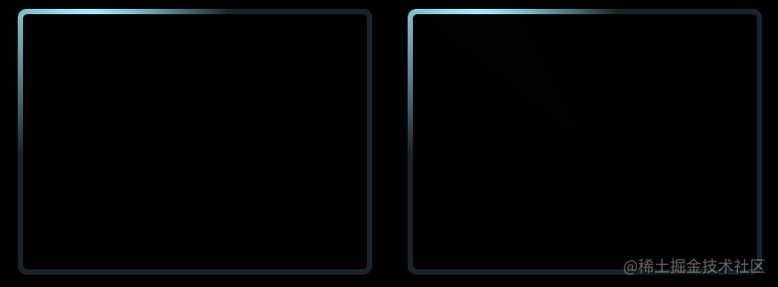
Before introducing clip-path, let's talk about angular gradients.
The linear-gradient is the main one used above. We can achieve exactly the same effect with the angular gradient conic-gradient.
Let's try to use conic-gradient to achieve the same effect, this time in a darker style. The core code is as follows.
.conic { position: relative; &::before { content: ''; position: absolute; left: -50%; top: -50%; width: 200%; height: 200%; background: conic-gradient(transparent, rgba(168, 239, 255, 1), transparent 30%); animation: rotate 4s linear infinite; }}@keyframes rotate { 100% { transform: rotate(1turn); }}The renderings and schematic diagrams are as follows. Rotate a graph with a partial angular gradient, and use another pseudo-element to mask the middle part, so that only the line part is leaked:
CodePen Demo -- Rotating border 3
Smart Use of clip-path
It is an old friend again clip-path, and interesting things will never be absent.
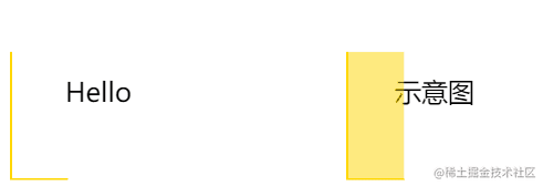
clip-path it is possible to animate the coordinate point itself, transforming from one clipping shape to another clipping shape.
Using this feature, we can cleverly implement such a border following effect. The pseudo code is as follows:
div { position: relative; &::before { content: ""; position: absolute; top: 0; left: 0; right: 0; bottom: 0; border: 2px solid gold; animation: clippath 3s infinite linear; }}@keyframes clippath { 0%, 100% { clip-path: inset(0 0 95% 0); } 25% { clip-path: inset(0 95% 0 0); } 50% { clip-path: inset(95% 0 0 0); } 75% { clip-path: inset(0 0 0 95%); }}The renderings together with the schematic diagram:
CodePen - clip-path border animation
Here, because the element will be cropped, borrowing the pseudo-element as the background for cropping and animation is enough, the advantage of using clip-path, the cut out border will not produce small triangles. Also, this method supports rounded corners border-radius.
If we use another pseudo-element as well, to actually implement a button style, we can get the effect that.

CodePen - clip-path border animation 2
Smart use ofoverflow
The following trick is implemented using overflow. Implement such a border animation:

Why do you say it is overflow realized?
Take a look:

CodePen Demo -- overflowtransformhover
Two core points.
- we use
overflow: hiddento hide an entire element that would otherwise be outside the container - we use
transform-originto control the center of rotation of the element
Did you notice that almost all of the interesting CSS effects use a similar technique?
*Simply put, the animation we see is only a small part of the original phenomenon, through specific cropping, transparency changes, masks, etc., so that we end up seeing only a part of the original phenomenon. *
Smart Use of border-image
With border-image, we can also implement some interesting border animations. There is a very good article about border-image - The correct use of border-image, so we won't go into the basic definition in this article.
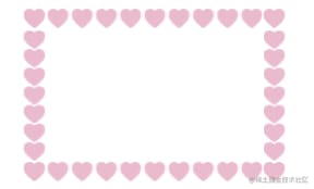
If we have a graph like this:

You can use the features of border-image-slice and border-image-repeat to get a similar border pattern.
div { width: 200px; height: 120px; border: 24px solid; border-image: url(image-url); border-image-slice: 32; border-image-repeat: round;}On this basis, the height and width of the element can be changed at will, so that it can be expanded to any size of the container border:
CodePen Demo -- border-image Demo
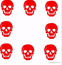
Then, in this article -- How to Animate a SVG with border-image, it also explains a way to use border- image, which is very cool.
Unlike the above example, we just need to make our pattern, move, that is we need a background image like this.
Then, we can also get the moving border map, the code is exactly the same, but the border is moving:
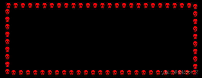
CodePen Demo -- Dancing Skull Border
border-image && Gradients
border-image can also be filled with a color or gradient directly, in addition to posting references to url.
We can use border-image + filter + clip-path to achieve a rounded border with a gradient transformation.
.border-image-clip-path { width: 200px; height: 100px; border: 10px solid; border-image: linear-gradient(45deg, gold, deeppink) 1; clip-path: inset(0px round 10px); animation: huerotate 6s infinite linear; filter: hue-rotate(360deg);}@keyframes huerotate { 0% { filter: hue-rotate(0deg); } 100% { filter: hue-rotate(360deg); }}
CodePen Demo -- clip-path, border-image and filter to achieve rounded gradient border
Finally
More wonderful CSS technical articles are summarized in my Github -- iCSS.
And maybe you will love my CodePen, which has a large number of amazing CSS effects.
Well, that's all for this article, I hope it helps you.:)
Original Link: https://dev.to/chokcoco/fantastic-css-border-animation-5166
Dev To
 An online community for sharing and discovering great ideas, having debates, and making friends
More About this Source Visit Dev To