
An Interest In:
Web News this Week
- April 2, 2024
- April 1, 2024
- March 31, 2024
- March 30, 2024
- March 29, 2024
- March 28, 2024
- March 27, 2024
Some of Our Sources
- BoingBoing
- Techcrunch
- Web Designer Wall
- Just Creative
- Pearsonified
- The Logo Smith
- Creative Curio
- Noupe
- 24 Ways
- Spyre Studios
Help Webnuz
Referal links:
Show dev: I built a collection of open-source drawer components for Tailwind CSS
Hey dev community
Together with my friends from the Flowbite community, we are shipping a brand new Drawer component that lets you show or hide an off-canvas element relative to the document page based on multiple placements: top, right, bottom, and left.
Here's a preview of the default drawer component:

The component works with clean Tailwind CSS classes and you only need to include the JS script to make it work with data attributes and the Drawer API (programmatically via JS).
We also built some examples such as:
- default drawer (title, description, and CTA buttons)
- contact form
- form elements including date picker
- navigation menu/sidebar
All of the components have dark mode included and are responsive and can be quite easily customized by adding any type of elements inside of it and you can also change the height and width of the drawer.
Another feature that we built is the swipeable edge component which lets you offset the drawer with a given height so that you can show a small part of it when inactive.
Brought to you with big by the Flowbite community.
Links:
Here's the full list of drawer components as a preview:
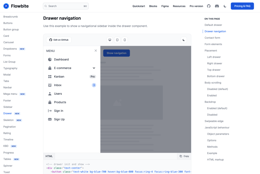
Drawer navigation (sidebar)
Use this example to show a navigational sidebar inside the drawer component.
Drawer contact form
Use this example to show a contact form inside the drawer component.

Drawer form elements
Use this example if you want to add form elements inside the drawer component including datepickers.

Drawer placement
Use the placement options to position the drawer component either on the top, right, bottom, or left side of the document page. This can be done using the data-drawer-placement="{top|right|bottom|left}" data attribute where the default value is left.
Learn more about drawer placement.
Swipeable edge
The drawer edge functionality allows you to show a small part of the drawer when it is not shown completely by applying the data-drawer-edge="{true|false}" data attribute.
In this example we also use the data-drawer-toggle="id" option to toggle the visibility of the drawer component by clicking on the edge part of the element.
Use the data-drawer-edge-offset="bottom-[*px]" data attribute where you can apply a class from Tailwind CSS to set the offset. Default value is bottom-[60px].
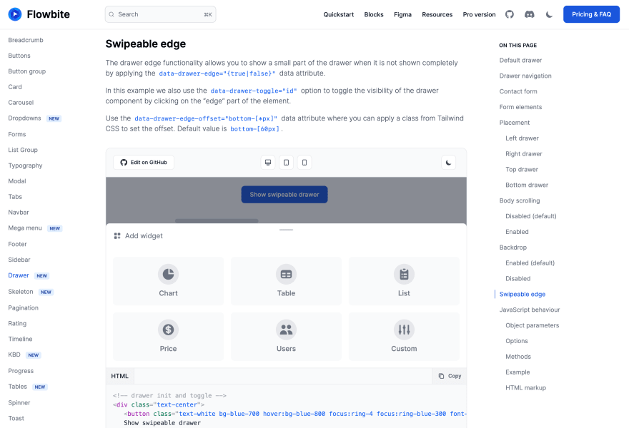
Learn more about swipeable edge drawer.
Dark mode
All of these drawer components have dark mode support if enabled via Tailwind CSS.
Original Link: https://dev.to/themesberg/show-dev-i-built-a-collection-of-open-source-drawer-components-for-tailwind-css-3m6e
Dev To
 An online community for sharing and discovering great ideas, having debates, and making friends
More About this Source Visit Dev To