
An Interest In:
Web News this Week
- April 20, 2024
- April 19, 2024
- April 18, 2024
- April 17, 2024
- April 16, 2024
- April 15, 2024
- April 14, 2024
Some of Our Sources
- BoingBoing
- Techcrunch
- Simplebits
- Web Designer Wall
- Joshua Blankenship
- The Logo Smith
- Smashing Apps
- Web Designer Depot
- Noupe
- Line 25
Help Webnuz
Referal links:
Searchable Data Table in Angular (NO Material) with SCSS, Useful Directives, JS methods, and Virtual Scroll
If you've taken on the use-case of a searchable or sortable data table in Angular, that avoids the restrictive styles of @angular/material by using the cdkTable under it, you've probably pulled out your hair as much as I have in frustration.
So, here's a way to create your own data table in Angular without MatTable OR cdkTable that's searchable, gorgeous, and can be configured (in terms of both data and style adjustments) from the component itself using some of Angular's most useful lower-level features like [style] and virtual scrolling. You can also make it completely reusable by other parent components!
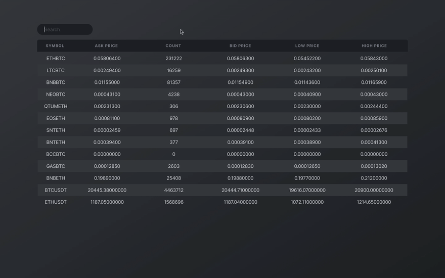
Here's what it will look like:
Note: you can add additional sorting capabilities by using JS' Array.sort() method; but it won't be covered here. You're likely set to figure it out easily, once you build the table outlined in this article though.
Skip Ahead
- Create the App
- Some Dependency Setup
- Utility Classes and Colors with @riapacheco/yutes
- Access Directives with CommonModule
- JSON Data Setup
- Generate a Data Table Component
- @riapacheco/yutes classes
- Enable the Consumption of JSON Data
- Add a Mock Data File and Access it with TypeScript's resolveJsonModule
- Import to Component via File Path
- Create and Structure the Table
- Populating Dynamic Cells
- Responsive Structuring with SCSS
- Fancy Basic Styling
- Component-Configurable Columns
- Add Flex-Basis Values to the Component
- Bind the Data with style.flex-basis
- Improving Performance with Virtual Scrolling
- Virtual Scroll Viewport
- Adding Search Capabilities with a Filter All Pipe
- Generate New Pipe and Apply Logic
- Add a Two-Way Bounded Input Field
- Result
Create the App
# Terminalng new custom-table-demo --skip testsWhen prompted:
# Terminal Response? Would you like to add Angular routing? (y/N) N# Terminal Response? Which stylesheet format would you like to use? CSS SCSS [ https://sass-lang.com/documentation/syntax#scss ] Sass [ https://sass-lang.com/documentation/syntax#the-indented-syntax ] Less [ http://lesscss.org ]Some Dependency Setup
Utility Classes and Colors with @riapacheco/yutes
To keep this post high-level, we'll borrow my @riapacheco/yutes package's utility classes (get it?) and access a seasonal stylesheet for colors only. We'll shape the table from scratch and add critical functionality without touching any other external libraries.
# Terminalnpm install @riapacheco/yutesAnd in your styles.scss file, add the following:
// styles.scss@import "~@riapacheco/yutes/main.scss"; // Strips webkit / default browser styles@import "~@riapacheco/yutes/season/two.scss"; // Access colorshtml,body { background-color: $midnight-dark; background-image: linear-gradient( to bottom right, $gunmetal-dark, $midnight-dark ); background-attachment: fixed; // fixes gradient to viewport color: $steel-regular; // font colors}Access Directives with CommonModule
Now we'll add the CommonModule to access directives. Add the following to your app.module.ts file:
// app.module.tsimport { AppComponent } from "./app.component";import { BrowserModule } from "@angular/platform-browser";// Add this import { CommonModule } from "@angular/common";import { NgModule } from "@angular/core";@NgModule({ declarations: [AppComponent], imports: [ BrowserModule, // and this CommonModule, ], providers: [], bootstrap: [AppComponent],})export class AppModule {}JSON Data Setup
Generate a Data Table Component
First, let's create a separate component so that our app-root acts as a wrapper. In your terminal, run the following:
ng g c components/data-tableOnce that's generated, replace the content in your app.component.html file with its selector and add a wrapper to make things easier on our eyes as we evolve the structure:
<!-- app.component.html --><div class="mx-auto-900px pt-5"> <app-data-table></app-data-table></div>@riapacheco/yutes classes
mx-auto-900pxsets the width of the container to the number indicated in the class (in pixels)- This shorthand class allows you to set a width anywhere from
1pxto3000px
- This shorthand class allows you to set a width anywhere from
pt-5adds5rem[rembeing a multiple of your base font-size] to the top of the container
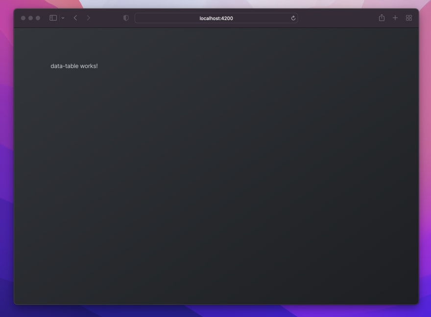
When you run ng serve this should appear in your browser:
Enable the Consumption of JSON Data
Since we want the table to handle a lot of data, we'll store some mock data in a local json file and import it into our component as though it were an external data source call.
Add a Mock Data File and Access it with TypeScript's resolveJsonModule
- Create a file called
data.jsonin your mainappfolder and populate it with this data (pulled from Binance's open API) - To enable the app to read the data, add
"resolveJsonModule": trueundercompilerOptionsin yourtsconfig.tsfile like this:
// tsconfig.json{ "compilerOptions": { // ... other options "resolveJsonModule": true }}Import to Component via File Path
Now we can import the data from its file path and assign it to an initialized array called cryptocurrencies. Add the following:
// data-table.component.tsimport { Component, OnInit } from "@angular/core";// import the file like this import * as data from "../../data.json";@Component({ selector: "app-data-table", templateUrl: "./data-table.component.html", styleUrls: ["./data-table.component.scss"],})export class DataTableComponent implements OnInit { // Assign like this cryptocurrencies: any = (data as any).default; constructor() {} ngOnInit(): void {}}Note: this is a great way to make an "instant" blog if you ever wanted to do that
Create and Structure the Table
Now we can create the actual table, and in a way that dynamically accepts the data we just imported. First, add the following to your template:
<!--data-table.component.html--><!-- ----------------------------- HEADER ROW ------------------------------ --><tr class="table-row header"> <th>Symbol</th> <th>Ask Price</th> <th>Count</th> <th>Bid Price</th> <th>Low Price</th> <th>High Price</th></tr><!-- ------------------------------ DATA ROWS ------------------------------ --><table> <tr class="table-row data"> </tr></table>Though the first header row (table-row header) isn't actually inside the the <table> element, our styling will ensure that they always align. We keep the header row outside of the table so that it doesn't scroll out of view when we restrict the container's height.
Populating Dynamic Cells
Now we can add the data dynamically for each row using Angular's *ngFor directive. Remember to ensure that the order of data types listed matches the headings we created earlier (there are 6 in total):
<!--data-table.component.html--><!-- ... code we added earlier --><!-- ------------------------------ DATA ROWS ------------------------------ --><table> <!-- add this --> <tr *ngFor="let crypto of cryptocurrencies" class="table-row data"> <td> {{ crypto.symbol | uppercase }} <!--Angular's `uppercase` pipe--> </td> <td> {{ crypto.askPrice }} </td> <td> {{ crypto.count }} </td> <td> {{ crypto.bidPrice }} </td> <td> {{ crypto.lowPrice}} </td> <td> {{ crypto.highPrice}} </td> </tr></table>If you run the app locally, you'll see that there's a lotta data (and it looks like a mess).

Responsive Structuring with SCSS
At first glance, we might want to structure the table by restricting cell widths in a way that uniformly aligns every header cell with those populated data cells below them.
The problem is that this restricts the width of the table overall and will prohibit it from filling the full area of whatever wrapper it's contained in.
Instead, we turn to flexbox aka my precious. In the app.component.scss file, we'll complete the following tasks:
- Ensure the width of the the overall table inherits the viewport
- Enable adjustments to "columns" from within the component itself
Add the following (read comments for more details):
// data-table.component.scss@import '~@riapacheco/yutes/season/two.scss';$column-spacing: 1rem; // For easier updating latertable { width: 100%; } // Expands the template's parent element/* -------------------------- STRUCTURAL PROPERTIES ------------------------- */// STYLES APPLIED TO BOTH TABLE-ROWStr { width: 100%; height: 2.5rem; // Emphasize the header row more display: flex; // Spread header row align-items: center; // WITHOUT losing vertical text centering // Enclosed Cells th, td { cursor: pointer; text-align: center; // Solves issue of growing into parent wrappers flex-grow: 1; flex-shrink: 1; width: 100%; // How the $column-spacing var we created acts as "column" spacing: math. margin-left: $column-spacing / 2; margin-right: $column-spacing / 2; &:first-child { margin-left: none; } // Removes left margin from very left column &:last-child { margin-right: none; } // Removes right margin from very right column }}The table is now taking shape!

Fancy Basic Styling
Now that we got the general structure out of the way, we'll:
- Differentiate the header row from the rest of the table
- We'll add a background color to every other row in our data rows
Add the following to the component's stylesheet:
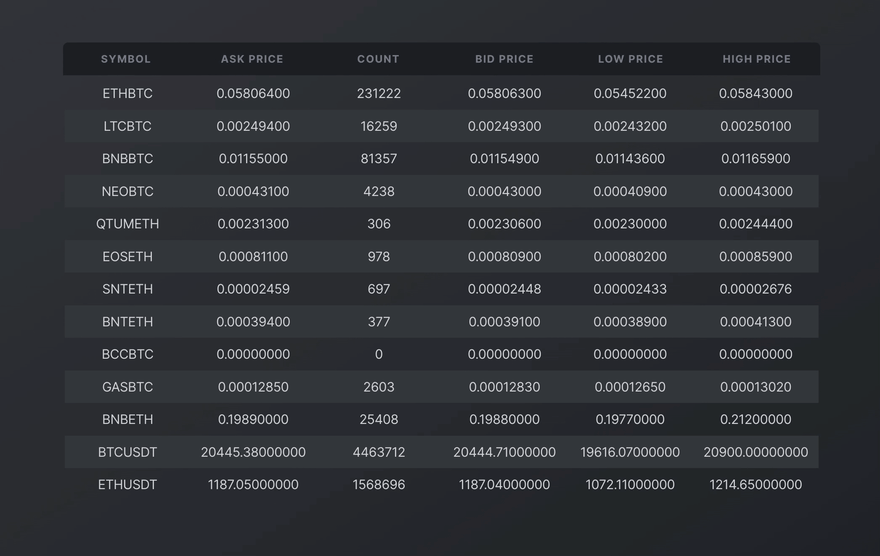
// data-table.component.scss@import '~@riapacheco/yutes/season/two.scss';$column-spacing: 1rem; // For easier updating latertable { width: 100%; } // Expands the template's parent element/* -------------------------- STRUCTURAL PROPERTIES ------------------------- */// STYLES APPLIED TO BOTH TABLE-ROWStr { // .. stuff added earlier}/* --------------------------- HEADER ROW STYLING --------------------------- */.table-row.header { background-color: $midnight-dark; // Adds a nice darker background border-radius: 6px 6px 0 0; // Rounds the top-left and top-right corners // Typical header styling font-size: 0.8rem; // Smaller and font-weight: 500; // less thick font text-transform: uppercase; // Uppercase and letter-spacing: 0.07rem; // spaced like a subheading color: $soot-grey-medium; // Subtle color}/* ---------------------------- DATA ROW STYLING ---------------------------- */.table-row.data { &:nth-child(even) { // Adds BG color to every other CHILD element background-color: $gunmetal-dark; }}Now run your app, and check it out!

Component-Configurable Columns
If you remember from earlier, we made sure to add two values to each cell: flex-grow:1 and flex-shrink:1. This means that each cell will grow or shrink, based on any stationary elements around it.
To effectively add a width to any one (or multiple) columns, we then simply need to add a flex-basis property to it with a value that accepts pretty much any measurement from % to px to rem. (though I'd advise on %).
Add Flex-Basis Values to the Component
Again, we're going to take advantage of how Angular binds data to a component with its [style.<property>] feature.
First, let's add variables that this can bind to from the component itself (further, this is how I usually add configuration for reusable components, where there's an @Input() decorator prefixed to this object.. but that's for another time):
// data-table.component.ts// .. other codeexport class DataTableComponent implements OnInit { cryptocurrencies: any = (data as any).default; searchText = ''; /* ------------------------ VIRTUAL SCROLL PROPERTIES ----------------------- */ itemSize = '2.5rem'; viewportHeightPx = 500; // add this /* ------------------------------ COLUMN WIDTHS ----------------------------- */ config: any = { columnWidth: { _1: 'auto', _2: 'auto', _3: 'auto', _4: 'auto', _5: 'auto', _6: 'auto', } } // .. other code}As with any object, you can access values with .<key>. So, to access the 'auto' string we stored here, we simply need to reference it in the template as config.columnWidth._1. I personally like to use text that makes sense in plain english to help others understand what's going on right away.
Bind the Data with [style.flex-basis]
Now we can add the these values to the template and any adjustments we want to make in the future can be done by changing that config variable in the component.
Add the [style.flex-basis] directive to the template like this:
<!--data-table.component.html--><!-- ----------------------------- HEADER ROW ------------------------------ --><tr class="table-row header"> <!-- add this --> <th [style.flex-basis]="config.columnWidth._1">Symbol</th> <th [style.flex-basis]="config.columnWidth._2">Ask Price</th> <th [style.flex-basis]="config.columnWidth._3">Count</th> <th [style.flex-basis]="config.columnWidth._4">Bid Price</th> <th [style.flex-basis]="config.columnWidth._5">Low Price</th> <th [style.flex-basis]="config.columnWidth._6">High Price</th></tr><!-- ------------------------------ DATA ROWS ------------------------------ --><table> <tr *ngFor="let crypto of cryptocurrencies" class="table-row data"> <!-- and add this --> <td [style.flex-basis]="config.columnWidth._1"> {{ crypto.symbol | uppercase }} </td> <td [style.flex-basis]="config.columnWidth._2"> {{ crypto.askPrice }} </td> <!-- continute adding them to each column after this -->Change the value of config.columnWidth._1 to '50%' and see what happens!
Improving Performance with Virtual Scrolling
One core tool we'll pull from Angular's CDK is is it's virtual scroll viewport. This creates a height-restricted view that only renders data that's visible in the viewport, which drastically improves performance.
Import the CDK package from Angular by running the following in your terminal:
npm install @angular/cdkAnd import the ScrollingModule to your app.module.ts file (and add it to the imports array):
// app.module.tsimport { AppComponent } from './app.component';import { BrowserModule } from '@angular/platform-browser';import { CommonModule } from '@angular/common';import { DataTableComponent } from './components/data-table/data-table.component';import { NgModule } from '@angular/core';// Import this import { ScrollingModule } from '@angular/cdk/scrolling';@NgModule({ declarations: [ AppComponent, DataTableComponent ], imports: [ BrowserModule, CommonModule, // and add this ScrollingModule ], providers: [], bootstrap: [AppComponent]})export class AppModule { }Virtual Scroll Viewport
Now we'll wrap the table-row data element with the <cdk-virtual-scroll-viewport> selector. For this to properly render, we add an [itemSize] value to the selector itself and specify a restricted height.
- The
itemSizerepresents what height the feature should expect of each row - To specify height, we can use Angular's handy
[style]directive. Both of these can bind values directly from the component.First, let's add those values to the component itself:
// data-table.component.ts// ... other codeexport class DataTableComponent implements OnInit { cryptocurrencies: any = (data as any).default; /* ------------------------ VIRTUAL SCROLL PROPERTIES ----------------------- */ itemSize = '2.5rem'; // Can accept pixels and ems too viewportHeightPx = 500; constructor() { } ngOnInit(): void { }}And apply them to the wrapping selector in the template:
<!-- ------------------------------ DATA ROWS ------------------------------ --><table> <!-- Add the viewport here with our bounded elements --> <cdk-virtual-scroll-viewport [itemSize]="itemSize" [style.height]="viewportHeightPx + 'px' "> <tr *ngFor="let crypto of cryptocurrencies" class="table-row data"> <!-- ... cell code --> </tr> </cdk-virtual-scroll-viewport></table>And to tell viewport what data it's reading, we'll replace our *ngFor="let crypto of cryptocurrencies" with *cdkVirtualFor="let crypto of cryptocurrencies". Now when running the app, we know that it only renders what's been scrolled into the viewport!
Adding Search Capabilities with a Filter All Pipe
You're likely familiar with Angular's pipe feature. If not, it's a handy way to transform data directly within template expressions. As an example, when we grabbed the symbol values from our data source earlier, we added | uppercase so that every instance it rendered ({{ crypto.symbol | uppercase }}) the string would be capitalized. However, we can also build our own, which is how we're going to add search capabilities to our table. Read more about pipes in Angular's official documentation.
Generate New Pipe and Apply Logic
To start, run the following in your terminal to generate a new pipe:
ng generate pipe pipes/filter-allThis generates a new pipes filter that contains a filter-all.pipe.ts file. In that file, add the following:
export class FilterAllPipe implements PipeTransform { transform(value: any, searchText: any): any { if (!searchText) { return value; } return value.filter((data: any) => this.matchValue(data, searchText)); } matchValue(data: any, value: any) { return Object.keys(data).map((key) => { return new RegExp(value, 'gi').test(data[key]); }).some(result => result); }}There's a lot going on here, but basically it accepts a value of any kind (our data) and searchText for us to apply to that data with a filter(). The filter calls a matchValue() function that returns the data we need by mapping through its Object.keys(), returning an instantiated regular expression which tests to see if the match we're looking for exists with .some(). To understand this more (in case I butchered it), ask the guy who posted this snippet on Stack Overflow: Daniel Caldera ;) [big shoutout!]
Now we can add this to our *cdkVirtualFor directive's expression like this:
<!--data-table.component.html--><!-- ... other code from earlier --><!-- ------------------------------ DATA ROWS ------------------------------ --><table> <cdk-virtual-scroll-viewport [itemSize]="itemSize" [style.height]="viewportHeightPx + 'px' "> <tr *cdkVirtualFor="let crypto of cryptocurrencies | filterAll:searchText" class="table-row data"> <td><!-- more code down here -->And add an empty string value to the searchText variable inside the component like this:
// data-table.component.ts// ... other codeexport class DataTableComponent implements OnInit { cryptocurrencies: any = (data as any).default; searchText = ''; // filterAll pipe// ... more codeTo test if this works, populate the searchText variable with a value that exists in the dataset, and it should return that value only. Try out searchText = 'BNBBTC'; and see what renders when you run your app locally.
Add a Two-Way Bounded Input Field
Instead of manually assigning values to searchText through the component itself. We can two-way bind an input field with Angular's [(ngModel)] feature. This creates a 2-way door that both accepts values from the template [.html file] to the component [.ts file] and pushes the value it receives back to the template simultaneously. To enable this feature, add the FormsModule to your app.module.ts file like this:
// app.module.ts// Import this module import { FormsModule } from '@angular/forms';@NgModule({ declarations: [ // .. other declarations ], imports: [ BrowserModule, CommonModule, ScrollingModule, // add this FormsModule, ], providers: [], bootstrap: [AppComponent]})export class AppModule { }We'll add some quick styling by adding the following to the bottom of the data-table.component.scss stylesheet:
// data-table.component.scss// ... everything we added earlier/* -------------------------------- CONTROLS -------------------------------- */// SEARCH FIELD.form-group { max-width: 180px; // overrides @riapacheco/yutes width (designed to fill any wrapper with width: 100%) margin-bottom: 1rem;}.search-input { // matches the style to our view background-color: $midnight-dark; color: $steel-regular; border-radius: 30px; padding-left: 1.5rem;}.search-input::placeholder { // changes color of placeholder text color: $soot-grey-dark;}Now you can add the new input field above the table like this:
<!--data-table.component.html--><!-- add Search field--><div class="form-group"> <!--Notice the new [(ngModel)] that references the `searchText` variable--> <input [(ngModel)]="searchText" placeholder="Search" class="search-input" type="text"></div><!-- ----------------------------- HEADER ROW ------------------------------ --><tr class="table-row header">Result
And here it is. You've created your own resizeable data-table (that can handle rendering a lot of data) with a searchable input field and configurable columns!
Take it a step further and have any parent access and use this child component by learning about it here.
Full code here.
Original Link: https://dev.to/riapacheco/searchable-data-table-in-angular-no-material-with-scss-useful-directives-js-methods-and-virtual-scroll-1ilh
Dev To
 An online community for sharing and discovering great ideas, having debates, and making friends
More About this Source Visit Dev To