
An Interest In:
Web News this Week
- April 20, 2024
- April 19, 2024
- April 18, 2024
- April 17, 2024
- April 16, 2024
- April 15, 2024
- April 14, 2024
Some of Our Sources
- BoingBoing
- Pearsonified
- Spoon Graphics
- Creative Curio
- Inspiredology
- Web Designer Depot
- Fudge Graphics
- Android Dissected
- Android Headlines
- Daily Now
Help Webnuz
Referal links:
How to build a responsive header component with Tailwind CSS
Today I would like to show you how you can build a responsive header component using Tailwind CSS and Flowbite including a hamburger icon which when it is clicked it will also show a menu on a mobile device.
Tailwind CSS is the most popular open source utility-first CSS framework that helps you build websites much faster without having to leave your HTML.
Flowbite is one of the most popular open source component libraries built on top of the Tailwind CSS framework featuring navbars, modals, dropdowns, carousel sliders, buttons, and more.
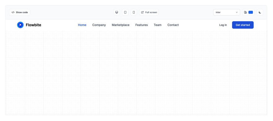
Here's how the header component will look on desktop and mobile view after we have built it:

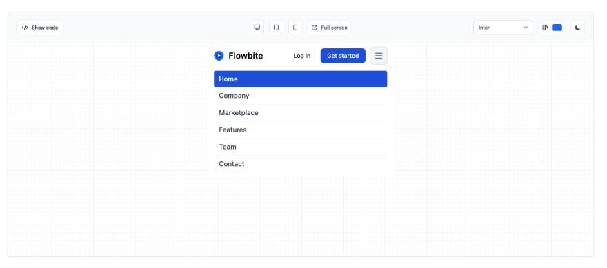
Here's the mobile view:

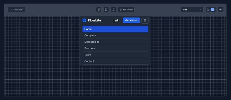
We will even code the classes for dark mode:

Without further ado, let's get started!
Install Tailwind CSS and Flowbite
For this project we will need to have Tailwind CSS installed on your local project.
For that you need to follow the official installation guide and install it via NPM:
npm install -D tailwindcssnpx tailwindcss initNow you need to configure the template paths:
module.exports = { content: ["./src/**/*.{html,js}"], theme: { extend: {}, }, plugins: [],}Next create a CSS file inside the src/input.css folder and import the Tailwind directives:
@tailwind base;@tailwind components;@tailwind utilities;Use the CLI tool to watch for changes and compile the CSS code:
npx tailwindcss -i ./src/input.css -o ./dist/output.css --watchInstall Flowbite
You will need to install Flowbite to make sure that the menu toggle will work. Follow the Flowbite quickstart guide and follow the next steps:
Install Flowbite via NPM:
npm i flowbiteRequire Flowbite as a plugin:
module.exports = { plugins: [ require('flowbite/plugin') ]}Configure the template path to the node_modules/ folder:
module.exports = { content: [ "./node_modules/flowbite/**/*.js" ]}Finally, include the JavaScript file to make interactive elements work:
<script src="../path/to/flowbite/dist/flowbite.js"></script>Optionally, you can also just use a CDN:
<script src="https://unpkg.com/[email protected]/dist/flowbite.js"></script>Awesome! Now that you have a working Tailwind CSS + Flowbite project it will be easy to start building the header component.
Building the header component in Tailwind CSS
First of all we will need to set up the main HTML markup. We will have a logo, a list of menu items and a few CTA buttons on the right side.
We'll use both the <header> and <nav> HTML elements:
<header> <nav> <div> <a href="#"> <img src="https://flowbite.com/docs/images/logo.svg" alt="Flowbite Logo" /> <span>Flowbite</span> </a> <div> <a href="#">Log in</a> <a href="#">Get started</a> </div> <div> <li> <a href="#" aria-current="page">Home</a> </li> <li> <a href="#">Company</a> </li> <li> <a href="#">Marketplace</a> </li> <li> <a href="#">Features</a> </li> <li> <a href="#">Team</a> </li> <li> <a href="#">Contact</a> </li> </ul> </div> </div> </nav></header>Pretty nice a clean markup-wise, however, we need to start styling everything up.
Let's use the styles from the Tailwind CSS Header component from the Flowbite collection:
<header> <nav class="bg-white border-gray-200 px-4 lg:px-6 py-2.5 dark:bg-gray-800"> <div class="flex flex-wrap justify-between items-center mx-auto max-w-screen-xl"> <a href="https://flowbite.com" class="flex items-center"> <img src="https://flowbite.com/docs/images/logo.svg" class="mr-3 h-6 sm:h-9" alt="Flowbite Logo" /> <span class="self-center text-xl font-semibold whitespace-nowrap dark:text-white">Flowbite</span> </a> <div class="flex items-center lg:order-2"> <a href="#" class="text-gray-800 dark:text-white hover:bg-gray-50 focus:ring-4 focus:ring-gray-300 font-medium rounded-lg text-sm px-4 lg:px-5 py-2 lg:py-2.5 mr-2 dark:hover:bg-gray-700 focus:outline-none dark:focus:ring-gray-800">Log in</a> <a href="#" class="text-white bg-primary-700 hover:bg-primary-800 focus:ring-4 focus:ring-primary-300 font-medium rounded-lg text-sm px-4 lg:px-5 py-2 lg:py-2.5 mr-2 dark:bg-primary-600 dark:hover:bg-primary-700 focus:outline-none dark:focus:ring-primary-800">Get started</a> </div> <div class="hidden justify-between items-center w-full lg:flex lg:w-auto lg:order-1" id="mobile-menu"> <ul class="flex flex-col mt-4 font-medium lg:flex-row lg:space-x-8 lg:mt-0"> <li> <a href="#" class="block py-2 pr-4 pl-3 text-white rounded bg-primary-700 lg:bg-transparent lg:text-primary-700 lg:p-0 dark:text-white" aria-current="page">Home</a> </li> <li> <a href="#" class="block py-2 pr-4 pl-3 text-gray-700 border-b border-gray-100 hover:bg-gray-50 lg:hover:bg-transparent lg:border-0 lg:hover:text-primary-700 lg:p-0 dark:text-gray-400 lg:dark:hover:text-white dark:hover:bg-gray-700 dark:hover:text-white lg:dark:hover:bg-transparent dark:border-gray-700">Company</a> </li> <li> <a href="#" class="block py-2 pr-4 pl-3 text-gray-700 border-b border-gray-100 hover:bg-gray-50 lg:hover:bg-transparent lg:border-0 lg:hover:text-primary-700 lg:p-0 dark:text-gray-400 lg:dark:hover:text-white dark:hover:bg-gray-700 dark:hover:text-white lg:dark:hover:bg-transparent dark:border-gray-700">Marketplace</a> </li> <li> <a href="#" class="block py-2 pr-4 pl-3 text-gray-700 border-b border-gray-100 hover:bg-gray-50 lg:hover:bg-transparent lg:border-0 lg:hover:text-primary-700 lg:p-0 dark:text-gray-400 lg:dark:hover:text-white dark:hover:bg-gray-700 dark:hover:text-white lg:dark:hover:bg-transparent dark:border-gray-700">Features</a> </li> <li> <a href="#" class="block py-2 pr-4 pl-3 text-gray-700 border-b border-gray-100 hover:bg-gray-50 lg:hover:bg-transparent lg:border-0 lg:hover:text-primary-700 lg:p-0 dark:text-gray-400 lg:dark:hover:text-white dark:hover:bg-gray-700 dark:hover:text-white lg:dark:hover:bg-transparent dark:border-gray-700">Team</a> </li> <li> <a href="#" class="block py-2 pr-4 pl-3 text-gray-700 border-b border-gray-100 hover:bg-gray-50 lg:hover:bg-transparent lg:border-0 lg:hover:text-primary-700 lg:p-0 dark:text-gray-400 lg:dark:hover:text-white dark:hover:bg-gray-700 dark:hover:text-white lg:dark:hover:bg-transparent dark:border-gray-700">Contact</a> </li> </ul> </div> </div> </nav></header>Now let's also add a hamburger icon and use the data-collapse-toggle data attribute from the collapse functionality from the core Flowbite JS library:
<button data-collapse-toggle="mobile-menu" type="button" class="inline-flex items-center p-2 ml-1 text-sm text-gray-500 rounded-lg lg:hidden hover:bg-gray-100 focus:outline-none focus:ring-2 focus:ring-gray-200 dark:text-gray-400 dark:hover:bg-gray-700 dark:focus:ring-gray-600" aria-controls="mobile-menu" aria-expanded="false"> <span class="sr-only">Open main menu</span> <svg class="w-6 h-6" fill="currentColor" viewBox="0 0 20 20" xmlns="http://www.w3.org/2000/svg"><path fill-rule="evenodd" d="M3 5a1 1 0 011-1h12a1 1 0 110 2H4a1 1 0 01-1-1zM3 10a1 1 0 011-1h12a1 1 0 110 2H4a1 1 0 01-1-1zM3 15a1 1 0 011-1h12a1 1 0 110 2H4a1 1 0 01-1-1z" clip-rule="evenodd"></path></svg> <svg class="hidden w-6 h-6" fill="currentColor" viewBox="0 0 20 20" xmlns="http://www.w3.org/2000/svg"><path fill-rule="evenodd" d="M4.293 4.293a1 1 0 011.414 0L10 8.586l4.293-4.293a1 1 0 111.414 1.414L11.414 10l4.293 4.293a1 1 0 01-1.414 1.414L10 11.414l-4.293 4.293a1 1 0 01-1.414-1.414L8.586 10 4.293 5.707a1 1 0 010-1.414z" clip-rule="evenodd"></path></svg></button>This will be added just after the two CTA buttons and we will only show it on mobile devices.
Here's the final HTML:
<header> <nav class="bg-white border-gray-200 px-4 lg:px-6 py-2.5 dark:bg-gray-800"> <div class="flex flex-wrap justify-between items-center mx-auto max-w-screen-xl"> <a href="https://flowbite.com" class="flex items-center"> <img src="https://flowbite.com/docs/images/logo.svg" class="mr-3 h-6 sm:h-9" alt="Flowbite Logo" /> <span class="self-center text-xl font-semibold whitespace-nowrap dark:text-white">Flowbite</span> </a> <div class="flex items-center lg:order-2"> <a href="#" class="text-gray-800 dark:text-white hover:bg-gray-50 focus:ring-4 focus:ring-gray-300 font-medium rounded-lg text-sm px-4 lg:px-5 py-2 lg:py-2.5 mr-2 dark:hover:bg-gray-700 focus:outline-none dark:focus:ring-gray-800">Log in</a> <a href="#" class="text-white bg-primary-700 hover:bg-primary-800 focus:ring-4 focus:ring-primary-300 font-medium rounded-lg text-sm px-4 lg:px-5 py-2 lg:py-2.5 mr-2 dark:bg-primary-600 dark:hover:bg-primary-700 focus:outline-none dark:focus:ring-primary-800">Get started</a> <button data-collapse-toggle="mobile-menu-2" type="button" class="inline-flex items-center p-2 ml-1 text-sm text-gray-500 rounded-lg lg:hidden hover:bg-gray-100 focus:outline-none focus:ring-2 focus:ring-gray-200 dark:text-gray-400 dark:hover:bg-gray-700 dark:focus:ring-gray-600" aria-controls="mobile-menu-2" aria-expanded="false"> <span class="sr-only">Open main menu</span> <svg class="w-6 h-6" fill="currentColor" viewBox="0 0 20 20" xmlns="http://www.w3.org/2000/svg"><path fill-rule="evenodd" d="M3 5a1 1 0 011-1h12a1 1 0 110 2H4a1 1 0 01-1-1zM3 10a1 1 0 011-1h12a1 1 0 110 2H4a1 1 0 01-1-1zM3 15a1 1 0 011-1h12a1 1 0 110 2H4a1 1 0 01-1-1z" clip-rule="evenodd"></path></svg> <svg class="hidden w-6 h-6" fill="currentColor" viewBox="0 0 20 20" xmlns="http://www.w3.org/2000/svg"><path fill-rule="evenodd" d="M4.293 4.293a1 1 0 011.414 0L10 8.586l4.293-4.293a1 1 0 111.414 1.414L11.414 10l4.293 4.293a1 1 0 01-1.414 1.414L10 11.414l-4.293 4.293a1 1 0 01-1.414-1.414L8.586 10 4.293 5.707a1 1 0 010-1.414z" clip-rule="evenodd"></path></svg> </button> </div> <div class="hidden justify-between items-center w-full lg:flex lg:w-auto lg:order-1" id="mobile-menu-2"> <ul class="flex flex-col mt-4 font-medium lg:flex-row lg:space-x-8 lg:mt-0"> <li> <a href="#" class="block py-2 pr-4 pl-3 text-white rounded bg-primary-700 lg:bg-transparent lg:text-primary-700 lg:p-0 dark:text-white" aria-current="page">Home</a> </li> <li> <a href="#" class="block py-2 pr-4 pl-3 text-gray-700 border-b border-gray-100 hover:bg-gray-50 lg:hover:bg-transparent lg:border-0 lg:hover:text-primary-700 lg:p-0 dark:text-gray-400 lg:dark:hover:text-white dark:hover:bg-gray-700 dark:hover:text-white lg:dark:hover:bg-transparent dark:border-gray-700">Company</a> </li> <li> <a href="#" class="block py-2 pr-4 pl-3 text-gray-700 border-b border-gray-100 hover:bg-gray-50 lg:hover:bg-transparent lg:border-0 lg:hover:text-primary-700 lg:p-0 dark:text-gray-400 lg:dark:hover:text-white dark:hover:bg-gray-700 dark:hover:text-white lg:dark:hover:bg-transparent dark:border-gray-700">Marketplace</a> </li> <li> <a href="#" class="block py-2 pr-4 pl-3 text-gray-700 border-b border-gray-100 hover:bg-gray-50 lg:hover:bg-transparent lg:border-0 lg:hover:text-primary-700 lg:p-0 dark:text-gray-400 lg:dark:hover:text-white dark:hover:bg-gray-700 dark:hover:text-white lg:dark:hover:bg-transparent dark:border-gray-700">Features</a> </li> <li> <a href="#" class="block py-2 pr-4 pl-3 text-gray-700 border-b border-gray-100 hover:bg-gray-50 lg:hover:bg-transparent lg:border-0 lg:hover:text-primary-700 lg:p-0 dark:text-gray-400 lg:dark:hover:text-white dark:hover:bg-gray-700 dark:hover:text-white lg:dark:hover:bg-transparent dark:border-gray-700">Team</a> </li> <li> <a href="#" class="block py-2 pr-4 pl-3 text-gray-700 border-b border-gray-100 hover:bg-gray-50 lg:hover:bg-transparent lg:border-0 lg:hover:text-primary-700 lg:p-0 dark:text-gray-400 lg:dark:hover:text-white dark:hover:bg-gray-700 dark:hover:text-white lg:dark:hover:bg-transparent dark:border-gray-700">Contact</a> </li> </ul> </div> </div> </nav></header>And here's the final result:
Flowbite Blocks
What if I told you that you don't have to code all these things from the ground up? You can take a look at the Flowbite Library and Flowbite Blocks to use both components and website sections and build your projects even faster with Tailwind CSS.
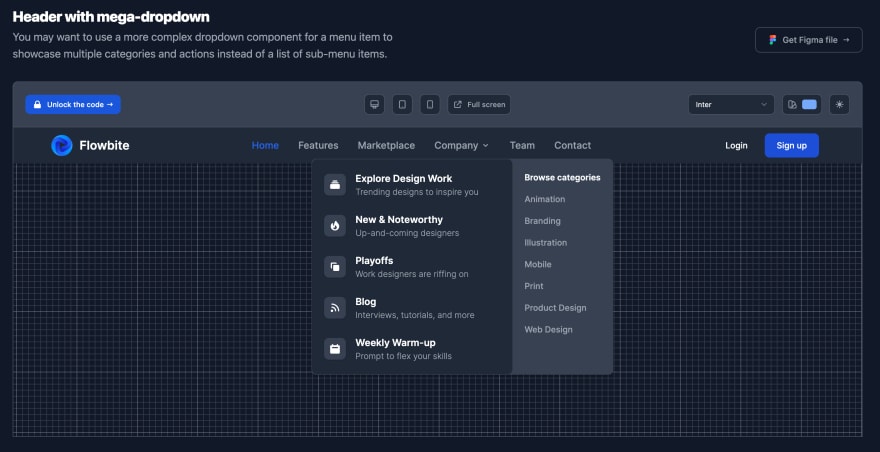
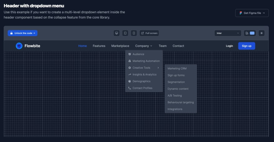
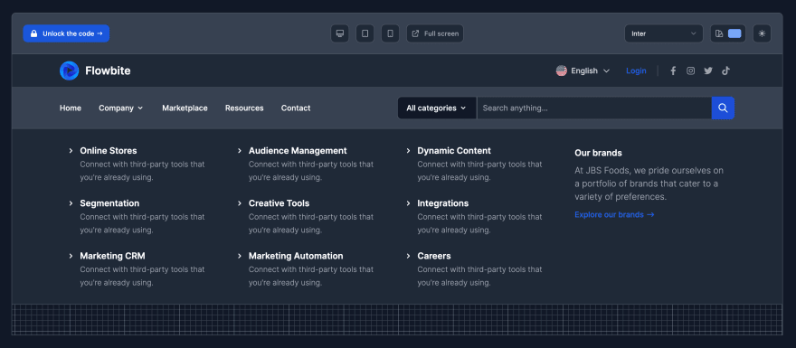
Here are a few examples of more advanced header components from the Flowbite Blocks collection:
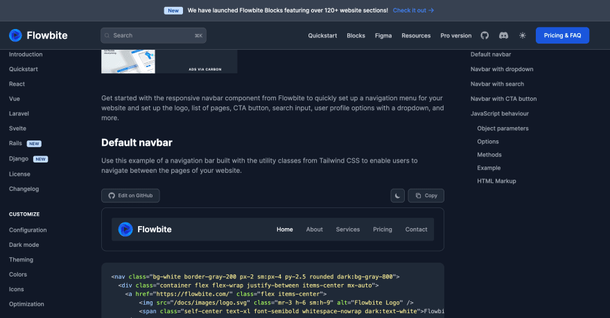
Flowbite Library
You can also check out a library of hundreds of open source Tailwind CSS component such as dropdowns, modals, navbars, and more.
Original Link: https://dev.to/themesberg/how-to-build-a-responsive-header-component-with-tailwind-css-2mae
Dev To
 An online community for sharing and discovering great ideas, having debates, and making friends
More About this Source Visit Dev To