
An Interest In:
Web News this Week
- April 19, 2024
- April 18, 2024
- April 17, 2024
- April 16, 2024
- April 15, 2024
- April 14, 2024
- April 13, 2024
Some of Our Sources
- Technology Review
- Team Treehouse
- Smashing Magazine
- Abduzeedo
- Vandelay Design
- You The Designer
- Creative Curio
- Reencoded
- CSS Globe
- Specky Boy
Help Webnuz
Referal links:
CSS Logos: GitHub logo
This one was requested during the previous series. And I put it on my list but dreaded creating it.
The GitHub logo contains Octocat, their mascot, and it is not an easy shape to re-create .

Analysing the logo
The logo is made up of a round shape containing a cutout Octocat.
The Octocat itself is the tricky part. Let's take it section by section to divide it up a bit more.
- Head: The head is the more straightforward shape as it's a rounded rectangle, the ears are pretty tricky, but I'll show you a trick for that :)
- Body: The body is again a cylinder shape but has some weird rounded edges that are pretty difficult to create
- Tail: By far the most challenging part as it's a snake kind of flow. I didn't get this perfectly right.
Alright, let's get started in recreating this fantastic but challenging logo.
CSS GitHub logo
Note: I'll be using SCSS throughout this article
Let's start with the HTML structure first. As this is quite a complex shape, we need some extra elements to help us.
<div class="github"> <div class="tail"> <div class="tip"></div> </div> <div class="head"> <div class="ear ear-left"></div> <div class="ear ear-right"></div> </div> <div class="body"> <div class="bottom"></div> </div></div>I tried to use as few elements as possible to challenge myself.
I then defined the root variables and decided on a size and the two colors.
:root { --size: 50vmin; --bg: black; --logo: white;}Then let's create the main wrapper, a round ball.
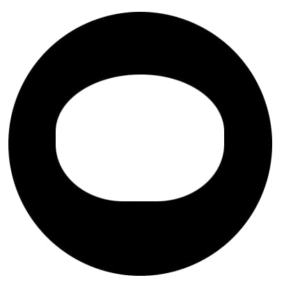
.github { width: var(--size); aspect-ratio: 1; background: var(--bg); border-radius: 50%; position: relative; display: grid; place-items: center;}Then let's create the head as it's an excellent shape to base everything on.
.head { width: 64%; height: 48%; background: var(--logo); position: absolute; top: 24%; border-radius: 50% 49% 40% 40% / 45% 45% 45% 45%;}I use the double border-radius solution. This makes a perfect use case for this odd shape.
So far, we should have the following shape.
Let's move on to the ears. As mentioned, these are quite an odd shape. They are rounded triangles but with pointy ends.
That is generally impossible to create in CSS.
However, by rotating a rounded rectangle, we can achieve the left side of one ear. We can then use an additional before element to round the right side.
We use the same code for the other ear but use scaleX(-1) to rotate it.
.ear { position: absolute; background: var(--logo); border-radius: 0% 56% 20% 80%; top: -2%; width: 32%; height: 40%; &-left:before, &-right:before { content: ''; position: absolute; background: var(--logo); border-radius: 50%; width: 62%; height: 15%; transform: rotate(4deg); top: -4%; } &-left { left: 4%; transform: rotate(16deg); } &-right { right: 4%; transform: rotate(345deg) scaleX(-1); }}In the following image, you can see the odd size of one ear in red and the white overlay that makes it rounded again.

Then the body is up. The basic shape is relatively easy as we can use a rounded rectangle.
.body { background: var(--logo); width: 25%; height: 35%; bottom: -4%; position: absolute; border-radius: 34%;}However, now we miss the bottom rounded edges.
To achieve this, we'll use the bottom div to add a wider section, which is a rectangle shape.
.bottom { position: absolute; background: var(--logo); width: 130%; height: 20%; bottom: 10%; left: -15%;}Then we use the main body :before and :after to add ellipsis shapes to cut out the rounding.
.body { &:before, &:after { content: ''; position: absolute; width: 30%; height: 30%; background: var(--bg); bottom: 18%; border-radius: 50%; } &:before { left: -32%; transform: rotate(327deg); z-index: 1; } &:after { border-radius: 50%; right: -32%; transform: rotate(33deg); }}In the following image, I colored those shapes red to see how they work.

And then the most tricky part, the tail!
This is the most challenging part to create, and I decided to split it into three sections.
- The central part that's attached to the body
- The corner part which skews different
- And the tip at the end
I based these on ellipses shape to make everything round.
Then I added pseudo-elements to "remove" certain parts by giving them the background color.
.tail { border-radius: 50%; position: absolute; width: 22%; height: 13%; background: var(--logo); bottom: 14%; left: 21%; &:before, &:after { content: ''; position: absolute; border-radius: 50%; } &:before { width: 100%; height: 100%; bottom: 64%; left: 10%; background: var(--bg); transform: rotate(337deg); } &:after { width: 19%; height: 52%; transform: rotate(327deg); bottom: 13%; left: 2%; background: var(--logo); } .tip { width: 36%; height: 110%; position: absolute; background: var(--logo); border-radius: 50%; left: -25%; top: -35%; transform: rotate(322deg); &:before, &:after { content: ''; position: absolute; border-radius: 50%; } &:before { width: 43%; height: 41%; background: var(--logo); transform: rotate(325deg); top: -9%; left: 35%; } &:after { width: 45%; height: 103%; background: var(--bg); top: -6%; left: -6%; } }}In this example, you can see the tail sections in different colors and the cutout shapes in red.

The image above shows the elements used to create the tail. Let's reference the parts.
aqua: The central tail partwhite: Connecting part to round the side of the tailpurple: Middle part of the tailblue: Tip of the tailred: Cutout parts (These are invisible)
And that's it!
Not simple, but a great challenge to recreate this logo. It contains many complex shapes.
You can view the result in this CodePen.
Thank you for reading, and let's connect!
Thank you for reading my blog. Feel free to subscribe to my email newsletter and connect on Facebook or Twitter
Original Link: https://dev.to/dailydevtips1/css-logos-github-logo-2j80
Dev To
 An online community for sharing and discovering great ideas, having debates, and making friends
More About this Source Visit Dev To