
An Interest In:
Web News this Week
- April 2, 2024
- April 1, 2024
- March 31, 2024
- March 30, 2024
- March 29, 2024
- March 28, 2024
- March 27, 2024
Some of Our Sources
- Slashdot
- Web Designer Wall
- Creative Curio
- FanExtra - PSD
- Crazy Leaf Design
- Reencoded
- Specky Boy
- Codrops
- Dev To
- TechPowerUp
Help Webnuz
Referal links:
Building a Scatter Plot in JavaScript
With data everywhere around us, it is imperative to know how to quickly create visualizations that help reveal trends and patterns in it. Today, lets learn how to build a scatter chart in just a few lines of simple JavaScript code!
Scatter charts, or scatter plots, are designed to identify a correlation between typically two variables. In such graphics, the data is visualized as a set of points usually displayed as markers. The position of each marker indicates the values of the variables along the horizontal and vertical axes.
In this tutorial, we will be visualizing international and domestic sales of the 1000 highest-grossing Hollywood movies as of January 2022. So, get your popcorn and start watching the JS scatter chart development!
Creating a Scatter Chart with JavaScript
Building interactive scatter charts from scratch can be difficult and time-consuming. But it is not a problem at all if you use JavaScript the right way.
Generally speaking, there are four basic steps you need to take to get a JS-based scatter chart up and running. Here they are.
1. Create a basic HTML page with a container
First of all, we need a web page with a container where our future scatter chart will be displayed.
Create an HTML file (or feel free to open an existing one of your own). Include a block-level element, provide it with a unique id that will be referenced later, and set its width and height. Heres a basic example of how all this can look:
<html> <head> <title>JavaScript Scatter Chart</title> <style type="text/css"> html, body, #container { width: 100%; height: 100%; margin: 0; padding: 0; } </style> </head> <body> <div id="container"></div> </body></html>As you see, weve got a very basic HTML page with a <div> element whose id is set as container and both width and height are 100% so that the JavaScript scatter chart is displayed over the entire screen (these values can be specified as per preference and requirement).
2. Include the necessary scripts
Second, include all the scripts needed for creating the plot in the <head> section of the HTML page.
To build this scatter chart, lets use AnyChart JS Charts. It is a very flexible JavaScript charting library with extensive documentation, a lot of readymade JS chart examples, and integration templates for many popular tech stacks.
The AnyChart JS charting library is modular, and its Base module will be more than enough in this case. The data we will visualize are stored in a JSON file, and the Data Adapter script will let us load it from there in a straightforward manner.
So, we only need to reference these two JS files.
<html> <head> <title>JavaScript Scatter Chart</title> <script src="https://cdn.anychart.com/releases/8.11.0/js/anychart-base.min.js"></script> <script src="https://cdn.anychart.com/releases/8.11.0/js/anychart-data-adapter.min.js"></script> <style type="text/css"> html, body, #container { width: 100%; height: 100%; margin: 0; padding: 0; } </style> </head> <body> <div id="container"></div> <script> // This is the place for the entire JS scatter chart code. </script> </body></html>3. Connect the data
Third, load the data you want to represent.
In this tutorial, we will use the scatter charting technique to visualize data from the Top 1000 Highest Grossing Movies dataset on Kaggle. I took the sales figures along with the titles of the movies and put them all in a JSON file.
AnyChart supports multiple ways to load data to charts. When it comes to data in a JSON file, for example, it is easy to add it using the loadJsonFile() method:
anychart.data.loadJsonFile( "https://gist.githubusercontent.com/shacheeswadia/dceaadd5fb4ea27cd9975ff39e9f98f4/raw/6baac571527d9b13e397cfb3d982d7942246dcc0/scatterPlotData.json", function(data) { // The main scatter plot visualization code will be here. });4. Write the visualization code
Now, lets get to the main part of having an interactive JS scatter chart appear on our web page. Actually, it will only take a few lines of straightforward code.
Add the anychart.onDocumentReady() function that will enclose all the scatter plotting JavaScript code, making sure that the page is fully loaded before the visualization is executed. Then load the data the way described in the previous step.
anychart.onDocumentReady(function () { anychart.data.loadJsonFile( "https://gist.githubusercontent.com/shacheeswadia/dceaadd5fb4ea27cd9975ff39e9f98f4/raw/6baac571527d9b13e397cfb3d982d7942246dcc0/scatterPlotData.json", function (data) { // The following JS code comes here. } );});Next, create a scatter chart instance (using the built-in scatter() function) and define markers (there are various options for the marker type, but lets adhere to the classic circle shape).
let chart = anychart.scatter();let marker = chart.marker(data);marker.type("circle").size(2);It is important to specify what kind of values are plotted along each axis. So, lets set the titles for both:
chart.yAxis().title("International sales ($ in millions)");chart.xAxis().title("Domestic sales ($ in millions)");Similarly, lets also title the entire data visualization:
chart.title("Top 1000 Highest Grossing Hollywood Movies: Domestic vs. International Sales");Now, simply reference the containers id and command to draw the chart.
chart.container("container");chart.draw();Thats it! A beautiful, fully functional, interactive scatter chart is created with just these few lines of JavaScript code and can be embedded as is into any web page or app!
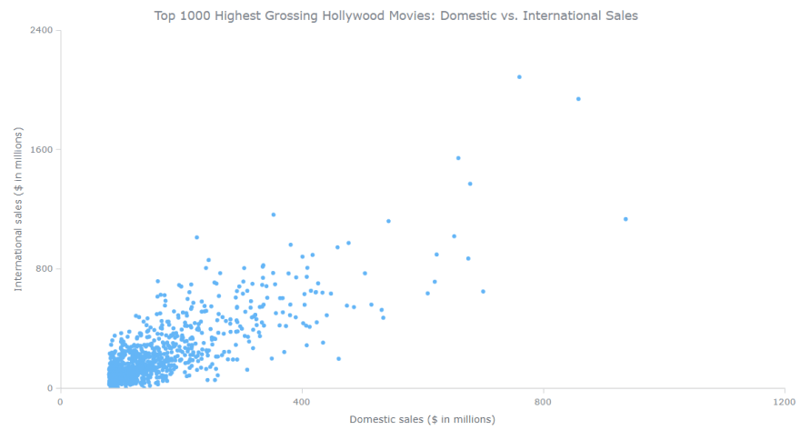
The initial version is available on AnyChart Playground. We can see that there is a definite correlation between domestic and international sales, but there are some outliers as well.
JS Scatter Chart Customization
A basic scatter chart is ready. Now, lets see how we can make it more informative and aesthetically better.
A. Improve the tooltip
B. Modify the scale
C. Add grid lines
D. Aesthetic changes
FOR A WALKTHROUGH OF THESE JS SCATTER CHART CUSTOMIZATIONS, CONTINUE READING HERE.
Original Link: https://dev.to/andreykh1985/scatter-plot-in-javascript-32h8
Dev To
More About this Source Visit Dev To