
An Interest In:
Web News this Week
- April 2, 2024
- April 1, 2024
- March 31, 2024
- March 30, 2024
- March 29, 2024
- March 28, 2024
- March 27, 2024
Some of Our Sources
- Simplebits
- TutsPlus - Code
- Just Creative
- Pearsonified
- Smashing Apps
- Vandelay Design
- FanExtra - PSD
- CSS Globe
- Daily Now
- Dev To
Help Webnuz
Referal links:
Custom OTP input component with VueJS
Sometimes we may not be able to find the components we require to build our projects on the NPM package manager, and sometimes we may find one that does not work either on production or even during development.
Here is when an expertise on building your very own component comes into play.
In the very short tutorial, I would be going through how to build your very own custom VueJS OTP input component with ease.
Requirement
- VS Code editor
To build this, we would first have to set up our project. In this tutorial, i would be using
npx -p @vue/cli vue create my-otp-project
to set up the vue project, selecting vue 2 as my preferred option.
After the project has been setup correctly, we then access the folder of our already initialized project with our vscode editor.

We locate the App.vue file and open it. Remove the content of the <div id="app">, that is were the OTPcomponent would be added.

Then we create a new component file with the name OTPInput.vue. this is were our code is going to be in.
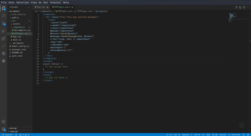
src/components/OTPInput.vue
<template> <div> <!-- Vue template code here --> </div></template><script>export default { // Vue script here}</script><style> /* Otp css here */</style>Moving to the template section of the component, we add the snippet below.
<div class="flex flex-row justify-between"> <input :style="style" v-model="inputs[idx]" :class="inputClass" @keyup="inputFocus" @focus="check($event)" @change="handleChange(idx, $event)" v-for="(inp, idx) in inputCount" :key="idx" :tabindex="idx" maxlength="1" autocomplete="off" /></div>For those who are familia with tailwind css, the flex flex-row justify-between would be a familia concept but to those who are not familia with it, you need not to worry because these classes would be added to our <style> section of the component manually.
Normally, OTPs' are a group of inputs field which their collective values are regarded as one and takes on one input per input field, so we try to implement this feature by
- using a
v-forto generate multiple input fields. - setting
maxlengthinput attribute to1to prevent more than one character per field - setting
autocompleteinput attribute tooffto prevent auto-completion which is not a feature of the OTP input - creating event handlers like
@keyup,@focus,@change.
The we move to the script section of the component. As we had done before, we add the snippet below to the <script> section
export default { props: { inputCount: { type: Number, default: 4, }, inputClass: String, dimension: { type: String, default: "30px", }, value: [String, Number, Object], }, data() { /* state properties */ } computed: { /* computed properties */ } watch: { /* watched properties */ } methods: { /* methods properties */ }}The props that this component would accept are inputCount which refers to the number of OTP input fields, inputClass which are extra styling for the fields, the dimension i.e the size of each input field and the value which is the literal value held by the OTP
export default { ... computed: { style() { return ` width: ${this.dimension}; height: ${this.dimension}; text-align: center; `; }, }, data() { /* state properties */ } watch: { /* watched properties */ } methods: { /* methods properties */ }}The computed property handles generating style for the dimensions, which is directly added to the input.
export default { ... data() { return { inputs: Array(this.inputCount), currentKey: 0, }; }, watch: { /* watched properties */ } methods: { /* methods properties */ }}the data property contains the state of this component. It holds and Array with length of the inputCount added by via the props and the currentKey which is the current position of the cursor on the fields.
export default { ... watch: { value() { this.inputs = this.value.split(""); }, }, methods: { /* methods properties */ }}We watch the value props for any changes externally so the component can be updated too.
export default { ... methods: { handleChange(key, event) { this.inputs[key] = event.target.value; }, getChildren(event) { return event.target.parentElement.children; }, check(event) { const inputs = this.getChildren(event); if (inputs[this.currentKey]){ inputs[this.currentKey].focus(); } }, inputFocus(event) { const data = this.inputs.join(""); const inputs = this.getChildren(event); this.$emit("input", data); if (data.length === this.inputCount) { this.$emit("completed", data); } if (event.key === "Delete" || event.key === "Backspace") { this.currentKey--; if (this.currentKey <= 0) { this.currentKey = 0; } if (inputs[this.currentKey]) { inputs[this.currentKey].focus(); } } else { this.currentKey++; if (this.currentKey >= this.inputCount) { this.currentKey = this.inputCount; } if (inputs[this.currentKey]) { inputs[this.currentKey].focus(); } } }, },}The methods used includes:
handleChange: This is the handler for the
onchangeevent on the input component. On change, the value of the input field is stored in thethis.inputsstate at the specified positionkey.getChildren: This method gets the NodeList of input fields form the event parameter.
check: This is the
onfocusevent handler. It calls the.focus()method on the input field specified using thethis.currentKeycontent. Since the current key holds the current position of the cursor, it is easier to just use it the know which input to focus on.
It also prevents focusing on non-existing input fields too.inputFocus: This is the handler for the
onkeyupevent. The OTP input are supposed to move to the next input field immediately after the character has been entered. So with this handler we make it happen.
In this handler we emit the data of the total OTP input by joining them and using thethis.$emit("input", data);feature of vue components.
Here we also handle the oncompleted feature of the OTP input i.e we emit back to the parent component that the inputs has been completely filled so that the next action can be carried out.
We also handle the deleting of value from the field. This is the most delicate part of the OTP input since the delete feature requires the backwards movement of the cursor.
As indicated in the snippet above, thethis.currentKeywhich hold the current position of the cursor on the input is reduced to handle for the backwards movement during delete.
Here is the full OTP Input component code snippet
<template> <div class="flex flex-row justify-between"> <input :style="style" v-model="inputs[idx]" :class="inputClass" @keyup="inputFocus" @focus="check($event)" @change="handleChange(idx, $event)" v-for="(inp, idx) in inputCount" :key="idx" :tabindex="idx" maxlength="1" autocomplete="off" /> </div></template><script>export default { props: { inputCount: { type: Number, default: 4, }, inputClass: String, dimension: { type: String, default: "30px", }, value: [String, Number, Object], }, computed: { style() { return ` width: ${this.dimension}; height: ${this.dimension}; text-align: center; `; }, }, data() { return { inputs: Array(this.inputCount), currentKey: 0, }; }, watch: { value() { this.inputs = this.value.split(""); }, }, methods: { handleChange(key, event) { this.inputs[key] = event.target.value; }, getChildren(event) { return event.target.parentElement.children; }, check(event) { const inputs = this.getChildren(event); if (inputs[this.currentKey]){ inputs[this.currentKey].focus(); } }, inputFocus(event) { const data = this.inputs.join(""); const inputs = this.getChildren(event); this.$emit("input", data); if (data.length === this.inputCount) { this.$emit("completed", data); } if (event.key === "Delete" || event.key === "Backspace") { this.currentKey--; if (this.currentKey <= 0) { this.currentKey = 0; } if (inputs[this.currentKey]) { inputs[this.currentKey].focus(); } } else { this.currentKey++; if (this.currentKey >= this.inputCount) { this.currentKey = this.inputCount; } if (inputs[this.currentKey]) { inputs[this.currentKey].focus(); } } }, },}</script><style> /* Otp css here */</style>After all that, We add the OTP Input component to our App.vue file to test.

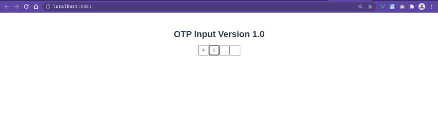
Here is the final result

Bugs
For most of it, it does what an otp input should do, but it still has some few bugs.
- After reaching the last input field, the delete feature works differently.
- if two keys are entered at the same time, it skips a field
If you have any fix for these or you discover more bugs you can put it down in the comment section or raise an issue in the github repository
Original Link: https://dev.to/otrex/custom-otp-input-component-with-vuejs-54dl
Dev To
 An online community for sharing and discovering great ideas, having debates, and making friends
More About this Source Visit Dev To