
An Interest In:
Web News this Week
- April 19, 2024
- April 18, 2024
- April 17, 2024
- April 16, 2024
- April 15, 2024
- April 14, 2024
- April 13, 2024
Some of Our Sources
- Slashdot
- Techcrunch
- Simplebits
- Pearsonified
- Inspiredology
- Web Designer Depot
- Line 25
- 24 Ways
- Web Resource Source
- Android Headlines
Help Webnuz
Referal links:
Get started with Chakra-UI
In this blog, I will teach you how to get Started with Chakra-UI.
Video Tutorial
What is Chakra-UI?
Chakra-UI is a React UI library that has tons of pre-styled components and utilities that you can use on the website.
Installation
- I will use nextjs.
yarn create next-app <my-app>- Install packages:
cd <my-app>yarn add @chakra-ui/react @emotion/react@^11 @emotion/styled@^11 framer-motion@^6Setup Chakra-UI with next
- Wrap the
Componentcomponent with theChakraProvidercomponent.
import { ChakraProvider } from '@chakra-ui/react'function MyApp({ Component, pageProps }) { return ( <ChakraProvider> <Component {...pageProps} /> </ChakraProvider> )}export default MyAppNow we can use chakra-UI components.
How to import components
Always import the components and utilities as a named import from the @chakra-ui/react package.
import { Button, Text, Heading, Box, Link, useTheme } from '@chakra-ui/react'const Index = () => { return <Heading>Heading 1</Heading>}export default Index
Custom styles
There are two ways to customize the styles.
- Style Props: With style props, you can use almost any CSS property as props. See all the available style props.
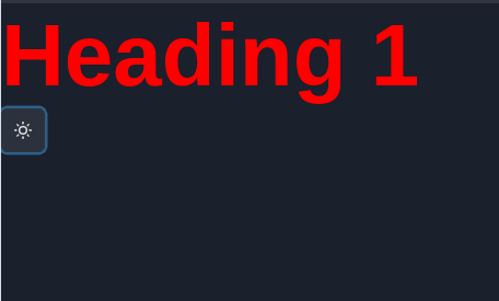
const Index = () => { return ( <Heading color='red' fontSize='5rem'> Heading 1 </Heading> )}- SX prop: With sx prop, you can use any custom style as an object. All the property name has to be camelcase.
const Index = () => { return ( <Heading sx={{ color: 'red', fontSize: '5rem', }} > Heading 1 </Heading> )}
Change the color mode
We can change the color mode using the useColorMode hook.
import React from 'react'import { IconButton, useColorMode } from '@chakra-ui/react'import { MoonIcon, SunIcon } from '@chakra-ui/icons'const ToggleMode = () => { const { colorMode, toggleColorMode } = useColorMode() return ( <IconButton icon={colorMode === 'dark' ? <SunIcon /> : <MoonIcon />} onClick={toggleColorMode} /> )}export default ToggleModeLight mode

Dark mode
To learn more about chakra-UI theme and responsive styles, please watch the video tutorial.
Commonly Used Components
Here are some of the components that I use most.
Shameless Plug
I have made an Xbox landing page clone with React and Styled components. I hope you will enjoy it.
Please consider like this video and subscribe to my channel.

That's it for this blog. I have tried to explain things simply. If you get stuck, you can ask me questions.
By the way, I am looking for a new opportunity in a company where I can provide great value with my skills. If you are a recruiter, looking for someone skilled in full-stack web development and passionate about revolutionizing the world, feel free to contact me. Also, I am open to talking about any freelance project. I am available on Upwork
Contacts
- Email: [email protected]
- linkedin: @thatanjan
- portfolio: anjan
- Github: @thatanjan
- Instagram (personal): @thatanjan
- twitter: @thatanjan
Original Link: https://dev.to/thatanjan/get-started-with-chakra-ui-1638
Dev To
 An online community for sharing and discovering great ideas, having debates, and making friends
More About this Source Visit Dev To