An Interest In:
Web News this Week
- April 2, 2024
- April 1, 2024
- March 31, 2024
- March 30, 2024
- March 29, 2024
- March 28, 2024
- March 27, 2024
Blob shapes with CSS
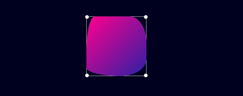
In this article, I'm going to talk about how can we create Blob shapes just using CSS.
So let's start with this. To achieve this, we're going to use a well-known CSS property called border-radius. Yes, you read it right we can do with just border-radius. To understand how this works, we need to first understand the property in-depth.
Learning about border-radius
We use border radius to have rounded/smoother corners for the elements. Each element in HTML has four corners(top-left, top-right, bottom-right, and bottom-left). We can use this property in multiple ways. For example,
// one value (all 4 corners)border-radius: 10px;// four values (top-left top-right bottom-right bottom-left)border-radius: 10px 20px 30px 40px;How this works
This syntax is just a shorthand. As we already know, we apply all 4 border-radius just using the single property. So if we want to apply it to a single corner (let's say top-left), we can do
border-top-left-radius: 10px;
What it does here is, it goes 10px right and down from the top-left corner and creates the round shape.
Enhance the learning
So we learned the basics of border-radius. But we have another thing to talk about which is, we can pass another value to this.
border-top-left-radius: 10px 20px;
Now, what's it doing here is, it is going 10px to the right and 20px down and connecting with a round shape.
Creating blob shapes
We did learn about shorthands, but we're not going to write shorthands, right? So the question here is, can we not do this directly from the border-radius property? The answer is, that we can. Let's learn about syntax by looking at this example.
border-radius: 10px 20px 30px 40px / 40px 30px 20px 10px;If you notice, each value after the slash(/) is mapped to its corresponding value. This results in this.
border-top-left-radius: 10px 40px;border-top-right-radius: 20px 30px;border-bottom-right-radius: 30px 20px;border-bottom-left-radius: 40px 10px;Let's make this more fun
Okay, now we have learned to create blob shapes with CSS. To make it more fun we can add animations, transitions and hover effects, etc. Please check out this codepen with a simple hover effect with pseudo-elements.
I hope this article was helpful and you learned something new. You can connect with me at Linkedin
Original Link: https://dev.to/itssharmasandeep/blob-shapes-with-css-3op9
Dev To
 An online community for sharing and discovering great ideas, having debates, and making friends
More About this Source Visit Dev To


