
An Interest In:
Web News this Week
- March 22, 2024
- March 21, 2024
- March 20, 2024
- March 19, 2024
- March 18, 2024
- March 17, 2024
- March 16, 2024
Some of Our Sources
- Techcrunch
- Technology Review
- The Logo Smith
- Naldz Graphics
- Crazy Leaf Design
- Fudge Graphics
- Line 25
- Stylized Web
- Specky Boy
- Daily Now
Help Webnuz
Referal links:
How to Define Flutter Theme
In this short blog series, we will define a global theme for our applications. We'll mainly work on two aspects colors and fonts. Check out the style guide below.
Intro
Welcome back to 3rd part of the series "Flutter App Development Tutorial". So, far we implemented Launch Icon, Splash Screen and Onboard Screen. Please find the source code for the progress so far from here.
Now, since this application is for Hindus, I tried to apply a few holy colors like Saffron as the primary color, red as an accent/secondary color, and Green as the background color of the app. The text colors are the result of experimenting with color contrast. For the font, I am using Proxima Nova. You can download your fonts from here.
Styling Your Flutter App
Alright, now that we've seen what our app's roughly going to look like. Let's create a theme folder and a file app_theme.dart inside the globals folder.
#on the root of projectmkdir lib/globals/theme# Create filetouch lib/globals/theme/app_theme.dartDefining Themes With ColorScheme
Now inside the app_theme file let's define the colors that our app is going to use.
app_theme.dart
import 'package:flutter/material.dart';// Instantiate new theme datafinal ThemeData asthaTutorialTheme = _asthaTutorialTheme();//Define Base theme for appThemeData _asthaTutorialTheme() {// We'll just overwrite whatever's already there using ThemeData.light() final ThemeData base = ThemeData.light(); // Make changes to light() theme return base.copyWith( colorScheme: base.colorScheme.copyWith( primary: const Color.fromARGB(255, 255, 153, 51), onPrimary: Colors.white, secondary: const Color.fromARGB(255, 223, 27, 12), onSecondary: Colors.white, background: const Color.fromARGB(255, 228, 243, 228), onBackground: Colors.black, ), );}Flutter ColorScheme can be used to define the colors of many components. Copying the Light theme leaves us less work to do. However, if you've tried the dark theme you're gonna need to experiment a little bit, cause some colors might get overwritten. The primary color is for navigation/app bars while the secondary is the accent color. We must define styles for buttons separately with respective ButtonTheme class.
Defining Text Theme
As mentioned before we'll be using ProximaNova font. Create fonts folder inside assets folder and download the font if you'll be using the same one. Now, as we've done previously we need to tell flutter to look for the font by adding path on the pubspec file.
The fonts section should be commented on in the pubspec file, uncomment it if you want, add the following instructions.
fonts: - family: Proxima Nova Rg Regular fonts: - asset: assets/fonts/ProximaNovaRegular.ttfLet's now head back to our theme and begin writing instructions for what our texts are gonna look like. We'll create a separate function _asthaTutorialTextTheme to keep our main function lean.
// Outside of _asthaTutorialTheme function create another functionTextTheme _asthaTutorialTextTheme(TextTheme base) => base.copyWith(// This'll be our appbars title headline1: base.headline1!.copyWith( fontFamily: "Proxima Nova Rg Regular", fontSize: 30, fontWeight: FontWeight.w500, color: Colors.white),// for widgets heading/title headline2: base.headline2!.copyWith( fontFamily: "Proxima Nova Rg Regular", fontSize: 26, fontWeight: FontWeight.w400, color: Colors.black, ),// for sub-widgets heading/title headline3: base.headline3!.copyWith( fontFamily: "Proxima Nova Rg Regular", fontSize: 24, fontWeight: FontWeight.w400, color: Colors.black, ),// for widgets contents/paragraph bodyText1: base.bodyText1!.copyWith( fontFamily: "Proxima Nova Rg Regular", fontSize: 20, fontWeight: FontWeight.w300, color: Colors.black),// for sub-widgets contents/paragraph bodyText2: base.bodyText2!.copyWith( fontFamily: "Proxima Nova Rg Regular", fontSize: 18, fontWeight: FontWeight.w300, color: Colors.black), );In flutter, TextTheme is a material design class for text . I've tried to provide font size and font weight to maintain a hierarchy and be less bland.
After defining the function, we'll need to pass it to our main function: _asthaTutorialTheme.
// Inside the base.copyWith method .... return base.copyWith( colorScheme: base.colorScheme.copyWith( // Leave it as it is .... ), // Add text theme textTheme: _asthaTutorialTextTheme(base.textTheme), );Elevated Button Theme in Flutter
ElevatedButtonThemeData is a button style that overrides the default appearances of ElevatedButtons. Like previously, we'll create a separate function to define the button style.
ElevatedButtonThemeData _elevatedButtonTheme(ElevatedButtonThemeData base) => ElevatedButtonThemeData( style: ButtonStyle( backgroundColor: MaterialStateProperty.all<Color>( const Color.fromARGB(255, 223, 27, 12), ), foregroundColor: MaterialStateProperty.all<Color>(Colors.white), ), );Material StateProperty contains the state of a widget's material. Button like elevated, text or outline is consists of many material state properties such as background color, that's why we're defining color property like in our code above.
With that out of the way, let's pass this function to the elevatedButtonTheme property inside a copy of the base theme.
// below text theme add this // Define styles for elevated button elevatedButtonTheme: _elevatedButtonTheme(base.elevatedButtonTheme),Styling Input Widgets in Flutter
We're going to be using input forms for authentication later on in the series. We'll need to add a few styles for that as well.
InputDecorationTheme _inputDecorationTheme(InputDecorationTheme base) => const InputDecorationTheme(// Label color for the input widget labelStyle: TextStyle(color: Colors.black),// Define border of input form while focused on focusedBorder: OutlineInputBorder( borderSide: BorderSide( width: 1.0, color: Colors.black, style: BorderStyle.solid, ), ), );We've made input such that when focused on it'll have a solid border with a width of 1px. Similarly, colors for both text and border will be black.
Can you add the _inputDecorationTheme function to our main function? I'll leave it to you then.
Now, putting it all together:
app_theme.dart
import 'package:flutter/material.dart';// Kinda like a getter to import theme from other filesfinal ThemeData asthaTutorialTheme = _asthaTutorialTheme();//Define Base theme for appThemeData _asthaTutorialTheme() { final ThemeData base = ThemeData.light(); return base.copyWith( colorScheme: base.colorScheme.copyWith( primary: const Color.fromARGB(255, 255, 153, 51), onPrimary: Colors.white, secondary: const Color.fromARGB(255, 223, 27, 12), onSecondary: Colors.white, error: Colors.red, background: const Color.fromARGB(255, 228, 243, 228), onBackground: Colors.black, ), textTheme: _asthaTutorialTextTheme(base.textTheme), // below text theme add this // Define styles for elevated button elevatedButtonTheme: _elevatedButtonTheme(base.elevatedButtonTheme), // Set Themes for Input Your homework // Define theme for text input );}// Outside of _asthaTutorialTheme function create another functionTextTheme _asthaTutorialTextTheme(TextTheme base) => base.copyWith(// This'll be our appbars title headline1: base.headline1!.copyWith( fontFamily: "Proxima Nova Rg Regular", fontSize: 30, fontWeight: FontWeight.w500, color: Colors.white),// for widgets heading/title headline2: base.headline2!.copyWith( fontFamily: "Proxima Nova Rg Regular", fontSize: 26, fontWeight: FontWeight.w400, color: Colors.black, ),// for sub-widgets heading/title headline3: base.headline3!.copyWith( fontFamily: "Proxima Nova Rg Regular", fontSize: 24, fontWeight: FontWeight.w400, color: Colors.black, ),// for widgets contents/paragraph bodyText1: base.bodyText1!.copyWith( fontFamily: "Proxima Nova Rg Regular", fontSize: 20, fontWeight: FontWeight.w300, color: Colors.black),// for sub-widgets contents/paragraph bodyText2: base.bodyText2!.copyWith( fontFamily: "Proxima Nova Rg Regular", fontSize: 18, fontWeight: FontWeight.w300, color: Colors.black), );InputDecorationTheme _inputDecorationTheme(InputDecorationTheme base) => const InputDecorationTheme(// Label color for the input widget labelStyle: TextStyle(color: Colors.black),// Define border of input form while focused on focusedBorder: OutlineInputBorder( borderSide: BorderSide( width: 1.0, color: Colors.black, style: BorderStyle.solid, ), ), );ElevatedButtonThemeData _elevatedButtonTheme(ElevatedButtonThemeData base) => ElevatedButtonThemeData( style: ButtonStyle( backgroundColor: MaterialStateProperty.all<Color>( const Color.fromARGB(255, 223, 27, 12), ), foregroundColor: MaterialStateProperty.all<Color>(Colors.white), ), );Adding Theme to GoRouter
We're using MaterialApp.router class for declarative routing. It provides a field theme to definine global theme for its children. So, in out app.dart file where we call upon this class, let's add the theme we just defined.
app.dart
// import theme at topimport 'package:temple/globals/theme/app_theme.dart';//In MaterialApp.router return MaterialApp.router( routeInformationParser: router.routeInformationParser, theme: asthaTutorialTheme, // add our theme here. routerDelegate: router.routerDelegate);- A kind reminder, your package name can be different while importing*
Test Theme
I've changed the Home screen a little bit, to test our theme. Please feel free to experiment on your own.
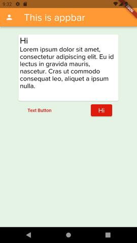
import 'package:flutter/material.dart';class Home extends StatefulWidget { const Home({Key? key}) : super(key: key); @override State<Home> createState() => _HomeState();}class _HomeState extends State<Home> { @override Widget build(BuildContext context) { return Scaffold( appBar: AppBar( leading: Icon(Icons.person), title: Text( "This is appbar", style: Theme.of(context).textTheme.headline1, ), ), body: SafeArea( child: Container( padding: const EdgeInsets.all(20), color: Theme.of(context).colorScheme.background, child: Column(mainAxisAlignment: MainAxisAlignment.start, children: [ Card( child: Container( width: 300, height: 200, padding: const EdgeInsets.all(4), child: Column( crossAxisAlignment: CrossAxisAlignment.start, children: [ Text( "Hi", style: Theme.of(context).textTheme.headline2, textAlign: TextAlign.left, ), Text( "Lorem ipsum dolor sit amet, consectetur adipiscing elit. Eu id lectus in gravida mauris, nascetur. Cras ut commodo consequat leo, aliquet a ipsum nulla.", style: Theme.of(context).textTheme.bodyText1, ) ]), ), ), Row( mainAxisAlignment: MainAxisAlignment.spaceAround, children: [ TextButton( child: const Text("Text Button"), onPressed: () {}, ), ElevatedButton( child: Text( "Hi", style: Theme.of(context).textTheme.bodyText1!.copyWith( color: Colors.white, ), ), onPressed: () {}, ), ], ) ]) ), ), ); }}The code yielded the following screen.
Homework
Do me a favor I've forgotten to add the text theme in the code, can you add it by yourself?

Summary
In this blog series:
- We defined a set of colors for our app.
- We also added font and then defined styles for texts.
- We gave a border to the input form that our app will use.
- Then we also tested the theme with a mock page.
If you want to learn more, visit Google Shrine App Tutorial, MDC-103.
Support Us
Many things are yet to be done like Authentication Using Firebase, Firebase Firestore, and Functions. Find the list of all the blogs in this series here.
I hope this blog was worth your time. If you have any queries let us know in the comment section. Don't forget to like and share them with your friends. Please do subscribe to get email updates.
This is Nibesh Khadka from Khadka's Coding Lounge, a freelancing agency. We make high-value mobile apps and websites at a reasonable price.

Original Link: https://dev.to/kcl/how-to-define-flutter-theme-c26
Dev To
 An online community for sharing and discovering great ideas, having debates, and making friends
More About this Source Visit Dev To