
An Interest In:
Web News this Week
- April 1, 2024
- March 31, 2024
- March 30, 2024
- March 29, 2024
- March 28, 2024
- March 27, 2024
- March 26, 2024
Some of Our Sources
- Engadget
- Simplebits
- Team Treehouse
- TutsPlus - Design
- You The Designer
- Inspiredology
- Naldz Graphics
- Fudge Graphics
- CSS Globe
- Spyre Studios
Help Webnuz
Referal links:
and : a native HTML accordion
: a native HTML accordion
Did you know about <details>? If you did, great. Im happy for you. If you--like me--did not, the code looks like this:
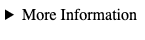
<details> <summary>More Information</summary> Lorem ipsum dolor sit amet, consectetur adipiscing elit, sed do eiusmod tempor incididunt ut labore et dolore magna aliqua. Ut enim ad minim veniam, quis nostrud exercitation ullamco laboris nisi ut aliquip ex ea commodo consequat.</details>Rendered, it would look something like this:
If you click on that more information texteither with a mouse or space bar on focusyoull see this
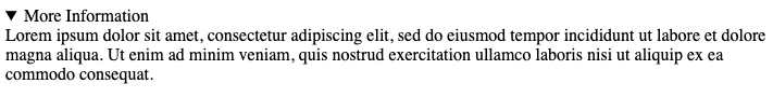
Clicking More Information will hide the expanded text again.
Essentially, anything you put in summary becomes a button-like element that, when pressed, displays any children of details that come immediately after it. You can wrap those adjacent children in a div for easy styling, but just dumping the text right next to the summary works just fine. This makes it sound a heck of a lot like the countless custom accordions youve no doubt had to make. This makes it sound a heck of a lot like the countless custom accordions youve no doubt had to make. A native HTML solution is almost always preferred to a custom one, and this one is supported in modern browsers, and its appearance is relatively easy to customize.
The black arrow renders as a :marker on summary in most modern browsers, which is easy to disable with list-style-type: none and replace with whatever pseudo-class content or background-image you choose. The exception, as expected, is Safari, which still uses ::-webkit-details-marker (summary::webkit-details-marker). So in order to fully disable the default marker style, youll need to do something like this:
summary { list-style-type: none;}summary::webkit-details-marker { display: none }Still pretty painless!
details also comes with a handy open property that appears when the full text is expanded, allowing you to animate your custom marker. Heres a simple, if impractical, example on codepen.
Limitations
Theres always a catch. While <details> and <summary> are a great, out-of-the-box solution for a lot of projects. There are some exceptions to consider.
No IE support
As Im sure you can guess, this is not available in any version of Internet Explorer. If you still need to support IE11, youll need to come up with a custom solution.
Customized animations/transitions
One of the main reasons we end up turning to custom solutions is because of very specific UI requirements; we often want that hidden text to gracefully slide into view when expanded. Unfortunately, while you can modify the appearance of the marker fairly easily, you wont be able to do too much with the actual text reveal transition without some extra Javascript.
Accessibility considerations
For the most part, this component is fairly accessible out of the box; youre able to navigate it using your keyboard, with both keyboard and most assistive technology treating the summary element as a button. However, as Hassel Inclusion discovered in a test of the element in 2019, the revealed text isnt always announced correctly by screen readers, so an unsighted user might not know what their button press actually did. A way around this may be adding extra markup and a little Javascript to make the expanded text a live region when it is expanded, or perhaps just move focus on expansion to the new text. At that point, youre basically making a custom component, though.
this post was cross-posted from my site
Original Link: https://dev.to/heyitsstacey/and-an-native-html-accordion-5797
Dev To
 An online community for sharing and discovering great ideas, having debates, and making friends
More About this Source Visit Dev To